• 2024 '22 '21 '19 '15 '14

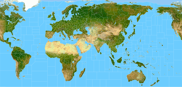
    I thought this might be more useful in this section. I’m working on a custom world projection for my gamemap and this is basically an outgrowth of that endeavor. The dropbox links have it at around 16000px.

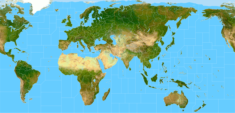
    Terrain relief draft

    terrain world indexed 20.png

    That’s the one I have for keeping the terrain filesize low in the digital game, lower res basically. But still works alright if adding more abstract layers or patterns or whatever on top. Basically you can just covert back to RGB, add in the dithering on another transparency layer and get a pretty similar look. For a print display probably would use true color and add the grain for a dotmap once it’s upscaled to the desired size. The Baseline TTs I think are easier to handle in inkscape vector, but tripleA uses bitmaps for everything, so different approach there just to get it working with that hehe.

    Global draft

    https://www.dropbox.com/s/rdr4b4eu443cbgg/terrain world G40.png?dl=0

    terrain world G40 25.png

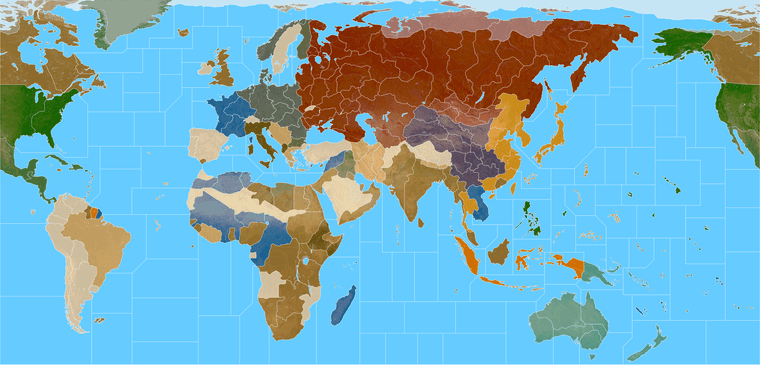
    Quick paint

    https://www.dropbox.com/s/1qlojy8bbgkujvz/World_War_II_Global_1940_painted.png?dl=0

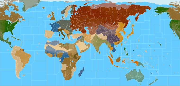
    Color Blend
    https://www.dropbox.com/s/nqanzab6s6zssl9/World War II Global 1940 feathered borders.png?dl=0

    World War II Global 1940 feathered borders 25.png

    At 1 px black line
    https://www.dropbox.com/s/4740bj0l87sbb57/World_War_II_Global_1940_baseline.png?dl=0

    I’ve been exploring a 1941 themed digital game that uses the same warps, but with more subdivisions and kicking around with that in the HR section, I’ll probably keep posting for HR scenarios, but these I thought might be fun to have for customizers or just ideas. I haven’t don’t the decorative layer done yet, but just to give an idea. I was going to get a vector going, but first I’ve been tooling around with bitmaps for use in TripleA. I figure people might like to spruce it up in different ways though depending on their aesthetic and style preferences, so here ya go. I gave it a basic SZ and TT geometry that should service G40 gameplay (unless I missed something lol.) I was gunning pretty quickstyle so there might be an artifact here or there, I’m sure the final will be cleaner. But feel free to use or tweak it however you like.

    Best
    Elk

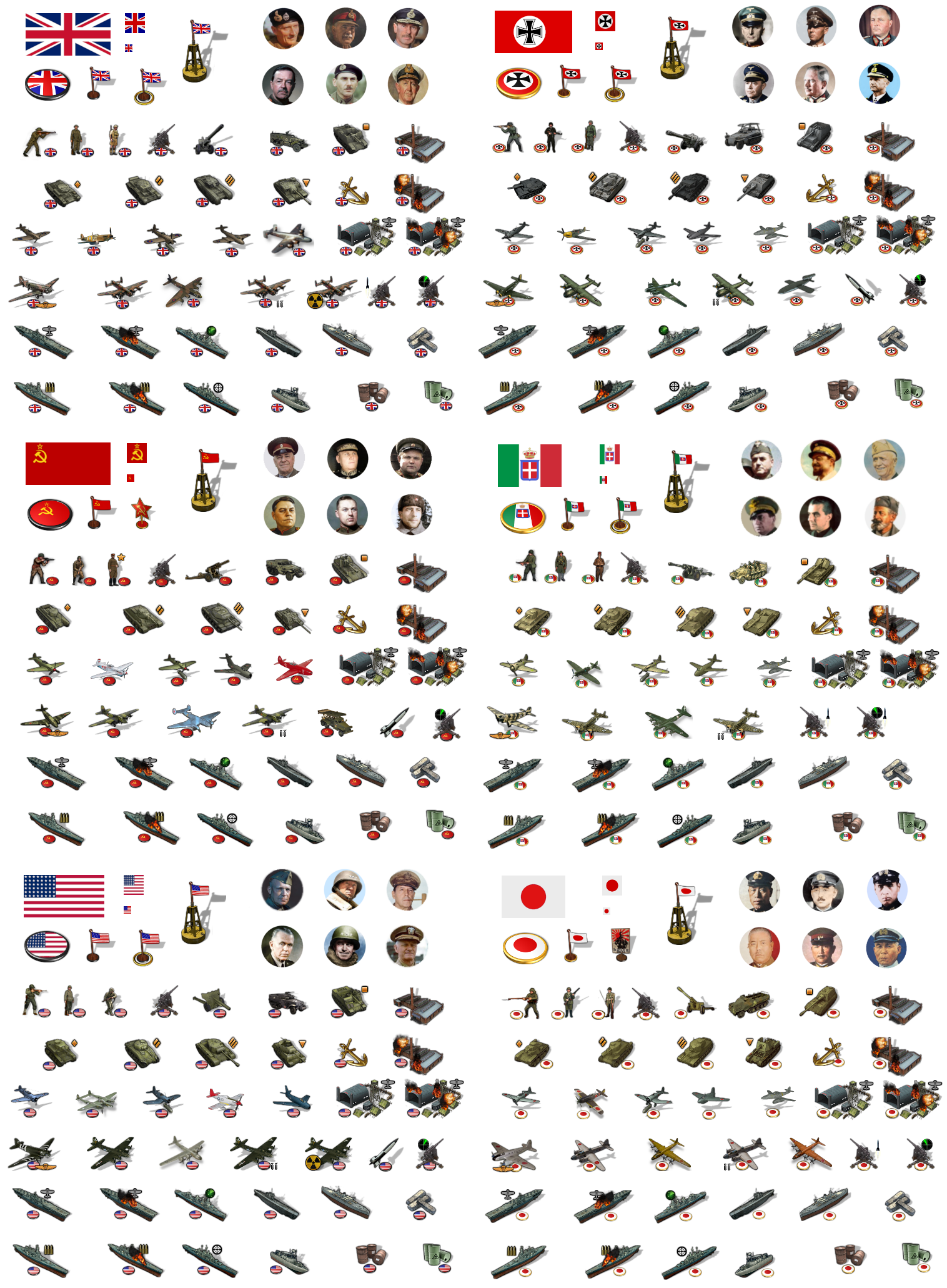
    ps. I’ll update this leads post as I am make corrections or add new materials. Here’s a quick set of tinted units for the mains.

    unit stickers tinted update.png


  • @black_elk

    My suggestion would be that you keep everything concerning this project in this thread - even the rules that you want to implement in the game.

    It is confusing if you post in House Rules anything that concerns this project - since players would have to look in multiple places to find information.

    Good luck & have fun :+1:

  • 2024 '22 '21 '19 '15 '14

    Right on! Sounds good

    If we come up with something worthy for a specific scenario I’ll expand on it in this section for sure hehe.

    The above can be used for the standard Global 1940 game

    It basically follows that board, and shows those boundaries. Unless I overlooked something all TT/SZ connections should work there. Just with a new take on the warp and a few tweaks to the geometry of the SZ shapes. Feel free to modify it or make use of it however you like.

    :)

    ps. What I posted there was just a G40 Map Customization as opposed to an A&A Variant, but I guess I’ll admit to finding these subcategories a little confusing lol. I posted in the Subcategory when I meant to post in the main Category hehe. I did it twice and missed both times haha. But whatever.

    Thought people might enjoy this as a template for their custom A&A boards, as an alternative to the OOB gameboard warps. The TT/SZ spaces are largely similar, it just doesn’t show as much distortion in the relative scale, particularly with the Global South.

    Like I was just tired of looking at India be all squished, and wanted something a bit more reminiscent of the Classic 1984 morphs, you know for the general shapes of the continents and the look of the world so there ya go! lol

    ps. Caught a correction with the G40 TT connections and the map split, on the base. Thanks Barnee!

    I’ll update it in the terrain reliefs tomorrow, should look more like this to follow OOB…

    G40_Paint_Blend_20.png

    ps. OK edited in the links at the head. Hopefully I got the splits correct now lol. I’ll do a quick labelling when I get a few hours to comb it over again. Night!


  • @black_elk Can Germany have a separate Prussia and pre 1939 borders? It looks too ww3 ish IMO. I understand its 1940, but to create the same land area, but redo the borders so its clear to see the part of Poland that was occupied. I do see you made a west and east Germany ( post war), but to me that consideration is secondary. Modeling the map so you see the starting points is golden. Germany can still win the game, so how does East/west thing work? The cartography is great. Whats going on with those two small areas above the Caucasus near Astrakhan? The area in front of Moscow is really small. I know it will be very crowded. The choice for neutrals is too close to UK IMO. Too many browns tans, etc. YOu got UK, Italy, and neutrals all in hue of brown…


  • Also, Alaska looks wonky. Another stretch job…hmmm. I would split Italy into 3 areas. The Allies took almost 2 years to get up that boot.

    The sea zones being as they are must allow naval movement to be must farther than 2 spaces or we’ll never finish the game imo.

  • 2024 '22 '21 '19 '15 '14

    Thanks!

    Yeah I think we’ll probably need to give the TT boundaries another pass for sure. Like just when I thought I’d had it somewhat in order, and was all ready to pat myself on the back, I immediately found a cascade of issues with the sea zones too that I was just trying to fix up lol. Somehow I’d left extra lines in place that created a couple phantom tiles that kept confusing me. Go figure lol.

    I could rework Alaska too while I’m at it. It started from a Robinson style shape up there, so it had that sort of lean I guess at the outset, but it probably drifted while I was redrafting. Or it might have been stomped in one of those intermediate drafts while I was trying to contort the Americas, cause initially I had it splitting weird and kept trying to mess with Yukon until I remembered, like duh heheh. Every time I think I got it across the finish line, I realize it probably needs another week. So we’ll just keep chipping away until it’s passing fair.

    I agree it would be cool to have the G tiles themed more 39 would probably be cooler. I was ballparking till I got the relief done, now I’m back at the divisions.

    Yeah the Neutrals are too close to UK khaki in that palette. I wasn’t sure how the color would read at 75% opacity with the overlay, but I think the neutrals definitely need to be a few shades lighter or different hue to set them apart. Some of the other nations too. Like I got the TripleA Chinese purple people eater thing going on right now and Japan all mustard, both of which could get the switcheroo lol. Fortunately it’s relatively simple to manipulate, or tweak with different HEX colors once I get it blocked in.

    So tops on the list would be…

    Rework the borders between West/East Germany, Western Poland, and Greater Southern Germany (so Bohemia Moravia looks right).

    Rework Russia/Moscow. I think I need to fudge the rivers a bit for the terrain in that tile, so I can pull everything to the right without it looking too goofy and Moscow being like thousands of miles out of position. Always a perennial conundrum haha. I’d like to get some kind of tendril/TT finger reaching for the Soviet capital, just so it doesn’t look too crazy far to the East. The OOB warp is pretty extreme there, so I’m kinda tap dancing around having to bite that bullet and make necessary compromises for the gameplay.

    For the region north of the Caucasus, I’ll have to double triple check. That area where the two edges of the board meet definitely shows the most distortion OOB, and here too, like it stretches pretty hard there in some spots, so trying to adapt that was kinda tricky. If there’s weirdness I introduced, it’s probably most pronounced in that region of the world, where things had to get a bit stretch armstrong lol. For the TT shapes I figure we’ll just keep taking swings until it looks good enough for the general nod. I’ll hop back on it tomorrow.

    Appreciate the feedback!
    All the best

    Elk

    ps. OK so this is clearly overkill hehe, but just in case people wanted lines to try different things. Here are the main administrative districts and annexations for like 1939-41. So depending on how much one wanted to gobble up into a given tile for the desired look. The main challenge is that there has to be compression somewhere, or else the warp would just have Europe looking like an inset enlargement. Basically the Balkans have to tweak a bit in order to have such a gigantic Europe vis a vis the stuff next door in the Middle East and the Med and such. The practical effect here is that Hungary has to get a little stretchy in order to make Germany more coherent, like how far down one wants Silesia or occupied Poland to touch ‘Hungary’ or the part of it annexed from Slovakia for OOB stuff. Just to get the connections to hit. Poland and Belarus have some compression to make Misk and Bryansk and such roughly where the ought to be. The leftmost point of the Russia tile is where Moscow should be given the rest of the warp, but this I guess could be a case where you just sort tweak it further East and suspend disbelief to make those intermediate stack/deadzones spots big enough. In tripleA with units at 150% scale I can easily fit enough with the standard G40 divisions, for a multination army, but one might want more zone for the analog version.

    G_warp_guides.png

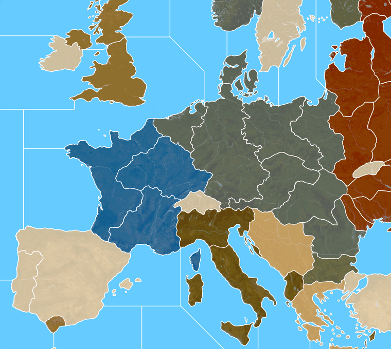
    So say we wanted Greater Southern Germany to include pretty much all of Austria and the stuff annexed from Czechoslovakia, and W/E break that isn’t on the Elbe, or with E. Germany just being extra beefy, might go something more like this… Then fudge it a bit in Poland to get the connections to land the same way they do in OOB. Stick a star or a flag on the Berlin spot and call it a day heheh. I guess I’d probably shift the line just a bit to the right to round out W. Germany with Hamburg or something. But just wanted to see how far I could before it hit the trip wire lol. Guess that’s more Prussia plus.

    Probably a given take no matter how ya slice it, but I can see a shape a bit more like that being kinda interesting, and more start of the war theme rather than end of the war theme heheh. Anyhow, just an idea. We could tweak the splits a few different ways depending on the desired visual/playscale.
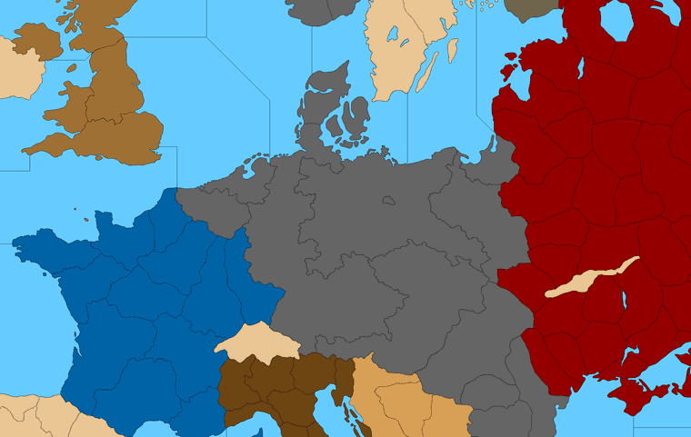
    Different lines Germany.png

    Or just ballpark it into a block lol.
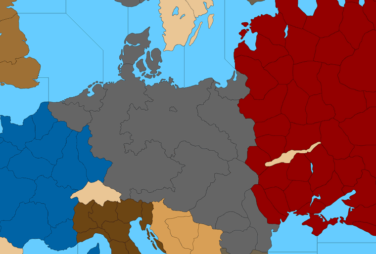
    G_Alt.png

    Or something with more that sort of vibe. Then if you want to add Danzig to the E. Germany tile can just carve it off from Posen and the current West Poland tile, though that’d make it a little different than the OOB Poland to baltic sz connect for G40.

    Or perhaps that’s what you meant initially? Like just to connect E. Prussia/Konigsberg with the main Prussian/Silesian tile?

    My thought for smaller tiles like that one is that they could drop the connection and attach the tile to the larger neighbor at a G40 playscale. So control of Konigsberg would just go to E. Germany the way say Sicily would attach to Italy in the older boards. It works in tripleA, like I was going to handle Aden and Brits in the Gulf like that, by attaching to Transjordan, but that might not be super desirable for the analog version if people might get confused about TT connections. I left the little Berlin space just to show where it was hehe

    ps. Here’s another pretty similar option for E. Germany/Greater Southern just depending on how one likes to assign the stuff taken from Czech or the shape to recast Hungary. The smaller divisions are kinda just guides, so you can tweak the boundaries for whatever makes the most sense for the given game/idea.
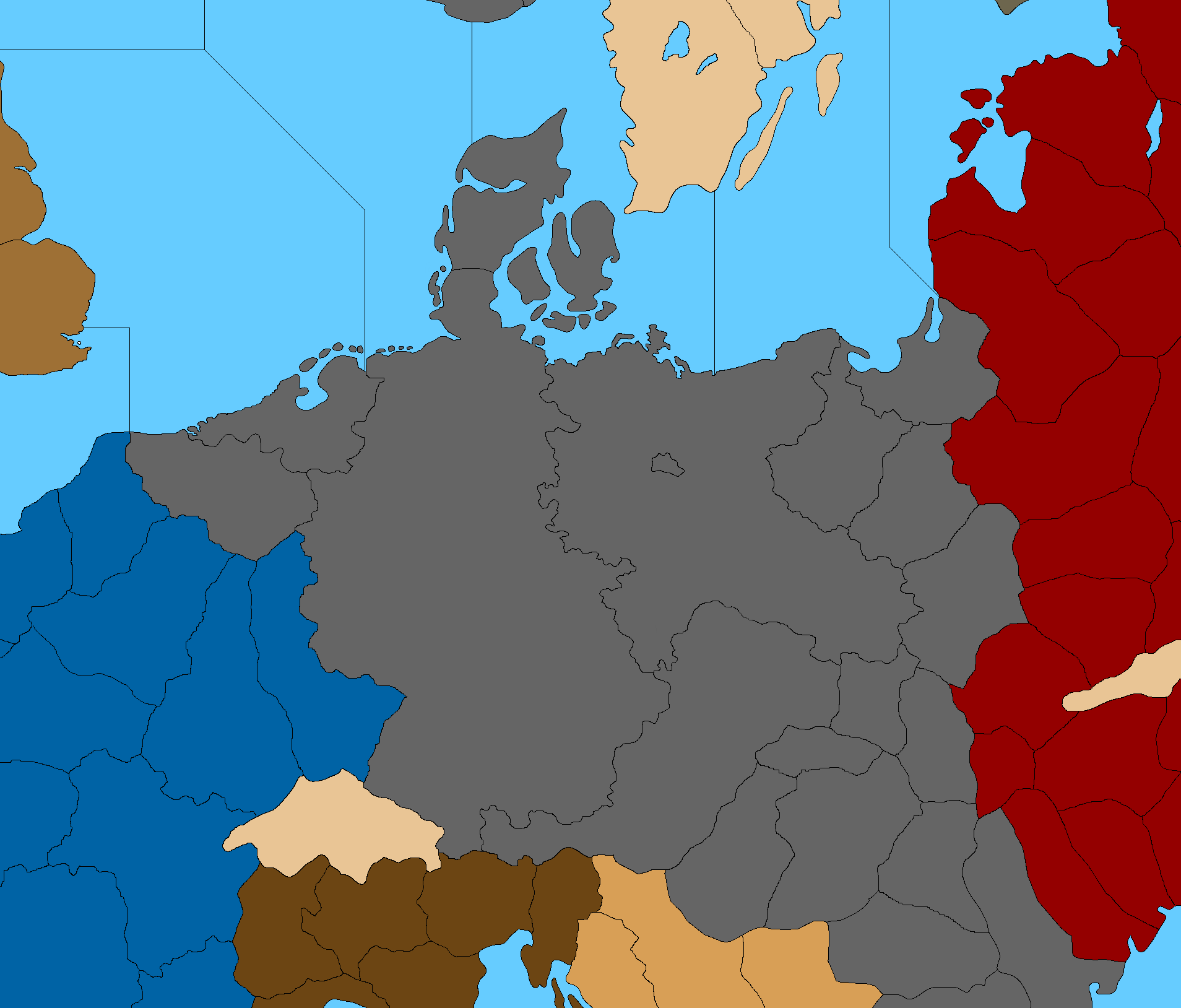
    Greater Southern G.png

    Sorta comes down to how skinny you’re willing to see Austria get I guess vis a vis the stuff around it heheh.

    So maybe ends up something a bit more like this after it’s rounded out…
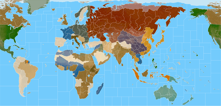
    Global paintjob 20.png

    Here’s the current Terrain with another quickie G40 overlay

    World War II Global 5px white terrain 25.png


  • @black_elk Australia partitions are strange. The middle of that continent should be essentially impassible, its a “Sahara” but worse. All the coastal areas are in play for partitions, so to invade is a giant ‘creep’ around the entire continent IMO. It cant be possible to cross it in any manner with armies.

  • 2024 '22 '21 '19 '15 '14

    Here is a version showing many more subdivisions, one of which inserts another tile in the middle of Australia that could serve as an impassible zone if desired. Along with a bunch of other lines in other spots that one might keep or ditch depending on how they wanted to reshape tiles for different stuff.

    https://www.dropbox.com/s/hmzuzwg6ytgh5rs/Domination_subdivisions.png?dl=0

    Domination_subdivisions_25.png

    base
    https://www.dropbox.com/s/khxkql58g73q1n3/Domination_1940_baseline.png?dl=0

  • 2024 2023 '22 '21

    When are you gonna make the rulebook ?

    Can the the map be used without special rules…?

    Units would have to move & fight differently than any OOB A&A game, since the distances seem much larger than even G40 map.

  • 2024 '22 '21 '19 '15 '14

    For the moment what I did was to take my ideas from the 1900 gamemap, and Heppster’s stuff from the 1914-18 gamemap in tripleA, and then tried to port that into something with a more late 1930s-40s vibe. I think it’s probably possible to create a game in tripleA for TTs on that scale that uses basically the normal rules, just with different starting unit set ups or production frontiers and microsculpts basically for all the units, since the digi sculpts can be scaled down and the map can be scaled. For a more analog thing I’d think one would either need to print a truly gigantic map to play that way, or more likely one would just add the borders they like and exclude the ones they find extraneous, for a game at a more normal playscale. Some ideas for the extra sea zones would be to add oldschool convoy lanes. For a ground game with that many tiles, you could probably keep the same movement dynamics for familiarity or change them for something a bit different I guess. M3 on the ground I think it really taxes the HardAI in tripleA, unless it’s a relatively uncommon unit, but M3 at sea I think could work. I haven’t tried to crack at the rules yet, just trying to draft map ideas that people floated as being potentially interesting. There’s an xml being worked on but haven’t delved too deep yet. Just trying to get the map and unit graphics stuff dialed then figure out what to do with it I guess hehe.
    :)

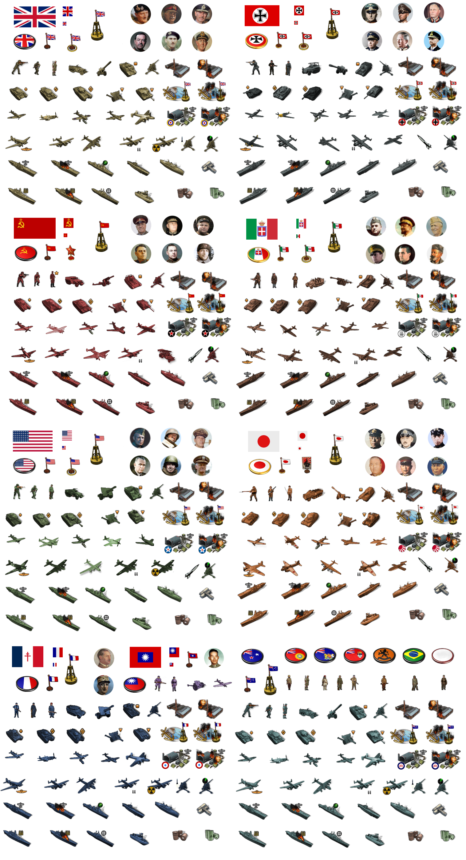
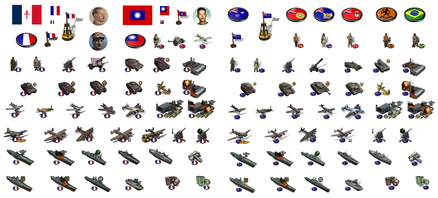
    Here’s the first set of supped up digi sculpts… based on Frostion’s set, with some additions I threw together. In tripleA the max display in the battlecalc is 68px tall, so that’s the ceiling there, but in game you can upscale these to like 150% for the map display. I tried to put em together here like a sticker sheet hehe.

    stickers.png

    And to round it out…

    stickers more.png

  • 2024 '22 '21 '19 '15 '14

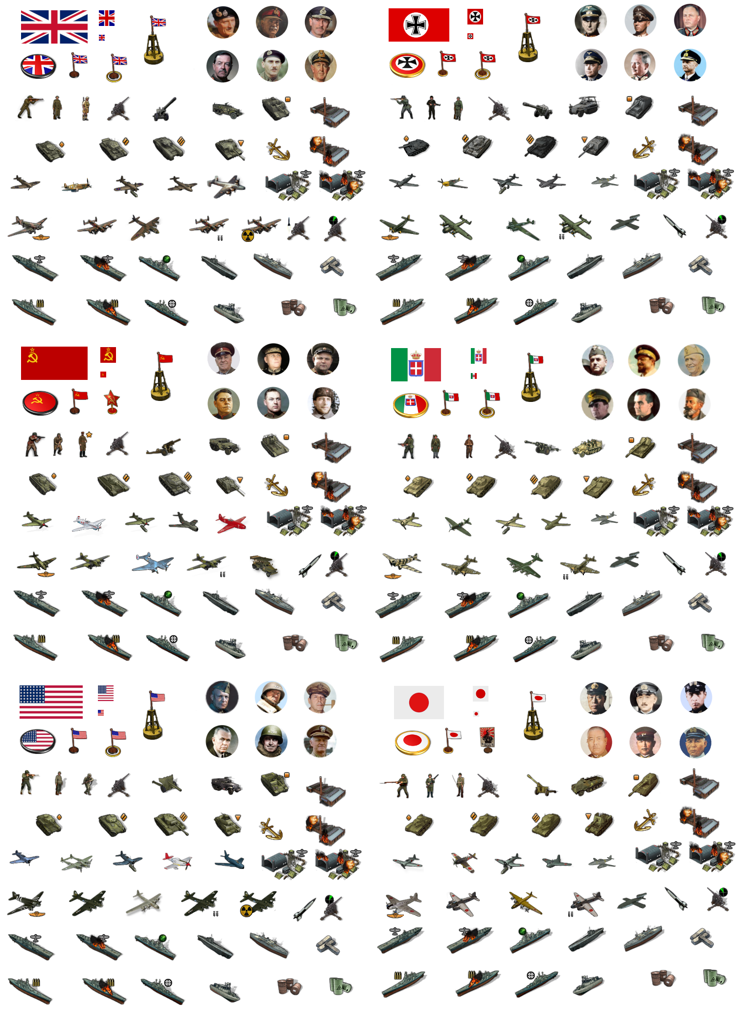
    Then here it is sans roundels, so the units can be flipped or colorized more easily. This one shows the Big 6 with a quick color tint, without any masking really, just hard and fast for an example hehe. They could be any color really, if doing the tint thing, just depends on the player’s preferred HEX combos in tripleA. Ideally the player could switch the unit orientation or change their tint on the fly.

    stickers clipped shadows.png

  • 2024 '22 '21 '19 '15 '14

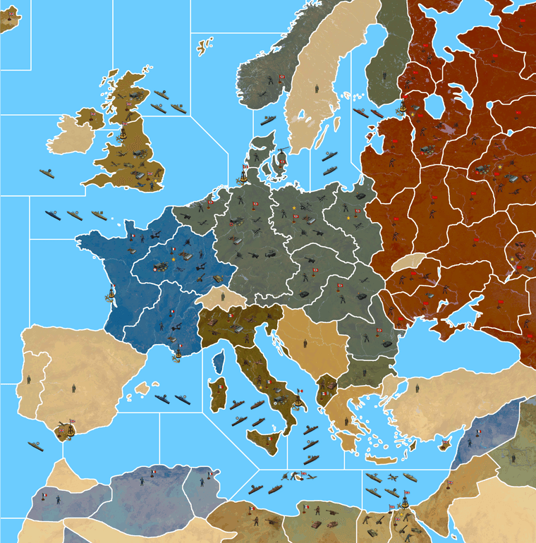
    Quickie Europe just for an impression of how it might display. Image is indexed so a little choppy there, I’ll probably play with the colors cause that paintjob of the map still had the gigantic border lines and the peach pro-allied neutrals hehe, but anyway, gives the gist…

    World War II Global Painted Terrain Units 125 indexed.png


  • @black_elk The white outlines along all coastal/border areas present a pixilation problem to the aesthetic. The lines need to be smooth. From far away it looks fine, but close up is terrible. IMO

  • 2024 '22 '21 '19 '15 '14

    @imperious-leader Yeah, that’s what I meant about the choppiness and the gigantor lines hehe. I was using one of the earlier paintjobs, indexed with no antialiasing or feathering there, cause it was one of those that I was just shrinking down to 25% scale anyway ,so it didn’t show too much for that purpose, but not the best choice here all zoomed in. I got like half way through laying down some example unit graphics then noticed I’d forgot to shrink the borders hehe. Reason is because I have this baseline file where the borders have to all be 1 px wide, and indexed to 3 colors for it to work in tripleA eventually. I had all the anti-aliasing and blur checked to “off” in my GIMP settings to work on that, cause the colors have to be exact, like 100% black or 100% white, no in between grays or blur, and just forgot to change the settings when adding that layer over the painted one. We’ll clean it up for the final for sure, just wanted to show the units against some color for that one to see how the contrast held up.

    Right now I’m battling the TT morphs in central Russia. It’s kind of a challenge, because OOB has Vologda connecting to Smolensk which I’d missed in the connections cause those regions are quite aways apart. It’s just a weird stretch OOB, cause the TT called Arkangel also has to somehow connect with Belarus at the same time as the Smolesk/Vologda but without the other TTs coming between. So I’m just kinda carving stuff away from Pskov and Tver to try and make that work, but Moscow is out of position for all this. Like I think I need to remove basically all the rivers there or knock back the subtle under terrain so it doesn’t look as noticeable just how far away the TT called Russia is from Moscow OOB.
    I think ultimately the warp just has to bend to service way the G40 gameboard works, though I was hoping to have some of those TT shapes a little closer to the real deal, but it’s like almost a geometric impossibility given how large some stuff has to be lol.

    ps. Here it is with borderlines stroked to show some feathering and noise reduction… GIMP takes forever to stroke, I thought my laptop was having an actual stroke hehe. So it was kinda easier to save that till last, relatively easy to polish as the final step, also cause I have some borders to tweak still. But anyway, it should end up a bit more like this when all’s said and done…

    https://www.dropbox.com/s/nqanzab6s6zssl9/World War II Global 1940 feathered borders.png?dl=0

    And the detail with the quick feathers, similar to the Europe view in the post above but with the thinner border and sans units graphics.

    detail feathered.png


  • @black_elk yea this is alot better. Ok you might consider the look of 1942.2 online for your oceans. The ocean has a white/light grey soft striped thing going with dotted lines for sea zone separations. Beamdog made that version alot more familiar than the OOB map

  • 2024 '22 '21 '19 '15 '14

    Hope you guys are well and happy holidays! I haven’t posted here in a few weeks, but I was kicking around on tripleA and making bunkers and whatnot lol.

    0e23ad27-b334-435e-bf40-ecf2bbe9e906-image.pngd19d9a39-e937-48cf-b9f2-374370101d2e-image.png

    Here is set of units for use in TripleA…

    https://www.dropbox.com/s/pqkn53r1vzjj467/units.7z?dl=0

    They can be used with the current WWII Global 1940 map, like that’s how I did the labelling in the folders, but they’re at 54px so kinda oversized there with Bung’s centers. I use them at like 75% unit view which helps with the crowding. On the new G40 map, which is a fair bit larger, they’ll display at 125%. But anyhow, just in case anyone wanted to use them in the meantime on the regular map, figured I’d drop them here as well.

    unit-stickers-tinted-update.png

    And then here is the crazy super zoom map we’ve been toying around with, painted up with a rough 1941 blocking… I did a quick label key which I’m currently typing out to take it through the tile busting utilities. Squashed a couple typos already lol, but gives a sense for that one. The playscale there is aimed more at computer bouts or like solo vs hardAI.

    https://www.dropbox.com/s/v4883h0aed6c5q7/Domination_1941_painted_labels_with_sz_key.png?dl=0

    Domination_1941_label_draft_25_percent.png

    We can always revisit the sea zone colors and such. Doing a broken line doesn’t really work for the base, but it could be added in the relief. My hope is for custom Sz colors that can be changed in the map properties with a HEX designation, the same way it works with TT ownership colors. So that way players can change the blue to suit their tastes. This one just shows the generic Classic blue from the web palette, but ideally the player could change it to the water color they like best. I also want to do the same for the black/white border line.

    Anyhow, that’s what I’ve been up to. The regular Global materials are pretty much ready to go, so hopefully in the new year we can get that one up. Catch you guys next round!


Suggested Topics

  • 2
  • 13
  • 63
  • 1
  • 3
  • 4
  • 1
  • 16
Axis & Allies Boardgaming Custom Painted Miniatures

180

Online

17.3k

Users

39.8k

Topics

1.7m

Posts