@Argothair
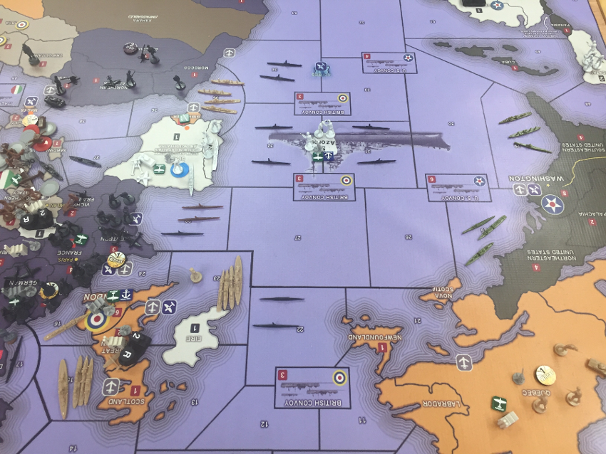
Point 3 is major. I remember bringing it up on the Larry boards and trying to explain the merits of that approach back before AA50 came out, since we had tried it with Midway and a couple other spots in Pact of Steel and I thought it made things a lot more interesting. But he seemed pretty committed to his definition of an island being entirely contained within a sz (despite UK breaking with that definition all along.) Anyhow, I think the gameplay is more dynamic for island hoping and naval cat and mouse when they straddle the sz borders.
For colors I don’t have a strong opinion when it comes to individual nations, but I guess I do have strong opinions when it comes to the overall color scheme for the whole, which I’ll elaborate on here in a sec. In tripleA its easy to edit the territory colors in the gamefile hex code on the player’s end, though much harder to adjust the color for the unit graphics themselves, so I guess that is something to keep in mind. One thing I’ve found helpful in the past is to differentiate the various national colors on 2 out of the 3 color dimensions. Color pedantics to follow hehe…
So for any color you have Hue, Value, and Saturation.
Hue just means ‘color’ in old english, which isn’t very helpful, but it basically refers to position in the rainbow, roygbiv.
Value is often described as the position along a grayscale, from white to black or tint to shade.
Saturation or Vibrancy is the intensity of the color, or how much light it kicks off. They are basically synonymous but sometimes vibrancy is an easier tool to work with in a graphics editor since it usually isolates the totals at one end and leaves the mids, whereas a saturation tool usually moves everything at once.
Even people who may have trouble distinguishing Hue (red/green colorblind is the most common), will usually still be able to distinguish Value or Saturation pretty easily. I think Value is the most recognizable and easiest to work with. The quickest way to determine what Values you have is to desaturate everything and make the map grayscale. If you can still differentiate the various nations in grayscale then you are usually solid. Just note that the defaults for most nations in tripleA do a really poor job of this. Some nation’s territories are almost identical in value/saturation. Many people have a strong aesthetic preference for colors at a certain value/saturation threshold and end up just changing the hue, which can lead to everything being more similar than one might realize at first.
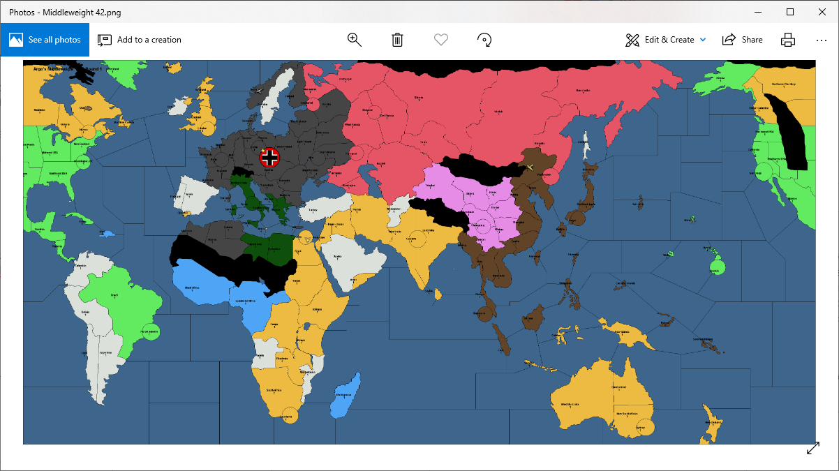
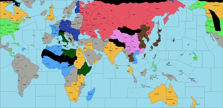
In the WW2 tripleA games the color values for many nations are very similar Germany/USA almost identical, Japan/Neutral the same, Russia/Britain the same. Here with Argos draft it is divided more by side Allies are lighter, Axis darker, which I like.
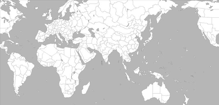
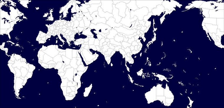
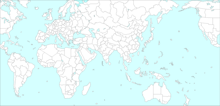
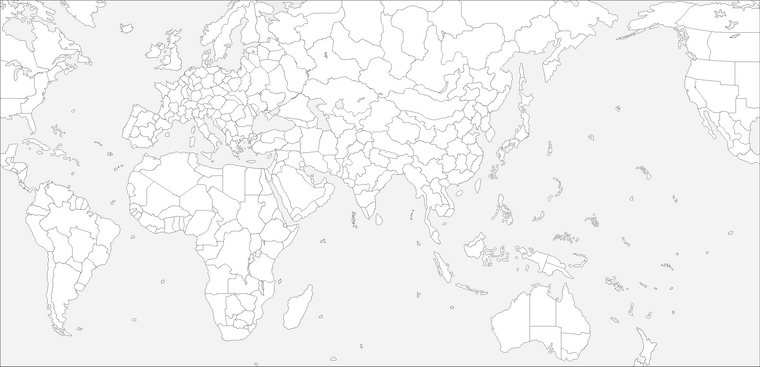
Also one last thought on color, when I made the original baselines for AA50 and the World Projection Map, parts of which have been used for various other tripleA maps, I put the ocean at a pretty light value intentionally. I honestly think I could have gone even lighter, so that nothing competed with it on the high end, and the ocean was always lighter than land. But for whatever reason someone changed the ocean to a mid-range value almost 50% gray, which was a weird call in my view. In the standard WWII maps it creates these strange visual ‘pops’, where some land territory colors are significantly higher value (closer to white), than other land tiles or than the sea (i.e. impassible neutrals, or lighter nations like Japan.) I think it is better to go way light or way dark on the Ocean color value. Below are examples of those same baseline maps I posted before, but totally desaturated to show how far you can push the value and still be blue just with hue/saturation adjustment. The last set shows an extremely light ocean color, probably about as far as I’d go before it gets obnoxiously light for me, but which would definitely allow all the darks/mids of the land tiles to be easily distinguished from the sea zone tiles, and make the overall ‘world’ of the world map feel more visually cohesive.
I’m not 100% percent, but I don’t think the ocean color for the standard WWII tripleA maps is something that can be quickly edited in the map file (its not listed with the hex codes for everything else), and the mapmaker will take any color other than pure black/white as a sz, so its kind of a pet peeve that all those standard A&A maps use a blue that is so close in value to true gray. Basically you need to turn on map details and provide a skin to make it look better after the fact, but yeah, the default ocean color is pretty far from what I had originally envisioned before they cut up the baseline. Alas. Logan’s color choice for the ocean tiles in the tripleA Classic map was better in my view, though still a little “neon glow” for my taste, but everything recent follows the standard color choices made for tripleA Revised, which is a little unfortunate. Anyhow, I think sea zone color is an important first choice, since it carries through after you color the baseline.
Totally on board with points 5-8. I really believe that its possible to have a more complex map (in terms of total territories/sz, or number of player nations, even the unit roster) without upending the learning curve, provided the basic rules are universal and other stuff isn’t too wild like with objectives and whatnot.
Anyhow, just wanted to offer some encouragement. Looks cool so far


ps. curious historical aside, in western painting blue pigment was rare and so many famous painters used clever tricks to limit its use. With a limited pallet of Raw Sienna, Burnt Umber, Yellow Ocher (red mud, brown mud, yellow mud) + Black and White, you can create the illusion of blue in your grays. Rembrandt was pretty slick at it. The storm on the sea of Galilee is a fun example. Almost all the blues you see in the sky/ocean there are actually grays, but they appear blue when viewed next to the colors that surround them. I think its cool. Anyhow point being, probably way too much thought can go into choosing the blues and the grays lol, but I think its important hehe.