I’m a little surprised at all the intense work that people do here making new maps, but they are made exactly like official maps - even down to the letter font used.
Take the Europe and Pacific 1940 official maps, for example. These are treated by some mapmakers as a scribe would the Holy scrolls of law handed down by Moses - one jot or tittle cannot be changed! Yet these maps were made by people who were under a deadline and trying to get a product out to make a profit. Did they love WWII history like we do? Do they themselves obsess for hours over Axis and Allies strategies like we do? Or was their priority to get a shipment out? Was Axis and Allies just another game to them amongst shelves full of fantasy and futuristic stock to move?
Could someone who genuinely loves history and loves Axis and Allies make a better map than those sold? I say emphatically YES! Here’s a few examples from the 1940 maps I’ll show you:
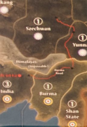
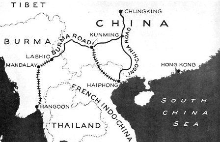
Below is the Burma Road on the G40 Pacific map. But actually this shows the Ledo road going into India. This road going to India didn’t even open until 1945.
The Burma road connected with a railroad that went down to Rangoon, in Burma, like this.
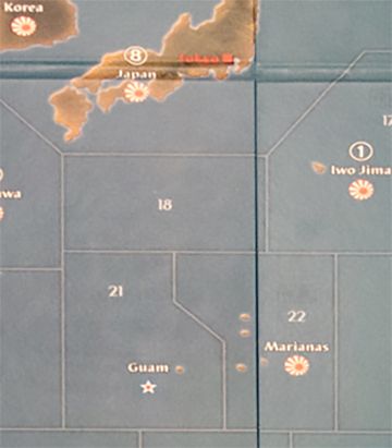
This part of the G40 Pacific map shows the Marianas and Guam. Guam is actually South of the Marianas, not West, and is part of the Marianas Island chain. Tinian Island is part of the Marianas. From Wikipedia “Immediately after (Tinian’s) seizure by the United States, construction work began on the largest airbase of World War II……this base was a 40,000-personnel installation.” So Tinian was THE island to have in WWII to make heavy bomber strikes against Japan. Yet on this map is it too far away. Iwo Jima is actually better on this map for a bomber base, even though it was only used for emergency landings in WWII.
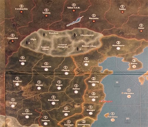
This part of the G40 Pacific map shows Russia, Mongolia and China. Look how huge Mongolia is. And with its texture and lighting, Mongolia is the first place your eyes go - yet Mongolia is a neutral! Why does a neutral have 6 territories and looks like it is the featured country in this theatre? Then look - these remote rugged areas of Russia and Western China are all worth 1 IPC each - the IPCs work like bread crumbs that lead Japan straight to the backside of Moscow. Actually Japan had no intention of going to Moscow - they knew the terrain was horrible and their units already performed badly in earlier border skirmishes with Russia. Japan historically chose the Southern Expansion Doctrine (Nanshin-Ron) for their war policy throughout the war.
A more sensical map would put a bunch of 0 IPC territories between Moscow and Japan, to discourage Japan from going there.
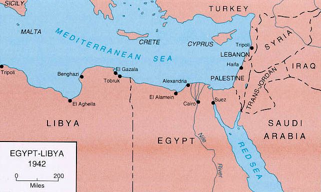
Here is Egypt on the G40 Europe map. You have control 2 different territories bordering the Suez canal in order to use it.
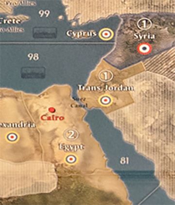
But just by Googling Egypt in 1942 you can see that the Suez canal only goes through Egypt itself.
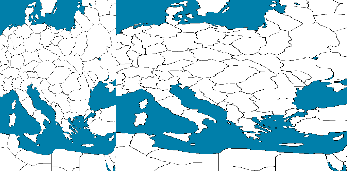
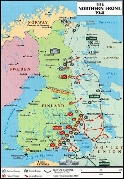
Finally, here’s a shot of Finland on the Europe 1940 map - look at Finland - it appears possible to access Finland from the North Sea and thus do an amphibious assault there:
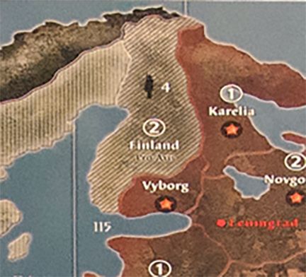
But by looking at a map of Finland from that era you can see that there is no access to Finland from the North Sea - Norway covers it.
These are just a few examples of the vast room for improvement these official maps leave.
In no way did I write this post to slam the official maps - I know that players have invested many hundreds of hours enjoying them and no doubt feel a sentimental attachment to them.
The purpose of this post is to encourage the many talented mapmakers out there to get creative and do BETTER than the official maps. You have no time constraint - no boss. You have your love for history and love for this game - why just stop at making a copy of what’s already done?
Make us a masterpiece!


.png)
.png)
.png)