@sjelso
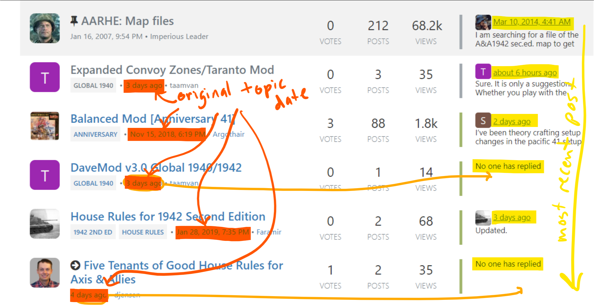
Why does a post Nov 15, 2018 show up higher in the list than your post from 4 days ago. The votes?
Take a look at the “dates” in the far right column. Like the old forums, this is where the most recent reply/post on the topic is listed. This is the date that is sorted.
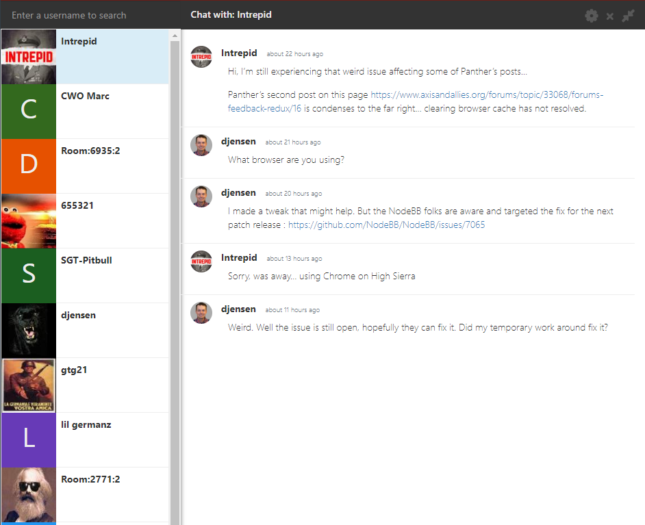
The date that you’re looking at is the original topic date, which is new. Both pieces of information are useful for different reasons but the most recent activity date, IMO, is the more important one. Not sure about the best way to fix this. I can bring it up to the NodeBB team see if they have ideas. See marked up screenshot below.
If so, don’t care about the votes, care more about the date.
:thinking_face: Yeah, I really want people to use the heart/vote more but for different reasons. The heart button is too subtle anyway. I’ll consider removing this. The formatting gets a little messed up if I just hide it though, ugh.
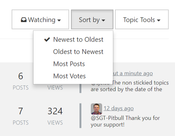
It might be good if one could sort/filter on votes, posts date, views, etc.
Sort controls are available. Take a look at the top menus. Filtering controls are core so I’d have to suggest to the NodeBB team and we’ll need more details.
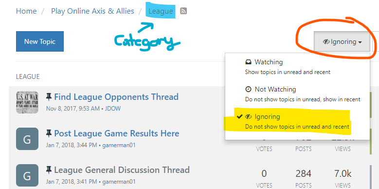
Also, it could be nice if one could hide all the pinned posts. Often it takes a page of scrolling to get past them.
I think the best way to solve this is fewer pinned posts. I know @Imperious-Leader liked pinning everything but it’s too much. I’ve been creating rollups or merged topics from previously pinned topics. The number of pinned topics is about the same as before but the non-dense format exacerbates the problem. I’ll bring this up to the NodeBB team as well.
In general, posts, avatars, etc. seem to take up much more real estate and require more scrolling than in the old site. Less scrolling, less clicking…more content. is better.
You are correct, more vertical space is being used. This is compromise between usability and density. If you’re not used to it something overly dense is hard to take in. Most modern social media sites don’t use the early 2000s style of content density anymore. This is important because those who are new to the site are more accustomed to the new style of social media; comfortable to read. It turns our the “graphics” are only marginally larger on some pages and they’re actually smaller on others.
There are two things I can do with this feedback:
- Suggest that the NodeBB team create a “compact” view for the theme we’re using. I would like them to address it because I want it to be an option and not the default behavior.
- I want to create less white space and introduce more borders. The idea is to make everything seem less free floating and more “together”.
Take a look at this forum: https://community.prototypr.io/
The density is technically the same if not more sparse but the borders and grey background make all the difference. It make scanning easier, etc.