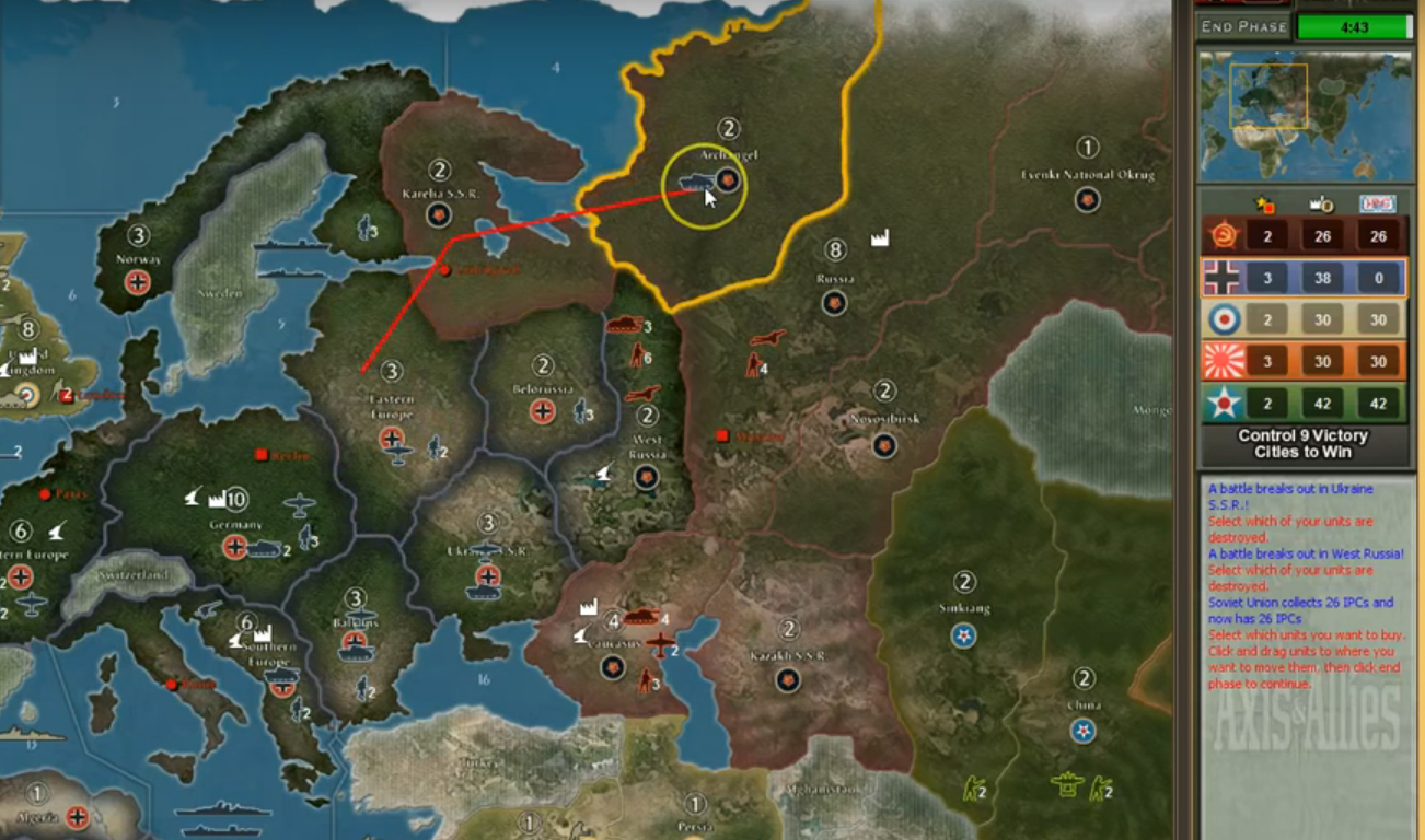
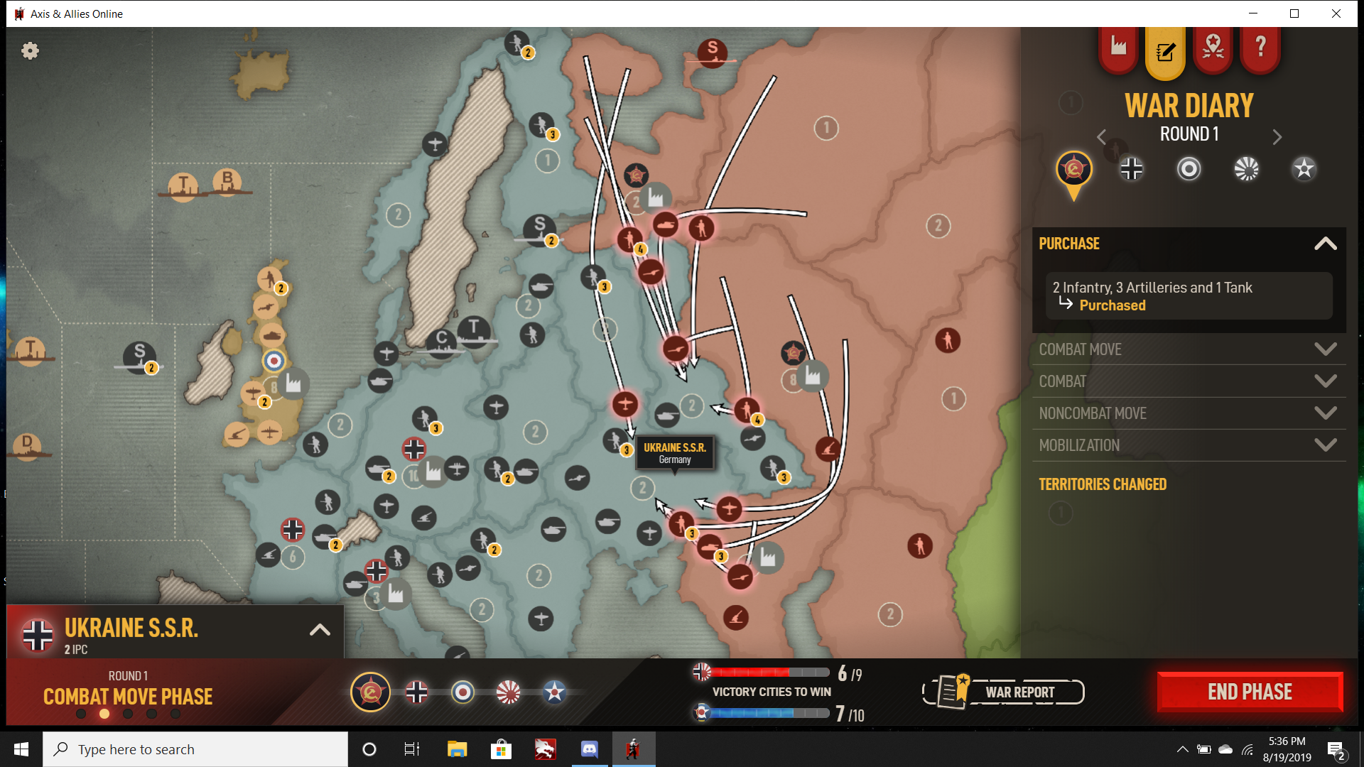
@bob-loblaw
Re: “ussr will have 2 aa guns, 3 tanks, 2 art, 5 inf normally in west russia (sometimes 6 or 4 inf)”, “attack Baltic states, belorussia, and West Russia”, “ussr Baltic opener . . . two of them have >90% chance of victory (3 inf, 1 tank, 1 fighter vs 3 inf) and (8 inf, 3 tanks, 2 artillery vs 3 inf 1 art 1 tank).”
. . . and 1 inf 1 art 1 fig vs 1 inf 1 tank at Baltic States, I assume.
Superficially, the numbers seem to check out. But take a good hard look at the numbers, and not just the net IPC changes, but the resulting positions, counters, and followups remembering dice variance.
Saying you’ll have 5 infantry at West Russia? Reasonable, but not something to depend on. Sometimes 6? If you get lucky. Sometimes 4? Perhaps, but also you might see 3, 2, or less.
And what happens in case of cascade failure? Suppose you do a bit badly at West Russia. You’re prepared for that? But suppose you also do badly at Belorussia. Now Germany has more to counter with, and there’s nothing USSR can do about it once the triple has been committed to.
Nothing can counter super bad dice, but a Ukr/W Rus open is slightly less vulnerable.
"I doubt a smart player would . . . "
You really think Germany would hesitate to destroy both USSR’s AA guns, three tanks, and two artillery, and cut off UK fighters flying from London to West Russia, along with a possible G1 tank build for quick early pressure and possibly even a J1 Manchuria IC to pump tanks on the timing - along with G2 starting with control of Karelia?
“a retreat after round 1”
Instead of assuming Germany stupidly overcommits tanks and loses them to an easy counter that can’t be punished, or assuming Germany needlessly exposes air to AA guns, how about assuming Germany correctly calculates the balance of ground and air that has about a 85%+ probability to capture West Russia and destroy all USSR’s valuable ground units? Not overkill, not underkill, but just about right, and if the attack on West Russia isn’t favorable then of course Germany doesn’t hit that and goes to Caucasus - but again, Germany doesn’t overcommit.
You’re assuming Germany does a 1-turn attack into West Russia then retreats after exposing German air to AA fire, without Germany even attempting to blow up USSR’s valuable tanks. What was it you were just saying about smart players? So it won’t just be a 1-turn attack, right?
“so you prefer Germany can put 5 tanks and 9 inf in Karelia”
Let’s not get sidetracked. There’s a lot that could be said about R1, G1, builds, attacks, counters, contingencies, percentages - but suffice to say I don’t say Ukr/W Rus is SAFE (in fact, I don’t think it IS, and that’s one of the reasons I push for preplaced bid which the developers won’t do but eh whatever).
But I do think Ukr / W Rus open has better outcomes than a triple open.
As to “you prefer Germany can put 5 tanks and 9 inf in Karelia”, do you think there’s a perfect answer? What would that be?
You do R1 tank build and retreat tanks from Ukraine for a heavy R1 counter to Karelia? Even then, how do you answer G1 tanks mobilized on Berlin? I don’t say G1 super heavy tank build, but just say Germany sticks two tanks on Berlin. Pretty good odds that means G2 captures and secures Karelia, especially if Japanese fighters are in range, which they may well be. But then you do an attack/retreat into Karelia to strain German logistics? Very well, then on G1 Germany sees USSR lined up with that mighty counter and instead just doesn’t do a heavy push to Karelia, then Germany captures and holds Karelia on G2.
Plainly, I’m saying if the Axis player is competent, Allies won’t have easy answers. Won’t matter if it’s USSR triple open or Ukr/West Russia, it won’t be easy. If it were, wouldn’t be much of a game.
If you want to go into R1 W Rus/Ukr open and the Karelia game, let’s have that discussion, but that’s a thread of itself.
“med fleet . . . allows uk fleet in India to . . . nearly impossible to take Egypt in (g2)”
I believe this is another topic better covered in another thread.
But I will say, before starting another thread, think on it a moment. If Germany’s about to smash the **** out of Europe, it doesn’t need to push in Africa, and there’s a decent chance something like that gets lined up after a USSR triple open. Also, you’re not considering what happens if Germany lands a chunk of air in Africa, and of course why would you because you probably don’t see it much. And maybe you’ll pull the ‘UK builds an Atlantic fleet if Germany puts fighters in Africa’ and I’ll shrug and say I don’t care because if UK dropped a carrier and a fighter I’ll reposition air on G2 (even better if I have the bomber) and blow up UK’s fleet at low cost to German air if they dare to drop, and if they stand off then I’ll just continue shenanigans in Europe. Then you can come back and say something else and I’ll say something else and that’s how it goes. But on balance, the question is what is gained and what is lost?
“not destroying the fighter in egypt . . . sz 37”
You want to roll the dice on UK1 vs Japan’s East Indies fleet, go for it. I think it’s a bad deal. Which is another thread.
Yes yes, you have ideas and you won’t be dissuaded, and that’s fine. Either you’ll try it over and over and fail when you come up against decent competition and you’ll change your mind, or you’ll try it against decent competition and win and maybe do a writeup and I’ll change my mind. But either way we’re not there right now.
But before you get into future writeups:
I don’t worry too much about IPC swings. I tend to think about things in terms of unit counts, positions opening up, and other less-tangibles. Yes, keeping an eye on IPC changes is important, but it’s definitely not the only thing to keep an eye on by far.
Don’t just think about 95% or whatever. Think about the resulting position. Think about the opportunity costs. Think about dice swings. Cascade failure. Concentration of force versus spreading out.
It is not safe to assume an opponent will not attack because of negative IPC expectation. No, really.
http://calc.axisandallies.org/?mustland=0&abortratio=0&saveunits=0&strafeunits=0&aInf=3&aArt=&aArm=1&aFig=1&aBom=&aTra=&aSub=&aDes=&aCru=&aCar=&aBat=&adBat=&dInf=3&dArt=&dArm=&dFig=&dBom=&dTra=&dSub=&dDes=&dCru=&dCar=&dBat=&ddBat=&ool_att=Bat-Inf-Art-AArt-Arm-Sub-SSub-Des-Fig-JFig-Cru-Bom-HBom-Car-dBat-Tra&ool_def=Bat-Inf-Art-AArt-Arm-Bom-HBom-Sub-SSub-Des-Car-Cru-Fig-JFig-dBat-Tra&battle=Run&rounds=&reps=10000&luck=pure&ruleset=AA1942&territory=&round=1&pbem=
At Belorussia you look at 3 inf 1 tank 1 fighter vs 3 inf, see 95% win, looks super good, right? But actually it’s not that hot, as the above link and some thinking shows.
4.58% no attackers survive (disaster)
5.56% attacking fighter survives (lost 15 IPCs of units for 9 IPCs of units and didn’t gain any income from capturing territory. Unless you want to lose the fighter, which is amazesauce for Germany so I assume you don’t do that.)
(Calculation aids state 5% loss. But there are different degrees of loss; here there’s at least a 10% of a strictly unfavorable outcome. That’s one thing players using aids often may miss.)
15.1% attacking tank and fighter survive. Which is where the situation becomes barely tolerable; at least you capture the territory and trade off 9 IPCs of attackers for 9 IPCs of defenders. But the tank is lost on the counter.
But what happens after the German counter? Pretty good chance that 6 IPC tank dies in exchange for perhaps a German infantry. Let’s say the tank has 2/3 chance to destroy a 3 IPC infantry (I know tanks hit 1/2 the time, but let’s just use 2/3 for Reasons), so USSR expects to gain 2 IPC from possibly destroying a German infantry, 2 IPC from the territory, meaning net gain 4 IPC in exchange for a 6 IPC tank.
Yes, USSR does have positional considerations that offset the 2 IPC difference, but the positional pressure isn’t all that great. Germany has much better options when USSR is spread thin, and if as already mentioned there’s some level of cascade failure then USSR will be in big trouble.
Now let’s look at West Russia.
http://calc.axisandallies.org/?mustland=0&abortratio=0&saveunits=0&strafeunits=0&aInf=8&aArt=2&aArm=3&aFig=&aBom=&aTra=&aSub=&aDes=&aCru=&aCar=&aBat=&adBat=&dInf=3&dArt=1&dArm=1&dFig=&dBom=&dTra=&dSub=&dDes=&dCru=&dCar=&dBat=&ddBat=&ool_att=Bat-Inf-Art-AArt-Arm-Sub-SSub-Des-Fig-JFig-Cru-Bom-HBom-Car-dBat-Tra&ool_def=Bat-Inf-Art-AArt-Arm-Bom-HBom-Sub-SSub-Des-Car-Cru-Fig-JFig-dBat-Tra&battle=Run&rounds=&reps=10000&luck=pure&ruleset=AA1942&territory=&round=1&pbem=
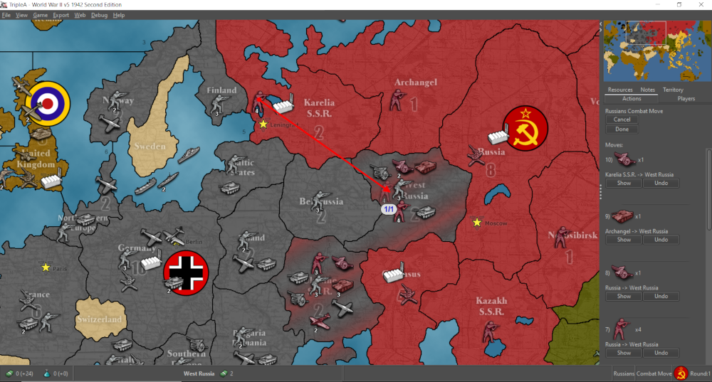
Let’s say 20.22% for 4 inf 2 art 3 tank 2 AA or less. Reasonably likely, and I’ll use 4 inf 2 art 3 tank 2 AA as the baseline. Germany’s counter is up to 3 inf 1 art 3 tank 4 fighter 1 bomber, without giving up attacking the UK battleship/destroyer.
https://aacalc.freezingblue.com/?rules=1942&battleType=land&roundCount=all&attInfantry=3&attArtillery=1&attTank=3&attFighter=4&attBomber=1&defInfantry=4&defArtillery=2&defTank=3&defAAGun=2
But also G1 capture of West Russia prevents Allied fighters from landing on, keeping it in play.
If you’re thinking “nah, Germany needs to maintain its air force to threaten Atlantic shipping” - as I’ve written in other threads, I use Japanese air for that when going anti-KGF. Germany still does well to have some air, the more the better, but smashing all USSR’s tanks and preventing fortification of West Russia? Maybe that’s only 20% to have favorable odds of all that following a USSR triple open as was described, but that’s still more than the odds Germany has against a Ukr/W Rus open.
