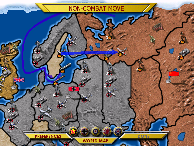
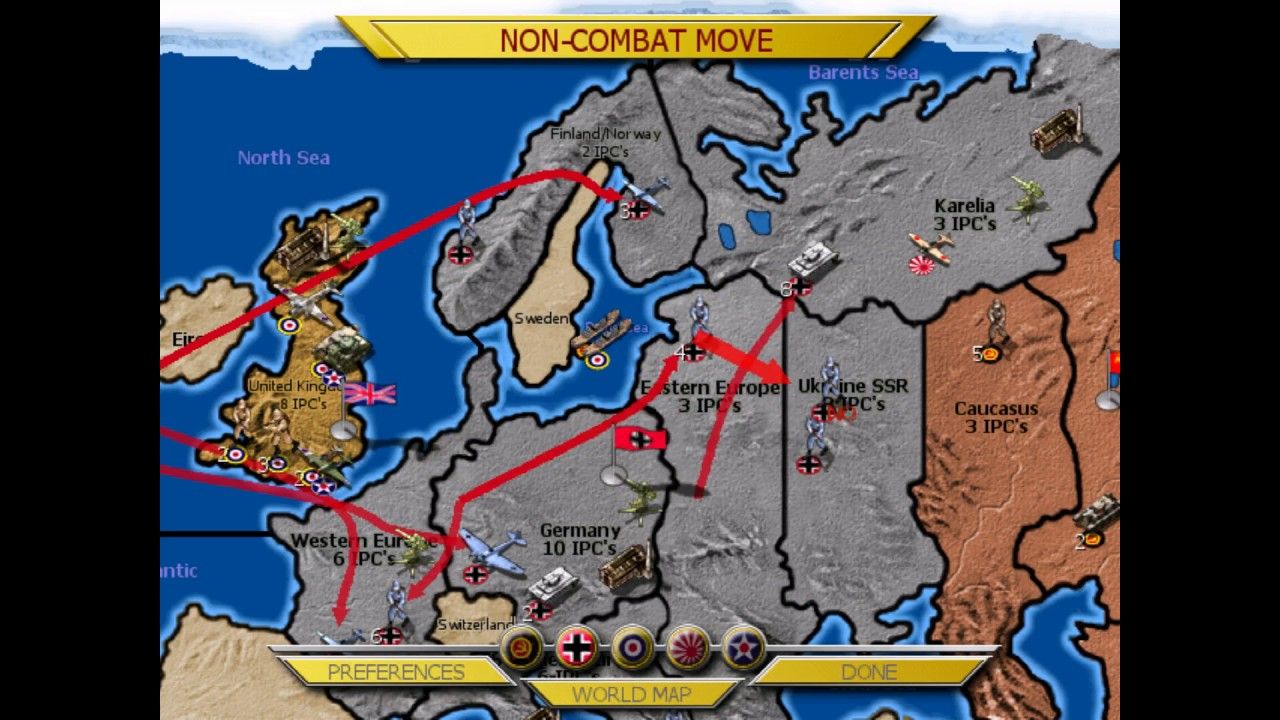
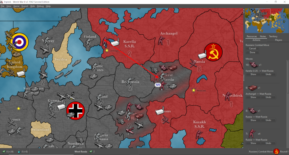
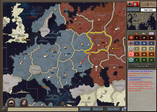
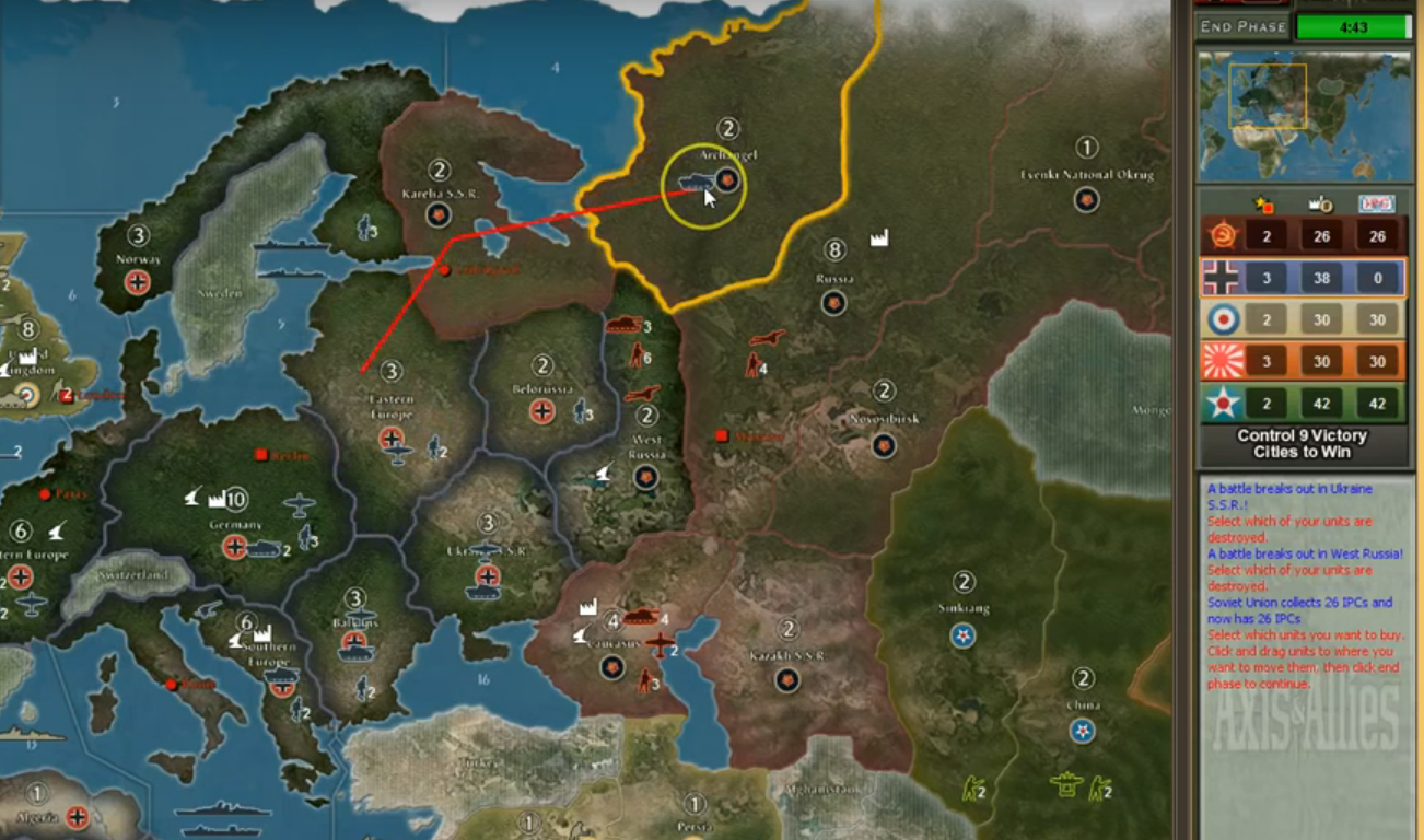
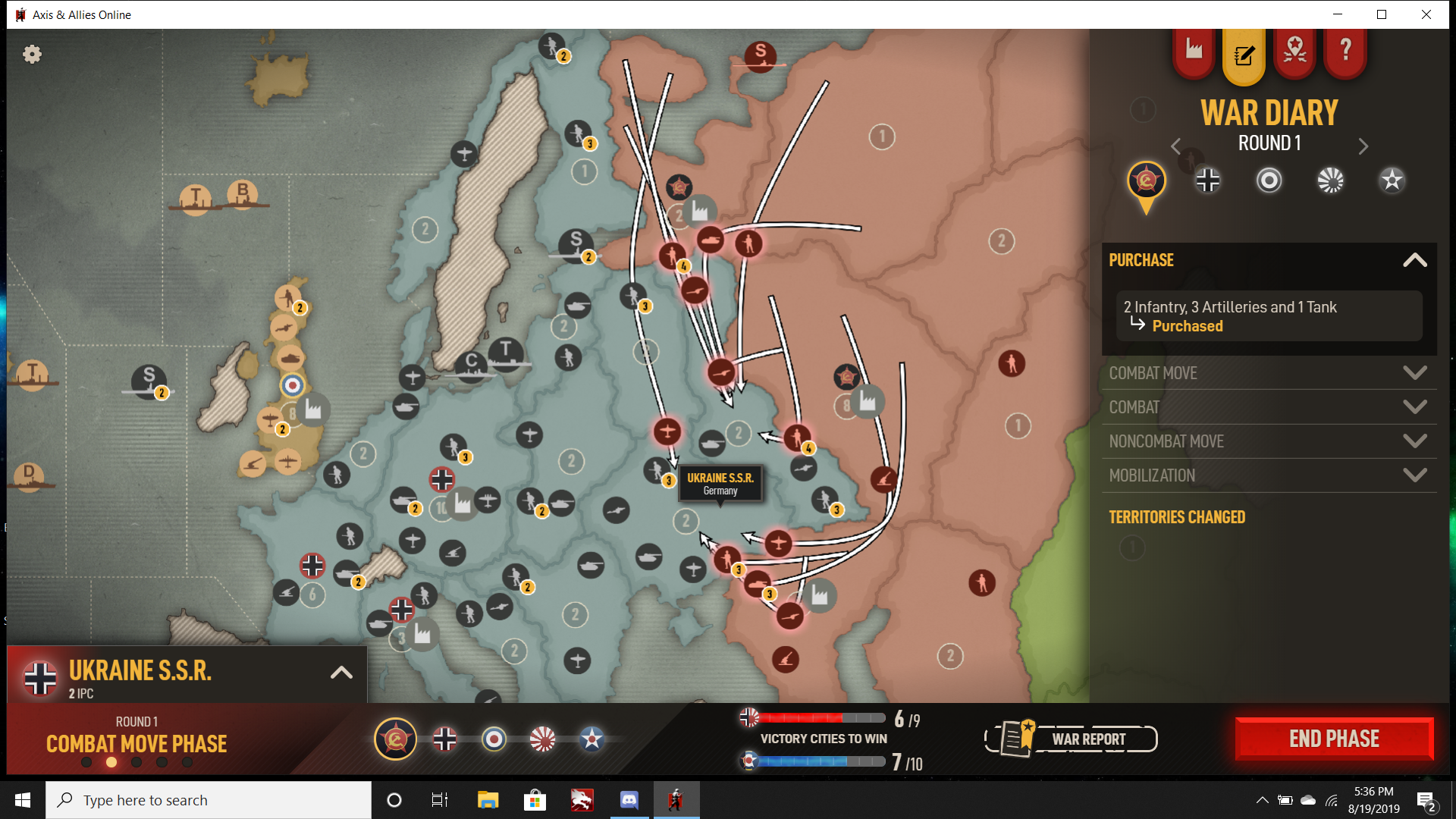
Most of the criticisms I’ve been hearing of the Beamdog movement UI revolved around the difficulty of doing/undoing moves, and a lack of visual clarity regarding the current move or moves just made. Personally I much prefer vector arrows with crystal clear paths, to curved ones that bend around, but the issue there is more ease of use than aesthetic preference.
The other major issue is an inability in the Beamdog version to move units in groups (move all) or to bring up some kind of list of available units by clicking the territory or sz. It is really time/click intensive trying to move each unit 1 by 1, and the potential for misclicks is high because left click will also undo a move if the wrong unit is clicked by accident.
I also much prefer units entering the tiles rather than hovering by the border, which can lead to confusion about whether/where exactly the unit is ending up.
Another big issue is unit overlap or movement path overlap, where it is hard to actually see the unit types or the numbers involved because they are actually covering each other up sometimes even at full zoom. Other games have used the ‘push aside’ method rather than overlap to deal with unit crowding, with a line or something indicating the units actual current position on the map.
GTO and TripleA both have a fast combat window that can be accessed from the main map rather than a separate screen, so both can be viewed at the same time.
Finally one thing that jumps out immediately to me in the Beamdog version is the lack of a minimap and functional sidebar. While it does technically have a sidebar (and a bottom bar if you count the war report and VC tracker) this is only used for information tabs and offers no way to actually control stuff, like tracking or undoing moves. Iron Blitz had a different approach where the default view was full zoom and you had to click the world map button to bring up the full map. I don’t think anyone would like to go back to that, since its very scroll intensive. It didn’t really have a sidebar either, but separate screens accessed from tabs or menus.
For the actual look of the thing, I’m ambivalent at this point. Obviously I have preferences there too, some things I like and some things I don’t. But purely from a functionality standpoint I think there could definitely be a lot of improvements so its easier to read at a glance and use quickly.
For single player vs the AI the game currently only allows Standard Victory conditions, whereas many would probably prefer Total Victory for that (if they want to take Washington or whatever.) Right now the AI is middling at best and makes a number of truly ill advised moves/purchases. I can’t see it being useful for anything other than learning the basic mechanics, not something a player could look to for guidance on tactics or strategy for example. Who knows, maybe it gets better but there isn’t anything you can do to increase the challenge level in solo play right now.
