Not sure I have any other suggestion for you, considering you’ve tried the AppData deletion already.
Does the problem still persist? Maybe it was a short outage/server lag 5 hours ago.
@Black_Elk I don’t think Beamdog is shooting for capturing the hearts and minds of the competitive crowd, though. TripleA already sort of has the market cornered on that thanks to having almost every map (Please give me a 1914 map, I’m begging you) in the franchise available + Play-by-Forum integration with this website. Can’t really beat that, especially when you have a battle Calc packaged with the game.
I think they’re going for a more casual audience, hence the focus on style (UI, asynchronous play, WW2-aesthetic art, etc.) over substance (multiple maps available, ranked ladder, competent AI, etc.). Still not an excuse for having multiple maps available to play on. I’m surprised WotC/Hasbro aren’t gunning for more maps to be added (even something scummy like 99 cent DLC for maps or whatever), since I doubt they’re selling new copies of the older games these days.
yea not sure their plan but that makes sense. One thing it’ll do is reach more people that aren’t aware of A&A.org and triplea. They seem as if they got a good group of people. Always important. Hope it works well for everyone.
This is in the pipeline. still a ways off.
https://forums.triplea-game.org/topic/1063/power-of-politics-1914-a-wwi-scenario
I think the quickest fix would be the adoption of an editor.
The most basic edits:
Revert to Previous Phase
Add/Remove unit
Change IPCs
Change Territory ownership
If the user could do that, I think it would be a very popular platform for casual play while still being able to accommodate competitive play. Because at least then we could fix errors in friendly matches, while also being able to hold tournaments with standard pre-placement bids or the Larry patch. I think the casual audience would like those features too. Gives players control over the digital gameboard like they have over the physical one to take units or roundels out the tray, and make corrections when stuff goes awry. Its probably even more important for that than in allowing for the kind of stuff that happens in tournaments and such, but the later would be a big bonus.
Some of these features were on Iron Blitz, which offers basic editing of unit costs, which along my suggestion an additional range of units could be offered:
Heavy tanks, Volkstrum/Conscripts, Mechanized, Fighter Bombers, Jet bombers, etc
'And Tech upgrades if that option was toggled on
Another bummer is constantly clicking to roll, the option should be to toggle only results at end of each combat round. We don’t need to see the stupid dice roll, and BTW i don’t believe the randomness of these rolls. Their seems to be some tit for tat thingy going on, where if one side is doing poorly, the other side is too. Option for Low Luck might be possible, but somethings wrong in this department.
The product should not have been released before more play-testing, you stalled the success of the game when you just throw it up in the air and let buyers complain. Just give them nothing to complain about.
Well I’ll say this much for it, probably more boxed 1942.2 set up games have been played in the past 2-3 weeks than have been played in a couple years. But I’m concerned that it will rapidly advance to the point where the general concensus of Axis advantage is reached once again, (even with some of the rules changes they made to make it more like AAZ and with the defense profile thing) and there isn’t anything in place to go to the next phase of the rehash, which would be the standard preplacement bid and the Larry patch. Basic editor would get you there at least.
The click click is a big issue for me, the whole movement and combat UI just feels cumbersome and inelegant right now and really in need of a clean up/speed up. I tried to send some suggestions to the feedback link and on steam forums, but in general just wish that was a lot smoother.
Other things I feel beyond a basic capability to swap out the digital sculpts or change control markers and the like, would be some basic aesthetic customization. Map scale, unit/font scale, also Map or Unit themes (alternative colors or textures), things that people can use to customize to their tastes or for things like r/g colorblind. Alternative icons or textures would I’m sure be a little more challenging art asset intensive, but least basic colors/light dark. Like why not make it so you can have Classic colors, or Revised colors, or Modern Topographical, or with all the colors of the old sculpts, like lime green UK or Black Germany, Red Japan or whatever? Would be cool if it could just bundle the basic boxes and offer some more choices there. I also think looking backward could be cool, if borrowing from AAZ maybe also bring in something from one of the older rulesets. Another thing that I don’t dig is that we can’t close off sz16 as a standard option, even though that’s in the manual. Sz16 closed is probably to the Allies advantage in the opening rounds, so that would help.
Right too much “click-click” its terrible. The icons of units could change automatically if you change the unit values. I know its not 1942.2, but it would bring value to the game since its very basic anyway and needs some “window dressing”
@Imperious-Leader “hire” game testers? new to the industry?
Why would you want to waste time on the AI when no-one will play in that mode when live players are available.
While Tripple A has all the maps, its crude. It’s impossible to see what you’ve moved, the piece icons and layout are incomprehesible, you can’t reverse without looking through the log, play a PBEM game without forum moderation, and especially obnoxious how it treats loading transports…I cannot figure out when my units are loaded and when they are correctly set up or not.
This game does all that well, whereas in Tripple A, its barely possible for me to start a live game
I believe the transport loading/unloading issue you are referencing has been fixed as of the last pre-release. TripleA doesn’t put out new stable releases very often, but I’m always pretty impressed with how much gets added each time they come out.
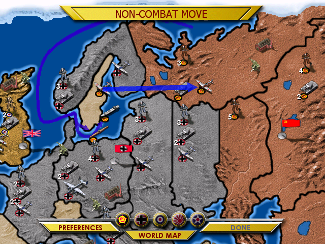
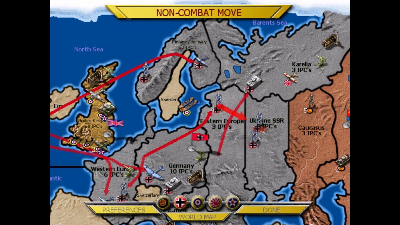
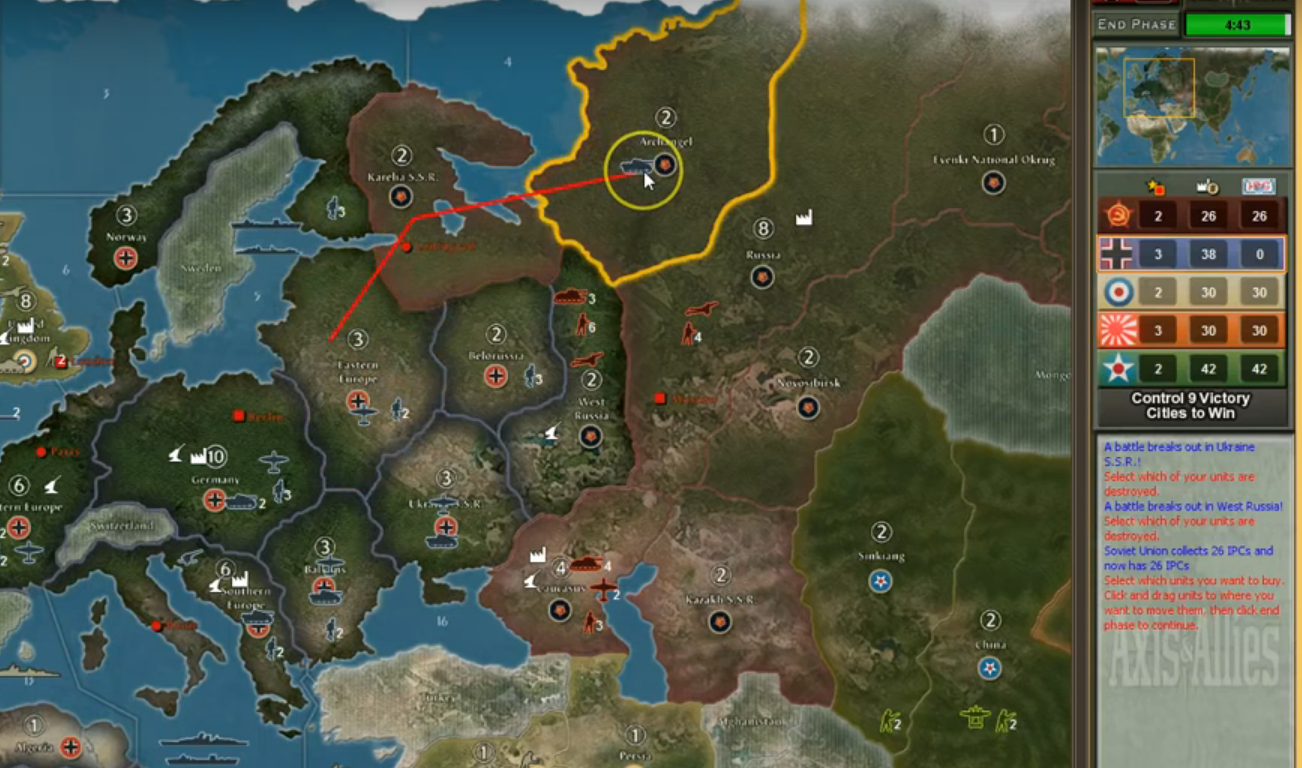
For my part I find the beamdog UI for movement very hard to parse. I set up 4 screenshots in discord showing Beamdog compared to Iron Blitz GTO and TripleA.
HASBRO
TRIPLEA
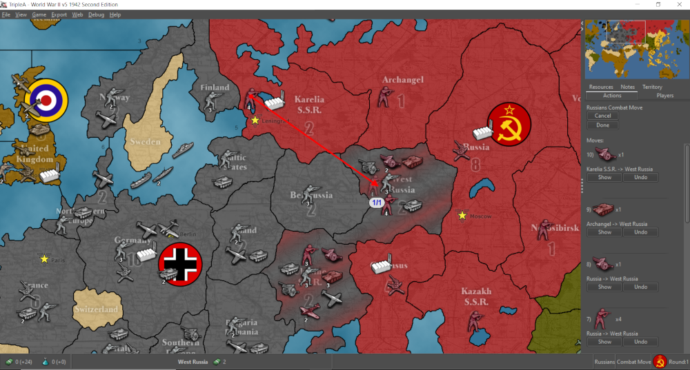

GTO
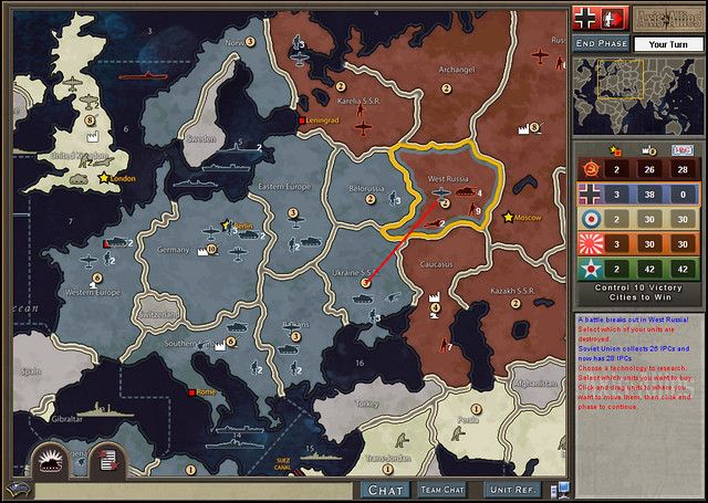
BEAMDOG
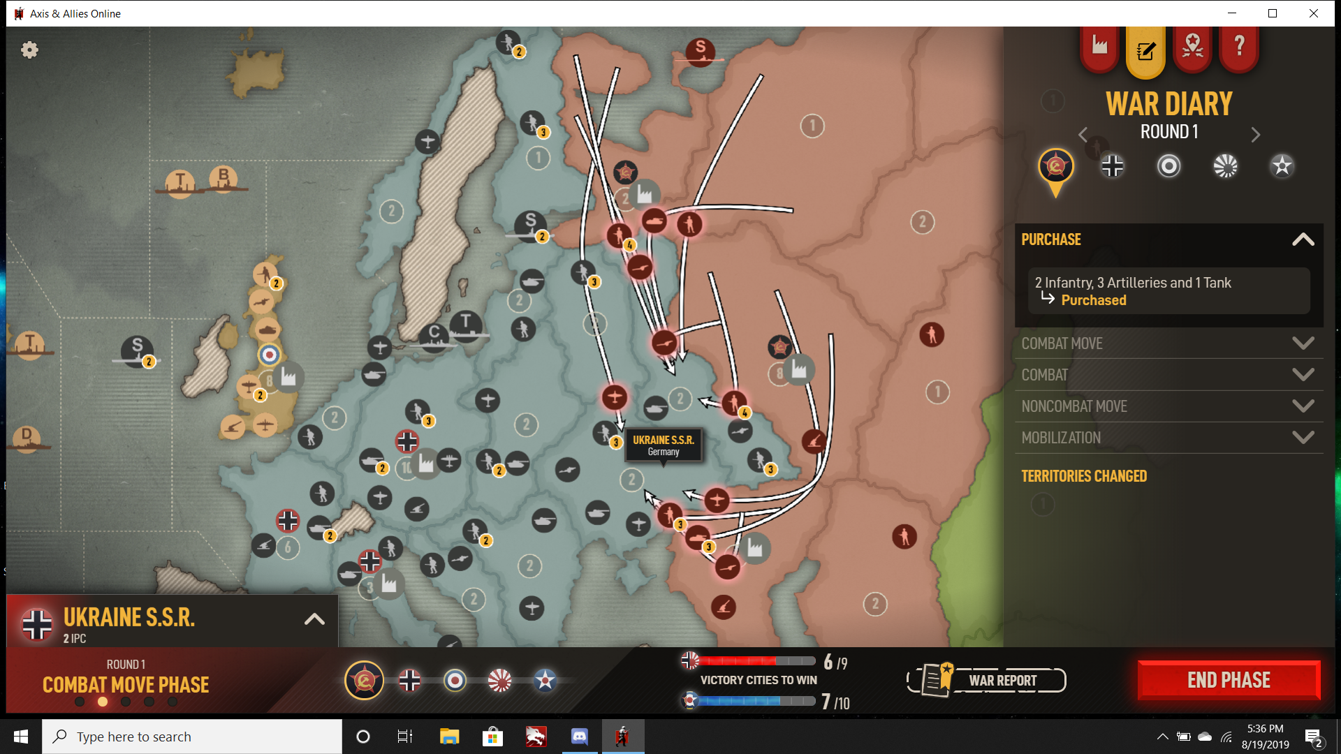
Iron Blitz and Beamdog both have all movements of a given phase displayed visually on the map with curved arrow lines, and rely on clicking of individual units to undo move. GTO and TripleA show arrows only for the current move, with previous moves made during the phase recorded in a sibebar list, with the undo move from there as well as right click option.
Iron Blitz, GTO and TripleA all indicate combat/non com moves by actually moving those units into the territory or sz they are entering. Beamdogs is the only one that hovers along the border (which I think can add to visual confusion.)
Iron Blitz, GTO and TripleA also show all units in a stack including Transports. Beamdog has each transport separate, which I think adds to clutter and crowding misclicks.
Anyhow just thought some side by side screens might help for the discussion.
Today I watched a game-play introduction by “The Historical Gamer” on YouTube, but I haven’t played the game personally yet.
In the video I was struck by how many prompts the player encountered during combat - why all the clicking? When I’m playing TripleA, I have the speed set to the fastest possible… and not only does the dice animation take forever in this game… but the constant mouse clicking during combat makes the combat phase long and tedious.
I liked the visuals that I saw however, it has a much nicer polish than Triple A.
@Black_Elk Fair enough, I suppose that it comes down to personal preference. Can’t get any of my friends to play any e-edition in any event…and prefer live play anyways.
@taamvan In Chess, the IA is most strong. Why cant it be even competitive, or why even have it if its a joke?
Most of the criticisms I’ve been hearing of the Beamdog movement UI revolved around the difficulty of doing/undoing moves, and a lack of visual clarity regarding the current move or moves just made. Personally I much prefer vector arrows with crystal clear paths, to curved ones that bend around, but the issue there is more ease of use than aesthetic preference.
The other major issue is an inability in the Beamdog version to move units in groups (move all) or to bring up some kind of list of available units by clicking the territory or sz. It is really time/click intensive trying to move each unit 1 by 1, and the potential for misclicks is high because left click will also undo a move if the wrong unit is clicked by accident.
I also much prefer units entering the tiles rather than hovering by the border, which can lead to confusion about whether/where exactly the unit is ending up.
Another big issue is unit overlap or movement path overlap, where it is hard to actually see the unit types or the numbers involved because they are actually covering each other up sometimes even at full zoom. Other games have used the ‘push aside’ method rather than overlap to deal with unit crowding, with a line or something indicating the units actual current position on the map.
GTO and TripleA both have a fast combat window that can be accessed from the main map rather than a separate screen, so both can be viewed at the same time.
Finally one thing that jumps out immediately to me in the Beamdog version is the lack of a minimap and functional sidebar. While it does technically have a sidebar (and a bottom bar if you count the war report and VC tracker) this is only used for information tabs and offers no way to actually control stuff, like tracking or undoing moves. Iron Blitz had a different approach where the default view was full zoom and you had to click the world map button to bring up the full map. I don’t think anyone would like to go back to that, since its very scroll intensive. It didn’t really have a sidebar either, but separate screens accessed from tabs or menus.
For the actual look of the thing, I’m ambivalent at this point. Obviously I have preferences there too, some things I like and some things I don’t. But purely from a functionality standpoint I think there could definitely be a lot of improvements so its easier to read at a glance and use quickly.
For single player vs the AI the game currently only allows Standard Victory conditions, whereas many would probably prefer Total Victory for that (if they want to take Washington or whatever.) Right now the AI is middling at best and makes a number of truly ill advised moves/purchases. I can’t see it being useful for anything other than learning the basic mechanics, not something a player could look to for guidance on tactics or strategy for example. Who knows, maybe it gets better but there isn’t anything you can do to increase the challenge level in solo play right now.
@Imperious-Leader In chess we’re talking about 288 billion variations after 4 moves with 32 in AxA we’ve got to be talking about trillions of permutations of the first few turns alone with 100+ pieces on the board to start, and the possibility of them all either interacting or not interacting each turn.
Its not something I expect much from in an explicitly Online game–I’d prefer the designers spend as little time as possible on it.
I think the best you can hope for from the Computer ‘AI’ is something that gives a reasonably accurate opening round, with the computer opponent doing stuff that a human might do. Then going from there using some basic attack/defense/movement/purchasing priorities. Russia and Germany do alright in round 1, Britian Japan and America not so much. But by round 2 it goes completely off the rails, doing things even a complete newb probably wouldn’t attempt. Stuff I’ve noticed that is particularly egregious would be the computer sending naked fighters to the front line or failing to move aircraft from the front line on non com. Parking or purchasing defenseless transports where they can’t be defended. Leaving expensive warships like carriers or battleships by themselves in sea zones where enemy air can attack them at advantage. Not prioritizing production centers/capital defense vs direct attack, let alone multi-nation attacks over the course of the round. Other things it doesn’t do that a human would, are blocking to prevent major losses, or airblitzing to take a key tile. Curiously I have seen the AI make suicide attacks with USA during the final round when Allies are about to lose the VC game, so it must have some kind VC priority, but not enough to prevent a general route over the course of normal play.
I do think having a reasonably competant AI would be a cool feature for new players, or just as a time sink for experienced players who like to beat up on the machine and watch the map change colors. But a poor AI with no way to handicap for it, just seems like a waste of dev zots right now when there are other more important PvP things to fix.
@taamvan So that means the AI can only buy transports, unloaded to attack you as a means of offense. Sorry sir, people could program moves based on odds. The whole architecture of what the AI does could be based on odds of success, not unlike a video game which this happens to be.
@Imperious-Leader Have you tried the TripleA AI? Its fairly decent especially for newer players. It does exactly what you describe as it looks at the odds and tries to make the best attacks/defenses it can.
AAA is butt ugly. Sorry. Cant play with inferior aesthetics.
@Imperious-Leader Well depends on which map you play but I’d generally say the higher quality TripleA maps are better looking than A&A Online, GTO, or Hasbro. But everyone is welcome to their own opinion.

That map is hideous! The pieces are terrible, too many colors are similiar
@Imperious-Leader Well beauty is in the eye of the beholder. Though I’d be interested in a screenshot that you think looks good of any version of A&A.