Any discounted coupons that are current for printing Maps at Office Depot/Max?
Sired's Map project - Updated- 4/16 - files available see first post
-
Thats nice makes it easy for set up! and i like the colored areas to indicate ownership
-
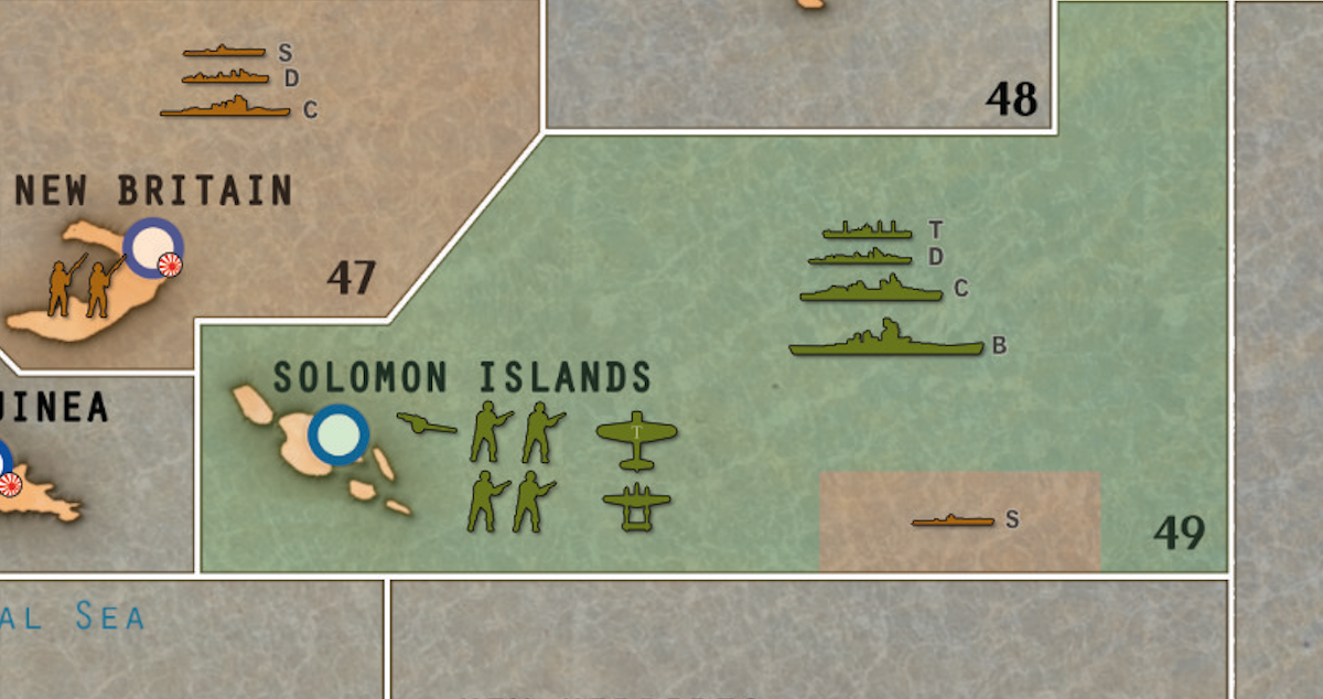
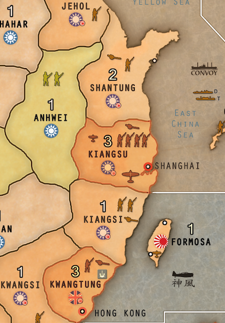
Someone asked for more closeups. The tricky things I found were regions that have troops from multiple regions. Also the cruisers and destroyers are hard to tell apart from the picture, as well as the tactical bombers. I’ve put letters next to the boats and a letter T on the tactical bombers. I haven’t done another print test with the latest though so I might need to be more explicit with the bombers.
Other Notes:- I put started money location on the scoreboard on the top.
- I put “little” flags on countries which start out occupied in the global game. For example, Hong Kong is owned by GB, but occupied at the start of the global tournament rules.
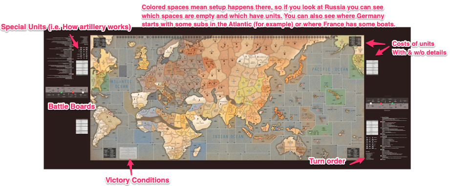
- I put important information on the sides of the map such as victory conditions.
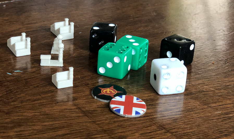
- After doing a tournament and seeing how other people play I also bought a bunch of colored dice and painted them so that only the numbers that “win” have pips, and then matched the board to the colors. it makes it SUPER easy to grab a handful of green and red dice, roll them, and see how many hits were scored.
- My son designed and 3D printed some air and water bases and industrial complexes. The first take were way too big, but this set came outs well scaled


-
@Imperious-Leader As a note, I’m 90% sure that those people at x-RayPad.com don’t have the rights to sell that map, and you have to buy it from Sired. He’s just a guy so he can’t fight them for having stolen it, but I’m pretty sure they don’t have a deal with him to use his artwork, and he put a LOT of work into it.
-
I did buy it, im just intrigued by your ideas on improvement.
-
@Imperious-Leader cool. I just wanted to make sure anyone who saw this thread knew that link was to a stolen copy of someone’s work.
-
@jasonondesign is Sired still selling it? I’ve reached out to him a couple of times but haven’t heard back. It’s an impressive map, but only willing to get it with permission.
-
I also tried to reach out ( well i paid anyway) Be patient. I like the version with the setup printed to make it easier…
-
@buddytoliver Yeah but he’s got a busy day-job, so sometimes it takes him a few days or even a week to get back in touch.
-
Can anyone give me a rough idea of how much this would cost to print?
-
For me 3’ x 6’ on vinyl 75.00. 3mm styrene 95.00
Probably more by you. -
@trent15 I just printed them on banners for like $45 each. I went through a few iterations with the color coding and the initial placement layouts and such. It’s not as nice, but it’s cheep and super awesome to play on.
-
@jasonondesign Good idea, thanks for info. I appreciate it. I love the map but trying to decide if the cost to print will be worth it. Do you roll it up when in storage?
-
@trent15 yeah. It fits under my couch in a big tube. I got it from bannersonthecheep.com I just looked it up and there was a promotion so it cost $29 for a 3ftx8ft banner
-
This post is deleted! -
Hi All,
I have quickly (and I mean quickly) glanced at all of the replies on this topic. About 9+ months ago I posted (on youtube) some work that I spent well over 1.5+ years researching and documenting WWII information and placing it on Siredbloods awesome map. My version includes details such as; where approx 750+ warships were sunk, 5000+ ships sunk by submarines, casualty counts for battles fought and their locations, where massacres took place, concentration and extermination camps, and many more items related to the history of WWII. I have recently posted my 3rd version of it a few months back to which I am very happy to share with the community under really ONE condition. You must first send Siredblood $20 USD for his hard work (siredblood AT yahoo DOT com). This will get you access to all his map versions. Once I have confirmation (email address below), which is typically a screenshot of your Paypal confirmation to him, I will add you to MY google drive for access. I get nothing out of this but the satisfaction that others will be experiencing a very interesting way to play this awesome game. Check out my latest version of the map on my youtube channel here >> https://youtu.be/_vbnqmpRdB4. If you look on my channel you will get a much deeper dive in the earlier versions of the map where I discuss in more depth what I did.
My WWII Details Map Version 1: https://youtu.be/foSEiqiAN_I
My WWII Details Map Version 2: https://youtu.be/QTq9IMSrVXg
My WWII Details Map Version 3: https://youtu.be/_vbnqmpRdB4The map you will see in the videos above was printed at about 85" x 39" on scrim vinyl. At this size, the cost has been around $120-$160 depending on the person calculating the size. Others have printed it at smaller sizes with complete success to include OOB size of 70" x 32". OOB size would be around $80-$90.
My email address is thedano1965 AT GMAIL DOT COMMMmmmm
Let me know if you have any questions.
-
@jasonondesign … I really like the subtle adds you have done to this map. great job
-
Where is the version that uses color to indicate the various factions? It like disappeared
-
The colored factions is one I made based on Sired’s map. If you send me proof that you purchased the original from Sired (Paypal receipt is good) I’ll send you my doctored Map.
-
Hey guys… I just made available the OOB version of the G40 map in the BBR theme with all of my WWII details. So if you have purchased Siredblood’s map and want the OOB G40 version but still want the BBR look and feel of the map, just send me proof that you purchased his map and I will add you to my GDrive.
Here it is: https://youtu.be/Cciy6JwhvZw
-
@jasonondesign were you able to load the map onto the site? My file for the map is way too large.


