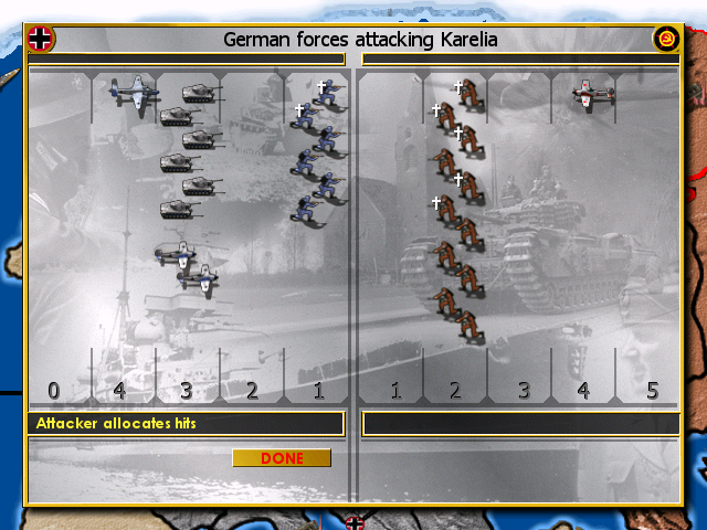
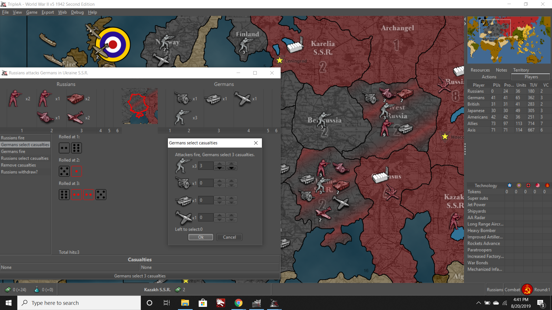
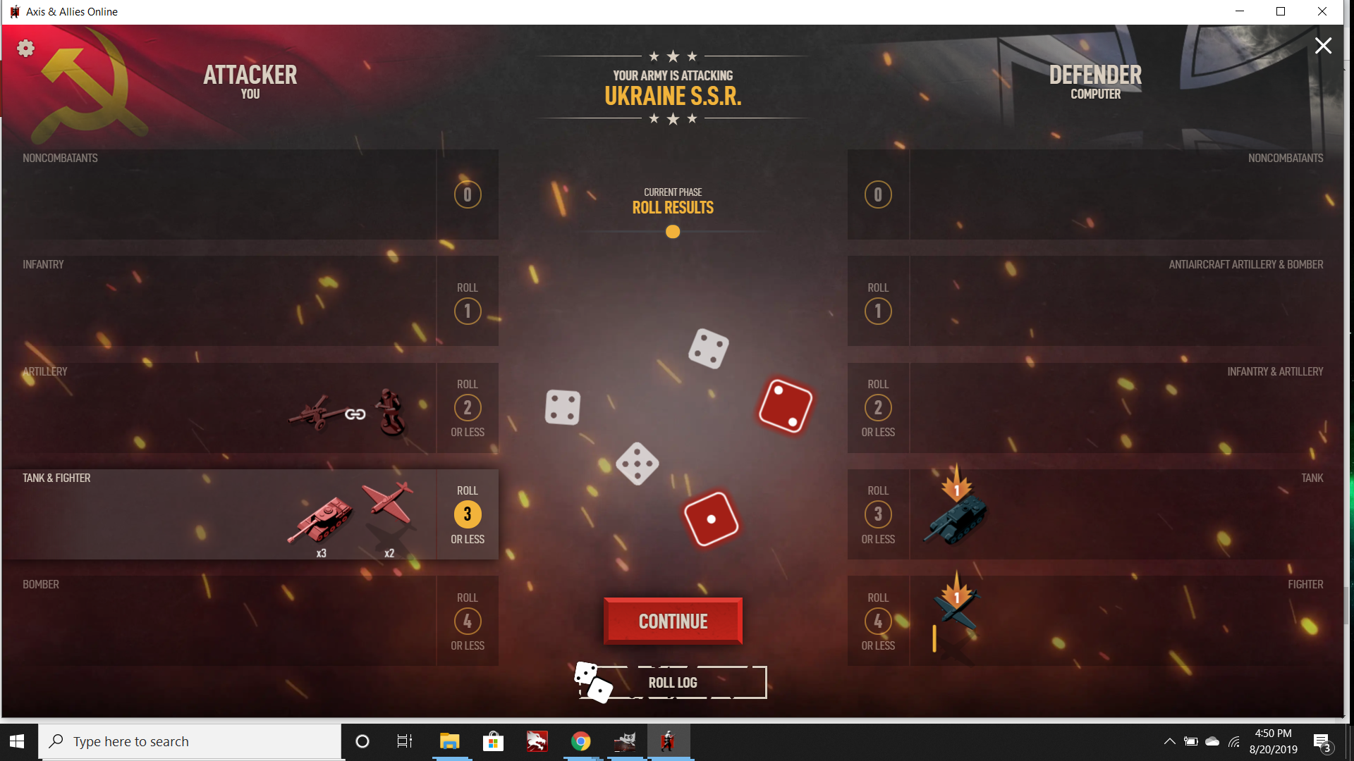
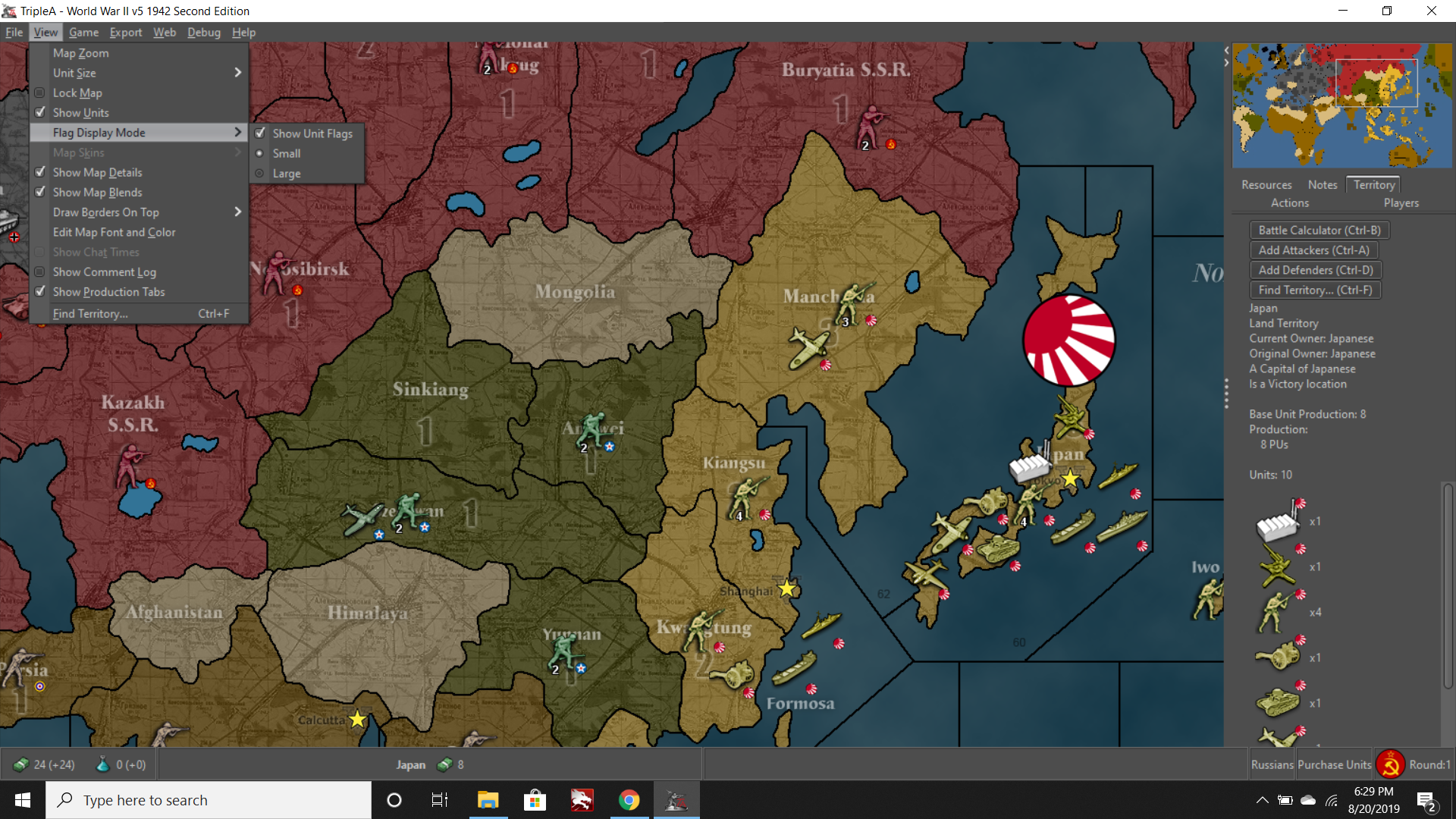
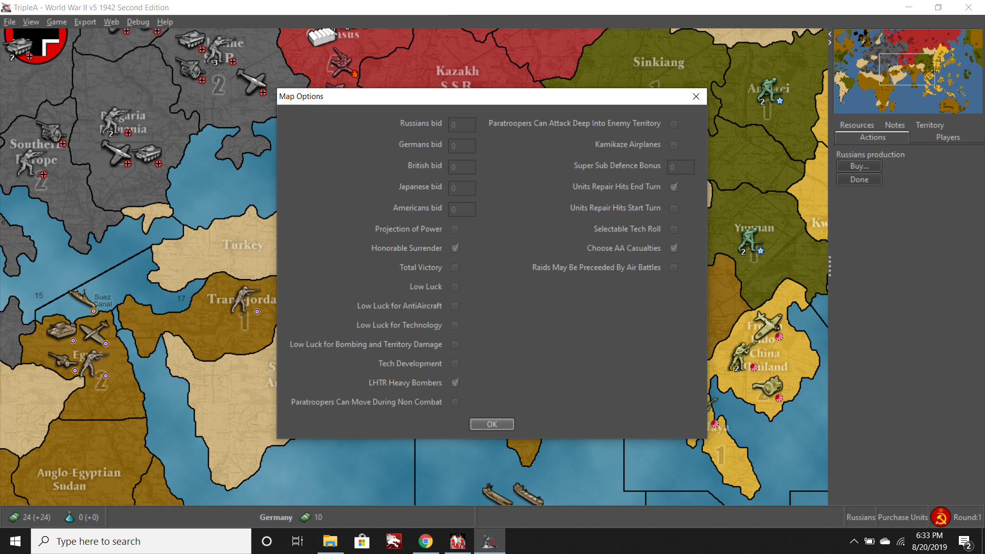
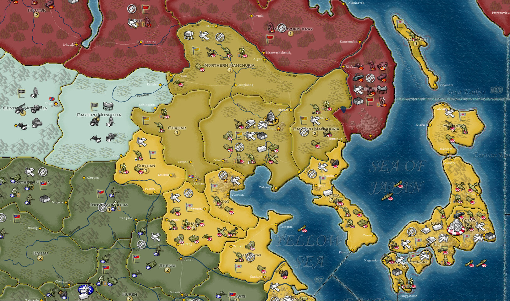
Yeah I get what you’re saying man. All I’m saying is that you could put your own map into TripleA and customize other things if you wanted, but you gotta do your own legwork for that to happen. There’s not any sort of team on it. Most of the people who created the artwork that tripleA uses aren’t even around anymore, and the default stuff is usually just a selection of whatever seemed popular from previous iterations of like 5-10 years ago. Not saying its the easiest thing in the world to get under the hood and alter graphics, but least there are ways to do it. If you find the default ugly, it can be changed on the fly by the user, all I was trying to point out.
(ps. Also gotta remember that we got DMCA’d a long time back, with the result that TripleA lost a large share of its user base, and some of the best graphics we had developed for the official games. We also lost the project creator at that time. I haven’t seen or heard from Sean in forever, but there was a point there where it was poised to look really beautiful. But someone at corporate must have axed us hard, so they could launch the GTO version or whatever. I honestly don’t know what happened, since I usually take long breaks from A&A and then return in a fit of excitement, but something must have gone down. I know it went dark for a few months and returned sans some of that content. I’m still kind of bitter about it. Felt like some of the most dedicated enthusiasts I knew were iced out, and nobody would touch the older mods. Which honestly is part of the reason it’s butt ugly if it is, because it was too good for its own good in other areas hehe.)
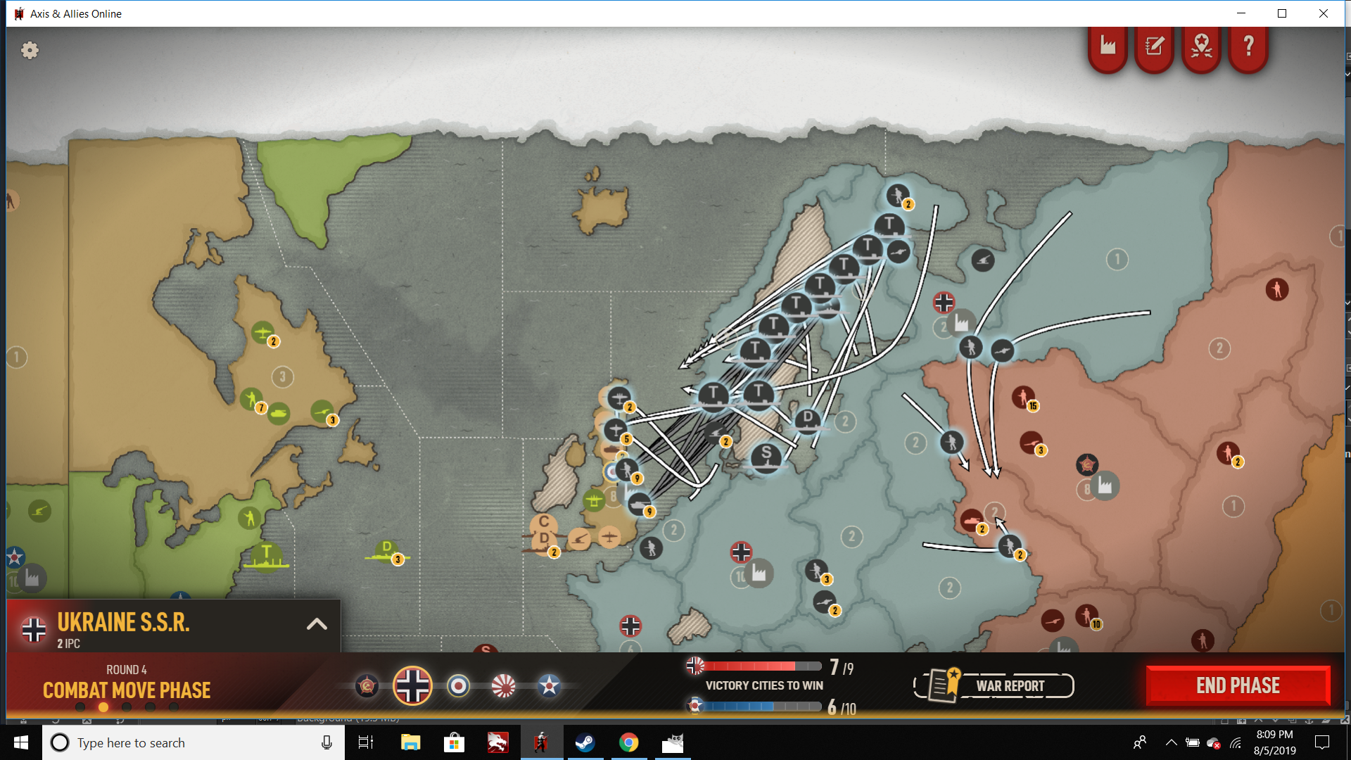
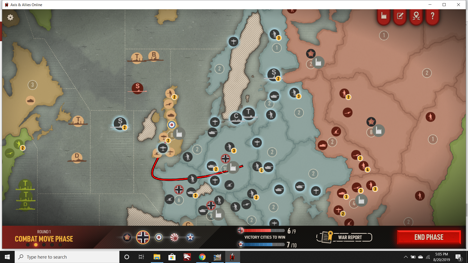
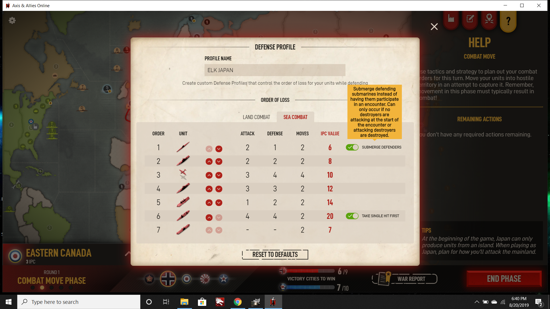
Sorry trying not to veer off topic here overmuch with tripleA. Just wanted to call attention again to the Beamdog screen that I took above, focusing especially on the movement arrows. Or here is another that I sent to their feedback site, which shows some of what I find problematic…

One thing you might notice is that the “moved” units often occupy a different position along the arrow line. Sometimes the unit rides the line where the arch of the curve is most extreme, sometimes it’s at the beginning of the line, sometimes it’s near the end by the arrow point. Often if the unit is riding a bend, it can be hard to trace the line when it picks back up again on the other side of the unit.
In general I’d say it’s just visually confusing and hard to parse. There might be an argument to be made about the visual appeal of an “attack pattern” with a bunch of arrows, or for having a kind of more organic look to the way units are grouped (instead of all straight vector lines, or units in neat rows and columns) but from the perspective of reading the UI at a glance, I just find it a tangle. It’s not that I dislike the visual per se, I just think those sort of graphics/animations could be used for something other than planning out movements. Like if it was just a flash of attack routes that took place before combat zoom, that’d be great. But trying to parse all those curved lines during the actual movement phase (when you’re trying to do/undo stuff) is really quite difficult and requires a ton of clicks.
