@SuperbattleshipYamato I have played a few games and though the Axis can initially worry the Allies , (I thought I would lose ), I have always been able to keep the income gap and , as the game progresses, it opens up much more .
I don’t believe , The Allies don’t need help in this game, if the players are equal ability.
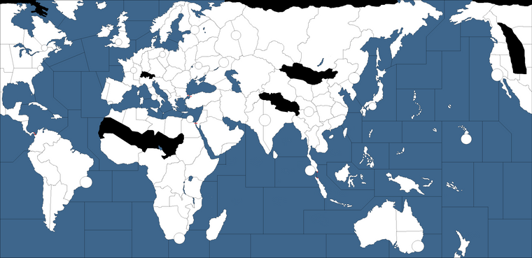
1942 3rd edition map thoughts
-

-
You left out the center of Austrailia which is definatly one of thoese areas
-
I like those ideas for a more advanced board. I think you could get some fun production values and choke points using something like that.
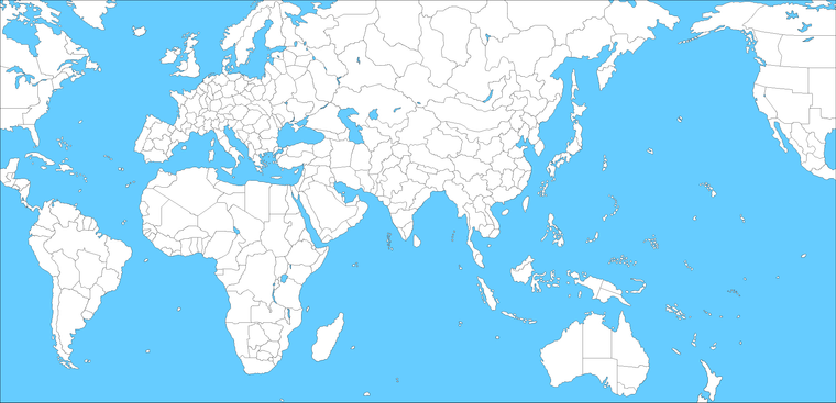
Here’s a baseline with a bunch of tiles if anyone wants to play around. You can erase borders or redraw the geometry. I had the ocean pretty light from a while back, and don’t have any sea zones drawn on this one, but those are easy to add. The islands are probably overkill for a smaller board, but they’re simple to delete or round out into larger groups. There is a little clipping at the top with Norway since it was an older draft, but still pretty easy to carve up or extend if anyone likes to play around with ideas. This was off the AA50 projection I did, but it warps pretty well if people like to re-scale it. I tried to put in a lot of smaller political boundaries so that they could stretch relative to each other, before knocking em out to form larger divisions. Europe is pretty large here relative to the rest of the globe (I had it pulling off at Gibraltar in this draft for a larger med) but I think you might be able to stretch even larger there if desired just by tweaking the aspect, and still feel pretty recognizable. To get AA50 I just compressed Spain and expanded UK a bit. Usually some liberties are taken when drafting the eastern front or central Russia to match the A&A distortions, but tried to have Asia/China a bit easier to work with and Europe/Med scaled up as much as possible without smashing Africa too much. Scandinavia can also be compressed or tilted even more than I did here and I think it still works if people like a taller Europe or need more room for sz, but this was kinda where I settled for something similar to a classic projection but with less blobbing and some recognizable 20th century political boundaries to draw from.


here’s a darker one more like revised if you like something deeper for the briny blue.

-
ps. That one was keyed off a scenario more late colonial era/early 1900s for Europe, but found it pretty easy to adjust for different eras once I knew where those spots were relative to each. Usually just needs a couple tweaks to make it recognizably 1940s after collapsing stuff down into larger regional tiles.
I think its easier to key in all the sz tiles first before adjusting the ocean color for tripleA use, but its pretty easy to switch after you have the divisions in place. Here the Atlantic ocean is compressed quite a bit since you didn’t need a ton of space there for AA50 scale, but is also pretty simple to extend, or move the wrap line if you need to add in more sz space.
That last one is about as dark as I can go before I can’t see the black pixels anymore, but you can make sz boundaries white after with a mapskin which seems to work pretty well for a more revised style look.
The A&A world map is pretty crazy, but I was fairly happy with how that projection turned out. I try to keep this one in mind when thinking overmuch on the relative scale, but I feel you can get away with a lot and have a world map that looks pretty familiar while still being playable for stuff like unit crowding…
-
@Black_Elk
whoa it’s a heartbeat :) -
@Imperious-Leader If you’re referring to my early draft of a 3rd-edition map, and saying that the center of Australia should be blacked out to indicate that it’s impassible, then my answer is that I’m only blacking out areas that would block at least one possible kind of movement. With only four tiles on the Australian continent, blacking out the center wouldn’t prevent any moves – unless you think Western Australia and New South Wales should not be adjacent by land?
-
You need to add another area to create a circle of areas, so you cant jump from the top half to Whales via Western Aus
-
What happened the idea that islands should not be surrounded by only one sea zone?
-
I don’t understand – my Middleweight map has multiple sea zones connecting to each of its islands.
-
I was referring to @Black_Elk 's project.


