@barnee
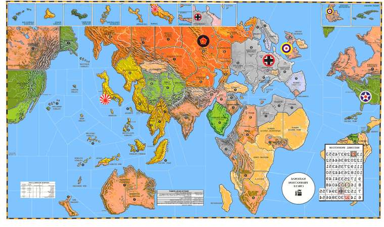
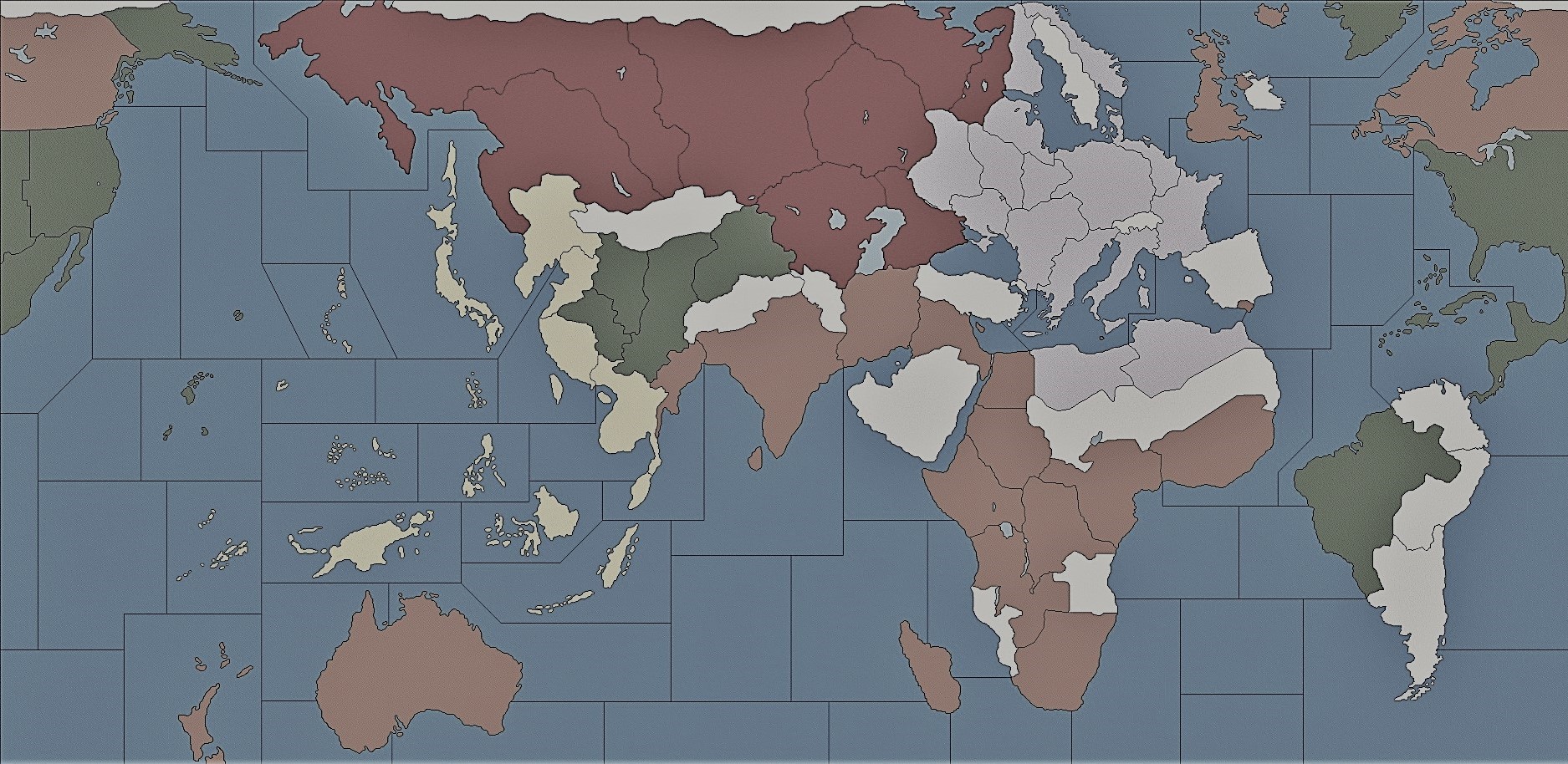
From my previous setup, the following changed highlighted are (DELETED NEW)
Victory Conditions:
Axis: Control 8 European Victory Cities or Control 6 Pacific Victory Cities, either one for a Complete Round of Play following the capture of the last necessary Victory City
Allies: Control 4 of [Berlin, Tokyo, Rome, Paris, Shanghai, Warsaw, Hong Kong, and Manila] for a Complete Round of Play following the capture of the last necessary Victory City
-SOVIET UNION (30 IPCs)
Russia: Major Industrial Complex, Air Base, 4 Infantry, 1 Mechanised Infantry, 2 Artillery, 2 Tanks, 2 AAA, 1 Fighter, 1 Tactical Bomber
Novgorod: Minor Industrial Complex, Air Base, Naval Base, 2 Infantry, 1 Artillery, 2 AAA, 1 Fighter, 1 Tactical Bomber
Volgograd: Minor Industrial Complex, 4 Infantry, 1 Mechanized Infantry, 1 Artillery, 1 Tank
Karelia: 2 Infantry
Archangel: 2 Infantry, 1 Tank
Vologda: 1 Infantry
Tambov: 1 Infantry
Caucasus: 2 Infantry
Urals: 1 Infantry, 2 Mechanized Infantry, 2 Tanks, 1 Tactical Bomber
Novosibirsk: 4 Infantry
Samara: 2 Infantry
Kazakhstan: 2 Infantry
Evenkiyskiy: 2 Infantry
Timguska: 1 Infantry
Yenisey: 2 Infantry
Yakut S.S.R.: 1 Infantry
Buryatia: 3 Infantry
Sakha: 2 Infantry, 2 Mechanized Infantry, 1 Artillery, 1 Tank, 2 AAA
Amur: 3 Infantry
Siberia: 3 Infantry
Soviet Far East: 1 Infantry
Iraq: Control Marker, 1 Mechanized Infantry
Northwest Persia: Control Marker
Persia: Control Marker, 1 Tank
Eastern Persia: Control Marker
Sea Zone 5: 1 Submarine
Sea Zone 115: 1 Submarine, 1 Cruiser
Sea Zone 127: 1 Destroyer
-EMPIRE OF JAPAN (45 IPCs)
Japan: Major Industrial Complex, Air Base, Naval Base, 6 Infantry, 2 Artillery, 1 Tank, 4 AAA, 1 Fighter, 2 Tactical Bombers, 2 Strategic Bombers
Siam: 4 Infantry
Korea: 2 Infantry, 1 Fighter, 1 Tactical Bomber
Okinawa: 1 Infantry, 1 Fighter
Formosa: 1 Fighter
Paulau Island: 1 Infantry, 1 Mechanized Infantry, 2 Strategic Bombers
Iwo Jima: 1 Infantry, 1 Mechanized Infantry, 1 AAA, 1 Tactical Bomber
Caroline Islands: Air Base, Naval Base, 2 Infantry, 1 AAA, 1 Fighter
Kiangsu: Control Marker, 2 Infantry, 4 Artillery, 1 Fighter, 1 Tactical Bomber
Philippines: Control Marker, Air Base, Naval Base, 2 Infantry, 1 Artillery, 1 Fighter
Kwangtung: Control Marker, Naval Base, 1 Infantry, 1 Fighter, 1 Tactical Bomber
Malaya: Control Marker, Naval Base, 1 Infantry, 2 Artillery, 1 AAA, 1 Fighter, 1 Tactical Bomber
Shan State: Control Marker, 1 Infantry, 2 Artillery, 1 AAA
Kwangsi: Control Marker, 2 Infantry, 1 Artillery
French Indo China: Control Marker, 1 Infantry, 1 Mechanized Infantry, 1 Tank
Sumatra: Control Marker, 2 Infantry
Java: Control Marker, 1 Infantry
Celebes: Control Marker, 1 Infantry
Jehol: Control Marker, 2 Infantry, 1 Artillery
Shantung: Control Marker, 2 Infantry, 1 Artillery
Kiangsi: Control Marker, 2 Infantry, 1 Artillery
Borneo: Control Marker, 1 Infantry
Manchuria: Control Marker, 4 Infantry, 1 Mechanized Infantry, 1 Artillery, 1 Tank
Guam: Control Marker, Air Base
Dutch New Guinea: Control Marker
New Britain: Control Marker, 1 Infantry
New Guinea: Control Marker, 1 Infantry
Wake Island: Control Marker, Air Base
Gilbert Islands: Control Marker, 1 Infantry
Sea Zone 6: 1 Transport, 1 Submarine, 1 Cruiser, 1 Aircraft Carrier (Carrying 1 Fighter and 1 Tactical Bomber), 1 Battleship
Sea Zone 17: 1 Transport, 1 Destroyer
Sea Zone 19: 2 Submarines
Sea Zone 20: 1 Transport, 2 Destroyers
Sea Zone 31: 1 Destroyer, 1 Cruiser, 1 Battleship
Sea Zone 33: 2 Submarines, 1 Destroyer, 1 Aircraft Carrier (Carrying 1 Fighter and 1 Tactical Bomber)
Sea Zone 35: 1 Cruiser, 1 Aircraft Carrier (Carrying 1 Fighter), 1 Battleship
Sea Zone 37: 1 Transport, 1 Destroyer, 1 Cruiser
Sea Zone 42: 1 Aircraft Carrier (Carrying 1 Fighter and 1 Tactical Bomber)
-UNITED STATES (52 IPCs)
Eastern United States: Major Industrial Complex, Air Base, Naval Base, 2 Infantry, 1 Artillery, 2 AAA, 1 Tactical Bomber
Western United States: Major Industrial Complex, Air Base, Naval Base, 4 Infantry, 1 Mechanized Infantry, 2 Artillery, 1 Tank, 2 AAA, 1 Fighter, 1 Tactical Bomber, 1 Strategic Bomber
Central United States: Major Industrial Complex, 2 Infantry, 4 Mechanized Infantry, 1 Tank
Hawaiian Islands: Air Base, Naval Base, 1 Infantry, 1 Artillery, 2 AAA, 2 Fighters
Midway: Air Base, 1 Infantry, 1 Fighter
Alaska: 2 Infantry
Iceland: 1 Fighter
Solomon Islands: 1 Infantry, 1 Tank, 1 Fighter, 1 Tactical Bomber
Brazil: Control Marker
Eire: Control Marker, 1 Strategic Bomber
Sea Zone 10: 2 Transports, 1 Destroyer, 1 Aircraft Carrier (Carrying 1 Fighter), 1 Battleship
Sea Zone 25: 1 Aircraft Carrier (Carrying 1 Fighter and 1 Tactical Bomber), 1 Battleship
Sea Zone 26: 1 Transport, 1 Submarine, 1 Destroyer, 1 Cruiser
Sea Zone 29: 2 Submarines, 1 Aircraft Carrier (Carrying 1 Fighter and 1 Tactical Bomber)
Sea Zone 49: 1 Transport, 1 Destroyer, 1 Cruiser
Sea Zone 64: 1 Destroyer
Sea Zone 101: 2 Transports, 1 Battleship
-CHINA (12 IPCs)
Suiyuyan: 3 Infantry
Shensi: 1 Infantry
Szechwan: 1 Infantry
Hopei: 4 Infantry, 1 Artillery, 1 Fighter
Kweichow: 3 Infantry
Hunan: 3 Infantry
Yunnan: 6 Infantry
-GERMAN REICH (51 IPCs)
Germany: Major Industrial Complex, 6 Infantry, 4 Artillery, 3 AAA, 1 Fighter, 2 Strategic Bombers
Poland: 2 Infantry, 1 Tank, 1 Tactical Bomber
Holland Belgium: 2 Infantry, 1 Artillery
Norway: 3 Infantry, 1 Fighter
Denmark: 1 Infantry, 1 Tank
Western Germany: Major Industrial Complex, Air Base, Naval Base, 2 Infantry, 1 Artillery, 4 Tanks, 3 AAA, 2 Fighters, 3 Tactical Bombers
Greater Southern Germany: 4 Infantry
Slovakia Hungary: 2 Mechanized Infantry, 2 Tanks
Romania: 2 Infantry, 1 Tank, 1 Fighter
Alexandria: 1 Infantry, 1 Mechanized Infantry, 1 Tank
France: Control Marker, Minor Industrial Complex, Air Base, 1 Infantry, 2 Mechanized Infantry, 1 AAA, 1 Tactical Bomber
Morocco: Control Marker, 3 Infantry
Normandy Bordeaux: Control Marker, Minor Industrial Complex, Naval Base, 2 Infantry, 1 Tank, 1 Fighter
Finland: Control Marker, 2 Infantry, 1 Artillery
Vyborg: Control Marker, 1 Infantry
Baltic States: Control Marker, 2 Infantry, 1 Tank, 1 Fighter
Eastern Poland: Control Marker, 3 Infantry, 1 Artillery, 1 Tank
Bessarabia: Control Marker, 1 Infantry
Bulgaria: Control Marker, 1 Infantry, 1 Artillery
Crete: Control Marker, 1 Tactical Bomber
Belarus: Control Marker, 4 Infantry
Western Ukraine: Control Marker, 2 Infantry, 1 Fighter, 1 Tactical Bomber
Ukraine: Control Marker, Minor Industrial Complex, 4 Infantry, 1 Tank, 1 AAA
Smolensk: Control Marker, 2 Infantry, 1 Artillery, 1 Tank, 1 Tactical Bomber
Bryansk: Control Marker, 2 Infantry, 1 Mechanized Infantry, 1 Artillery, 1 Tank
Rostov: Control Marker, 3 Infantry
Sea Zone 99: 1 Transport
Sea Zone 103: 2 Submarines
Sea Zone 105: 1 Battleship
Sea Zone 113: 1 Submarine, 1 Cruiser
Sea Zone 118: 2 Submarines
Sea Zone 124: 2 Submarines
-UNITED KINGDOM (29 IPCs for Europe, 13 IPCs for Pacific)
United Kingdom: Major Industrial Complex, Air Base, Naval Base, 3 Infantry, 1 Mechanized Infantry, 1 Artillery, 1 Tank, 4 AAA, 3 Fighters, 1 Strategic Bomber
Egypt: Naval Base, 1 Infantry, 1 Artillery, 1 Tank
Quebec: Minor Industrial Complex, 1 Infantry, 1 Tank
New Brunswick Nova Scotia: Naval Base
Iceland: Air Base
Scotland: Air Base, 1 Infantry, 1 Mechanized Infantry, 1 AAA, 1 Fighter
Gibraltar: Naval Base, 1 Tactical Bomber
Malta: 1 Infantry, 1 AAA, 1 Fighter
Trans-Jordan: 2 Infantry
Anglo Egyptian Sudan: 1 Infantry
Union of South Africa: Minor Industrial Complex, Naval Base, 1 Infantry, 1 Mechanized Infantry
British Columbia/Western Canada: 1 Infantry
Suriname: Control Marker
Ethiopia: Control Marker
Italian Somaliland: Control Marker
Sea Zone 71: 1 Transport
Sea Zone 92: 1 Battleship
Sea Zone 97: 1 Cruiser, 1 Aircraft Carrier (Carrying 1 Tactical Bomber)
Sea Zone 98: 1 Transport, 1 Submarine, 1 Destroyer
Sea Zone 106: 1 Transport, 1 Destroyer
Sea Zone 109: 1 Transport, 1 Cruiser, 1 Battleship
Sea Zone 110: 1 Transport, 1 Cruiser, 1 Aircraft Carrier (Carrying 1 Fighter)
Sea Zone 111: 1 Transport, 1 Submarine, 1 Destroyer, 1 Battleship
India: Major Industrial Complex, Air Base, Naval Base, 6 Infantry, 1 Mechanized Infantry, 2 Artillery, 4 AAA, 1 Fighter, 1 Tactical Bomber
Kwangtung: Naval Base, 2 Infantry
Malaya: Naval Base, 3 Infantry
West India: 1 Infantry
Burma: 2 Infantry, 1 Infantry, 1 Fighter
Shan State: 2 Infantry
Sumatra: Control Marker
Celebes: Control Marker
Sea Zone 38: 1 Battleship
Sea Zone 39: 1 Transport, 1 Destroyer, 1 Cruiser, 1 Aircraft Carrier (Carrying 1 Fighter)
Sea Zone 44: 1 Cruiser
Sea Zone 45: 1 Cruiser
-EMPIRE OF ITALY (18 IPCs)
Southern Italy: Minor Industrial Complex, Air Base, Naval Base, 6 Infantry, 2 AAA, 2 Fighters
Northern Italy: Major Industrial Complex, 2 Infantry, 1 Artillery, 2 Tanks, 2 AAA, 1 Strategic Bomber
Sardinia: 1 Infantry
Sicily: 1 Infantry
Libya: 1 Infantry, 1 Mechanized Infantry, 2 Artillery, 1 Tank
Albania: 1 Mechanized Infantry, 1 Tank
Tobruk: 3 Infantry
Western Ukraine: 1 Infantry
Rostov: 1 Artillery, 1 Tank
Southern France: Control Marker, Minor Industrial Complex, Naval Base, 2 Infantry
Algeria: Control Marker, 1 Infantry
Tunisia: Control Marker, 1 Infantry
Yugoslavia: Control Marker, 2 Infantry
Greece: Control Marker, 2 Infantry
Alexandria: Control Marker, 1 Infantry, 1 Tactical Bomber
Sea Zone 87: 2 Submarines
Sea Zone 93: 1 Transport, 1 Submarines, 1 Destroyer, 1 Cruiser
Sea Zone 94: 1 Submarine
Sea Zone 95: 1 Transport, 2 Cruisers, 1 Battleship
Sea Zone 96: 1 Transport, 1 Destroyer
-ANZAC (10 IPCs)
New South Wales: Minor Industrial Complex, Naval Base, 1 Infantry, 1 Mechanized Infantry, 1 Artillery, 2 AAA
Western Australia: 2 Infantry
Queensland: Air Base, Naval Base, 2 Infantry
New Zealand: Air Base, Naval Base, 1 Infantry, 2 Fighters
Egypt: 2 Infantry
Malaya: 1 Artillery, 1 Tank
Burma: 1 Infantry, 1 Artillery, 1 Tank
Sumatra: 2 Infantry
Celebes: 2 Infantry
Sea Zone 54: 1 Battleship
Sea Zone 62: 1 Transport, 1 Destroyer, 1 Cruiser
Sea Zone 63: 1 Submarine, 1 Aircraft Carrier (Carrying 1 Fighter)
-FRENCH REPUBLIC (0 IPCs, Capital Under Occupation)
French West Africa: 1 Infantry
French Central Africa: 1 Infantry
French Equatorial Africa: 1 Infantry
Syria: 1 Infantry, 1 Artillery, 1 Tank
United Kingdom: 1 Infantry, 1 Fighter, 1 Tactical Bomber
Sea Zone 72: 1 Destroyer
Sea Zone 98: 1 Cruiser
Sea Zone 109: 1 Cruiser
Sea Zone 110: 1 Destroyer


