• 2024 '22 '21 '19 '15 '14

    IL I know you like making maps for the physical boards, this is one area where you could probably help if you wanted. Hepps is blowing my mind lately with the work he’s been doing for newer custom games, but I’d agree that many of the older WWII maps leave something to be desired. I also know you aren’t the biggest fan of the boxed 1942.2 gamemap. Sure there are limits to the baseline maps tripleA uses, but you can do a lot with skins and map details. The PDF you have posted in the 1942 sec edition section for example, that’s something I imagine could be added as an optional map skin. Same deal with the unit graphics, like if you don’t dig the default ones, alternative icons can be used. Territory colors can be adjusted using Hex Codes. Anyhow, main point is that nobody over there catches a paycheck for their contributions, and nobody is really beholden to anyone else’s views on map aesthetics. On the upside though, anyone can contribute and try to make it better, just gotta throw the hat in there.

    Right now this level of functionality or customization doesn’t exist in A&AOnline, so we have to rely on their in-house art team. But it would certainly be nice if it did have some tools or ways to import custom art assets, or allow for more modern approaches to graphics.


  • I have done the 1942.2 map and its great. They could have just used that. I didn’t get “paid” i did it to benefit others and their welcome to enjoy it. The AA online thing has an ok map, at least the colors are decent and the pieces are great! Its just the multiplayer interface and the AI.

  • 2024 '22 '21 '19 '15 '14

    Yeah I get what you’re saying man. All I’m saying is that you could put your own map into TripleA and customize other things if you wanted, but you gotta do your own legwork for that to happen. There’s not any sort of team on it. Most of the people who created the artwork that tripleA uses aren’t even around anymore, and the default stuff is usually just a selection of whatever seemed popular from previous iterations of like 5-10 years ago. Not saying its the easiest thing in the world to get under the hood and alter graphics, but least there are ways to do it. If you find the default ugly, it can be changed on the fly by the user, all I was trying to point out.

    (ps. Also gotta remember that we got DMCA’d a long time back, with the result that TripleA lost a large share of its user base, and some of the best graphics we had developed for the official games. We also lost the project creator at that time. I haven’t seen or heard from Sean in forever, but there was a point there where it was poised to look really beautiful. But someone at corporate must have axed us hard, so they could launch the GTO version or whatever. I honestly don’t know what happened, since I usually take long breaks from A&A and then return in a fit of excitement, but something must have gone down. I know it went dark for a few months and returned sans some of that content. I’m still kind of bitter about it. Felt like some of the most dedicated enthusiasts I knew were iced out, and nobody would touch the older mods. Which honestly is part of the reason it’s butt ugly if it is, because it was too good for its own good in other areas hehe.)

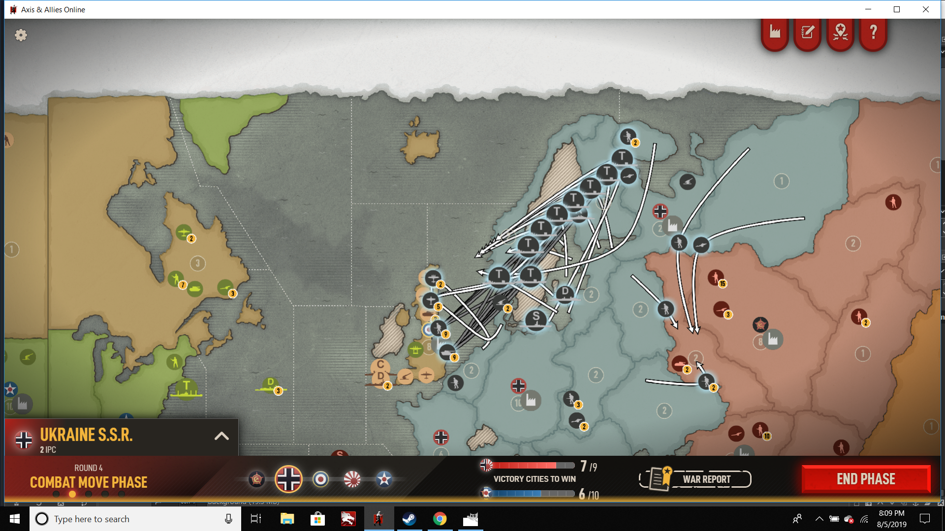
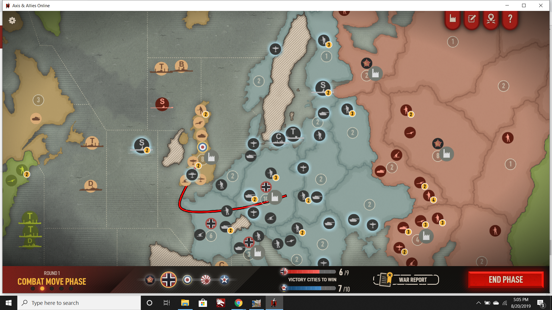
    Sorry trying not to veer off topic here overmuch with tripleA. Just wanted to call attention again to the Beamdog screen that I took above, focusing especially on the movement arrows. Or here is another that I sent to their feedback site, which shows some of what I find problematic…

    sealiontangle.png

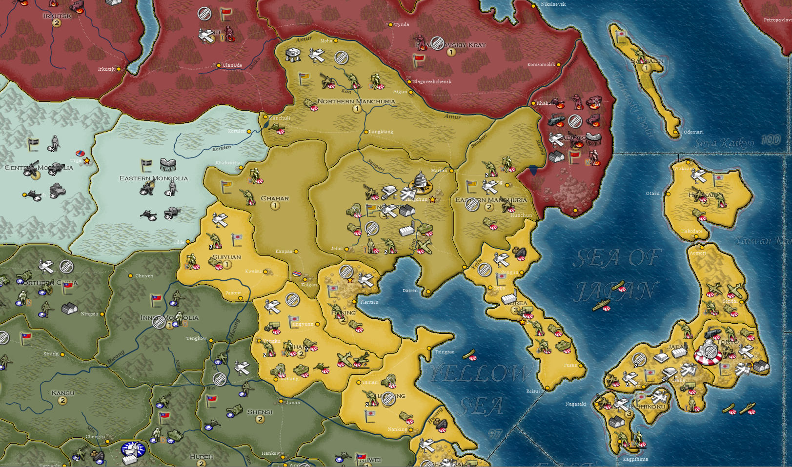
    One thing you might notice is that the “moved” units often occupy a different position along the arrow line. Sometimes the unit rides the line where the arch of the curve is most extreme, sometimes it’s at the beginning of the line, sometimes it’s near the end by the arrow point. Often if the unit is riding a bend, it can be hard to trace the line when it picks back up again on the other side of the unit.

    In general I’d say it’s just visually confusing and hard to parse. There might be an argument to be made about the visual appeal of an “attack pattern” with a bunch of arrows, or for having a kind of more organic look to the way units are grouped (instead of all straight vector lines, or units in neat rows and columns) but from the perspective of reading the UI at a glance, I just find it a tangle. It’s not that I dislike the visual per se, I just think those sort of graphics/animations could be used for something other than planning out movements. Like if it was just a flash of attack routes that took place before combat zoom, that’d be great. But trying to parse all those curved lines during the actual movement phase (when you’re trying to do/undo stuff) is really quite difficult and requires a ton of clicks.

  • 2024 '22 '21 '19 '15 '14

    Also just for the record, I am enjoying Axis and Allies Online.

    I picked this thread to drop those screens because I just wanted to re-iterate that I think the work so far has been pretty good, and I am using it more than I thought I would be, and weirdly way into 1942 sec edition again. But all that said, I think there are many ways it could be improved, and its hard to talk about that at Steam because threads get buried or subject goes negative, and sending feedback direct is kind of one sided, whereas I find it easier to gather my thoughts in discussion.

    One thing I did like about GTO was the handling of the battleboard screen and fast combat. This was organized pretty well there I thought.

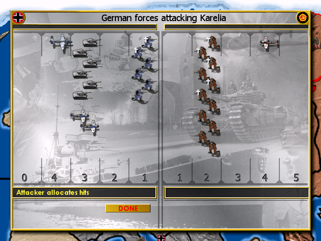
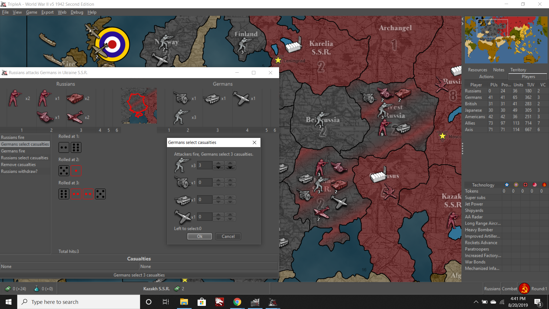
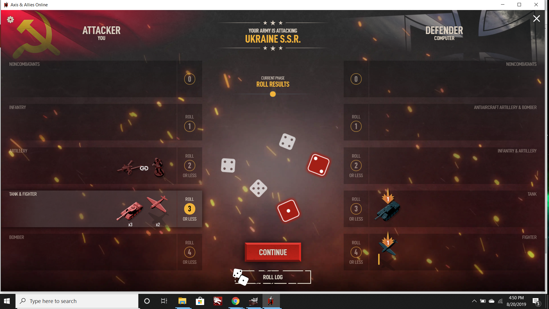
    Here are some more screens for comparison.

    Hasbro Combat

    microprose combat screen.png
    microprose battle screen.png

    TRIPLEA Combat

    triplea fast battle.png

    GTO Combat

    gto fast battle.png

    BEAMDOG Combat

    battlescreen.png

    casualty selection.png

    battlescreenfinal.png

    I tried to grab a few screens since it’s animated by default, the final was with those animations turned off… You can see like Microprose its basically a full screen combat menu, rather than a windowed one. I prefer a combat window for fast battle, that allows us to still drag around the map.

    Also here are screens of the SBR handling. I don’t have GTO for that but I think it also had a prompt/confirm. (I was pulling from a youtube video for GTO, kind of sucks that even when you drop the ducats you don’t get to own the software like you used to. Like obviously I can still load up my old Hasbro CDs, but when an online only platform goes down you’re just outta luck.) Anyhow in the beamdog version the arrow line turns red if the factory is clicked, but no prompt. If you put the bomber into the territory instead of the factory the line remains white and the bomber will attack, even if unaccompanied.

    microprose confirm sbr.png

    tripleA sbr confirm.png

    beamdog sbr.png


  • @redrum Look at that picture. Italy blue, France Blue, Spain blue, Turkey blue, Ocean Blue, Then they got three shades of tan to break up the monotony. Humbug

  • 2024 '22 '21 '19 '15 '14

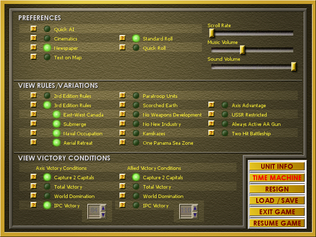
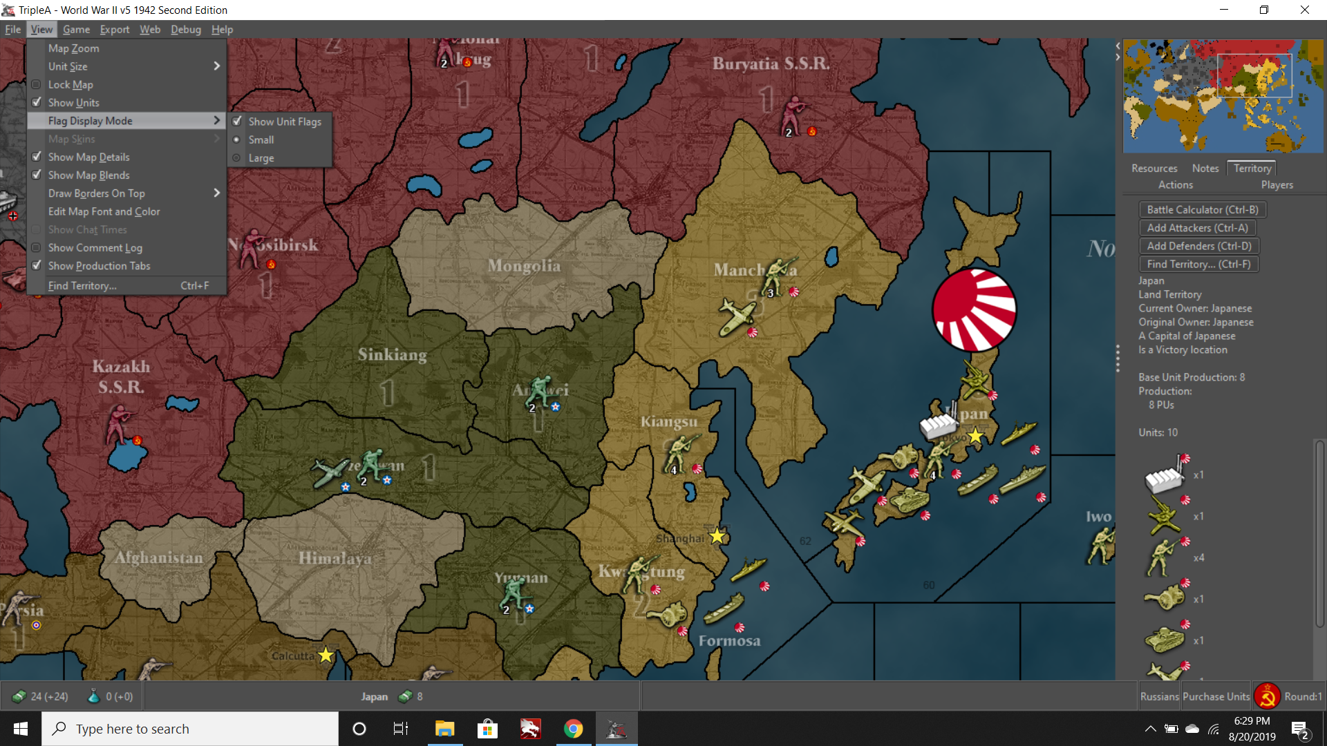
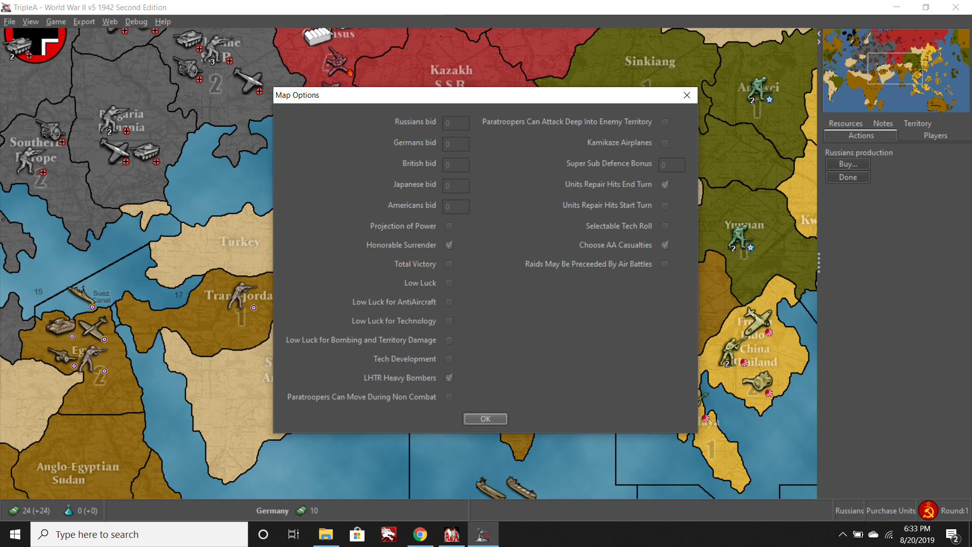
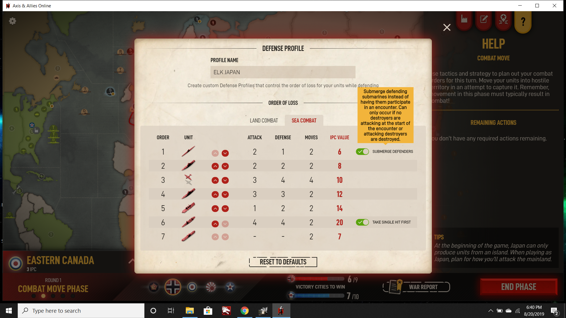
    More screens for consideration. These show things like View settings or Map settings/options. Right now the only settings we can really access or change in A&AOnline are for the defense profiles. But basically more features, both for graphics type stuff or general game options that can be accessed or viewed from the in game tabs. Currently most tabs we can click only provide reference information, anything graphics setting or map view related is just like on/off for animations or sounds etc, but no real way to alter what’s displayed or how.

    Some of the Hasbro menus (lot of game options in that one, note especially stuff like Quick Roll or Ruleset, but also novel options like USSR Restricted or Kamikazes. Also Timemachine, which is very useful.
    microprose preferences.png

    microprose time machine.png

    Some TripleA menus
    map view.png

    map options.png

    Again alas I don’t have any access to GTO because its defunct, but that one had a fair number of game/display options as well.

    beamdog game settings.png

    beamdog settings.png

    So another area where I think we could see more. Thoughts?


  • @Imperious-Leader Well there are a lot of nations on this particular map and the shades of tan are because there is a major-minor nation system for Britain’s colonies. But here you can see another part of the world with some other colors :)

    5b92b1c0-0b95-41dd-b244-ea989c36406d-image.png


  • I like how i started a game and nobody is around…:white_frowning_face:

    At Least Black Elk joined the axis as Japan.

  • '21 '20 '18 '17

    @Imperious-Leader

    What? I want in! An Axa.org all stars game hell ya!


  • were playing UK up next


  • @weddingsinger
    @DoManMacgee
    @Imperious-Leader
    @Black_Elk
    dangit computer’s at home. I’ll set up a game with an appropriate title and wait until some of the all-stars have joined. NO NOOBS!

  • 2024 '22 '21 '19 '15 '14

    Yeah I saw that one last night and had to dive in haha. I was in a game with David yesterday so not sure when it launched, but I’ll fire off Japan when I get back from work. Most games default to PBEM style unless you’re really keep an eye on the launch. I think I hung out for maybe 30 min to see if it would launch after joining but after that its like asynchronous only most times and who knows when people are around. For pick up games closer to live play I’d use Discord. The only live games I’ve played to completetion have been by meeting up in the Discord chat rooms. Games are pretty boring otherwise with no way to talk.

    ps. Just got home and fired it off. The emperor was pleased with our rolls. Hopefully will get back round to G before too long, best of luck Imperious. If you hop on the A&A Discord I use the same handle there.

  • 2024 2023 '22 '21 '20 '19 '18

    @taamvan Whoops. I was at work when this was all going down. Sorry I missed the boat.

    Agree with Black_Elk though. I’ve been playing all my games on a PBEM-basis. I just don’t have 3-4 continuous hours of free time to sit down and play out a full game live these days. Best I can manage is like 1-3 moves (countries, not full rounds) per game I’m in a day.

Suggested Topics

  • 6
  • 1
  • 3
  • 9
  • 29
  • 8
  • 2
  • 4
Axis & Allies Boardgaming Custom Painted Miniatures

154

Online

17.3k

Users

39.9k

Topics

1.7m

Posts