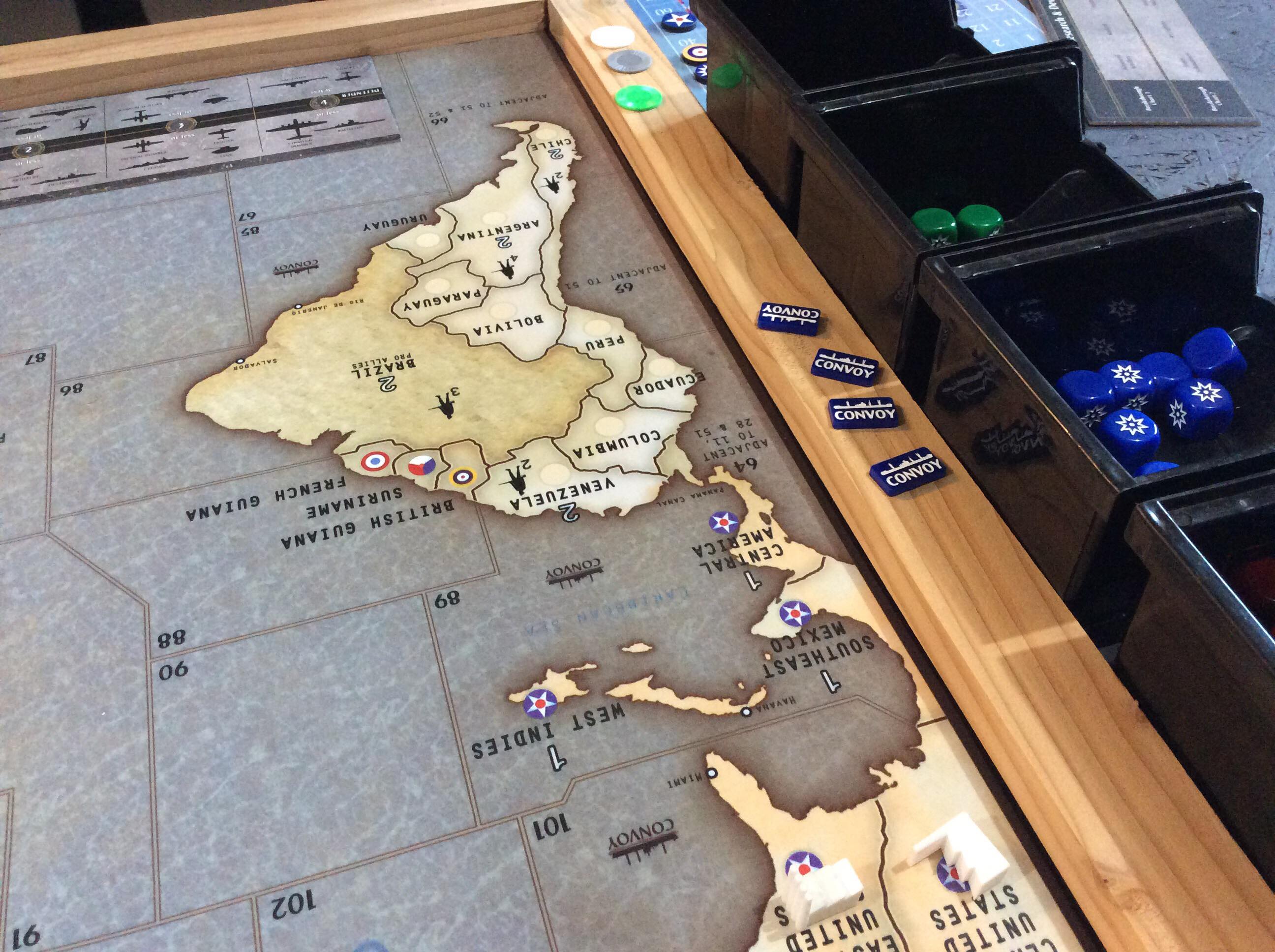
I have been playing around with different configurations for a custom table and wanted to note some things I’ve landed on that I really like. A main one thing is having the map mounted so that it can slide around as needed on top of a bigger playing area. My table is 65” x 95” in total with a 5.5” arm rest around the outside and the middle is a recessed neoprene surface. I have the OOB Global map mounted on 1/2” rigid foam with a 1/2” aluminum frame around it. This allows the map to slide up close to whoever’s turn it is, but then be in the middle so both players can roll dice In front of them without disturbing the map and in easy view of the other player. (Plus we like lots of room to roll the bones). This ability to adjust the surface along with a standing height, makes it comfortable for long uses because you can move around more and don’t feel as tied down.
Things I’ve learned and changed from original design - I originally used too big of a frame for the map and mounted it on too high of a foam block (you can see these pictures at the bottom) - it made it hard to see the other player’s dice and the big frame took up too much real estate. My global map is mounted on much thinner foam (the framing is bad, you can see if you look closely) but I also used much thinner aluminum angle for the frame. This gives just enough grip when needing to move the map around (I use furniture slides on the bottom, which glide very nicely on the neoprene) but doesn’t make the whole thing too bulky. Having it an inch or so off the surface keeps the dice off, but isn’t so heigh that you can’t see the other player’s dice rolls. When playing other versions (such as Zombies) the board is much smaller, but it can easily swap in and out on the same table since it can move around where ever it is needed or be pushed aside.
I originally made it normal table height, but found long reaches while sitting were harder and it just felt cramped. Standing height with a bar stool is a great way to have the best of both worlds.
The 5.5” rim around the table itself gives you a nice arm rest that doesn’t interfere with the gaming surface. I’m playing with how to best add some cushion to this part - open to suggestions. Sometimes I just lay a piece of leftover neoprene on it.
Dice bounce nice on the neoprene and stay off the floor. It also feels nice and has enough give to allow things to slide but be picked up easily. Wouldn’t definitely go with neoprene again as a surface covering.
I made the drawers open to the inside of the table so you can stay hunched over the action while accessing and stowing stuff away. 50/50 on whether I would keep this if I were to do it again. If I were doing it again, I might try to build customer drawers form scratch using actual drawer glides, but that was beyond my ability when I first did this, so I just used clear plexiglass boxes with aluminum pulls mounted on them. It’s nice having them clear, and I was happy with how the pulls came out, but without glides they can be a little fussy sliding in and out of their slots.
I originally designed the table so that I could put a cover surface back on top when not in use, but find I don’t really ever do that, so if I were to do it again, I might not mess with that part (I never even finished staining those as you can see in the pictures).
CF362D52-269F-4480-8CBB-08139099138F.jpeg A9E12EA1-66EB-4671-86AC-68C62FD30AD5.jpeg 858DE1F2-030A-4D5A-93E4-70A7D1180ADB.jpeg 8F513EE0-DA37-4BA9-880E-4D5EF7BF431F.jpeg F0188165-757B-4CC1-BF67-5045832283C9.jpeg 2E3CD627-0D31-4121-ACF8-682F9F58A40B.jpeg
Sired's Map project - Updated- 4/16 - files available see first post
-
Thanks tjoek, I wanted to keep the theme as the standing army.
Thanks imperious, wasn�t sure you approved, you went dark on the topic haha… I knew the IPC changes wouldn�t be popular, but I feel where they were made has little impact, as if japan takes Sydney, they will get Victoria anyway, japan often takes soviet Far East while Germany snags up Ukraine… so same IPC loss, and Egypt exchanges hands quite often.
On the flip side, I�ve had games where Anzac was chocked out even with a minor in Queensland… would be better to just upgrade Sydney.
Also… floor huh? One of my guys is going to bring me a sample on mousepad material, wonder if that�s the sane thing.
@ Leatherneck, ya bro, we�ll set a date soon… little busy at work now to take a Friday off, but soon for sure, within a month.
Printing this on mouse pad material would actually be really great for me. I have done some searching around my area but haven’t found a place that prints on it. :(
-
One of my guys is printing on mouse pad, his place only has it in 4x4… so he’s getting it in 2 pcs… I’ll ask him where and cost.
-
Found a website, inkedplaymats.com. Looks like they have a size that will work. Cost would be $160 plus shipping I am sure. I haven’t checked it out yet fully.
-
My mat came in last week and it looks amazing! Unfortunately I can’t seem to get images uploaded. I found a place overseas that I went with since it is one large playmat, not two like it would have been if I went with Inked Playmats. Simply amazing the detail and how it looks. Thanks sired, you did a great job on this!! Currently have a game planned with a buddy in two weeks. :)
-
You gotta post it brother! At least email me some pics!
-
My mat came in last week and it looks amazing! Unfortunately I can’t seem to get images uploaded. I found a place overseas that I went with since it is one large playmat, not two like it would have been if I went with Inked Playmats. Simply amazing the detail and how it looks. Thanks sired, you did a great job on this!! Currently have a game planned with a buddy in two weeks. :)
You have only 5 posts. You need 10 posts before u can upload pics.
-
Files have been updated, current versions are 1.1 (mine) and 1.6 (oob). Remember to varify version on lower right of map. You should receive an updated link for your files shortly.
-
A great piece of work, Siredblood. We finally printed and trimmed our map last week and played on it over the weekend. Thanks so much for the time and effort you put into it.
Edit: sorry for the potato image. I’ll try to get a better photo after work today.
.jpg)
-
A great piece of work, Siredblood. We finally printed and trimmed our map last week and played on it over the weekend. Thanks so much for the time and effort you put into it.
Edit: sorry for the potato image. I’ll try to get a better photo after work today.
Sweet! I couldn’t make out what the blue roundels were on the right on the frame… what are they?
-
Convoy markers from HBG.

-
My mat came in last week and it looks amazing! Unfortunately I can’t seem to get images uploaded. I found a place overseas that I went with since it is one large playmat, not two like it would have been if I went with Inked Playmats. Simply amazing the detail and how it looks. Thanks sired, you did a great job on this!! Currently have a game planned with a buddy in two weeks. :)
I went to the website you mentioned but didn’t find a custom mousepad size (or a rectangle size that would work).
Can you provide a specific link or more info?
I found this link and was curious if anyone has used? shop.x-raypad.com/custom-axis-allies-g40-play-mat/
Thx
jonpfl -
Our mostly finished table using your map. Pretty happy with it so far.
https://imgur.com/gallery/eeon10G -
I must say that map and table is styling and profiling…
-
Navy, that’s super sick, thanks for the pics buddy!
-
Hey Siredblood,
Congrats on the ‘Bloodbath’ Tourney, it looks like it was a great time from your video on Youtube.
Just a couple questions on your map files that are available to purchase and download for $20. Is the OOB map file completely true to the original?
- OOB Anzac Roundel
- All IPC values returned to normal
- Removal of cavalry from Mongolian territories
- OOB Italy Roundel
- OOB Far East Command Roundel
- OOB German Red and Black Roundels
Thank you for your time, and your hard work on this project,
Rand.
Ipc values are OOB, standing army is OOB, roundels remain changed
-
Thanks for the answer, will be in touch.
-
Version 2.0 is under way
-
-
Spinal Tap suddenly comes to mind along with the number 11. :-D
I figure since his bloodbath, he has seen areas to tweak/enlarge/clarify on the map.
I know from experience, coming back to a project after a break, you see things that were missed before.
OR
he just likes to tinker with something which he enjoys… 8-)


