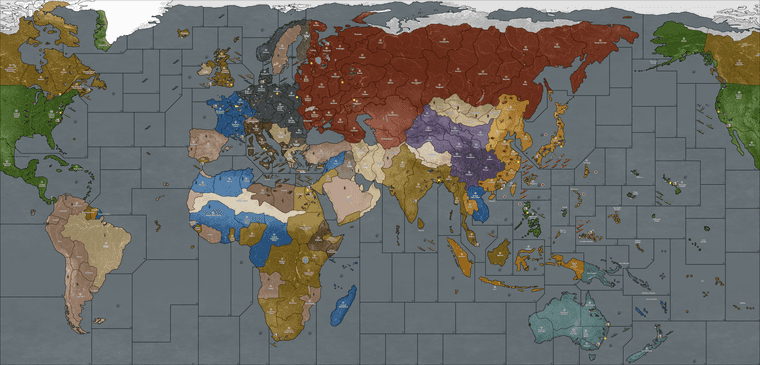
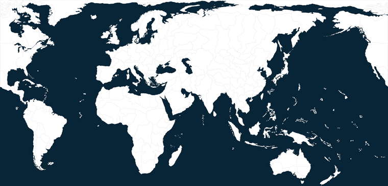
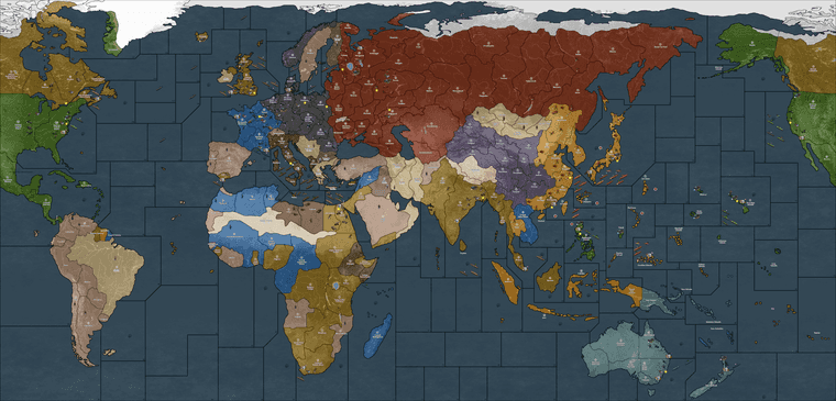
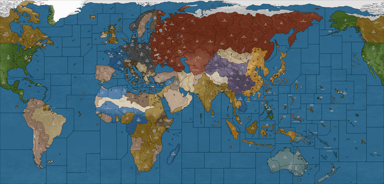
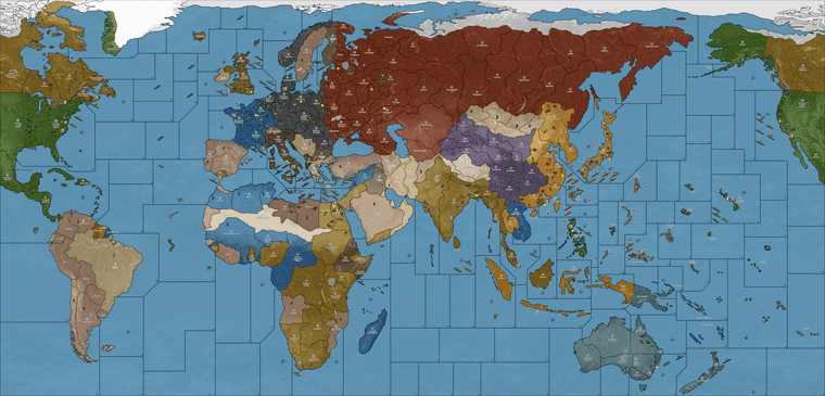
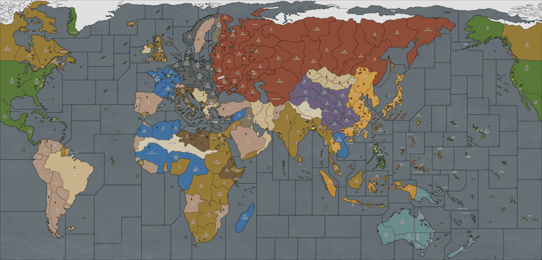
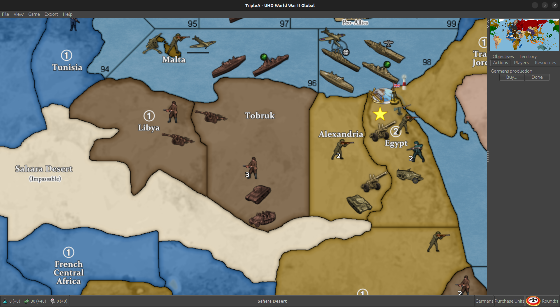
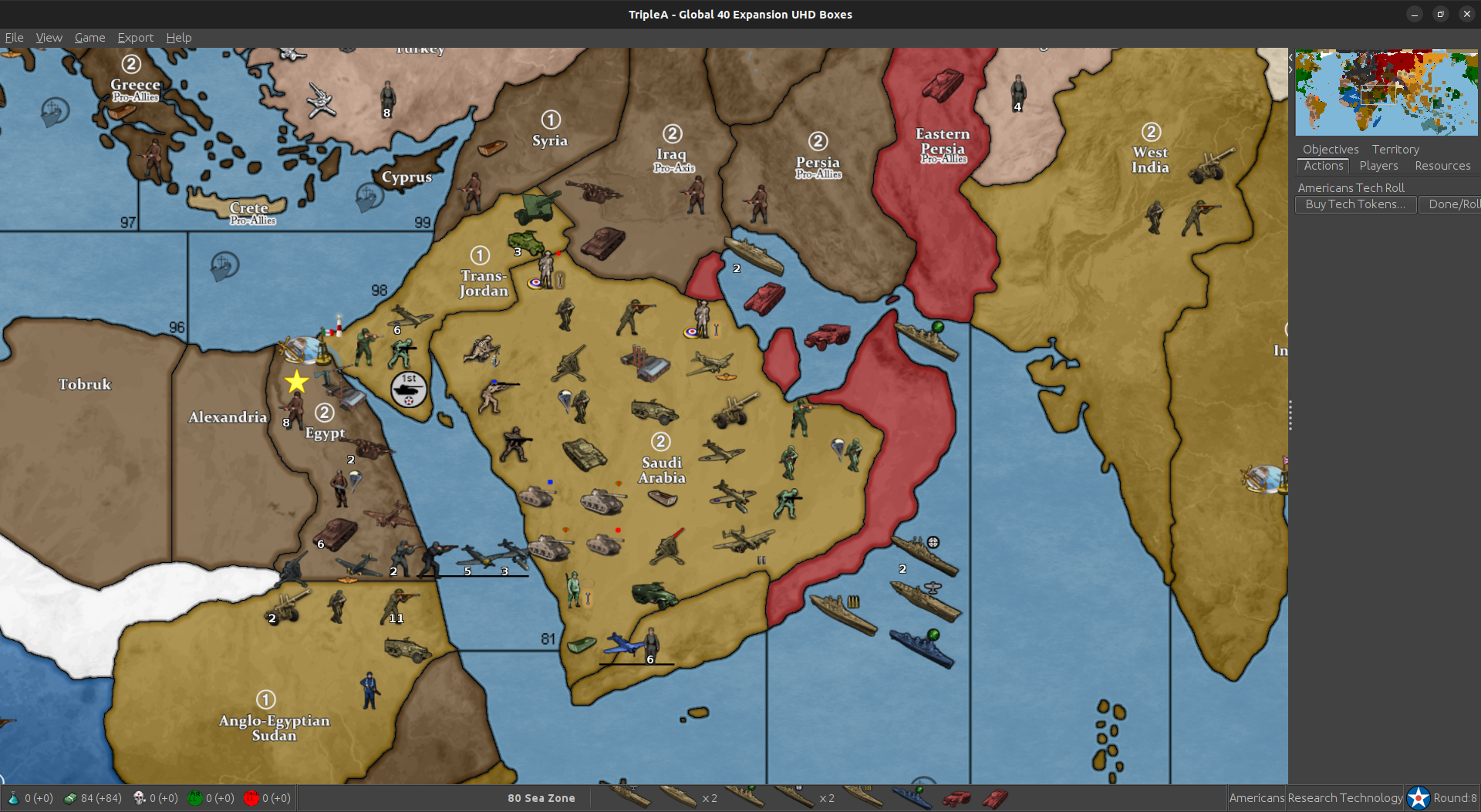
New TripleA Map UHD World War II Global

  • 2024 '22 '21 '19 '15 '14

    @barnee

    To fix your Korea issue, Amur needs the connection to the false TT N. Sakhalin (that’s a cosmetic tile, but the poly is attached to Amur) so needs an assignment after a change is made to the Amur TT.

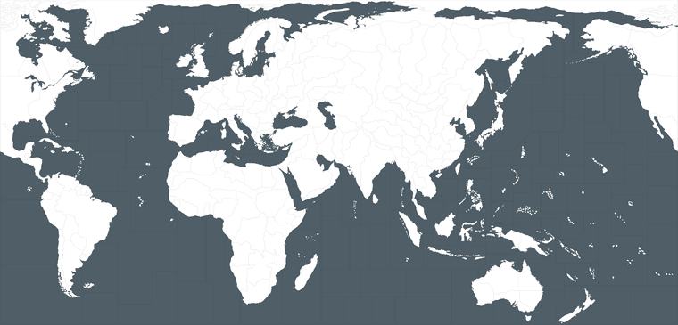
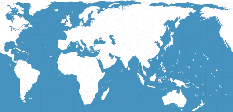
    To fix the blue this is handled entirely via the baseline now. Here’s a high saturation version closer to what you had before, I just cranked the blue in the base and ran it back through the tilebreaker.

    https://www.dropbox.com/scl/fi/zafutctyjfxiorf97klcq/baseline_uhd_global_1940_new_3-1-24_ultramarine.png?rlkey=8ymrygzt460ks8wv6al163o5n&dl=0

    You can make it lighter or darker that way too, or adjust the hue. The cloud pattern is just replicated from the one you liked from earlier. I made it using a GIMP plugin for cloud effects, but then forgot to grab that again when I set up the new rig, so this was just more expedient.

    Anyhow try that and see if you dig, if not adjust the sliders in GIMP or whatever program for to adjust that ocean portion of the baseline image. Should give you what you’re after.

    Oh and you may wish to include these graphics somewhere in the folder, as they usually need to get dropped in last, after doing any opacity adjustments to the relief.

    canal.png lighthouse.png

    Hope that helps

    I also forgot it was leap year, so tell’s you where my heads at. But shoot me a message, I’m sure we can get it sorted.

    Elk

    ps. here’s a quick view after making that adjustment to the blue in the baseline. So you can see it comes through more vibrant in-game (also on the mini map), cause the baseline is more vibrant. But we use the base to control that. Baseline image clocks in at like 800kb, compared to the relief with is like 40mb now. It was heftier before. With the space saved I figured we can just have a dozen baselines with a range of blues. All the player needs to learn how to do is navigate from the map utility to their downloaded maps folder, and run the tilebreaker to get the new base tiles. Not as easy as changing the national colors via the Map.props HEX codes, but after that it’s the simplest way I could think of to do this, and make it as modular as possible.

    You can also use map blends if desired, this may recommend a darker baseline blue and darker Hex codes for each nation just to offset that blend (which adds like 50% white on the land, and 50% whatever the blue from the base) and blends those colors. The border line will also blend. But it should work the same way in each case. If you want to adjust colors the HEXs for land, the baseline blue for the SZ. Retinting units is the hardest, requires a batch save or doing each one manually (takes forever) but least this way the two biggest things (land color and ocean color) are customizable like that. If that makes sense.

    global quick screen base blue ultra reduced.png

    Storms rollin’ in, will probably have to catch ya on the next one. But hopefully that makes it closer to the grade for now heheh


  • @Black_Elk right arm It came through. A little diff but way closer. I’m gonna roll with it for the upload if that cool with you.

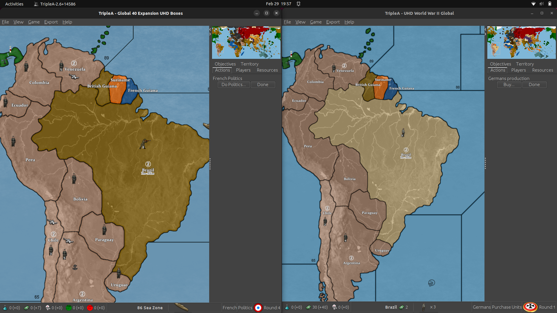
    Screenshot from 2024-02-29 19-57-50.png

    I don’t quite understand how to change it still. I’ll study on it some more and yea, would want to keep the clouds as is :)

    Anyway, hope i didn’t come across as a debbie downer lol heh heh yea i know we good :)

  • 2024 '22 '21 '19 '15 '14

    @barnee

    Here’s a quick example of how to do it. I made some silly names just to get the ball rolling. Basically you run the tilebreaker in map creator tools, then navigate to the downloaded maps folder to get at different color ocean blue. We could do a range, I sent you a few at scale just to get it in the ballpark. That one I did before was probably just one swatch off or something, cause I was eyeballin’ it. We can give em another pass once the poly’s all sorted.

    Just to show how it’d work though, these example baselines would give the following displays in-game…

    baseline_uhd_global_1940_new_3-1-24_parchment.png

    parchment.png

    baseline_uhd_global_1940_new_3-1-24_harbour.png

    harbour.png

    baseline_uhd_global_1940_new_3-1-24_midnight.png

    midnight.png

    baseline_uhd_global_1940_new_3-1-24_cobalt.png

    cobalt.png

    ultra.png

    global quick screen base blue ultra reduced.png

    baseline_uhd_global_1940_new_3-1-24_frosty.png

    frosty.png

    We can do the pick 6 on whatever, just gives peeps a guidepost. Then the default whatever you like best, and we can just tune it that way. Anyone can go to town in the map props for the land colors, or like for blends. Easy to make a new base cause the filesize is low and it’s only a single color adjustment. Let me know if that seems good. Catch ya next out

    ps. oh and one last, this is a relief that can be used to create a more simple style or to fill with patterns. In this one I combined the harbour blue base with the topo underlayer eliminated and replaced with just a simple blur and like 35% opacity off a neutral gray. You can see how it can be used this way for a different vibe, like a callback to the more oldschool triplea, just for something easy to work with. The filesize on that one is about 30 mb, not sure if you want to toss it in the mix too. Just depends how large you want the folder to be.

    https://www.dropbox.com/scl/fi/k7leffuylzelem9zkcmde/relief_uhd_global_1940_3-1-24_sunday.png?rlkey=4ng24cihcdw3b5lfw9rldgutp&dl=0

    sunday.png


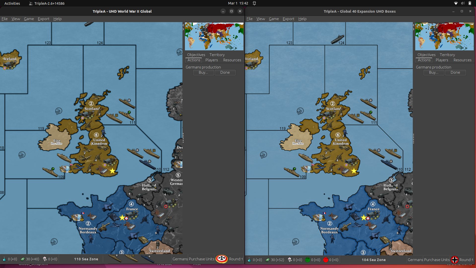
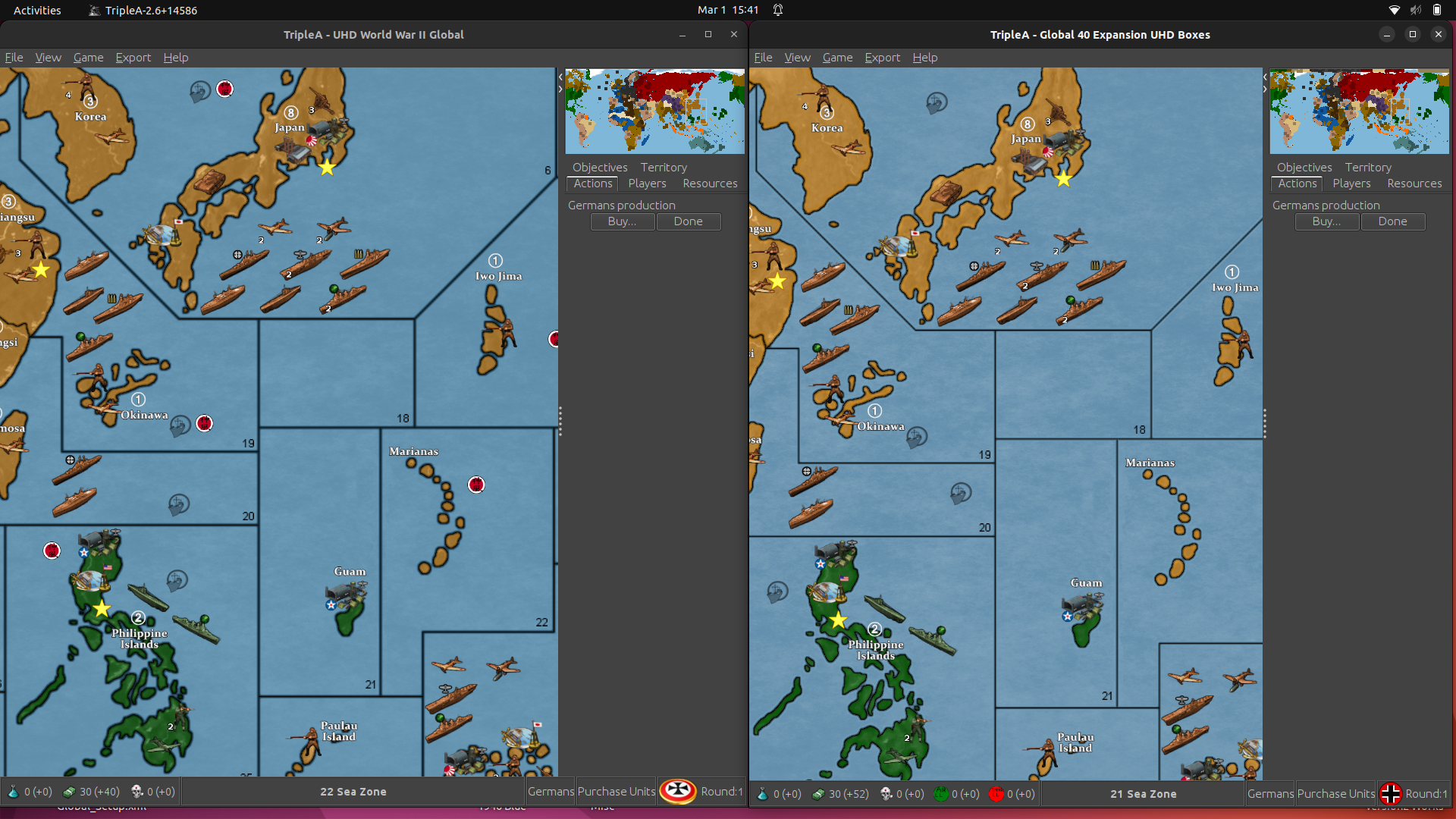
  • @Black_Elk This is using “baseline_uhd_global_1940_new_3-1-24_ultra” and “relief_uhd_global_1940_new_3-1-24_ultra”

    Screenshot from 2024-03-01 15-42-37.png

    Screenshot from 2024-03-01 15-41-15.png

    It just seems the new one isn’t quite as sharp or clear to me. The SZ borders seem thicker.

    Anyway, I’ll finish checking place and upgrade Notes than load to git and you can check out.

    We’ll roll with what you think is best obviously :) It’s your Creation :)

    Should be up in a couple hours


  • Yeah something is going wonky there. I’ll need to dig under the hood and see which step I missed. Probably was off by a pixel with expanding the selection, or it went rogue when applying the blur across the transparency layer. The undertopo needs sharpening or brightening or an opacity tweak too. I had made some notes on it before, but I must have made some sort of last minute adjustment on the older one that I need to reverse engineer now. Probably better to kick the can on it for a few till I can get it figured. If you got the polys already handled, just hang onto it as a WIP. We can table it for now and sort it things out once I figure out to replicate that border fade using the different method.

  • 2024 '22 '21 '19 '15 '14

    OK dude here ya go. This relief just has your preferred blue drawn directly into the relief again. It should work with the new divisions in the WIP. If you use the HEXs from before, should be pretty close to identical.

    Here is the relief to put through the tilebreaker…

    https://www.dropbox.com/scl/fi/dqn2colbi23vxq9ond2q1/relief_uhd_global_1940_3-1-24_new.png?rlkey=5xr07f1jdj04ocsx3vpa4nv75&dl=0

    Here’s an opacity mod on it I think may be closer. Hopefully we can just figure out a way to adjust it or via HEX to get to the same kinda read.

    https://www.dropbox.com/scl/fi/7002d162ciqpzvovqkpwi/relief_uhd_global_1940_3-1-24_new_opacity99.png?rlkey=43pe710ba58el2t4jgvjy1dzb&dl=0

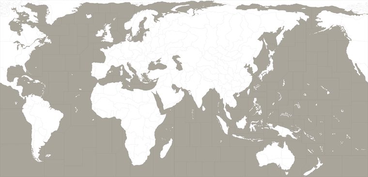
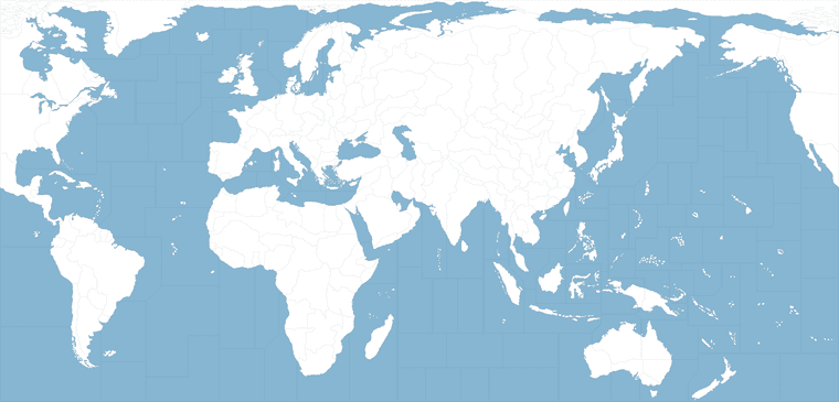
    Here is the base to use with it… it’s just the older ocean color, but with the new lines.

    https://www.dropbox.com/scl/fi/vyba3xnfwt9j8afnj1urs/baseline_uhd_global_1940_new_3-1-24_ultra_new.png?rlkey=oujicuugecauskaqyqsaai0ie&dl=0

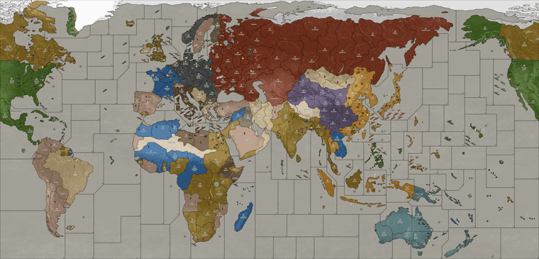
    Run those both through the breaker (with the old HEX colors in the map.props) and you should get something that looks like this… The high vibrancy version. Here’s a preview of what I am seeing and then reduced to 25% to display here on the boards. It just needs your reassigned polys and place to match, the preview shows the areas that got the adjustment, fairly minor tweaks, but hopefully a little easier on the quick glance.

    global quick view reduced.png

    I tried to spec it the way you wanted (I think I understand what you were after now, not the sharpness/blur of the tile interiors, but simply the color of the borderline around the sz divisions.)

    The reason it looked the way it did before was a 1px gap in the sz boundaries, which allowed the color of the base to show through completely. If the ocean was darker that line would go darker, and so the visual impression was an increased thickness of the line.

    The issue with the ocean is that it’s not a single blue, cause I added those clouds effects. Instead of a single blue we have a couple dozen blues scattered across all those pixels that all come together to form a more impressionistic blue. Basically it’s just a value change on the colors that make of the cloudiness happen. The problem is that if I take that stuff from 100% opacity to anything else (in order for the end user to control the blue by having it show through from the base) this will change the color on the sz borderline and give it a glow. Either that or it will just change the overall impression of the color once it’s passing through the cloudy visual effect. I had a hell of a time trying to recreate this, because it was achieved just randomly off the cuff for the one you liked most hehe.

    If one wanted to change the national HEX colors, the overall visual impression of the map will key off the choice of blue, because it’s the dominant color on the map and on the screen. It’s the key choice for the overall vibe of the map. To change that as an end-user would have to isolate that portion of the relief and color change there directly. I think it would be ideal to handle this via the baseline because it’s easier to manipulate for the end user, but then the user is likely to get a slightly different border glow or perhaps a slightly thicker line on the sz boundaries doing it that way. Just cause of how the blur applies when that portion of the map is transparent instead of fully opaque. In short, the lines appear thinner here because the blue on that 1px gap around the sz boundaries is a lighter/more muted blue. The other stuff, I just got confused what you meant by sharpness, I thought you meant sharp like the opposite of blur. But you just meant the sz lines right?

    Anyhow, let me know if that make sense. I think if making adjustments to the baseline for the TT shapes instead of me just hacking the old relief like I had been doing, we’ll build it out again from the elements. The relief I think would come in right around 50 mb. You can just keep it in the WIP till I can figure out what’s what on that last step that to get the color to match, and roll with the earlier iteration till then. I’ll try to get it sorted when I got a weekend free. Catch ya next out


  • @Black_Elk Sweet ! Just looking at the picture and it looks real close. I’ll run everything through the map creator and see where were at.

    Good work Brother !

  • 2024 '23 '22 '21 '20 '19 '18

    @Black_Elk

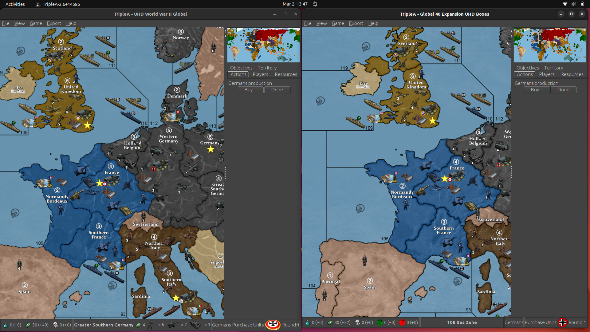
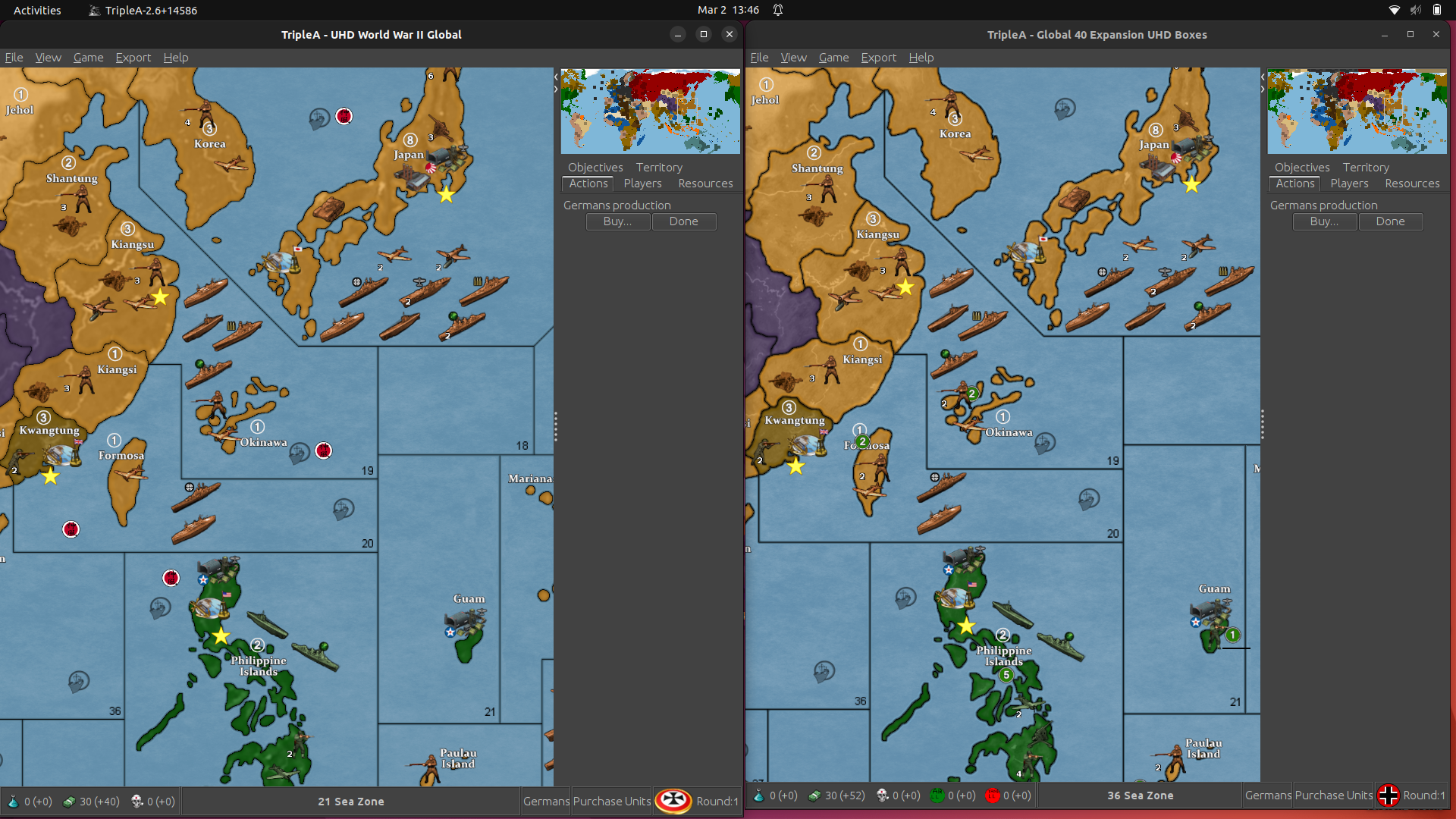
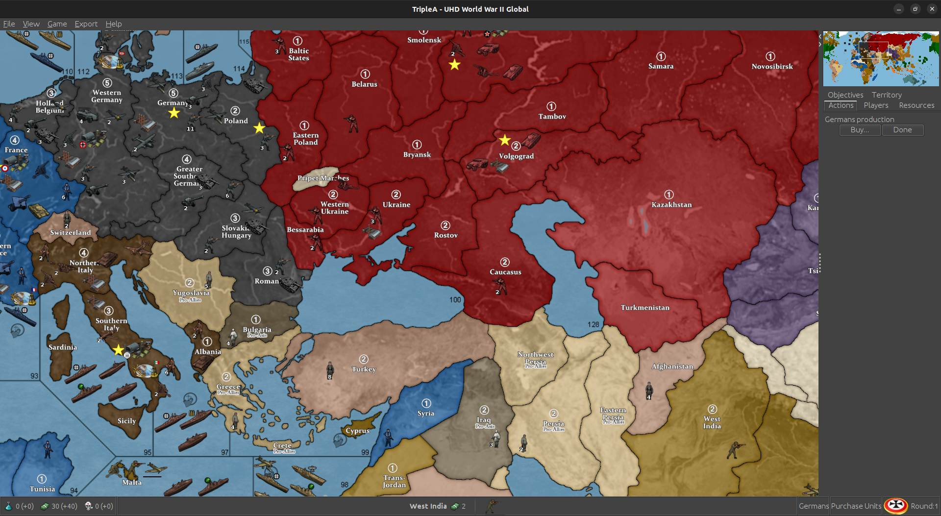
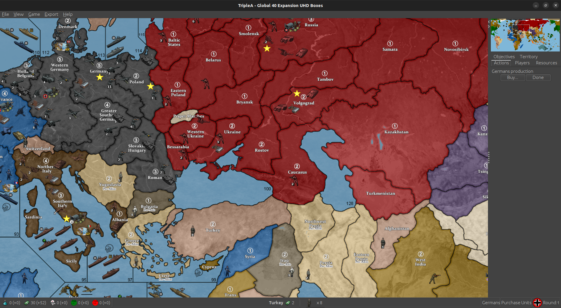
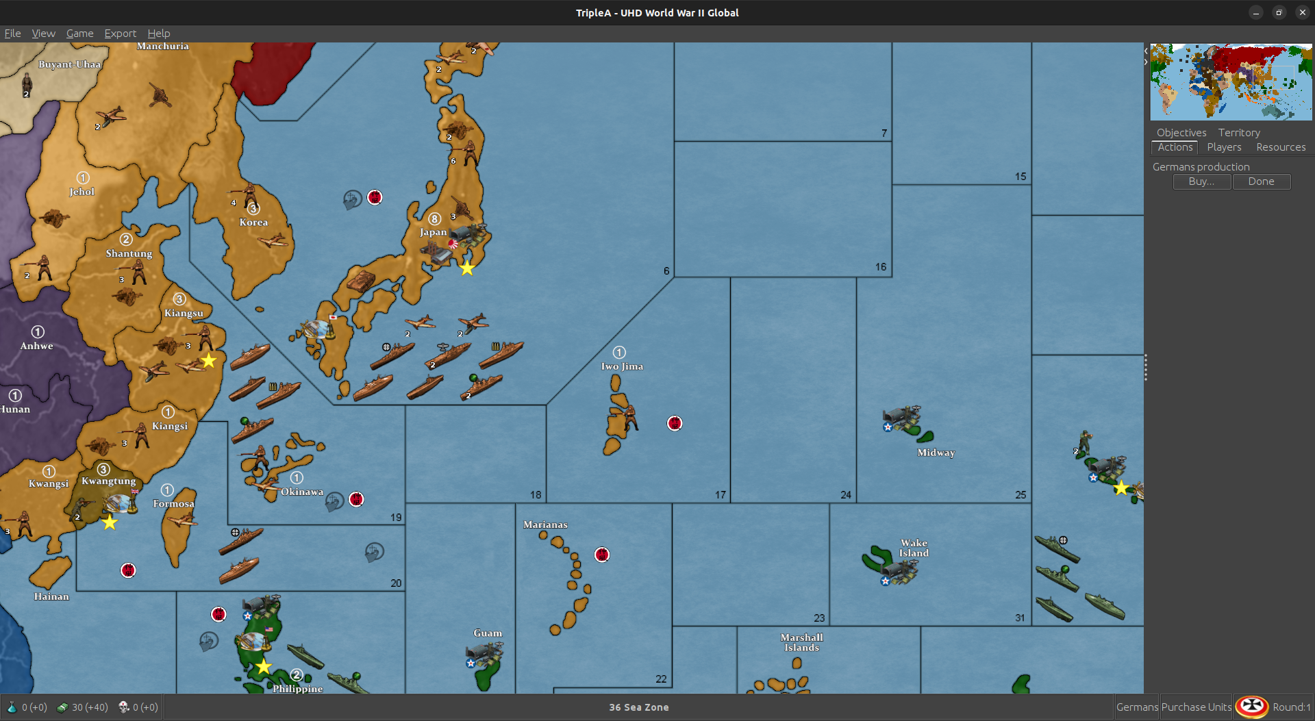
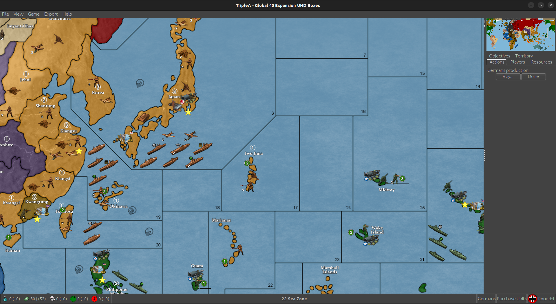
    H Yea !!! 99% fer sure lol New is on left.

    Screenshot from 2024-03-02 13-47-17.png

    Screenshot from 2024-03-02 13-46-29.png

    New
    Screenshot from 2024-03-02 13-52-38.png

    Box
    Screenshot from 2024-03-02 13-53-21.png

    New
    Screenshot from 2024-03-02 13-50-28.png

    Box
    Screenshot from 2024-03-02 13-51-02.png

    I guess I’d be tempted to just roll with it. I’ve been staring at it every day for a year and a half, so i can notice slight differences lol

    But if you never even seen it before, it’ll be as Thanos said " doesn’t matter because they won’t know you ever existed" lol

    It’s a matter of personal preference anyway. You’re not gonna please everyone. I did link in Notes how to change the colors.

    Well, I’ll hold off for now in case you get a brain storm for the last 1% lol I went back through emails but no go there.

    Well done :)

    Edit
    The shots don’t come across quite as clear here as they do in game either

  • 2024 '23 '22 '21 '20 '19 '18

    @Black_Elk

    yea we lost the blue for the canals

    Screenshot from 2024-03-02 17-31-50.png

    If you can paint that back in I’ll go ahead and upload to git.

    I really kinda like the blue in the canal :)


  • @barnee Right on!

    The upside of having the HEX colors for the national paint jobs showing through one shade darker (like they do in the opacity99 version I threw together) is that it made the Map blends feature works slightly better that way. In the regular display the lines hold all the way down to mapview 18% for me, with map blends turned on it’s closer to 30% and the lines have just a tiny bit of dance a little bit zooming out further, but nothing too major. The lines don’t break or disappear for example as sometimes would happen on Bungs. I never use map blends really, but I figured it made sense to try and find a fade that worked ok for both. If using the regular view or the map blends view players can of course, also reassign their HEX colors to be darker via Map Props as an end-user. The limiting factors for customized aesthetic would be the unit tints and the ocean color right now, but otherwise it should be pretty adaptive, and if someone really wants to go under the hood and change the colors, we can always create a simplified relief for color mixing and stick it in the backup folder somewhere on the repro. We used to have a simpler method for map skins, but it still basically works, provided the end-user knows how to use the tilebreaker utility. Otherwise the most important thing for me was just that the border lines would hold (not break or disappear) when zooming in/out in the Mapview, at least for the normal play range at like 50-80% mapview, cause the rest would be like personal preference and modular via map.props.

    For the assignment of cosmetic tiles, you can approach this in whatever way makes sense. There are a few choices one could make there. For example in the Western Hemisphere, I had most stuff just coming under USA aegis, but one could assign the false tiles for say Jamaica or Falklands etc to nearby British tiles instead of USA tiles. Initially I had them not crossing SZ boundaries, but it doesn’t really matter, provided the tile is not labelled this should indicate that it is cosmetic, and if you cursor over that sort of tile the territory tab will show what’s going on there. Just be mindful if reassigning the Polys on the tiny extra islands, that you’re not introducing actual connections to the false tiles. Also if you switch an assignment, say you want Jamaica or Falklands to paint over from a nearby Brit tile instead of USA, you may need to go back and re-polgrab a few other things, so they continue to paint in properly. Otherwise they’ll show white/unassigned, like what happened for you with N. Sakhalin earlier. If doing it that way you could also assign a TT like the Yemen/Kuwait one to say Transjordan instead of East Persia, since I only did it that way to avoid having to cross a sz boundary too. I would just use your Bermuda shorthand on it, and treat them all the same way you treated that one for consistency. The USA aegis is a little weird, cause the game starts in 1940, but by 1941 some stuff makes more sense, stuff like this https://en.m.wikipedia.org/wiki/Bermuda_Base_Command but you’re going to have some inconsistencies just coming from the abstract timeline. Also just to note that I assigned Sierra Leone to Britain as a starting TT rather than a true neutral TT. I don’t know if that one ever made it into the errata. You might have to make a shotcall there, as I still haven’t seen the latest g40 reprint. Should be mostly just noodling.

    I’ll update your relief with the canals just to give you that hint of blue back. Give me a couple minutes I’ll just update the dropbox link. Let me know if it hums hehe

    and have fun!


  • @Black_Elk

    Nice :) Yea Sierra Leone is UK by default. Bermuda and now Falklands are there own TTys under UK ownership. They just don’t connect to anything. I guess I could do that for yemen too. Idk if it’s that big of deal as it’ll get activated sooner or later.

    Yea, idk, I think the yanks got a buncha 99 year leases from the brits in the carribean, so changes it up. But don’t think I’ll dick with anymore changes.

    I guess the only thing missing is Yukon, but since Larry made it impassable in 2nd edition, it doesn’t change anything. A person can always hack off a chunk of BC and create it if they want :)

  • 2024 '22 '21 '19 '15 '14

    @barnee sounds good! We can always revisit that stuff for the finer toothed comb, once we’re on the same page again. I have so many random maps on my hard drive or that dropbox that it’s tricky to keep em sorted hehe. For extraneous materials those could probably get moved to a separate WIP type folder that just houses the elements. So basically we could have a little grab bag on it, called Global Customizer or something along those lines.

    Good stuff to include there might be Unit flips, the baselline blues, and the relief at 100% opacity and the topo in color, then maybe some alternative HEX color options that key off things like map blends, or just a simplified design that’s easier for stuff like mods. If the end user wants to go under the hood and break out the paint they can cruise around in the Customizer version of the map and have more toys to play with. For the more standard package could probably reduce the filesize a fair bit that way. I’ll think of how to organize it, then maybe just put some quick steps in the notes. Ideally it would function the way veq approached the pact of steel2 folder, except that it would be more oriented on map display stuff (with options laid out on that) rather than the gameplay/xml type stuff. Or it could work that way for gameplay stuff too I suppose, just that I don’t know how to do any of that. Making the map more modular would be a good for an endgame goal on this for me, cause tripleA just doesn’t have anything quite like that really.

    For example the same materials could be used for other standard projections, or border divisions. In principle you could have several ww2 themed games, with options to make the relief stuff look different from the same sorts of elements. Short of having color change or the mapskin stuff it-built in to tripleA from a dropdown tab as like a quick palette or hotkey, this still seems workable. Or at least having a customizer folder would give peeps a place to start with it. I regard tripleA as more of a map tool or gameplay aid, but also it’s basically a kit bashing box like with some riffs to cover some different bases. I tend to just really enjoy something that recalls 99 and Iron Blitz in the nostalgia vibe apparently lol. Probably with too much pop for some tastes, but then if the end user can adjust it’s pretty cool hehe. Like if we got some ways to let people go different directions with it that’d be cool, especially for stuff like colorblindness too, or ways to adjust contrast, which is sorta what map blends would do. Anyhow, all that stuff I’d think could be in a map makers WIP type folder, and then the standard thing could be a bit more streamlined, and easier to parse maybe.

    Off to watch some Shogun, but let me know if ya hit any snags.

    Catch ya next round!


  • @Black_Elk right on

    Yea could move some stuff to a WIP folder outside of map so it wouldn’t clutter map as much. It’d still be part of the overall dl though. Or maybe I could link to a secondary git repo and keep the extra stuff there. Idk

    Anyway, we’ll get this up and running after the hockey game and see how it rolls :)

  • 2024 '23 '22 '21 '20 '19 '18

    Update to Version 2.92

    Change Log

    UHD: 2.92
    3-3-24
    Correct Starting German Infantry Total in Germany for Oztea 1941.
    Some Land Border Adjustments and Place Changes.
    Make Falklands British.

    May be downloaded in triplea 2.5 under Experimental or in 2.6 Alphabetically

  • 2024 '23 '22 '21 '20 '19 '18

    Update to Version 2.93

    Change Log UHD:

    2.93
    3-3-24
    Add Blue to Canals.

    May be downloaded in triplea 2.5 under Experimental or in 2.6 Alphabetically

  • 2024 '22 '21 '19 '15 '14

    Looks good! I was able to grab it in 2.6 with the image too, which was nice! This will be way more convenient for me.

    I think what’s in there looks pretty solid, this way I can just send you the relief image at 100% opacity for safekeeping (that would be the one that the end user can tweak if making adjustments to the base) or whatever random other stuff. I may make a rail pattern for it following Bung’s convention if I get the motivation/time, or any other unit graphics type stuff. But we can put that together later somewhere down the line.

    To recreate a new relief from the baseline map I tried to keep it pretty much to the steps in the guide. Basically you’d expand the base (black line) by however many desired pixels say 3-5px lines fill with 100% black and then apply some blur to that selection to soften the boundary area. To create the color pop you do the same thing except instead of painting a fuzzy line on top, you remove that section of the relief undertopo (delete it from the layer that it’s 100% transparent on the relief, no topography) little blur the same way. This will create an opening where the HEX color shows through at 100%. That is the visual effect going on anyway. When you take those 3 layers and collapse them together you can use a color or opacity tweak to the whole image to create different presentations. ’

    Default is high vibrancy just to try and set a ceiling there, meaning I wouldn’t go too much brighter than that on color saturation (cause much more would hurt my eyes after viewing for longer than say an hour) instead I’d go down from there and just control like the HUE or Value (brightness/darkness) of the color on the map instead of cranking the saturation any higher. This is so you can kinda control the unit tints too if ever you need to, because you can just match the Saturation and slide the swatches for hue when you go to use GIMP for retints. Map blends would have the unit tints doing something similar say passing through 50% white to knock them and make more muted. When choosing HEX colors for map blends just add 50% white to the swatch, and you can rematch the colors that way. Controlling ocean color can be done via the Baseline. So least a little bit more modular that way. Main thing goal was just to get something a little larger for larger displays and to get the lines holding together at those further zoom outs which should work now. I’ve been playing it at 1440 and 1600p just to see how it holds up and I can go down to the 20% zoom out which is nice. For font scaling it’s a little rougher cause the tripleA UI looks better at 1080p but I tried it without font upscaling in windows still looked pretty decent.

    In April it’ll be 12 years since this one which still holds up for general purpose play, I just thought it’d be cool to try for something a little larger at 54px since displays are scaling going up. But you can make it look pretty much the same I think, with a little mix and match.
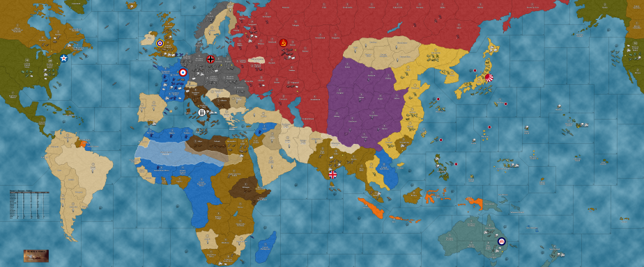
    159671_TripleA_world_war_2_global_1940_alpha_smallest.png

    Anyhow, tapping out for a few! Shogun is back on hehe

    Catch ya next round and have fun!

    ps. In order to make your poly assignments consistent, I would suggest that if you make Bermuda British, then you should do this as well for the other Caribbean possessions. Jamaica, Bahamas, and the British Virgin Islands down to Trinidad. Br. Honduras is of course not shown as a separate tile (I removed it when collapsing the GCD TTs, you can still see the shape there hooking up into the Yucatan), but for the stuff that is there, I’d just try to do them all the same way. Otherwise the question immediately arises, ‘why here, but not there?’ hehe. When it was all folded under USA aegis the 1940-41 abstraction glosses over this, but to keep stuff in line with the other areas of the gameboard now, that’s what I’d suggest. Like probably just attaching that stuff to the nearest actual game-tile, say Br. Guiana or whatever, just with no actual connections.

    Here is the current presentation that I grabbed from the mapdownloads…
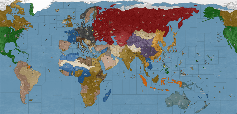
    quickie.png

    Comparing that with what is shown here in red… (1939), you can see which polys should get the cosmetic adjustments for the HEX paintjob on that part of the board…

    https://en.m.wikipedia.org/wiki/File:British_Empire_and_Commonwealth_1939.xcf

  • 2024 '23 '22 '21 '20 '19 '18

    WC is smiling

    Screenshot from 2024-03-20 15-46-41.png

    Well he’s a little bummed about cairo but heh, overall, he’s good with that lol


  • So pretty!
    Of course it took several rounds to get past the “why am I playing this against a strong player in competition that counts in the records forever” but
    I’m only about halfway through the first game and I’m getting pretty used to it.

    TRY IT! And don’t give up easily


  • @gamerman01

    It grows on a guy :)


  • That just totally made my day!!!

    Have a blast out there!

Suggested Topics

Axis & Allies Boardgaming Custom Painted Miniatures

190

Online

17.4k

Users

40.0k

Topics

1.7m

Posts