@panther right on . I’m glad it’s working ok for others. The switch from firefox to Brave and the ubuntu update only thing I can think of that changed on my end.
Thanks again for all that you do :grin: :+1:
Nice :) Yea Sierra Leone is UK by default. Bermuda and now Falklands are there own TTys under UK ownership. They just don’t connect to anything. I guess I could do that for yemen too. Idk if it’s that big of deal as it’ll get activated sooner or later.
Yea, idk, I think the yanks got a buncha 99 year leases from the brits in the carribean, so changes it up. But don’t think I’ll dick with anymore changes.
I guess the only thing missing is Yukon, but since Larry made it impassable in 2nd edition, it doesn’t change anything. A person can always hack off a chunk of BC and create it if they want :)
@barnee sounds good! We can always revisit that stuff for the finer toothed comb, once we’re on the same page again. I have so many random maps on my hard drive or that dropbox that it’s tricky to keep em sorted hehe. For extraneous materials those could probably get moved to a separate WIP type folder that just houses the elements. So basically we could have a little grab bag on it, called Global Customizer or something along those lines.
Good stuff to include there might be Unit flips, the baselline blues, and the relief at 100% opacity and the topo in color, then maybe some alternative HEX color options that key off things like map blends, or just a simplified design that’s easier for stuff like mods. If the end user wants to go under the hood and break out the paint they can cruise around in the Customizer version of the map and have more toys to play with. For the more standard package could probably reduce the filesize a fair bit that way. I’ll think of how to organize it, then maybe just put some quick steps in the notes. Ideally it would function the way veq approached the pact of steel2 folder, except that it would be more oriented on map display stuff (with options laid out on that) rather than the gameplay/xml type stuff. Or it could work that way for gameplay stuff too I suppose, just that I don’t know how to do any of that. Making the map more modular would be a good for an endgame goal on this for me, cause tripleA just doesn’t have anything quite like that really.
For example the same materials could be used for other standard projections, or border divisions. In principle you could have several ww2 themed games, with options to make the relief stuff look different from the same sorts of elements. Short of having color change or the mapskin stuff it-built in to tripleA from a dropdown tab as like a quick palette or hotkey, this still seems workable. Or at least having a customizer folder would give peeps a place to start with it. I regard tripleA as more of a map tool or gameplay aid, but also it’s basically a kit bashing box like with some riffs to cover some different bases. I tend to just really enjoy something that recalls 99 and Iron Blitz in the nostalgia vibe apparently lol. Probably with too much pop for some tastes, but then if the end user can adjust it’s pretty cool hehe. Like if we got some ways to let people go different directions with it that’d be cool, especially for stuff like colorblindness too, or ways to adjust contrast, which is sorta what map blends would do. Anyhow, all that stuff I’d think could be in a map makers WIP type folder, and then the standard thing could be a bit more streamlined, and easier to parse maybe.
Off to watch some Shogun, but let me know if ya hit any snags.
Catch ya next round!
@Black_Elk right on
Yea could move some stuff to a WIP folder outside of map so it wouldn’t clutter map as much. It’d still be part of the overall dl though. Or maybe I could link to a secondary git repo and keep the extra stuff there. Idk
Anyway, we’ll get this up and running after the hockey game and see how it rolls :)
Update to Version 2.92
Change Log
UHD: 2.92
3-3-24
Correct Starting German Infantry Total in Germany for Oztea 1941.
Some Land Border Adjustments and Place Changes.
Make Falklands British.
May be downloaded in triplea 2.5 under Experimental or in 2.6 Alphabetically
Update to Version 2.93
Change Log UHD:
2.93
3-3-24
Add Blue to Canals.
May be downloaded in triplea 2.5 under Experimental or in 2.6 Alphabetically
Looks good! I was able to grab it in 2.6 with the image too, which was nice! This will be way more convenient for me.
I think what’s in there looks pretty solid, this way I can just send you the relief image at 100% opacity for safekeeping (that would be the one that the end user can tweak if making adjustments to the base) or whatever random other stuff. I may make a rail pattern for it following Bung’s convention if I get the motivation/time, or any other unit graphics type stuff. But we can put that together later somewhere down the line.
To recreate a new relief from the baseline map I tried to keep it pretty much to the steps in the guide. Basically you’d expand the base (black line) by however many desired pixels say 3-5px lines fill with 100% black and then apply some blur to that selection to soften the boundary area. To create the color pop you do the same thing except instead of painting a fuzzy line on top, you remove that section of the relief undertopo (delete it from the layer that it’s 100% transparent on the relief, no topography) little blur the same way. This will create an opening where the HEX color shows through at 100%. That is the visual effect going on anyway. When you take those 3 layers and collapse them together you can use a color or opacity tweak to the whole image to create different presentations. ’
Default is high vibrancy just to try and set a ceiling there, meaning I wouldn’t go too much brighter than that on color saturation (cause much more would hurt my eyes after viewing for longer than say an hour) instead I’d go down from there and just control like the HUE or Value (brightness/darkness) of the color on the map instead of cranking the saturation any higher. This is so you can kinda control the unit tints too if ever you need to, because you can just match the Saturation and slide the swatches for hue when you go to use GIMP for retints. Map blends would have the unit tints doing something similar say passing through 50% white to knock them and make more muted. When choosing HEX colors for map blends just add 50% white to the swatch, and you can rematch the colors that way. Controlling ocean color can be done via the Baseline. So least a little bit more modular that way. Main thing goal was just to get something a little larger for larger displays and to get the lines holding together at those further zoom outs which should work now. I’ve been playing it at 1440 and 1600p just to see how it holds up and I can go down to the 20% zoom out which is nice. For font scaling it’s a little rougher cause the tripleA UI looks better at 1080p but I tried it without font upscaling in windows still looked pretty decent.
In April it’ll be 12 years since this one which still holds up for general purpose play, I just thought it’d be cool to try for something a little larger at 54px since displays are scaling going up. But you can make it look pretty much the same I think, with a little mix and match.
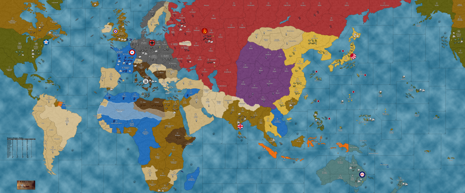
Anyhow, tapping out for a few! Shogun is back on hehe
Catch ya next round and have fun!
ps. In order to make your poly assignments consistent, I would suggest that if you make Bermuda British, then you should do this as well for the other Caribbean possessions. Jamaica, Bahamas, and the British Virgin Islands down to Trinidad. Br. Honduras is of course not shown as a separate tile (I removed it when collapsing the GCD TTs, you can still see the shape there hooking up into the Yucatan), but for the stuff that is there, I’d just try to do them all the same way. Otherwise the question immediately arises, ‘why here, but not there?’ hehe. When it was all folded under USA aegis the 1940-41 abstraction glosses over this, but to keep stuff in line with the other areas of the gameboard now, that’s what I’d suggest. Like probably just attaching that stuff to the nearest actual game-tile, say Br. Guiana or whatever, just with no actual connections.
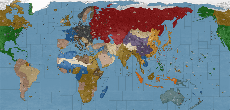
Here is the current presentation that I grabbed from the mapdownloads…
Comparing that with what is shown here in red… (1939), you can see which polys should get the cosmetic adjustments for the HEX paintjob on that part of the board…
https://en.m.wikipedia.org/wiki/File:British_Empire_and_Commonwealth_1939.xcf
WC is smiling
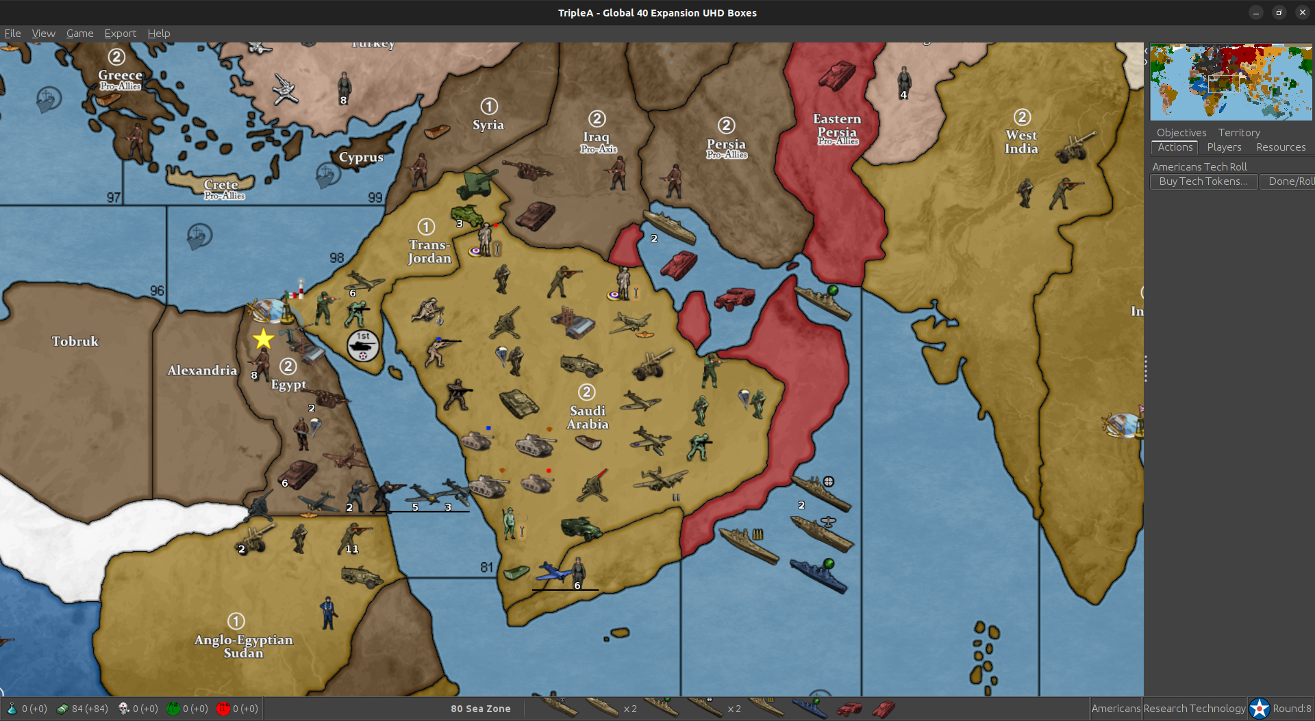
Well he’s a little bummed about cairo but heh, overall, he’s good with that lol
So pretty!
Of course it took several rounds to get past the “why am I playing this against a strong player in competition that counts in the records forever” but
I’m only about halfway through the first game and I’m getting pretty used to it.
TRY IT! And don’t give up easily
It grows on a guy :)
That just totally made my day!!!
Have a blast out there!
Update to Version 3.0
Change Log UHD:
3.0 3-23-24
Revert Bermuda to US Control.
Remove v3 Units.
Shrink Download Size.
DL instructions in 1st post.
Guys, I’ve been playing UHD, in my first game still, in round 7
Is this the right thread to post feedback?
On the UHD map, it definitely appears that Sikang borders Afghanistan but it certainly should not.
Thanks…
Struggling with Pacific sea zones but otherwise really like the map.
Yeah… From Borneo to the Solomons to the Marshalls to Okinawa - in that box I really struggle.
will ping @Black_Elk and take a look
Hope game going good :)
Edit
yep those Afghans and the chinese hooking up doesn’t look good.
Not really a game changer but good look out.
@Black_Elk Elkstar your talents are needed :)
Good catch!
I’ll fix it up over the weekend
I think that part of the board gets a little tricky just cause it’s where the two sides of the map meet OOB. Looking at the cardboard version, I think basically that portion of Afghanistan east of Kunduz with the little strip was sorta folded into the neighboring impassible tile there. I think we can just carve into the tip a little bit to remove the errant connection.
Yeah I agree the geometry for the Sea Zones in the Central Pacific can be a bit awkward in translation. I think I spent many many hours just looking at the board on my carpet, and then on the laptop to compare and see if I was managing the connections alright, and still had a bunch of stuff giving me the slip.
For OOB you got that situation where the naval sculpts are pretty large, so the sea zones need to be extra beefy to hold them all. I drew the landmap first for that other board, then collapsed a bunch of the boundaries to get back to the G40 playscale. Sea Zones were the last thing added. If I was going the other way, I could bend the land territories to fit the more familiar sea zone shapes, but I started with the warp for the continents first. Here I basically tried to preserve the contours of the land, and then bent the sea zones to match, if that makes sense.
It’s sorta hit or miss in some spots just because of the overall shape of the continents. Like if prepping for the tournaments there’d be an advantage to using Bung’s, just cause those sz shapes fit the OOB and the land is more abstract. To me it felt somehow more believable to keep the land territory shapes and those contours a little truer to reality and just adjust the abstract sea zone shapes where I had to. I mean there’s still hella distortion all over the place, but just that idea that I could try to make the shapes a bit more familiar in South Asia or Coastal China, or a bit less compression going on for Africa and such. But then where the horizontal lines strike into the coastal TTs, had to make some adjustments along the way. Part of it was just trying to get some of those lines to hit the right coastal territories, when the stretches weren’t quite as extreme.
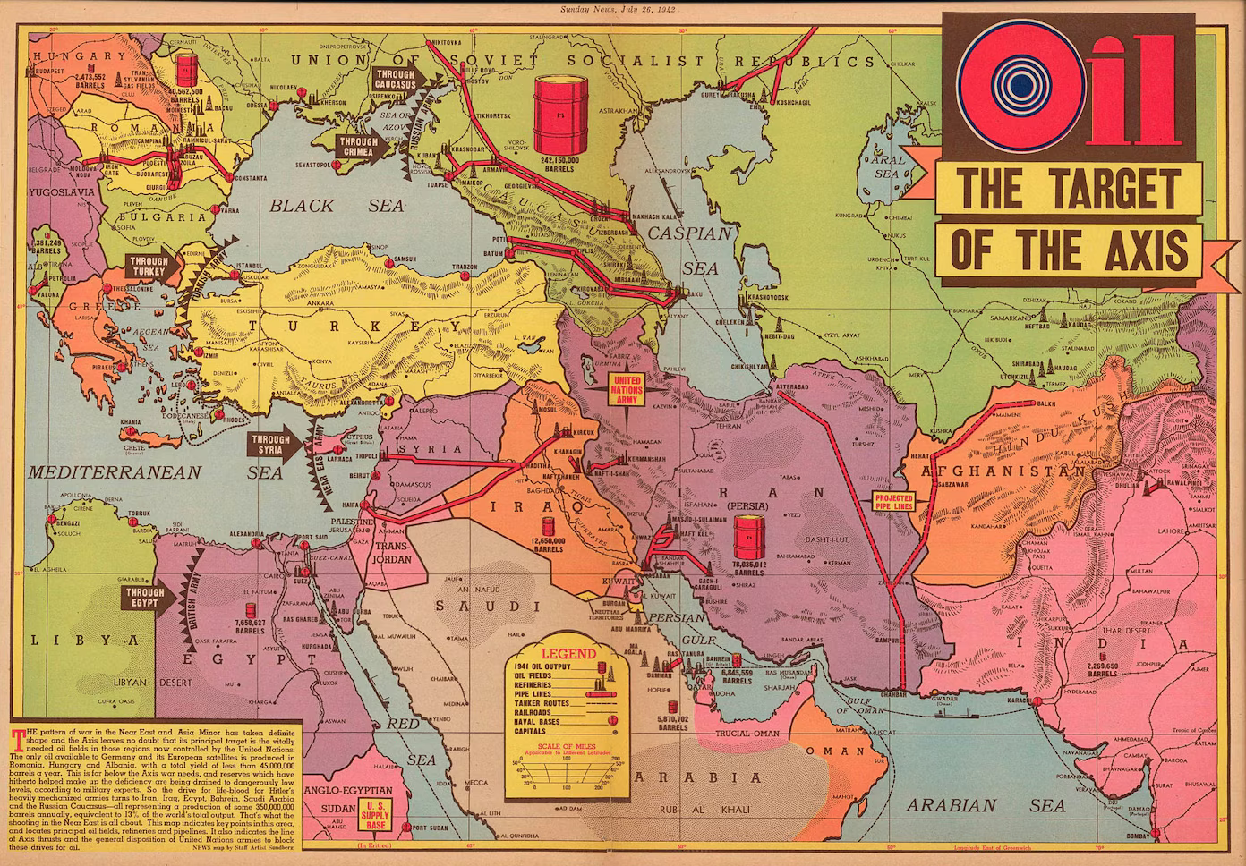
ps. I was looking at this image when I made it initially. Well not this image exactly, now for some reason I can only find that map on Etsy, or at one of those image clearing-house sites that seem to have scooped everything and put it behind a paywall in the past couple years. But anyway you can see off there to the righthand side the Wakhjir Pass that leads to China. Like since ancient times Silk road style, but it’s pretty tiny so I think OOB it just gets clipped or abstracted into the Mountains next door. Just a holdover from the larger map probably. We’ll nix it to avoid the confusion.
The sea zone Geometry is harder, just cause so much is already in place. If I had it to do again I’d probably rework the warp of the entire globe to make it a bit more G40 OOB-esque. I imagine the OOB may have been drawn by hand or using the warps and such, like in Photoshop to stretch and morph stuff. But because tripleA needs the baseline at 1px and 100% black it means retracing the entire thing to do a big warp change like that. Otherwise the lines will have interpolation applied and go fuzzy when using the transformation tools. Plus it would nix whatever is already going on with the coordinates in the polygons files or the place files. OOB is basically 2:1 aspect ratio, like where each theater board is a square. Here it’s more rectangular like with the whole thing targeting more 16:9-ish. That’s like before the compression for the Global south that you’d see on the OOB map, I just mean the overall dimensions. Also how North America is stitched in/re-sized. It means the horizontal lines will strike at different spots when trying to match the Sea Zone shapes exactly. Kinda tough, I wasn’t able to find an awesome solution, but I also didn’t really start with the G40 in mind, which made it unnecessarily complex there probably. Like if I’d just started from the G40 might have been easier to move a couple islands around or stretch Asia and North America to fit just so. Maybe for a 2.0 if I ever get around to it hehe
Here’s a quick edit that should be serviceable for now. Just needs a little touch up for the blur.
zip with the BaseTiles and ReliefTiles for the map folder
https://drive.google.com/file/d/1ZkhnF2Dzwx-9K2vUFWLqI-rE1WwDLafA/view?usp=sharing
Here is the txt file for the polys for the shift
Should look like this when you fire it up. I can clean the border fade a bit later. This was just to strong arm the line into place. I tried to leave a little bit on the Afghanistan side just to suggest the shape. Just like pretending the frontier there is sorta disputed. Makes sense hopefully.
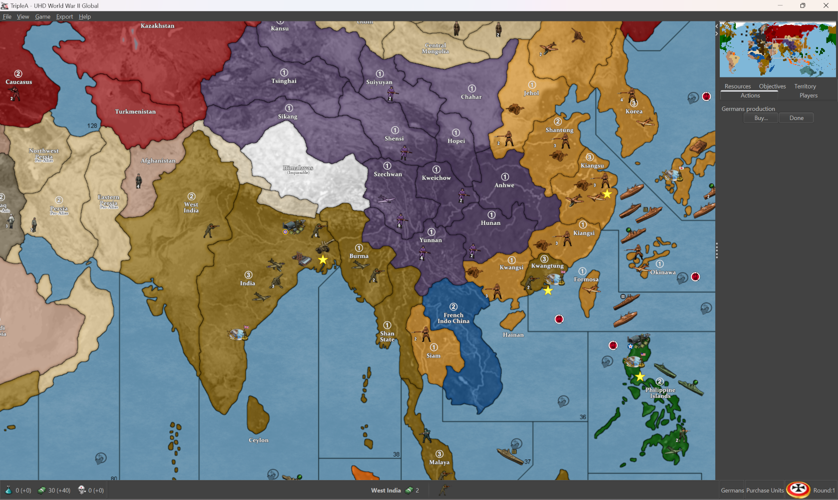
yay it looks like success :)
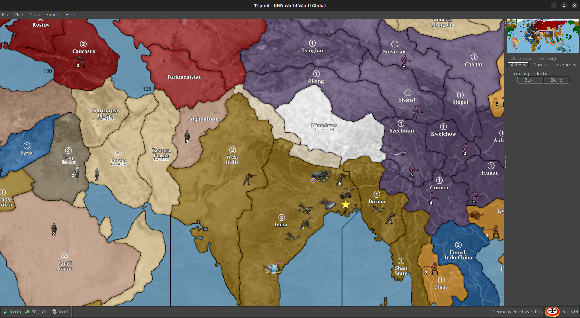
I barely struggled lol Well, not done yet. Still gotta upload to git :)
Update to 3.1
Change Log UHD:
3.1
8-3-24
Fix Afghanistan/Sikang Connection.
Here is the update for sz 64/65. Probably gave me the slip cause it’s harder to see the map wrap in GIMP. I just hacked in a couple lines, hopefully passes muster.
Looks like so
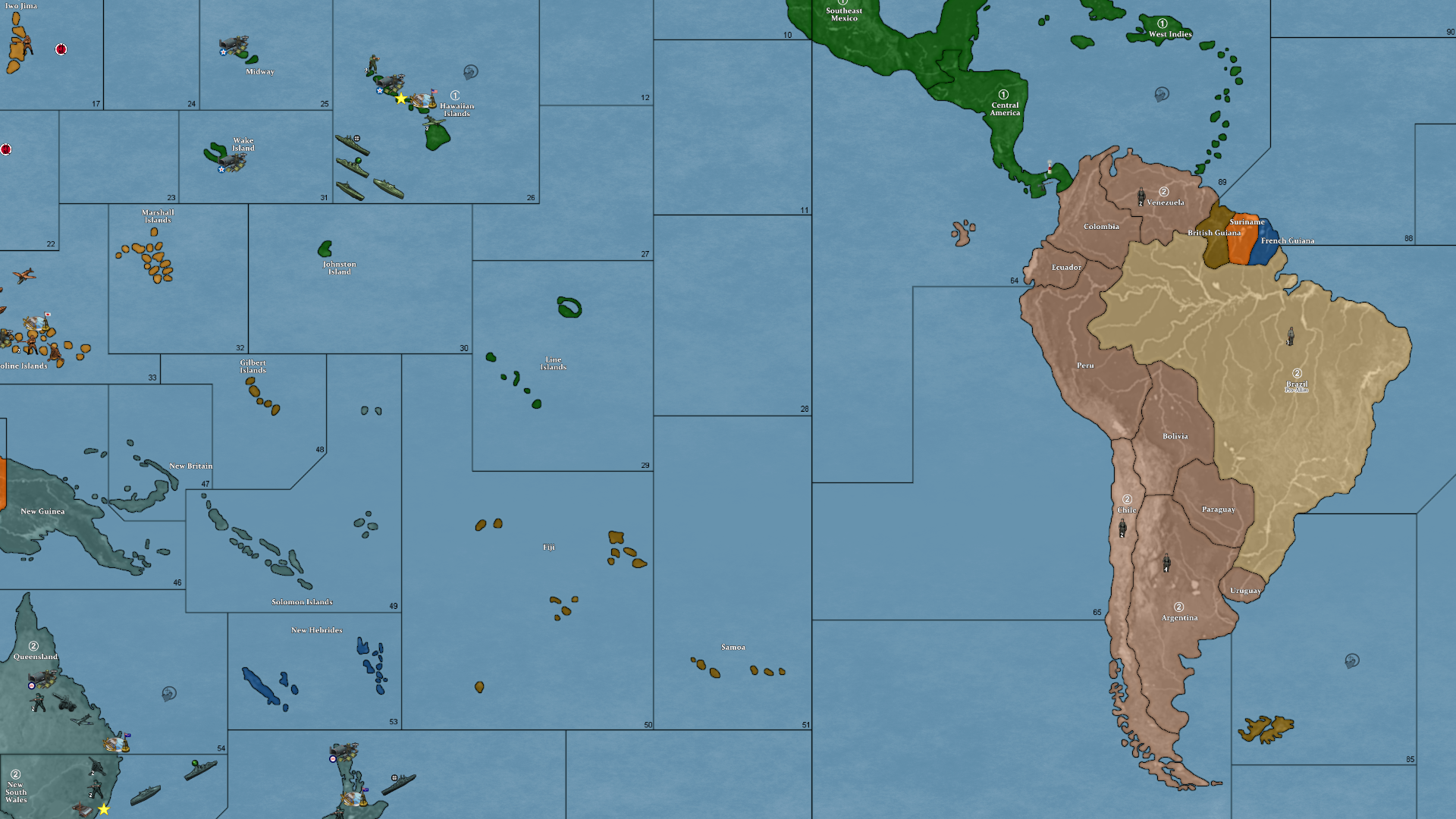
Here is a zip folder with a BaseTiles and ReliefTiles folders updated (already run through the tile breaker.)
https://drive.google.com/file/d/1nqernvZtD8MYOstgAblw8DDZ4Hrk4JLb/view?usp=sharing
Here are the Base and Relief as single images
Base
https://drive.google.com/file/d/134oogwEtlLW1kkHR_zvvXJCpDtUxiDzH/view?usp=sharing
Relief
https://drive.google.com/file/d/1zRi0q7AqTQrHfCikDEnW1aAw5J5QRe0Y/view?usp=sharing
Here is the Polygon txt attached below
Let me know if that works for ya. I’m pinballing around at the moment, but I can update the other boxes map/polys on Friday. Or you can just copy/paste that section over from the UHD if you need it before then.
Thanks again for helping me catch all these damned connection goofs lol. Hopefully we nailed em all! Good work gang
Just getting up to speed on this. Been glorifying the Niners all day lol
Victory finds another one. It’s gotta be the last one :)
Well, he definitly earned those boxes :)
I think between the two of us we can get Boxes to work. Actually Victory can probably knock it out on his own lol. He’s already better at it than I am :)
If we need help, we’ll send a SOS out to ElkStar :)
@VictoryFirst I’ll try and get UHD out tonight. Might need your help with Boxes, but I’ll take a crack at it too.
I can’t remember if you have access to UHD as well ? If you don’t and want it, let me know. Although, I think you can still drop PRs to the repo if you don’t.