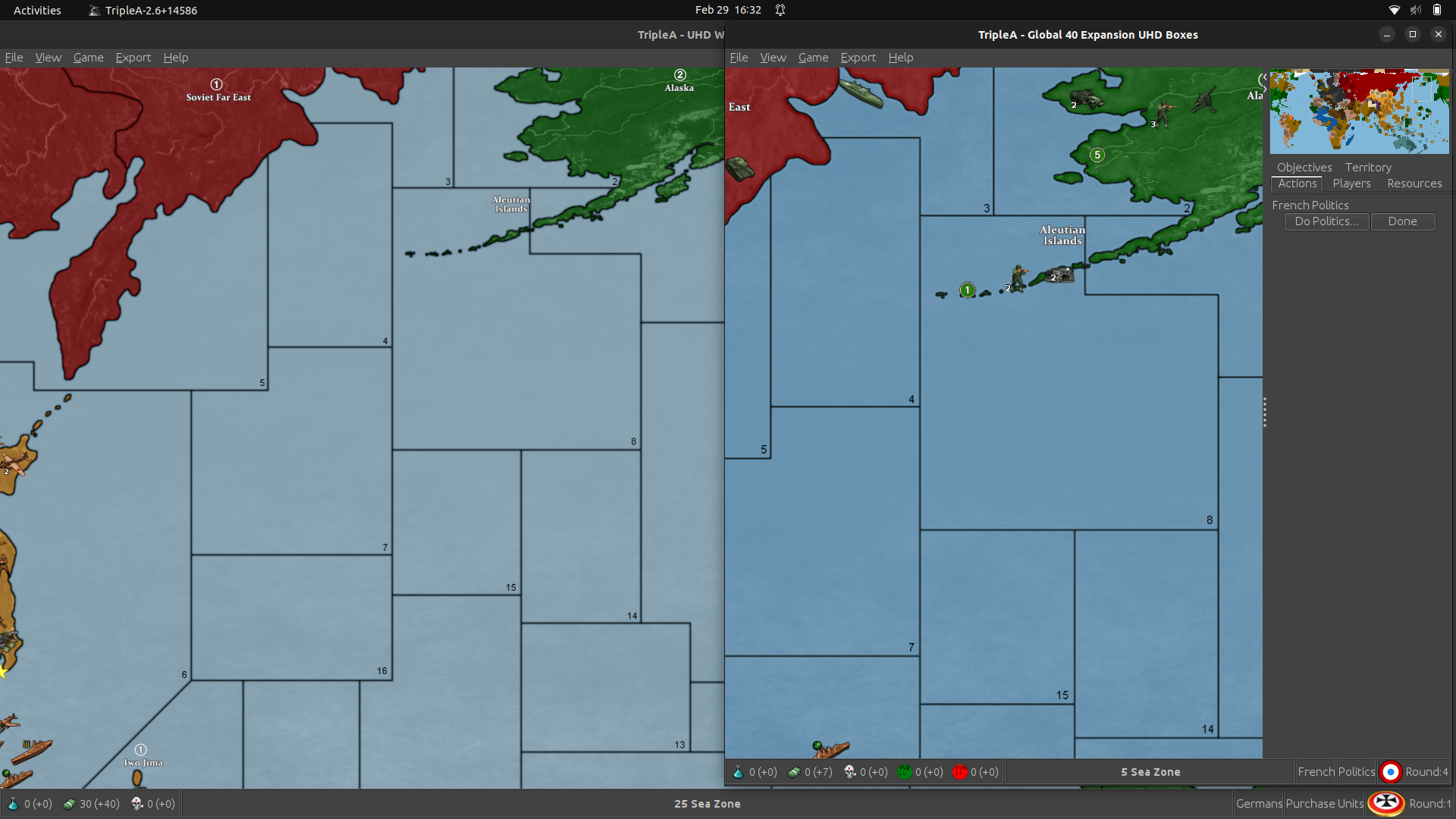
@barnee I am not able to recreate the bug anymore, I suppose it’s only the first time I loaded, the result above was done by your method, with the renamed folder instead of the zip file.
New TripleA Map UHD World War II Global
-
I’m in round 1 of my first game of UHD
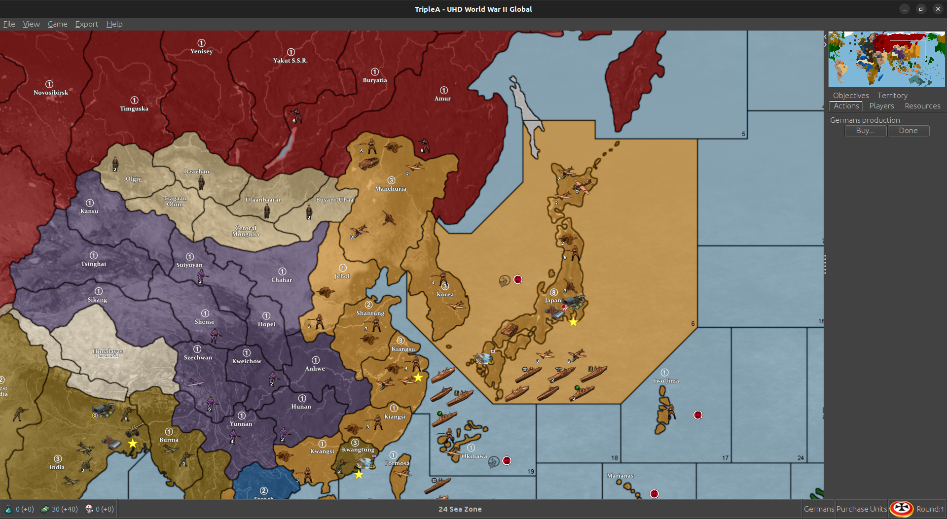
I notice UK airbases have RAF roundel for the flag, while all other? UK units have the Union Jack
Indian facilities have a variation of the Union Jack in the details (on the right - territory tab)
On India, the major complex has no flag, airbase has RAF roundel, and naval base has Union Jack
Syria border with Zone 98 is very small
Kuwait is drawn, looks cool but isn’t on G40 map. In Triple A is labeled East Persia so could be a problem
Just calling attention…
-
yeah I’m trying to recall if I have a second set of bases units somewhere without any markers. Initially I thought it might be cool to have the naval ensigns for the naval bases and the air roundels or the ABs. But then I thought that might be a bit busy/confusing, and there are some inconsistencies there, cause G’s roundel is invented with the red added in, Japan’s follows a different convention coming off the little cardboard markers too stuff of that sort. I decided to switch the flag roundels inside the DoW menus to follow Frostion’s scheme, but for the ABs left those, since I figured they’d be sorta familiar and recall some of the other maps like the v3.
The tricky part was that the way G40 in tripleA handles tech for bases is different than AA50, and there are damaged versions of each. For the ICs I think there are something like 30 graphics needed for each nation, which was kinda tedious so I ended up just going generic so it’d be easier for me to knock it out hehe. I tried to leave some space in case people want to remove/switch stuff around there, since the unit graphics is a little easier to tweak/substitute out, more than stuff drawn directly on the map relief. I think there might be a set in that one I did for the Dogs command decision map for alts. The handling of the UK pacific stuff is also a little weird, just cause of the way it’s coded, has some definite redundancy.
I agree some of those borders are bit of a stretch, probably needs another pass to clean it up some once we crush the bugs and make sure the connections are all sorted. It would have been a lot easier I think if I’d just started with the G40 instead of trying to redraft a different map I was making for this purpose hehe.
I wasn’t quite sure if the whole Kuwait/Trucial coast idea would actually work, as I was trying to find a way to make it look a little more accurate without upending too much stuff by just associating it with a neighboring territory. But then the way the tiles are labelled in tripleA G40 made that a little tough. I had already laid down the divisions there for the other map, so just kinda ported em over. I borrowed the idea from this video, where tiger mentioned it as a way to sneak in some missing TTs for the overall visual without necessarily needing to add new tiles. The thought being that by the end of the first turn it would likely come under the British aegis for the look.
https://www.youtube.com/watch?v=7K-wX1CUsw8
I thought the overall idea there was pretty novel, but not sure if I executed it in the most elegant way. For the other borders, probably would easiest just kinda blow it out a few more pixels for any of those spots that cut it a bit close. Mostly it was corrections to stretch a border that got tweaked when I was porting over the GCD stuff.
Anyhow cool feedback! Maybe I can shake off this BG3 obsession for a few weekends to doctor it up some, if there are players now. It’s been flying under the radar for a while now. Like I totally just pawned it off on barnee there, cause I knew I’d got all lazy stomping around in Faerun till the end of time haha.
Keep em coming! We’ll get it sorted one or another
Best Elk
-
@Black_Elk Do I need to play Baldur’s Gate 3?? My daughter talks about it.
I loved 1 years ago, do not like it on the playstation (controls)
Dove into 2 but only halfway because my inventory was full of stuff like +4 flame shields and there were just too many things going on for me! -
OK, this one should be easy.
I was trying to figure out where my German army went (I’m playing I1)
Germany territory starts with 1 infantry in UHD but is supposed to have 11. All else seems correct.Guess we don’t need a bid after all! ;)
I’ll just edit it for my game.
-
@gamerman01 I wish I could rock a controller, cause I find it a little more relaxing for the exploration, but then I’m a Y Axis invert, and for some reason couldn’t get that to work properly. On PC I was able to pull it off by going into the Big Picture settings. I’m a diehard BG1 nut, so of course I have a million thoughts on Larian’s approach and many critiques. In the end I made peace with it though, just because I think it’s doing a lot of heavy lifting to get the youngblood back into this stuff. Like I’m an ancient dinosaur, but I knocked around on twitch for a few, and discovered to my amazement that there are like a million kids playing a Baldur’s Gate game right now, and then it sweeps all the awards and such, so for that they get my love.
I hopped into the EA the second I learned about it, so they got like all my feedback there lol (you know I’m born rambler haha), but it was low key torture for some months just waiting on the new stuff to drop in Early Access. I think if I was going in blind right now, I might wait until they drop whatever Definitive Edition of the thing to iron out all the kinks, but yeah I had a grand old time. New fangled 5e not withstanding, it definitely scratched some kind of itch for me.
Larian boards can be rough though, I think they must be getting DOS’d just constantly cause I get a lot of gateway timeouts over there. As an alternative https://tavernrpg.com/ is pretty cool for a hangout. I believe Julius and the gang set it up back when the beamdog boards went down that one time, so some BG1/2 players over there and a fair bit of A&A crossover fandom which was cool.
I keep wishing A&A might somehow stage a similarly glorious comeback, but honestly I think we need to do way more work to appeal to women and girls before that happens. To me there’s nothing in the game itself or the WW2 theme that should make A&A a total boys club, even though we know toy soldiers have always been sorta marketed that way. The combat mechanics and such, these are all abstract and really fun to tease out, a definite A&A strong suit, so I think there’s no reason why it wouldn’t work. But when I compare the strides made in D&D, or stuff like Dragon Age to bring that demographic into the fold, then I look at A&A and of course we’re all greybeards lol. I swear, there’s gotta be a way, like even small steps, down to things like the game manual and the art. Who knows maybe it starts with the daughters and the dads! And Becca Scott and just kinda attending to that idea a little bit more, so we don’t get left in the lurch sans half the population. More stuff like this for a start, they had the right idea in 2019, but just keeping with that and trying to chip away at some of the barriers to entry on that front.
Oh right on! Have a blast! Catch you guys next round
-
Certifiably hard core, you are
Respect -
Sorry for not making a list, I’d rather post 'em as I see 'em
Border of France to North Italy is really small…
-
@gamerman01 yea the Wehrmacht looking a little light lol I’ll go through the entire setup in case there are any others. Not sure how that happened :)
-
@barnee Rest is mostly likely good because I proved the TUV’s compared to map we’ve had
-
@gamerman01 right on Good call on the TUV check. I’ll bust out a update
-
Update to Version 2.91
Version 2.91
Change Log UHD:
2.91
1-31-24
Correct Starting German Infantry Total in Germany.Download Instructions in First Post.
-
Sorry if you don’t want piecemeal…
I’m on G3 and I see it’s really easy to miss Vyborg/115 boundary.
-
Sounds good! Piecemeal is cool - I made a quick list from the suggestions. Good lookin’ out. I think it makes sense too, especially if zooming out all the way. Display for mine caps out at 18%. I was mostly somewhere between 50% and 80% trying to kinda eyeball, but some of those skinners got kinda skinny there with the stretch. I also get some hot fuzz if I zoom in past like 120% or thereabouts, I can’t imagine ever needing to go that big unless someone had like giant flatty screen or a projector or something. I kinda wish I’d done the base at 16000px cause that would have been nice if unit upscaling past 125% ever got sorted, but I think would take forever at this point to draw that again at 1px, so probably just gotta keep rocking with this one. Hopefully I can run through the base and widen things up a little for those tight spots. It’s already pretty distorted anyway, so just kinda noodlin’ the last mile for an ok read at a glance seems sensible. Then maybe another pass on the units or something if I can rally. Or someone swoops the torch on that hehe. Catch ya next round dude!
-
Great, thanks for the reply, I’m relieved because I don’t want to sound critical or complaining. Especially when someone made a work of art, putting lots of hours into it.
Is all meant in the spirit of constructive criticism. I’m trying to only bring up things I think are significant -
Happy gaming,
-
Ok so I had the triple threat going, knocked down under the weather, then knocked down by the weather (thanks xfinity lol) then a little BG3 detour, predictably, but I’m on the mend again now trying to get back on track.
So I have the baseline more or less sorted, I blew out the pixels in the mentioned areas just so they’d be slightly easier to read. Might need more just wanted to get something down. Image is too large to attach at scale on these boards. But here’s a quick wip on the drobox and then reduced to 25% so it could be attached.
https://www.dropbox.com/scl/fi/f8aq8x0dijka0sreeow66/baseline_uhd_global_1940_new_2-25-24_wip.png?rlkey=34y2lp8ws0kuwz5rsxtx9a0ae&dl=0Just to give a quick primer on what I’m doing, so hopefully it will be easier for other peeps to make adjustments if they want. The baseline image for whatever map will live in the downloaded maps folder. This one anyone can adjust just using a simple image editing tool like say MsPaint or GIMP or PS cause it’s only 3 colors. It’s also the easiest to run through the utilities (main is the tilebreaker, and then the polygon grabber) which tells tripleA what is a tile and where it’s boundaries are. The baseline image is the one used inside tripleA. I find it helpful to think of not so much as the map, but as a stencil.
The baseline can be used like a stencil to mask or to make selections from another image (in this case a topo) to create the relief map image. That relief is the thing that ultimately gets displayed to the player in-game. It’s like the fancy part that has all the border feathering or cloud effects and whatnot. The current relief is sort of a hackjob, cause I created the topo from a different map, then pulled it into this one at a reduced scale so it would just crush my rig. The difference between UHD and 4K is like a gang of ram, and many minutes for each layer. Like it works for me, cause I vaguely remember what I did in terms of the masking, like what selections I grabbed and how I hotkeyed the borders and such to be at whatever width, but it’s not terribly useful right now for the end user. Instead what I need to do is create a topo that matches the base 1:1.
That way anyone could just use the baseline and the topo to generate a new relief without having to do the extra steps, going back to the old relief and noodling the stuff, or replacing the pixels for whatever gets moved around or tweaked.
For the current UHD stuff, it’s a bit jank and bit off and just sorta impressionist I guess, the under part I mean, but I’m trying to clean it up a bit. If I can do the ocean layer and the land topo layer separately that might also be helpful in case someone just wants to tweak one part. Like all this stuff they do by selecting stuff using the baseline. So isolating just the white part, or just the blue basically, or just the black (and then modifying only that selection on whatever under image for the relief.) I used basically a combo of fill/copy/paste, and expand selection, feather and whatnot to an entire selection all at once, which is way faster than the noodling, but only if I get it set up like that first.
This is what I think would be cool…
A map relief that has the political boundaries with the borders all colored over with paint, like in the current display. For that one the player should be able to adjust the HEX colors that are painting over tiles in the map.props pretty much at 1:1. Basically supped up Iron Blitz in the look, or whatever I can cobble together that gets kinda close to that.
Then a map relief that has the political boundaries with the colors along the border lines. Basically looks more like the physical boards. Again for players to adjust the HEX colors to customize that but the colors are different. It’s just a different look and the colors read differently, basically you want them brighter relative to the topo (which right now is high saturation, cause I just desaturate it anyway so the colors show through) but on the map version that looks more like the physical board the overall read is pretty different. Not sure if it would even be interesting to most players, so I might just totally table that until I get this other one dialed, but ideally they’d just both be there so the player can choose.
Finally the one thing that I can’t really change in map props which is the ocean color. For that what I’d like to do I guess is have maybe 3 baselines where the blue is the control color. 1 darker (revised style) 1 lighter (modern) 1 very light (classic). I think then all the player has to do is run the tilebreaker on whatever base they prefer and I can get that blue to carry into the relief from the base. The current map isn’t like that, not for the UHD anyway, for that the relief has the ocean blue sz tiles stuff painted over as the topmost thing basically. But I also lazed out and forgot to save the last one, so sorta trying to re-figure out what I did last time lol.
Anyhow, ramble ramble, too many excuses. I’ll get on, I’m aiming for a Spring cleaning. Fingers crossed
Catch ya next round
-
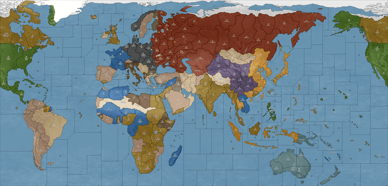
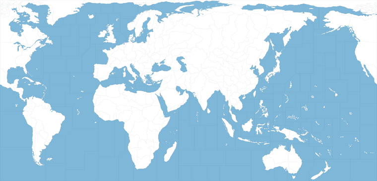
Ps. here are a couple quick elements. So basically this top one is what we got going on in the current map UHD. It’s not really Ultra High def in any meaningful way, but that was sorta just the idea I had, that it needs to be larger than the gaming display so the player has something to zoom-out from. This mainly cause when tripleA started out 1080p would have been like the extreme upper limit back then, whereas now that scale is pretty standard. The ceiling on it is actually the unit sizes which are basically all keyed around the 48px square still. The largest we can make a unit right in tripleA is basically 54px tall, and then upscaled to 125%. So the map could go larger, but then the units end up super tiny. This one is kinda just working with what we got I guess. It’s not part of making the relief, just the limit on how big the map can realistically be made for an upscale, before it just runs away from the UI and the unit graphics out of range.
Anyway these are the jank parts, which I’d like to clean up, but then I figured might as well just toss em out here in case it’s easier…
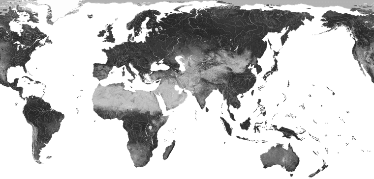
In this image the relief topo pattern is already isolated and desaturated. It’s at 100% opacity though. To make adjustments basically you’d redraw the stuff on that one, and then reduce the opacity afterwards. Then the painted over tiles will show through with the HEX colors chosen. By the time it’s passed through that and had the border feathering added and a little gaussian blur, what’s underneath becomes more impressionistic. The features recede into the background and we get a little play for the obvious liberties to distort that topo to match the baseline warp. The 100% transparent sections here will display whatever the background color you got going. Like for me on these these forums it shows white on desktop, dark on my phone. This would be like what comes through from the ocean blue in the baseline, or the pure Hex colors in-game for the stuff on land.
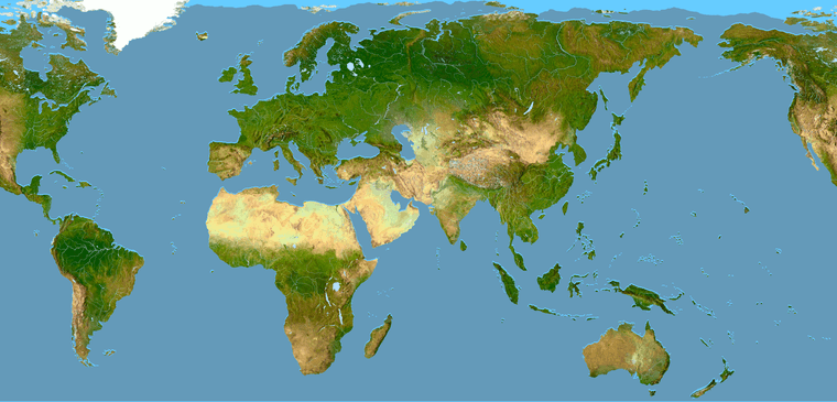
Then here’s the same thing, but in color with a quickie blue for the ocean. Immediately all the jank will jump out there, because now peeps can kinda see everything going on, especially the little alignment issues like say where coastal areas are or larger lakes and rivers pop. The blues there were just to make those areas easier to spot. Once it’s desaturated and layered in we can clone stamp around, move a topo feature, HEX colours on top or whatever and it all will kinda just blend together a bit easier. It works for trying to do the thing like in the current display, but not as well standing all by itself.
Anyway, those are the sorta the main things to draw over or tweak if one wanted to go in and noodle around to alter the relief. Then the opacity is reduced afterwards, when the layers all get collapsed together into a single image. The border stuff just comes from the baseline image, with the feathers, blend and blur, or variations in opacity between the layers.
For the ocean waves and all that, it’s basically the same deal as the land portions, except we use a cloud pattern to kind gloss over whatever is happening in the water and knock back the jank there using those sorts of cloudy/wavy type patterns. For the last one I just threw something together and dropped it on top to clean things up, but didn’t save out the element, so I have to just redo it I guess once the base is fully sorted.
For the stencil type thing here is another version of the baseline which won’t work in tripleA but might be easier to use for the masking. It’s just the base image with the black 1 px line turned red. Basically when everything is done you paste that layer on top and then use the red selection to delete the actual borderline from the final relief, this will allow the black border line from the base to invert to white, when the territory is highlighted in-game.
That line, the border line can never be anti-aliased. It has to be 1 px wide and 100% black in the baseline map at scale, or tripleA won’t know what to do with the image and all the utilities will bust. Or the map won’t scale properly when changing mapsviews, and all the rest. That’s why tripleA is sorta tough to work around, cause it needs that base map image to be a certain way, which is a limiting factor.
I do this step after the black border is already expanded/feathered or had some blur tossed around the edges to make it appear softer in the relief. Trying to manually antialias it in whatever way through opacity and gaussian blur or whatever. The whole thing works better at some map view scales than others, super zoom shows some hot fuzz, but I was aiming for like 50-80% on the players view, where it presented alright to my eyes. Kinda tough cause everything is all rastery hehe. Anyhow just in case someone wants to play around with the pieces to go under the hood.
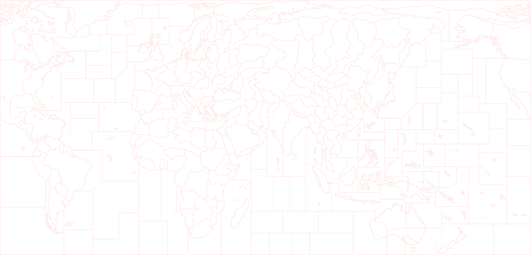
The previews there are all downscaled to like 25% just so the image could display here.
Right then, just thought might be cool to show ya how it looks when putting stuff together. The final relief for a tripleA map I usually will just get the version where all the working layers are already collapsed, which is why they’re harder to modify from the materials in downloaded maps folder. Usually I have to reassemble the tiles to using the breaker utility in reverse to get an image that can be tinkered with for the relief. I wanted to just put something in the folder itself, not for the game to use, but for the end user to use, if that makes sense. But also I need to keep the overall filesize sensible, just to save room for all the extra units and such, and the images which the game actually uses (the stuff in the tiles folders etc) which is already pretty hefty.
Here’s how the polygrabber works. It’s the main thing you need to just tweak the base, which can be run without any relief pretty easily just to test stuff. Like to change the borders shapes of the tiles or the overall world warps you do this sort of stuff… There’s another thread where I tried to explain the relief stuff, but it’s complicated. Needs a tutorial video or something probably, but I don’t excel at that stuff. It’s probably easier in PS, but I mainly just use GIMP.
https://forums.triplea-game.org/topic/3432/a-brief-guide-to-the-map-creator-tools-utilitiesIt’s technically possible to do this for any sort of aesthetic sensibility really. Any colors or map warp, or unit type looks. Like one could make the thing look more like the OG, battlemapish or the beamdog style or Iron Blitz or whatever, though I figure that ground is already staked out and I would just direct peeps to those places anyway. For me tripleA is sorta for customizers. Like it’s exactly the same thing in my mind as painting the sculpts or making your own cool map on a big piece of posterboard, but like the digital version of that. Main things that holds it back is that there aren’t really developers, and the whole design is sorta 20 years old using raster graphics, so the gamemap sorta has to key off the display size. Like however big you expect someone’s screen to be. As screens get larger and images get higher resolution, it’s harder to keep pace. Also needs to have that jank I think on some level, like a fan art riff, otherwise it’s stepping on toes probably.
One thing I wish tripleA had a bit more of would the sorts of elements in the UI or overall user experience that I’d call haptics.
Like making the dice feel unique, or doing the cool film reels or newspaper headlines. The RP aspect I guess. Oh and sound!
There’s like no soundwork at all right now really, which in itself is a fairly jank aspect. like I tend to just play my big playlist of period music or classical jams, or film score stuff, Conan the Barbarian battle at the mounds on repeat or whatever. But of course can’t use that sort of stuff at all. If it has a time signature the filesize balloons and it’s bad practice to use anything not created from scratch there I feel. It’s sorta on the end user I think or if ever there was a sound guru for tripleA, but I don’t recall and have no clue how to do any of that stuff. Just sorta stick to the maps and little flags and the tiny dudes which I can get my head around lol. I just went with the vibe I was feelin, but ideally it would just be a custom riff of some sort.
For the G40 I worked it backwards from the one I made for the Dog. He had an idea for a game which was like all kind of m3 on the ground and a bunch of other stuff that I only vaguely understood, for like unit interactions. Different vibe there, but I thought the map projection would basically work for this too, so just tried to bang out a G40 along the way. Idea would be anything not labelled isn’t a discrete tile, but just kinda cosmetic on the G40. Like unless it has a label that shows a name. Here sorta the same thing, but I just use the production value since everything had 1 pu, on the crazy big one where the tiny units sorta worked for the scale.
This map image for the other one is like 90mb, but basically shows what I was shooting for initially. Like large enough for some sorta micro-sculpt maybe if it was actually a physical board, where the map itself is trying to maybe climb up to 1200p 1600p 2160p. Units can scale up but not enough for the super zoom, UI still looks kinda jank at that res though ,cause all the font and the tiny flag images displayed within the UI, upscale together. Again sorta hits the ceiling there. The map itself seemed to worked pretty well though, like just in the mapview scaling out. Here it is at 100% view 1600p just exporting the map image from tripleA to create a png. You can do similar stuff sans units if you just turn that off in the mapview before exporting the image to see how the whole map looks at once without needing to scroll around. They pretty much key off each other, but then I had to stretch a lot in central Eurasia where the OG gameboards come together. Just to hit the connects to be analogous to the G40 stuff. Anyhow here’s what that one ended up looking like…
https://www.dropbox.com/scl/fi/rd96m1sbphowxsgwpdyb9/gcd.png?rlkey=zg05dcioht29puewdjesch11b&dl=0
here’s the G40 keying off that, image at the same res 1600p, but with the option “show units” toggled off. You can see the map is a little smaller, which meant redrawing the baseline so that it would show the units at 100-125% larger and just much larger overall in relative terms compared to the tiles. The single map image when shown all together at once clocked in right around 50mb, so about half the filesize on the map stuff.
https://www.dropbox.com/scl/fi/qvmqx7zygsi49rjd5oj5d/g40-units-off.png?rlkey=p6aphfdg4pgbwdw2zoa2jtxma&dl=0That image doesn’t have any of those latest base adjustment just included, but just to show the scale of the actual image compared to the display in-game at whatever resolution, but probably 1080-1200p just to smooth it out for the UI.
-
@Black_Elk Go Elkstar Go !!! :)
My small cranium just exploded reading all that hee hee
Rock On Brother !
-
Ok dude I made you a quickie relief… Try this one
The opacity layer is also desaturated, which shaved off about a 5th of the filesize. This should allow you to control the hue of the ocean just via the baseline image. Basically changing the color blue in the base = changing the color of the ocean that displays in-game. Here’s an example baseline to use with it.
Remember that the choice of blue for the ocean will change the impression of all the land HEX colors, ie the colors appear slightly different based on what others colors are showing next door. Since blue is the dominant color it will have the more dramatic effect when changed. The lakes have to be added separately if you want them to totally match hues when changing the ocean color around, but otherwise should be able to go lighter or darker blue that way and it made the filesize slightly more compact.
Then all you gotta do is grab the polys for em with the polygrabber for the following TT connects. If you run the new base/relief through the tilebreaker first you’ll see the effected tiles.
Syria/Transjordan
Amur/Manchuria
Kazakhstan/Novos
Finland/Vybord/Novgorad
France/Southern France/Switz
(Oh and the label for sz 112 if you didn’t add that one already)
The color match wasn’t totally perfect, but it should work well enough for now, just to get us back on the same page again. The end user can also adjust the relief itself, by tweaking the opacity or brightness/contrast of the relief before running it through the breaker. The more opaque the more chalky/pastel, the less opaque the more it will look like the HEX color fills. This one has the midrange palette. I’ll give the borderline another pass when I get the chance, but I think should be good enough for government work lol
Everything else you should be able to control via the HEX color codes in the map properties for each nation. Here are the Hex colors I used for the map.props below. You can change them to whatever, but this is what I’ve been running.
color.Neutral=d8ba7c
color.Neutral_True=b88a6c
color.Neutral_Axis=6A5B3D
color.Neutral_Allies=d8ba7c
color.Italians=58360E
color.British=8E6600
color.UK_Europe=8E6600
color.UK_Pacific=8E6600
color.French=10569C
color.Impassable=e7d5b0
color.Americans=326100
color.Russians=831E00
color.Germans=3f3f3f
color.Japanese=e19521
color.Chinese=533c69
color.Canada=bf0010
color.ANZAC=4d7f7f
color.Dutch=CF7E00
color.Mongolians=d8ba7cThis is how the image displays for me when I use the export feature to save a picture of the gameboard…
Hopefully that helps. Let me know if you got it working. We can iron out the other color stuff later. The relief for your other modded board would be the same, you just need to replace the top section of the relief with all the boxes and whatnot. Catch ya next round
-
@Black_Elk Right On !!! Thanks Brother !
-
I think i fckd up korea lol
heh heh actually went pretty smooth. The ocean is a bit pale to me. I liked the old one better. I’ll reread what you said about changing it.
Other than that, i think were good togo. Dog told me how to fix image for description too. haven’t tried it, it’ll be a last step before triplea update, but hopefully that works too.
Still can’t play the cocksckr in the lobby though. Idk wtf is up with that. I guess I’ll bug on those guys some more.
Anyway, almost done. Hmm … I think I remember stuff turning out a little brown one time. The ocean. I don’t think it’s the same deal but just remembered.
Anyway, I’ll upload to git just not do the triplea full on yaml update so you can check it out.
Oh yea, and fix korea lol