Modules for ABattlemap
-
how are the fleet marker’s used ?
A fleet marker represents a fleet in a seazone. So you do not have to move lots of ships from one sz to the other but only the fleet marker.
There will be a place on the board (for example a neutral territory or special fields) where the “real fleet” will be stored.I learnt from this thread
http://www.harrisgamedesign.com/bb2/viewtopic.php?t=1702&sid=9283f45b3a668d14b6f3077ac48c4027
that in former versions of AA there were so-called “Marshaling Circles and Cards” which had the function above-mentioned.Of course this is not limited to fleets but can be used for all groups of units.
-
how are the fleet marker’s used ?
they are used just like the marshaling circles from AA Revised. You put the actual fleet/army in whatever unused space you want (neutral territory/ AA logo on bottom-left).
-
Hey all, uploaded a final version of ABattleMap (final in the sense of: no more compability issues after this one).
Things changed:
- smaller Sahara ;)
- fleet markers
- fleet marker space in the lower left corner of the screen
- recoloring of pieces and map so the Italians and Chinese are a bit better to distinguish.
- some minor territory redraws
- added territory namings
It will be the last version of the modules which might raise compatibility problems, maybe some day I’ll add some extra figures in the background, but that won’t affect compatibility.
Have fun :-)
-
Great work, thank you, HolKann.
I just want to offer my mod of BigPieces.bmp
The bomber is slightly different (the way it “throws” bombs), I “enlarged” and partly “redesigned” the ships a little bit.
Using the same color scheme I saved them as 8bpp-bmp instead of 24bpp. So the file size is even smaller.
Personally, I cannot view a difference between 8bpp and 24bpp on my screen.Download from
http://www.mediafire.com/download.php?wymm2zmj3zn
if you like (3.34 KB - 7z-format).:-)
-
No offense, but I like my Italian colors better, possibly because I am used to that shade of blue. /shrug.
Anyway, the white lettering kind of clashes, don’t you think? Maybe it’s just my girlishness but wouldn’t it be better if the Sea Zones were numbered with a lighter or darker shade of blue (something that contrasts, but does not clash) and the territories with lighter/darker shades of themselves?
Maybe the Italian color for Sea Zone numbers, Japanese colors for Germany, German Colors for Japan, etc?
-
@Cmdr:
No offense, but I like my Italian colors better, possibly because I am used to that shade of blue. /shrug.
Anyway, the white lettering kind of clashes, don’t you think? Maybe it’s just my girlishness but wouldn’t it be better if the Sea Zones were numbered with a lighter or darker shade of blue (something that contrasts, but does not clash) and the territories with lighter/darker shades of themselves?
Maybe the Italian color for Sea Zone numbers, Japanese colors for Germany, German Colors for Japan, etc?
You may probably want to try my mod of the map.bmp.
Download (451 KB)from
http://www.mediafire.com/download.php?raquvyy1jywWhat I did is to recolour the seazone-numbers and the territory-names nation by nation. So my map.bmp will be an example. As everyone probably likes different colours I included a layered file. With the map as background there is a layer for the seazones and a layer for each nation. So it is easy to recolour the territory names nation by nation or only the seazone-names. There is a layer with every territory-name in white, too.
Just colour everything the way you like it. You will need paint.net to work with the layered file (.pdn-format). See www.getpaint.net
:-)
-
I will try it later today.
Honestly, I am trying to copy paste IL’s map into Battlemap. His is really, REALLY pretty, but I don’t know if I can do it or not. Problem is, I have to kinda squeeze his territories into the Battlemap territories so that no coding has to change, only graphics change.
-
Howdy all.
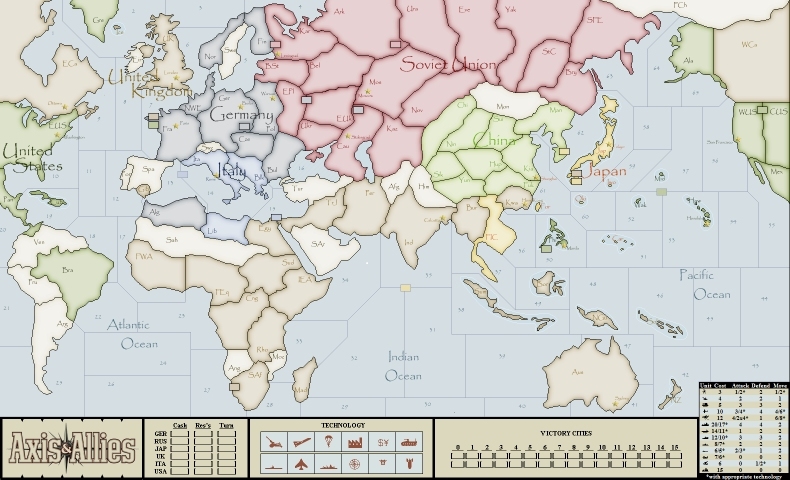
I found the latest incarnation of the AA50 map was not my favorite. The colors were unpleasant (everything was too brown), and the labels made the map look very cluttered and they just stood out too much for my tastes. Sorry guys, but the word “garish” came to mind. So I set about to create a newer, more “stylish” version of the map.
The first thing to note is that I have only changed the coloring of the map, not the size or shape of any territories. This map was based on the March 9, 2009 “compatibility” map, so as long as you are playing someone using that map, it should continue to be compatible with the map your opponents are using.
I want to offer credit and thanks to several people. First and foremost to HolKann for putting together the AA50 maps and putting so much hard work into these modules. Without his work I wouldn’t have had a map to work from. Second I’d like to thank P@nther for putting the map into Paint.NET format and starting to add the layers. I had been toying with that idea for some time, but it wasn’t until he started with it that I decided to get in to the file he started and really work with the image the way I wanted to. Finally I want to credit cominges for his Art Deco Map as a sort of inspiration for this map. I know this is nowhere near the style and artistic quality of his map, but his use of light colors and color shading gave me the inspiration for applying a lighter, shaded style to the map and making it look a little more like an “old fashioned” map.
Because the map is so much lighter than the standard, I had to recolor the toolpieces as well. I’ve included a toolpieces for both 41 and 42. I also changed some of the tokens to be more to my liking (HolKann prefers all roundels, I think some of the roundels are just difficult to draw that small and so some of the tokens look better as full flags)
In addition to the Map.bmp, I’ve also incuded the .pdn file (aa50_AlternateMap.pdn) so if you have Paint.NET (www.getpaint.net - it’s free!!!) and want to get in and customize it you can. All the labels are in their own layers and therefore can be turned on and off. If you’d like some explanation of all the layers, send me a PM. Hopefully most of it would be self-explanatory if you are familiar with PDN.
I’ve been using the map in several games for the past few weeks to make sure it doesn’t have any compatibility or usability issues and I think it’s good to go, but send me a PM if you have any problems. The files are pretty large and I didn’t bother to compress them. Sorry if that is an issue for anyone trying to download them.
I’d appreciate hearing what you all think about this.
Tim’s alternate map file folder
Note, I’ve inlcuded a smaller, jpeg version of the map (click on attachment thumbnail below to expand) so you can get an idea what it looks like without downloading the full bmp. Just don’t try to use that file with the game. You have to go to the mediafire link above to get the real map.bmp and toolpieces.bmp’s
-
I like the look, but I have one concern.
There several variations of this map floating around. Does everyone have to be using the same map to pass moves back and forth? What if one person I’m playing with has the old map, and another has the new one? Can Abattlemap handle both at the same time?
-
The bmp file is just an overlay - other files tell the software where the various territories actually reside. (HolKann can probably explain this a lot better than I can.) But I’m pretty sure that as long as they’re based on the same set of other files (the sek files, etc.) it seems to work fine. I’ve used this map, or earlier incarnations of it, for about a month now with no problems as long as everyone is using the march 9 set of files.
-
Wow - that looks great on the first view.
Can’t wait to get deeper in this evening when I’m at home.
:-) -
I’d appreciate hearing what you all think about this.
What a great piece of art… congratulations… that must have taken you some time.
Personally I would prefer to use the layer “pale” instead of “very pale”… but that’s a question of individual preference.
The only thing that disturbs me a bit is the abbreviation “Mos” for Russia. This is a mistake in the original ABattlemap-AA50-modules, because on the “real” board the territory is named “Russia”.
I will try to find out, in which of the files “Mos” is used instead of “Rus” and try to correct this.Which font did you use for the labels?
As I am using the BigPieces (screen 1920x1200) I will recolor them to match the colours you used in your toolpieces and distribute them here when I’m ready.
-
Thanks for the kind words. I’ve gone back and forth between the pale and very pale background - that’s why they’re both in there. I’ve been tempted to try off-white as well, but I think that’s probably going to be too little colorless and would get in the way of game play regardless of how it looks on it’s own, so I haven’t bothered to try it.
As far as Rus vs. Mos I just used the abbreviations that I’ve gotten used to using in games here, and most of the time I’ve seen it as Mos/Moscow here on the game threads. I know in AAR, Karelia was usually abbreviated Len for Leningrad, but I’ve always used Kar because that’s what made sense to me. However I have my own personal preferences in other places as well. E.g., I use SFE instead of Far for Soviet Far East. I use IEA and FWA instead of EAf and WAf for Italian East Africa and French West Africa. I think I came up with new abbreviations for some of the neutrals as well.
The font for all the labels is called Papyrus.
I don’t use bigpieces, so I didn’t even think to recolor those. Thanks!
-
As far as Rus vs. Mos I just used the abbreviations that I’ve gotten used to using in games here, and most of the time I’ve seen it as Mos/Moscow here on the game threads. I know in AAR, Karelia was usually abbreviated Len for Leningrad, but I’ve always used Kar because that’s what made sense to me. However I have my own personal preferences in other places as well. E.g., I use SFE instead of Far for Soviet Far East. I use IEA and FWA instead of EAf and WAf for Italian East Africa and French West Africa. I think I came up with new abbreviations for some of the neutrals as well.
I see… thanks to the layers everyone can use the abbreviations one is used to.
The font for all the labels is called Papyrus.
Unfortunately I don’t have this font. Where did you get it from?
-
@P@nther:
As I am using the BigPieces (screen 1920x1200) I will recolor them to match the colours you used in your toolpieces and distribute them here when I’m ready.
I don’t use bigpieces, so I didn’t even think to recolor those. Thanks!
Here are the BigPieces that are of the same colours as Tim’s ToolPieces:
http://www.mediafire.com/download.php?tnthot2udjz
(7zip-format, 3.12 KB)Those who prefer “my original” colours will download from
http://www.mediafire.com/download.php?jng3uy3i4zm
(7zip-format, 3.06 KB) -
@P@nther:
The font for all the labels is called Papyrus.
Unfortunately I don’t have this font. Where did you get it from?
Sorry I don’t know. I don’t know if it came on the computer or if my wife might have purchased a font kit for her PTA flyers and stuff. I didn’t think about the possibility that others might not have that font installed. :| I wish I knew how to help you get it.
-
Hey all, uploaded a final version of ABattleMap (final in the sense of: no more compability issues after this one).
Things changed:
- smaller Sahara ;)
- fleet markers
- fleet marker space in the lower left corner of the screen
- recoloring of pieces and map so the Italians and Chinese are a bit better to distinguish.
- some minor territory redraws
- added territory namings
It will be the last version of the modules which might raise compatibility problems, maybe some day I’ll add some extra figures in the background, but that won’t affect compatibility.
Have fun :-)
If you ever do another update, can I request that you increase the size of Egypt, it gets really crowded there. :-D
-
Hey P@nther, here (=attached to post) is the papyrus font, just remove “.jpg” as usual, and put it in C:\Windows\Fonts and all your programs should recognise it. Hopefully it works (haven’t got time to test it right now).
@Emperor:
If you ever do another update, can I request that you increase the size of Egypt, it gets really crowded there. :-D
I already did with the last update, and after that I promised compatibility would’nt be affected again. At most, I might take some pixels from the Red sea, East-Med and the Sahara, but if I go any further => compatibility :( We’ll see…
@Tim
Wooow! :-o Amazing, I like it very much a whole bunch lot! Though we’ll keep differing about the toolpieces, your map is simply superb. I was going to update the current map with the none-white territory namings I got in this thread and maybe the map cmdrJennifer might have come up with, but she’ll have to do an awesome job to get it as good as you did. Thanks a lot for sharing this with us :) Though I’d go for the “pale” instead of “very pale” (I have trouble discerning Ita/Ger on my bright laptop screen). Also, I’ll stick to the official “real life” board for territory naming conventions (Len or Kar, I’ll look it up one day). Abbreviations don’t bother me much though ;)Ofcourse, this calls for some color adjusted toolpieces/bigpieces, which is a small effort compared to the great map you created. Expect an updated first post soon 8-)
…
(“garish”, pff, at least the Italians weren’t colored Russia-brown ;) )
-
@P@nther:
Personally I would prefer to use the layer “pale” instead of “very pale”… but that’s a question of individual preference.
Though I’d go for the “pale” instead of “very pale” (I have trouble discerning Ita/Ger on my bright laptop screen).
FYI guys: I used the “Pale” version for a week or two before getting used to it and deciding to go even lighter. I think the transition from the standard map to the very pale map is a big difference and I could see it taking some getting used to.
For those who don’t have Paint.Net and haven’t looked at the available layers for the map and aren’t sure what we’re talking about, there are two backgrounds available to provide the underlying map color: one called “Pale” and the other “Very Pale”. The Map.BMP I uploaded uses the “very pale” version. Just so you can see the difference and choose which you prefer without looking at the .PDN file I have loaded a version of the map.bmp file using the “Pale” version these guys are talking about. This new file is called NotSoPale_Map.bmp in the same mediafire folder. Or, here’s a direct link: http://www.mediafire.com/?z2nxdznirzh
-
One concession I had to make was removing the faces from the southern indian ocean sea zones - they were just too hard to work with as I was changing colors. Anyway, my question is: who was the dude on the far right?