yea I don’t really know, just that league guys use it to pbf. There’s a few other people here that use it as well.
They’re separate sites. Seems like there was a little more interaction when redrum was actively developing.
Here’s a quick edit that should be serviceable for now. Just needs a little touch up for the blur.
zip with the BaseTiles and ReliefTiles for the map folder
https://drive.google.com/file/d/1ZkhnF2Dzwx-9K2vUFWLqI-rE1WwDLafA/view?usp=sharing
Here is the txt file for the polys for the shift
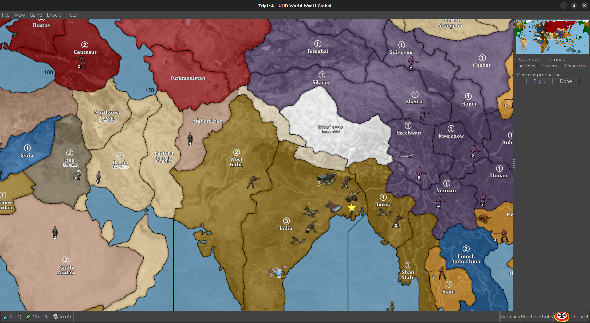
Should look like this when you fire it up. I can clean the border fade a bit later. This was just to strong arm the line into place. I tried to leave a little bit on the Afghanistan side just to suggest the shape. Just like pretending the frontier there is sorta disputed. Makes sense hopefully.
yay it looks like success :)
I barely struggled lol Well, not done yet. Still gotta upload to git :)
Update to 3.1
Change Log UHD:
3.1
8-3-24
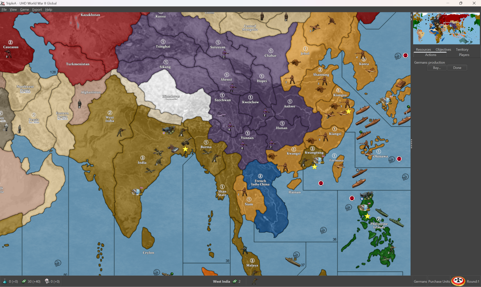
Fix Afghanistan/Sikang Connection.
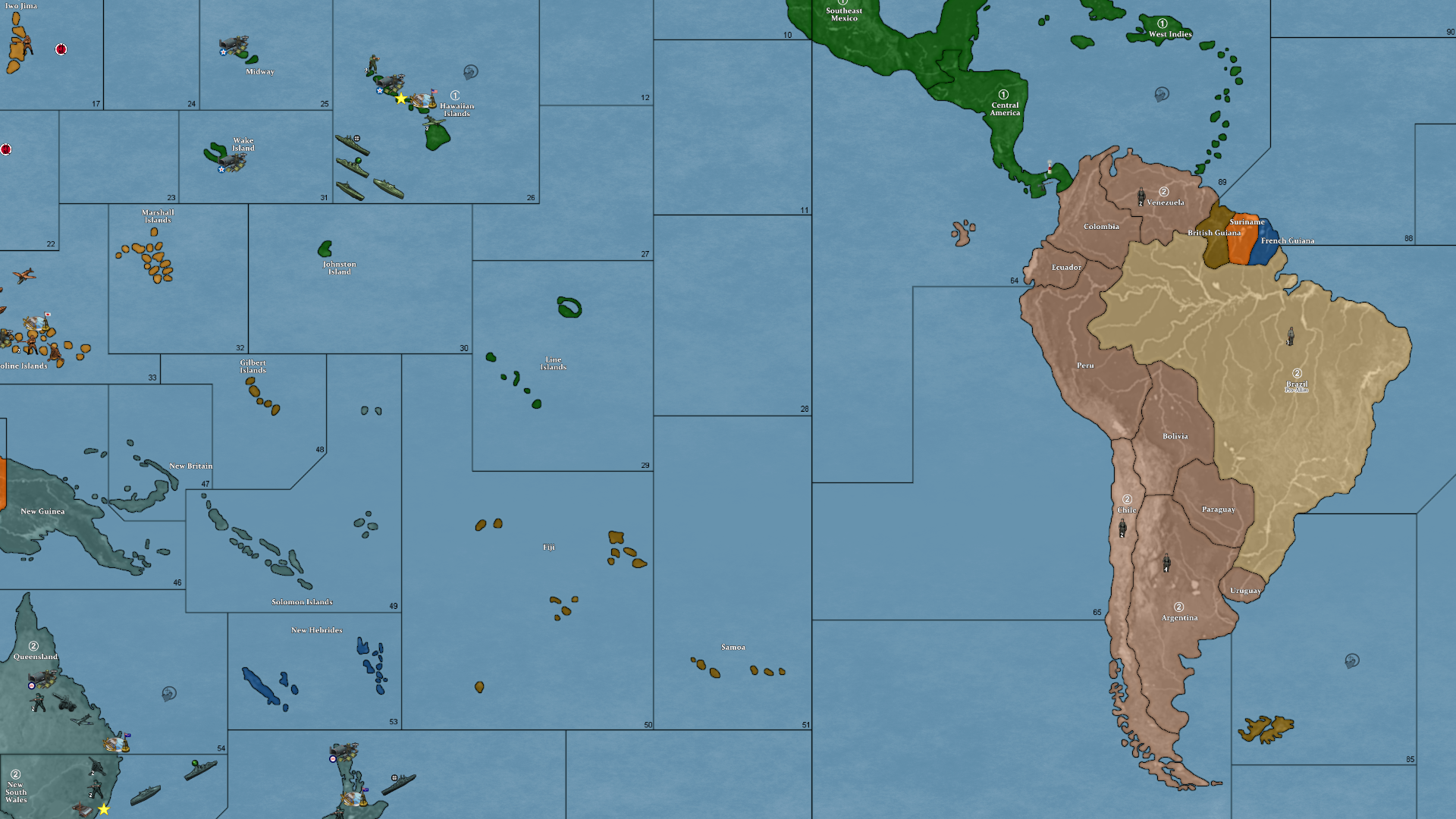
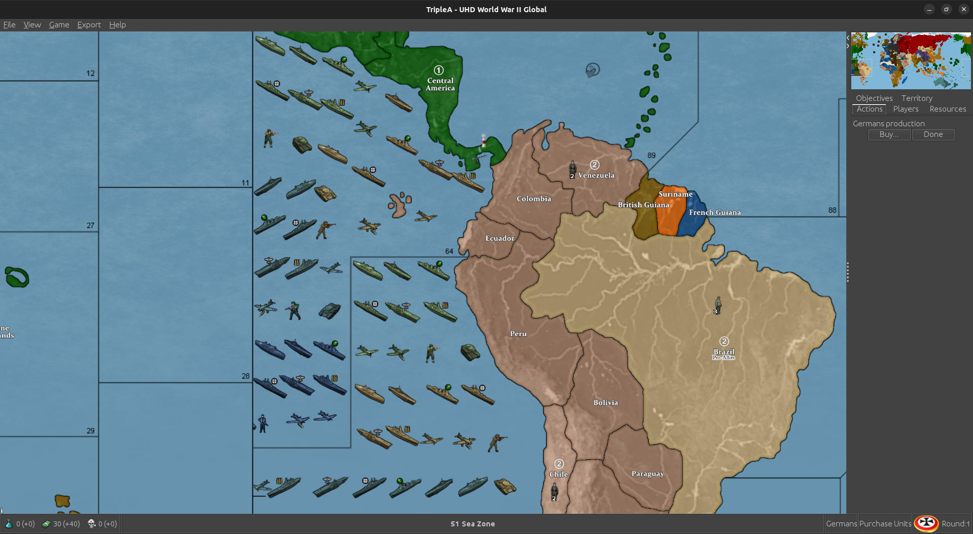
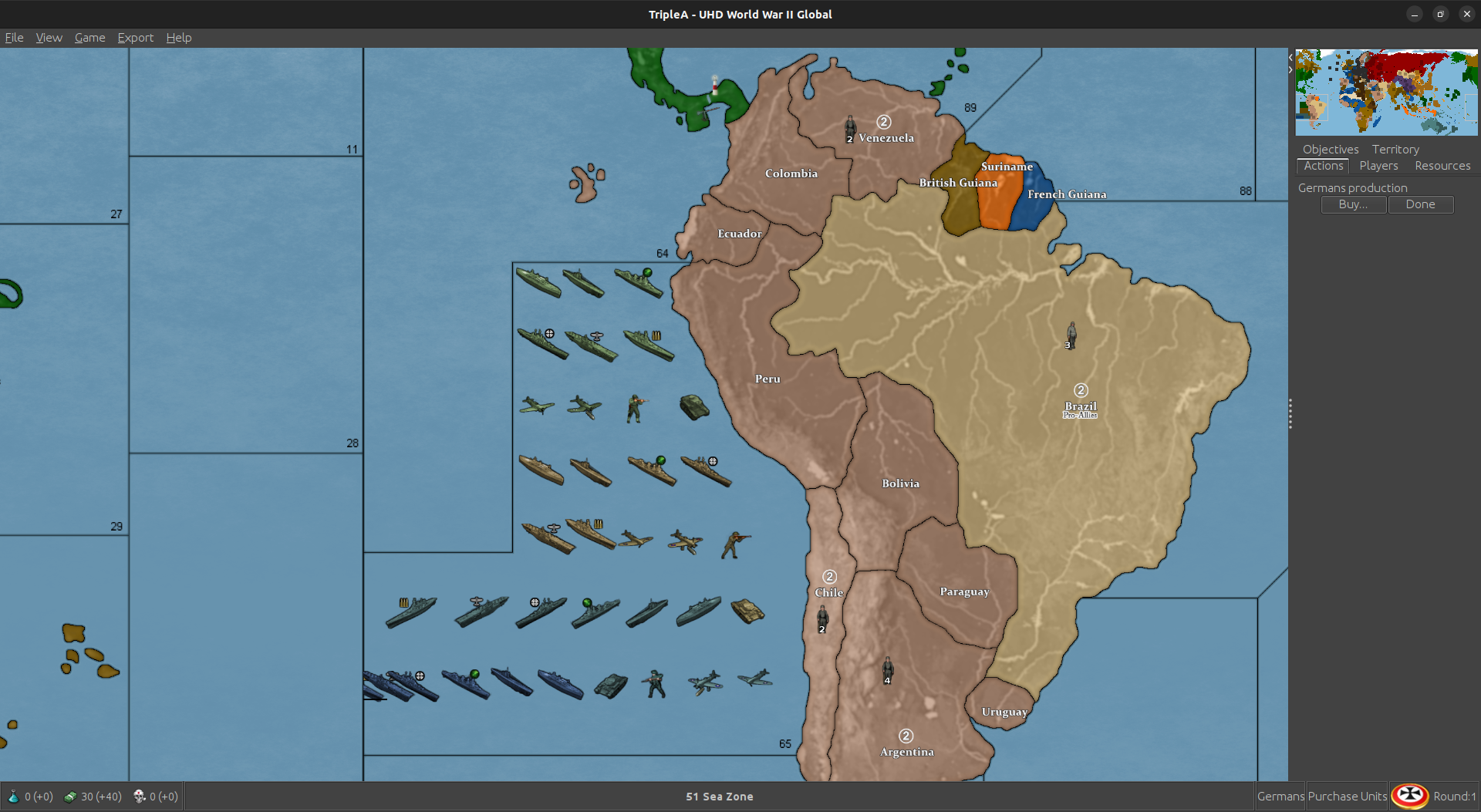
Here is the update for sz 64/65. Probably gave me the slip cause it’s harder to see the map wrap in GIMP. I just hacked in a couple lines, hopefully passes muster.
Looks like so
Here is a zip folder with a BaseTiles and ReliefTiles folders updated (already run through the tile breaker.)
https://drive.google.com/file/d/1nqernvZtD8MYOstgAblw8DDZ4Hrk4JLb/view?usp=sharing
Here are the Base and Relief as single images
Base
https://drive.google.com/file/d/134oogwEtlLW1kkHR_zvvXJCpDtUxiDzH/view?usp=sharing
Relief
https://drive.google.com/file/d/1zRi0q7AqTQrHfCikDEnW1aAw5J5QRe0Y/view?usp=sharing
Here is the Polygon txt attached below
Let me know if that works for ya. I’m pinballing around at the moment, but I can update the other boxes map/polys on Friday. Or you can just copy/paste that section over from the UHD if you need it before then.
Thanks again for helping me catch all these damned connection goofs lol. Hopefully we nailed em all! Good work gang
Just getting up to speed on this. Been glorifying the Niners all day lol
Victory finds another one. It’s gotta be the last one :)
Well, he definitly earned those boxes :)
I think between the two of us we can get Boxes to work. Actually Victory can probably knock it out on his own lol. He’s already better at it than I am :)
If we need help, we’ll send a SOS out to ElkStar :)
@VictoryFirst I’ll try and get UHD out tonight. Might need your help with Boxes, but I’ll take a crack at it too.
I can’t remember if you have access to UHD as well ? If you don’t and want it, let me know. Although, I think you can still drop PRs to the repo if you don’t.
probably shouldn’t have got hi before i tried do this lol
It seems the overflow dissapears at the dividing line in the map. Took a while to figure that out lol
Got room for one more row in 65, but as much as I’m struggling tonight, were just gonna leave that part of the ocean untouched for now :)
All right I added the last row lol
Sorry ocean. No free space for you :)
Update to Version 3.2
Change Log UHD:
3.2
9-11-24
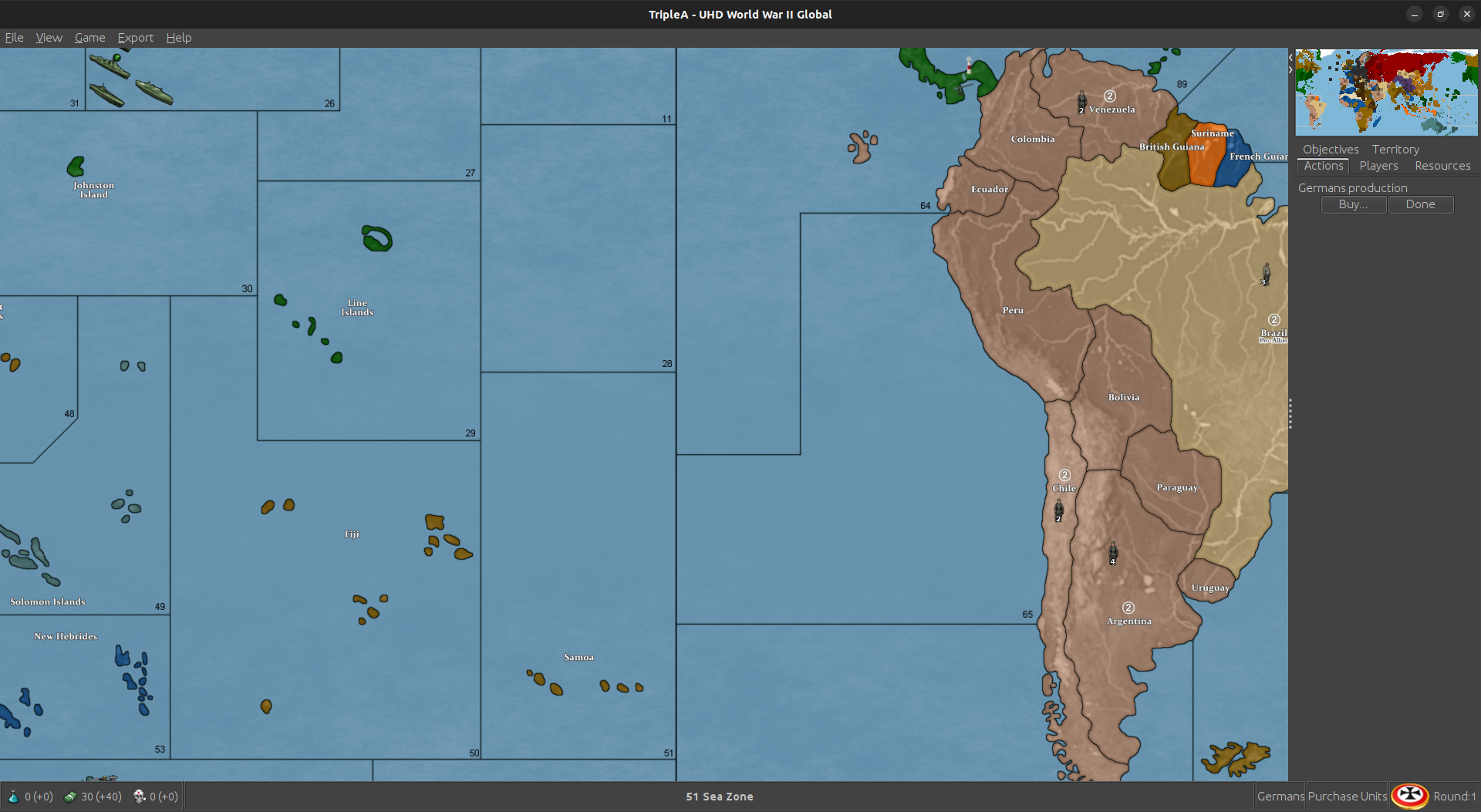
Fix Sea Zone 65/64 Connection.
Hi gamer
Latest version is 3.2 and has the fix. You should be able to DL and your save will work. It should look like this
Let me know if still having trouble.
Update to Version 3.3
Change Log UHD: 3.3
12-25-24
Change “Sierra Leone” to “Neutral”.
Change Placement of Southern France Naval Base.
Update to version 3.4
Change Log UHD: 3.4
1-5-25
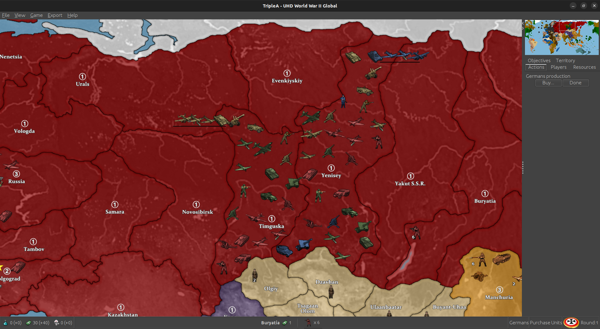
Fix Timguska and Yenisey Map Borders.
Thx a lot for that work! Can I play with your map but default unit images?
For sure!
To do that you can go into your downloaded tripleA maps to the World War II Global folder, and copy over the Units folder to the UHD to use the larger map with the OOB units. Or vice versa. Should just be like a plug and play there. Or similarly you could copy over the flags and such. The final display for those graphics will show them slightly smaller since the vanilla units are 48 px tall and square, whereas the UHD are 54px tall and up to 96px wide. The placement of the units relative to each other should worth fine though, since it’s keying off the larger sizes you shouldn’t see like overalaps or anything I wouldn’t think. You can upscale the units a little bit too, I think I have a set somewhere where all the 48 pxers are enlarged via a batch edit to 54px, keeping the graphics the same but just enlarging them manually instead of inside tripleA. Right now the limit for unit view is 125% but for the 48px units from standard tripleA I think we’d want something more like 150%-200% to match the zoom. It definitely should work though even with the regular units just dropped in. Especially since they’re more familiar it’d likely be easier to spot em at the slightly reduced scale.
Let me know if that worked for ya, and have a blast!
cool stuff, I did it and at least it loaded properly! Do you also have a guess if it causes an error when I am using default units and my opponent is using Frostion?
@pacifiersboard you should be good I think, since all the graphics are local to the individual user. I wouldn’t expect it to kick off any errors unless it’s a different xml/gamesave. So far example, you can customize your own units or flags in those local folders, and they’ll show up that on your screen with whatever you put in there, but on the opponent’s screen display as whatever graphics they have in their own local folder. Or you can customize them to other stuff, as long as the labels match what’s in the standard game. You can also change the Hex colors around for the different nations in your map.properties locally, so people can choose the colors they like that way.
I was trying to play it using a few different views, a high vibrancy sorta hi fi for the default, but then if you want to punch up the contrast between the units and the map, or use the standard tripleA G40 units, those may look closer to the tints using either map blends or some lighter Hex colors for the nations. Also if you like a more simplified revised-style look, can click all the map details to off in the view options, and it will sorta time warp the look of the thing back to the way tripleA in the aughts hehe. Like with like no relief - just sorta bare bones. With map details off that way, the max zoom out before some of the sz border lines start to breakdance is about 50% I think, but should hold to at least that scale. 60% mapview I think should be good to go for whatever.
For the flags/pucks that show in the UI those will scale depending on Font size you have set for the main display on computer, so when I use tripleA at 1440 or 1600p I have to upscale my Font to either 125 or 150% for some of those images to look good at that higher resolution scale. Basically just tried to do what I could to go from the older 4:3 sorta display to something that’d work with the super zoom or a wider stretch there, but for the units those are all sorta set by the standard dimensions from when tripleA was first made. 54 was as tall as it would let me go before they started clipping at the top/bottom of the UI windows. Flags were sorta the same, like with a hard ceiling there for how it was set up initially for the stats I guess.
The larger flag pucks for units were somewhat harder to center, sometimes they’d cover over a bit or be like dead center behind the tank. Just sorta depends on how beefy the unit is. What would be cool is if the units could go extra large like the same way the map can super zoom in 2.7 and then position the flags or roundels around them, but not sure if that’s likely to happen any time soon. As I recall that was the main reason for going with something about 11000x5000 px just so that the units we had available wouldn’t look too tiny relative to the size of the map, but I think something slightly wider and just a bit taller might be cleaner for the 200% zoom in thing. Might try for a sping project if I can get up the juice. But meantime hopefully it’s not too hard to tweak around. Let me know if you hit a snag, we can probably figure it out.
Best
Elk
thanks a lot, you are doing an outstanding job👍
Yea you and your opponent can use different units.
Edit
Oh i see Elk already replied :)
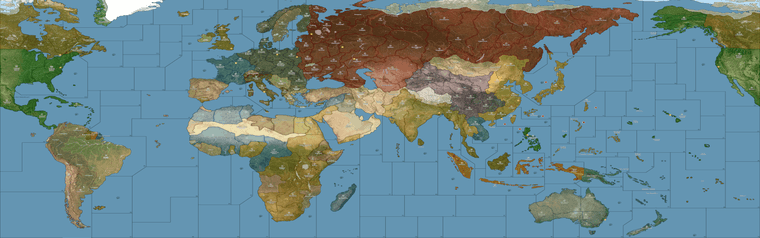
Oh also speaking of the local stuff, I just remembered that I need to update the alternative map reliefs, for those last couple adjustments. I’d held off there, being fairly convinced that another tweak would probably crop up, but I guess now that central Asia is sorted again I could bang out a couple.
I feel like a lot of stuff can be controlled via the Hex colors in the map.props, and other features like map blends, or simply turning all the map details Off - and working up from the desired colors. Again the only thing that’s hard to customize that way is the color of the ocean blue, since for everything on Land we can just assign a new HEX color with a line of text in the map.props, but to do that for the sea zone color means either an alternative Relief map that covers over the ocean at 100% opacity using whatever specific hue, or ideally an alternative Baseline map where the blue there just shows through the Relief map, allowing the user to change that color with a single edit in an image processing program like GIMP, or PS, or Paint, like select/fill foreground color. The baseline is only 1mb, the relief is like 40 mb, so to me it just makes more sense to control that via the baseline. I’ve just been foot dragging cause matching the current default for that blue has been a bit of a chore, figuring out what exact hue of blue is needed on the base to give an identical look when it’s passed through the opacity layer. Always seem to come out a bit more muted than the current default.
In any case I think other than the blue, I can see 2 displays that might be desirable. One that makes the board look more topographical using a full RGB topo instead of a desaturated one. And then another to basically look more like Revised (eg darker ocean color, white line boundaries etc.) I think with those 2 and the current default players could customize it their tastes fairly easily via Hex color adjustments.
Beyond that I think an interesting challenge would be a print in physical media. Probably using graphite and prismas since I enjoy those. I’ve always been a shitty painter, but drawing I can kinda zone out hehe. So might give that a go.
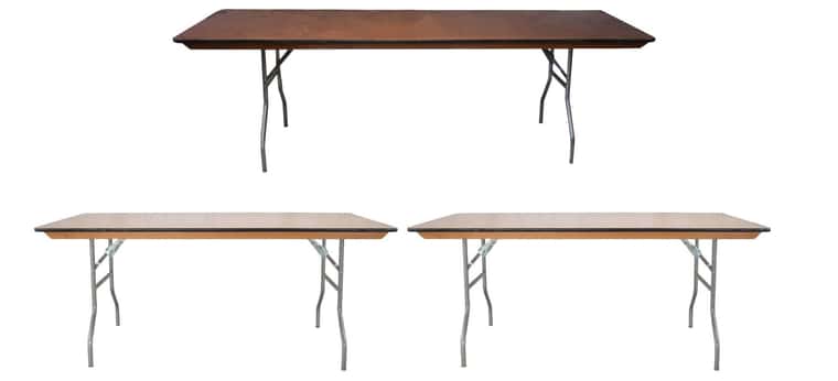
I think the optimal sizing for a physical board using this same style of projection, would aim for roughly 30 inches by 96 inches. So covering the entire surface of a standard 8 ft banquet table, or else two 6 ft tables end to end (with 2 ft of space on either) side, and having the board-split between theaters match where tables come together. Corners are almost always rounded a bit, so probably lose an inch or two on the longest side to account for that with an 8 ft table, but basically taking advantage of the 30 inch depth as much as possible, right to the edge there.
There are King-size banquet tables with depths ranging from 36-40 inches, but nobody really has those, I mean unless it some sort of specialty event you’re just not going see those floating around much. Standard tables, and most folding tables, or whatever you’re going to find at a Target or Home Depot, those are pretty much always going to be 30 inches. Sorta industry standard there I think.
Right now if you took the current UHD in tripleA, hit export screen and printed it out at say 200 dpi, you’d get a bord about 28 inches by about 55 inches, so essentially a 6 ft table. Going wider to 8 ft, I think gives a better stretch to use actual physical sculpts which are significantly larger than the digital sculpts relative to the map scale.
Print would look jank since it’s not a dot map, but for a quickie it can be done using just like a regular inkjet and taping the pages together to get a vibe on it. Colors register quite a bit darker in pigment rather than light, so all the hexes are a bit of a guessing game there. Like I’d want to do a bunch of AP runs just to see at a smaller scale, but it sorta works like one might expect. Basically fiddling with the opacity of the land pattern (whichever is chosen, here it’s the topo in full color) to get something that recalls the OOB design, just with updated contours and such.
Basically a bit like this, just using one of the reliefs I had that’s vaguely OOBish for the color design… Imagining it to basically fit the entire 8 ft and ultra wide, like stretch armstrong lol. As if it had to fit on either one of these or two of those. I think 2x 6 ft tables is optimal because then you’d have space on either side for drinks, or rolling dice or overflow panels/battle boards/extra map extension boxes and the like. You know like just using markers to associate the overflows with whatever space. Then pictured with the little cardboard roundels and such to indicate ownership changes.
https://drive.google.com/file/d/1VnBVYJkZU3pKRtE0_rVm_W7w_2RZyFp4/view?usp=sharing
For sculpt housing, the issue there is not so much the land but the sea zones, since those need to be fat enough to hold the pretty long and quite beefy carrier decks, along with whatever other naval units - ideally without chips under ships, least for the starting set ups.
Everywhere on the OOB board where we get the heavy distortion most of that is to make the sea zones sufficiently large to house the naval sculpts. The ground units and aircraft are smaller and easier to fit since they’re rarely much larger than a chip. But some naval units can be 2, 3 almost 4 chips in length, so they need a lot of room and blockier tiles to fit well. I think it just about works if doing a stretch extra wide, because that buys precious extra inches, especially in the sea zones, but really across the whole board.
So why you get that sorta switch from a convex shape on Africa to a concave shape, in order to make the Med very large. Or the contortions on Europe to make the Baltic as large as possible, or how some stuff tilts to create that telescoping effect around Europe and the Pacific we see in OOB, stuff like that.
You can ballpark it by doing say a 100% compared to 200% zoom and just holding the sculpt up to the screen to see it roughed out. There are few tight spots, but usually those are next to a neutral overflow type area where ships can sorta breach into say Sweden or Arabia, the way we tend to do when space is at a premium. But then another easy option is to say put a row of generic boxes along the top of the board, or a production counter or tech counter along the bottom, things of that sort, but I think ideally you’d just run it right to the edge and have those as separate float panels. Especially since the sides could be extended more easily than the depth. Even still, you could cut in I think a couple inches on either the top/bottom and not be losing too much.
For morphs if anything, I’d probably just stretch South America slightly so it reaches further south so more closely mirror the reality, but otherwise I think the telescoping works reasonably well, with fewer tilts needed to make it all work. Downside is that the sea zone geometry is invariably going to look slightly different doing that, but that’s the trade off trying to get the contours of the landmasses to have a bit more fidelity. I mean there’s only so many things one can do to make Europe and Japan all extra jumbo without losing something else along the way, but seems to work alright as a compromise.
For something like that I think it would be fun to use the baseline projection as an actual stencil, blow it up to life size and then do a mock up in prisma color on something like bristol board, and carry it the rest of the way from there. If I ever get up the juice, and enough ink to mess around lol
Hey that looks pretty slick ! So a different baseline and map.properties would be enough to change the current setup ?
If so, that wouldn’t be much to add to the overall dl The dudes would probably not blend in as much in certain areas.
Would be cool to have both options. Put them in a separate folder in the map dl and just swap them out.
Well done :)