@pacifiersboard you should be good I think, since all the graphics are local to the individual user. I wouldn’t expect it to kick off any errors unless it’s a different xml/gamesave. So far example, you can customize your own units or flags in those local folders, and they’ll show up that on your screen with whatever you put in there, but on the opponent’s screen display as whatever graphics they have in their own local folder. Or you can customize them to other stuff, as long as the labels match what’s in the standard game. You can also change the Hex colors around for the different nations in your map.properties locally, so people can choose the colors they like that way.
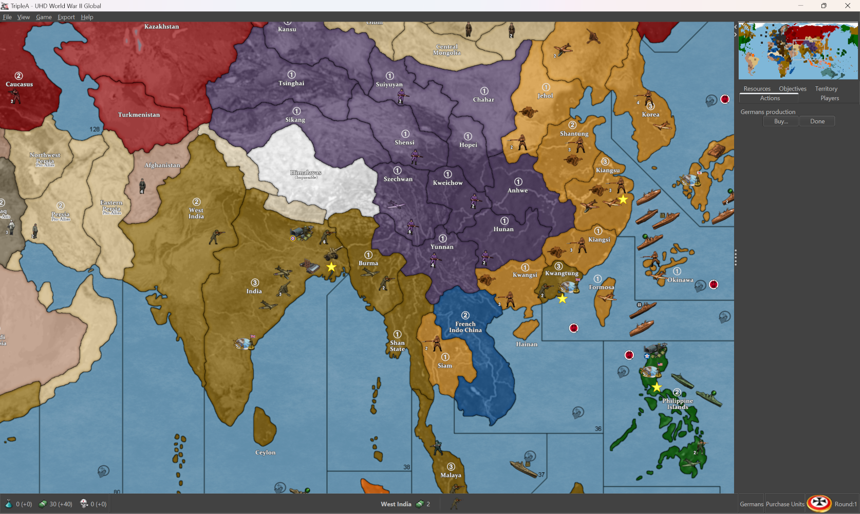
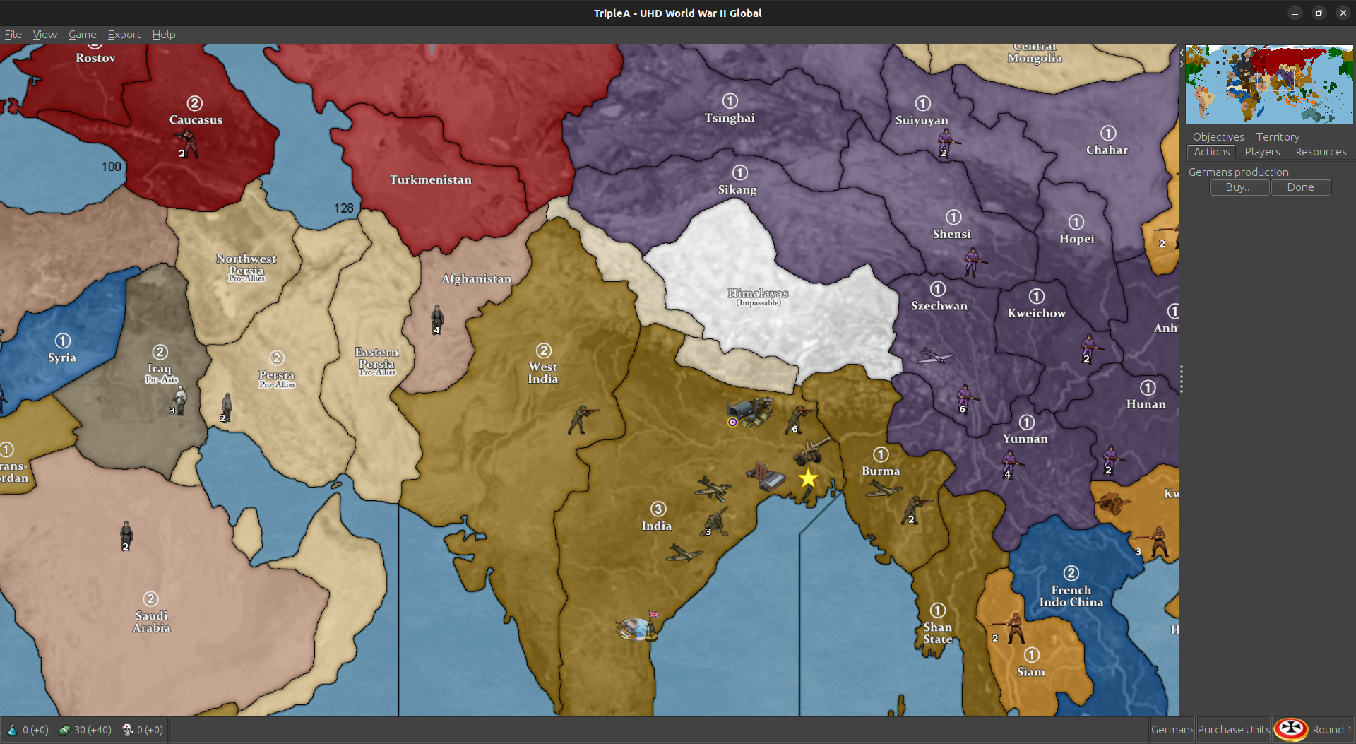
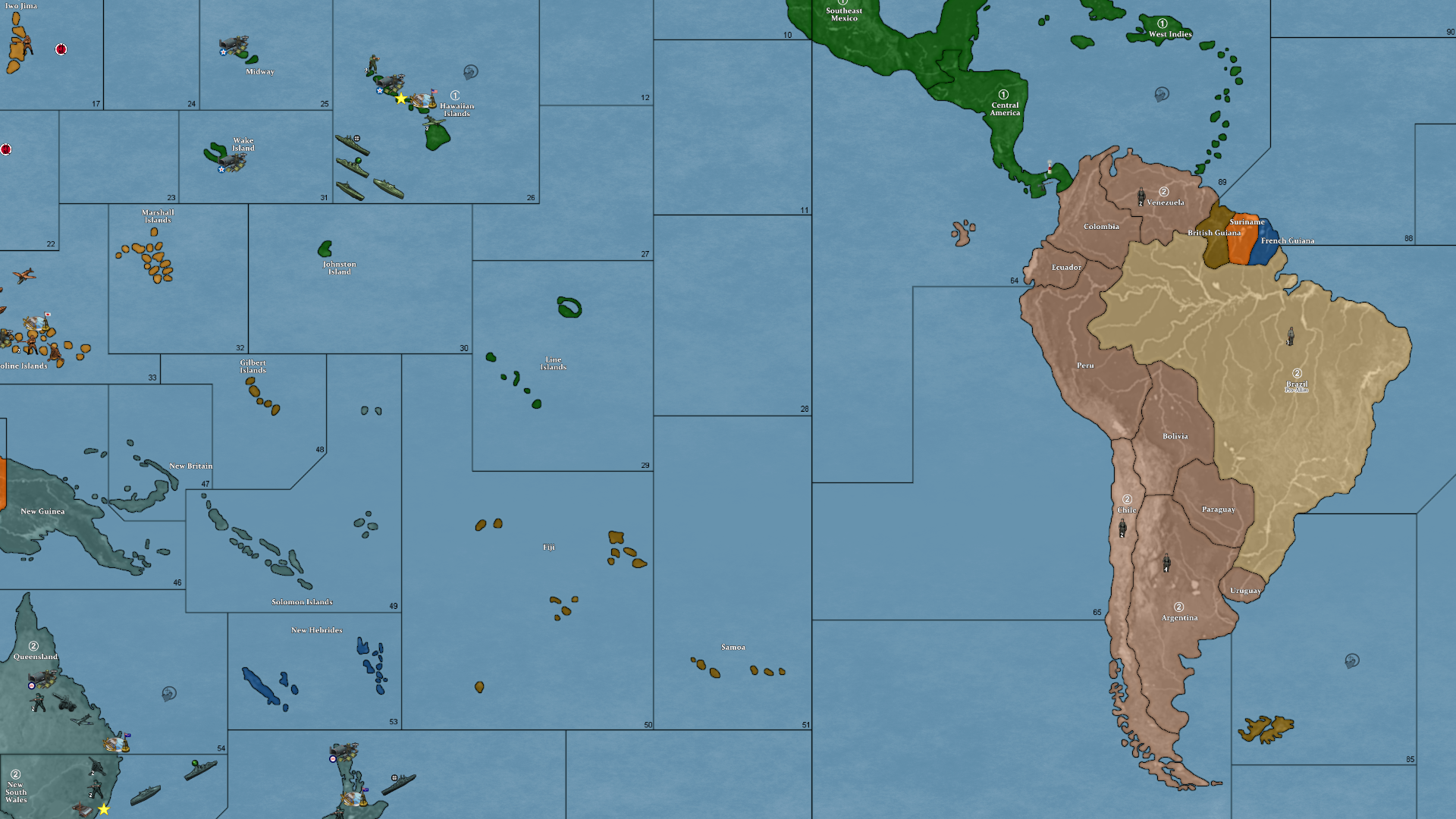
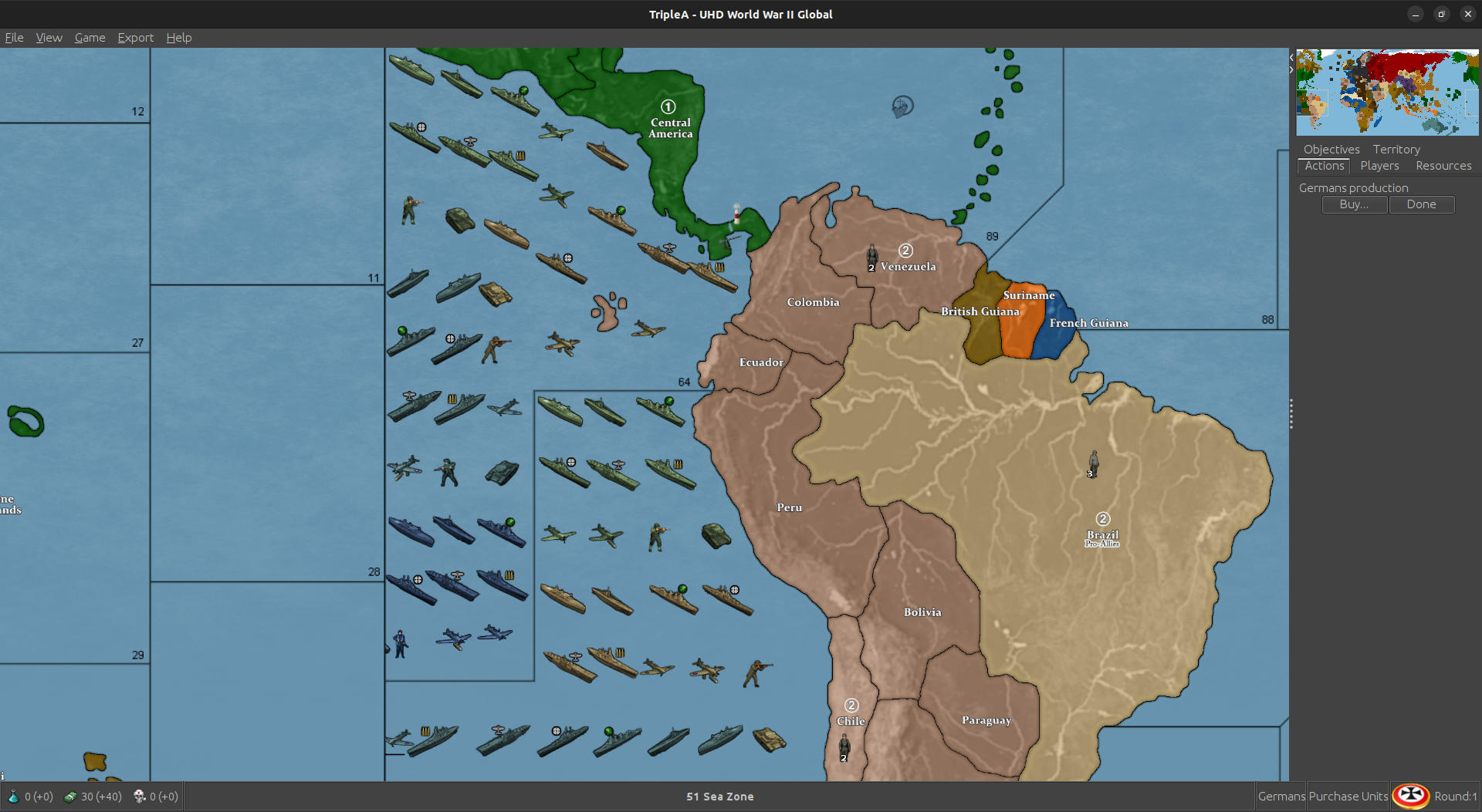
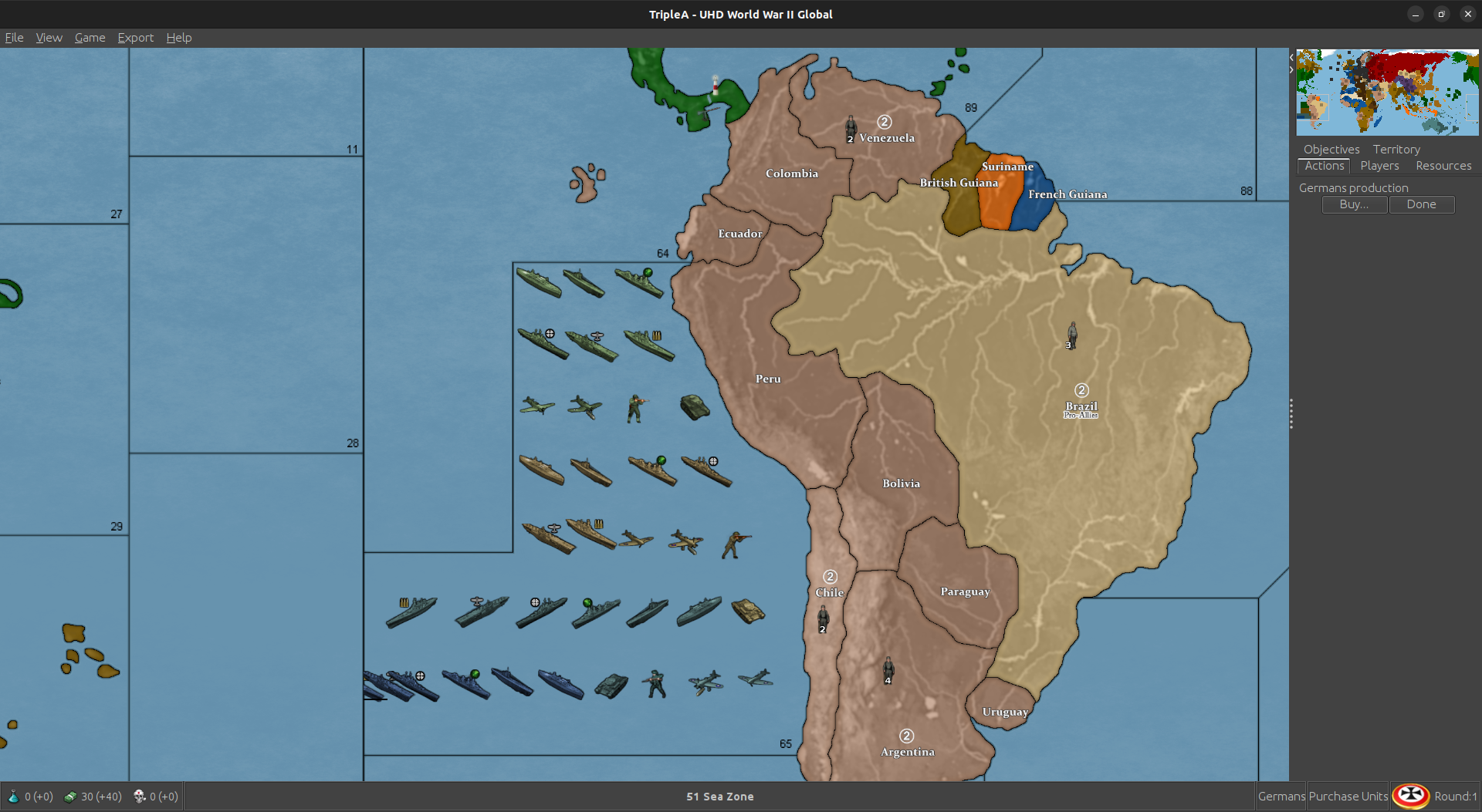
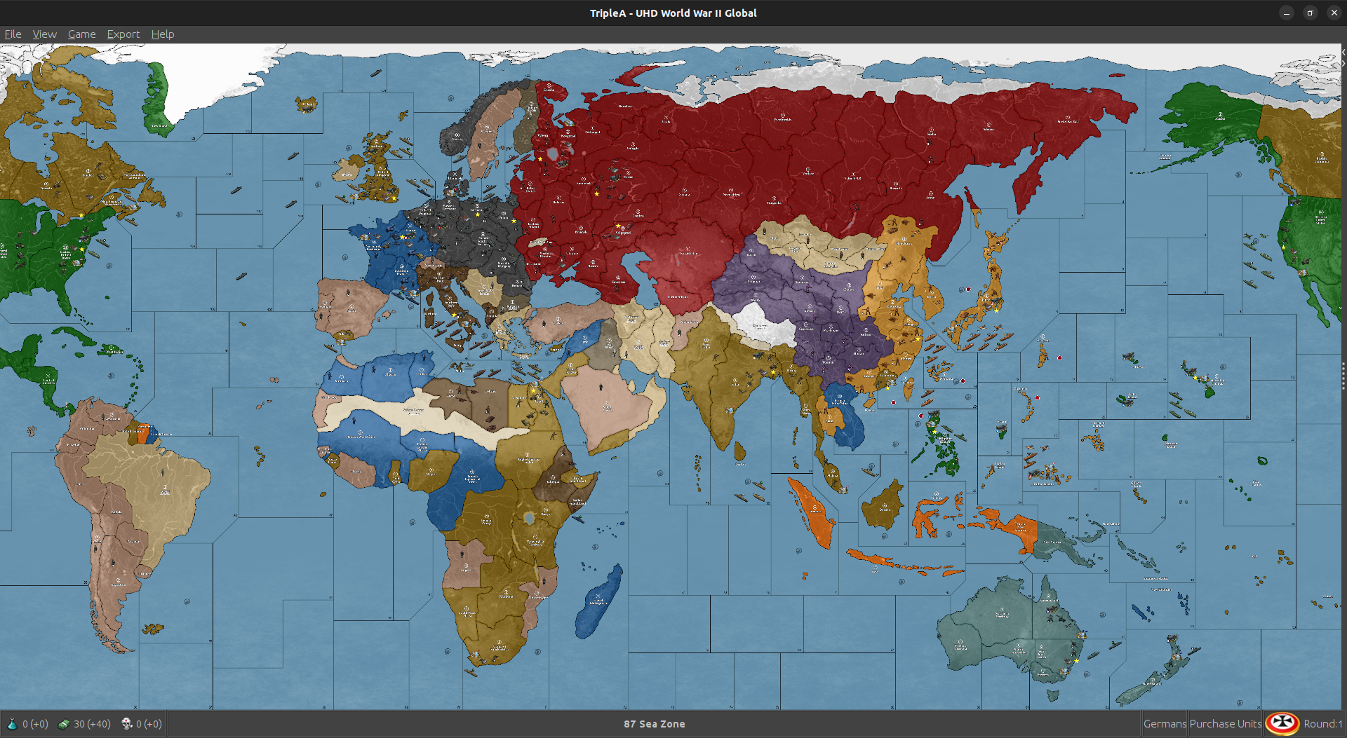
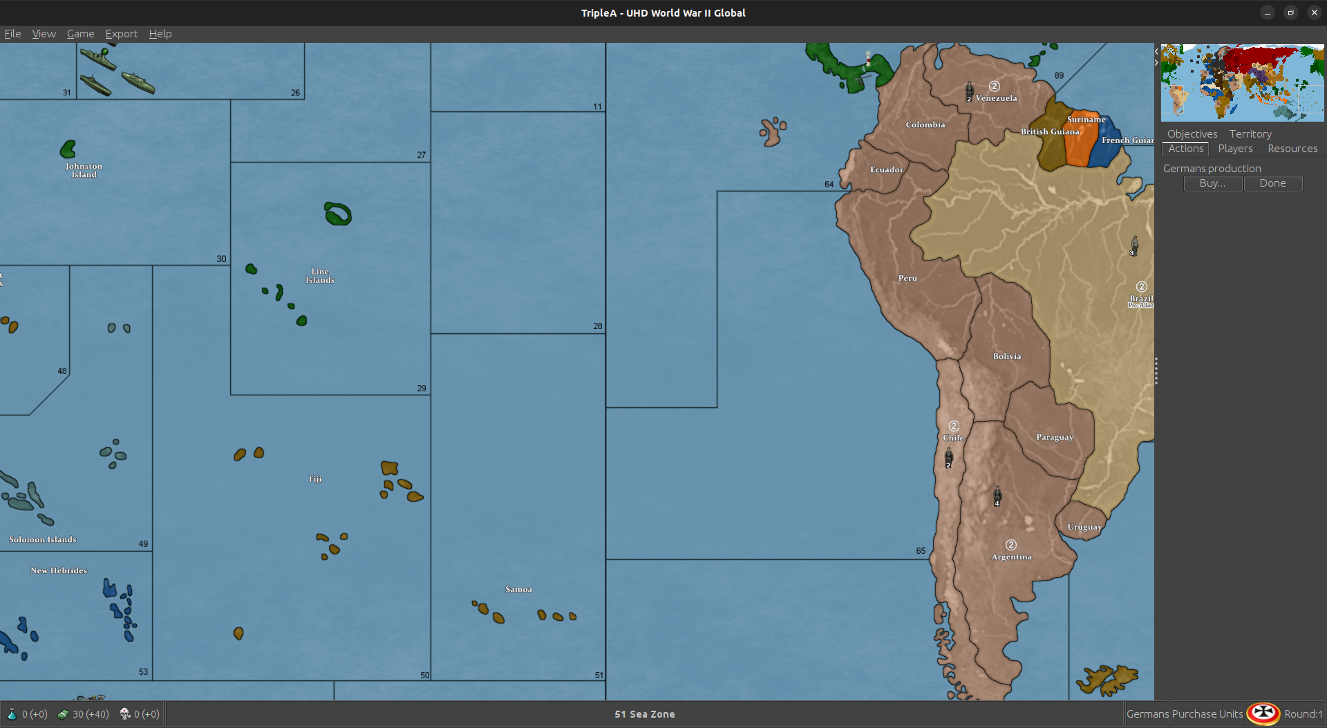
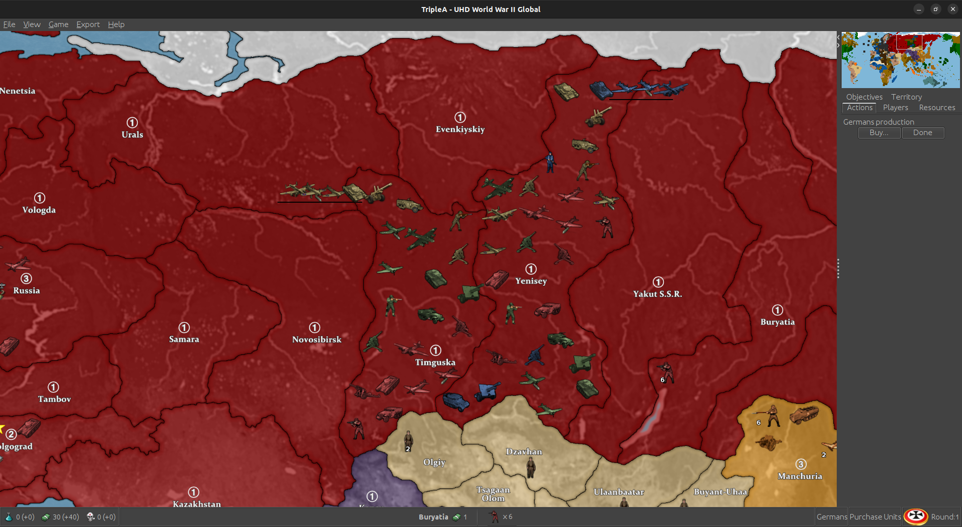
I was trying to play it using a few different views, a high vibrancy sorta hi fi for the default, but then if you want to punch up the contrast between the units and the map, or use the standard tripleA G40 units, those may look closer to the tints using either map blends or some lighter Hex colors for the nations. Also if you like a more simplified revised-style look, can click all the map details to off in the view options, and it will sorta time warp the look of the thing back to the way tripleA in the aughts hehe. Like with like no relief - just sorta bare bones. With map details off that way, the max zoom out before some of the sz border lines start to breakdance is about 50% I think, but should hold to at least that scale. 60% mapview I think should be good to go for whatever.
For the flags/pucks that show in the UI those will scale depending on Font size you have set for the main display on computer, so when I use tripleA at 1440 or 1600p I have to upscale my Font to either 125 or 150% for some of those images to look good at that higher resolution scale. Basically just tried to do what I could to go from the older 4:3 sorta display to something that’d work with the super zoom or a wider stretch there, but for the units those are all sorta set by the standard dimensions from when tripleA was first made. 54 was as tall as it would let me go before they started clipping at the top/bottom of the UI windows. Flags were sorta the same, like with a hard ceiling there for how it was set up initially for the stats I guess.
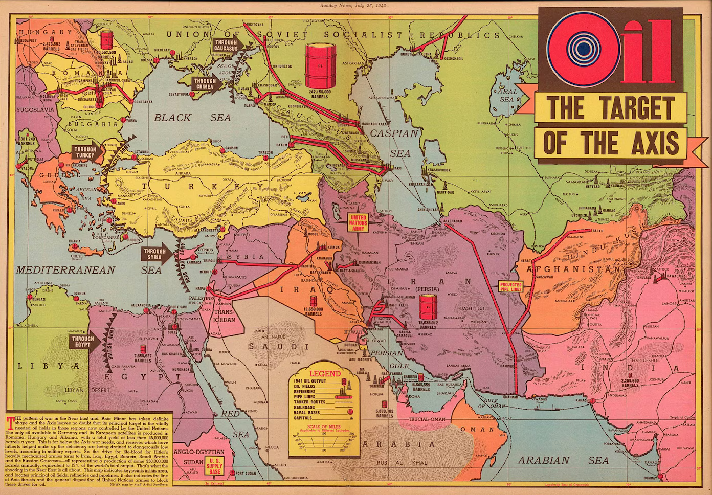
The larger flag pucks for units were somewhat harder to center, sometimes they’d cover over a bit or be like dead center behind the tank. Just sorta depends on how beefy the unit is. What would be cool is if the units could go extra large like the same way the map can super zoom in 2.7 and then position the flags or roundels around them, but not sure if that’s likely to happen any time soon. As I recall that was the main reason for going with something about 11000x5000 px just so that the units we had available wouldn’t look too tiny relative to the size of the map, but I think something slightly wider and just a bit taller might be cleaner for the 200% zoom in thing. Might try for a sping project if I can get up the juice. But meantime hopefully it’s not too hard to tweak around. Let me know if you hit a snag, we can probably figure it out.
Best
Elk