Modules for ABattlemap
-
I have not tried to minimize it. I know it crashes when you play around in the new area too long, so save often when using that area.
-
Well so far looks like I am the only one this is not working for. As soon as I minimize battlemap the program crashes.
@Cmdr:
I have not tried to minimize it. I know it crashes when you play around in the new area too long, so save often when using that area.
There was a little bug, sry :oops:
Should be fixed now (the .MAP file wasn’t neatly sync’d with the .bmp).:cry: Keep the Hammer & sickle!!! :lol:
They are there, you just have to have a really good look ;)
Ow, and thanks for all the help you guys gave: toolpieces, bigpieces, tech drawings, VC counters… Some thing missing though is a nice photoshopped .bmp, kinda like IL’s, but I’m lacking the time and skills for now.
However, if you like any new counters/things added/things changed to the map, now is the perfect time to ask :)As soon as I get your blessings, I’m gonna make a 42 module and put them in the first post.
-
we need to redownload to get the fixed maps then I take it?
-
Some thing missing though is a nice photoshopped .bmp, kinda like IL’s, but I’m lacking the time and skills for now.
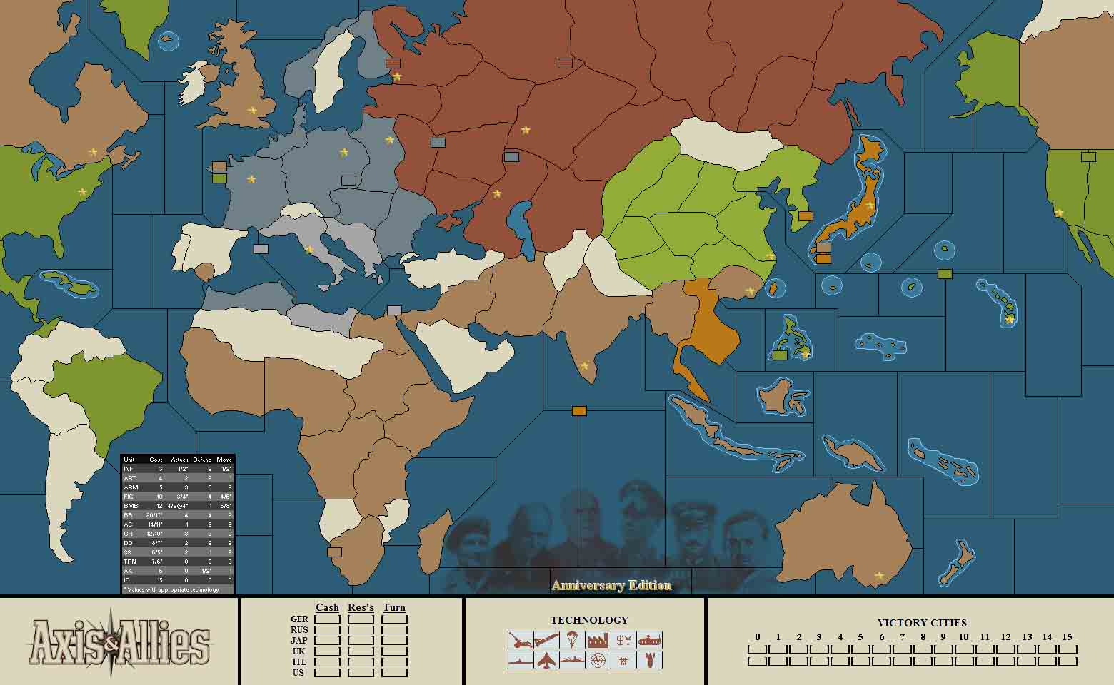
I will be loading my graphics programs onto this computer sometime this weekend. I can probably take care of such for us. The crash bug seems to be gone now. One thing does need to be changed however. The squares on the tech chart are only large enough to accommodate 4 flags. they need to be increased in size to handle 6 flags on the off chance all the countries acquire the same tech.
-
Shouldn’t the starting map Show Japan’s cash as 17 not 18?
-
However, if you like any new counters/things added/things changed to the map, now is the perfect time to ask :)
As soon as I get your blessings, I’m gonna make a 42 module and put them in the first post.
How about a chart showing unit cost?
-
@Cmdr:
You can copy the old toolpieces and put them back in the folder, Jeff
Thanks, that’s much better.
-
Correct me if I am wrong, Holkann, but I think I can make cosmetic changes to the map (ie put unit costs in a sea zone or something) without screwing up the functionality of the map.
-
Yes Jenn the bitmap itself as far as appearance, can be modified without affecting the functions. Changing territories or adding them which is basically what the new map has done with the chart space requires changing the sektor files as well. As long as none of the territory borders are moved everything is fine. For me the map is fine as is, and I don’t think it needs anymore stuff added to it. Spiffy pictures and all that jazz do not really add to the functionality of the map.
-
I just wanted to put the price charts on there. With so many flavors of Axis and Allies and different unit abilities and prices and everything, it can get hard to keep straight. So I fixed it up a bit.
-
@Emperor:
Shouldn’t the starting map Show Japan’s cash as 17 not 18?
You’re right, will be corrected.
@Emperor:
How about a chart showing unit cost?
@Cmdr:
I just wanted to put the price charts on there. With so many flavors of Axis and Allies and different unit abilities and prices and everything, it can get hard to keep straight. So I fixed it up a bit.
I’ve got nothing against a price chart :) But since there’s enough room left at the bottom, I’ll add it there.
And the tech thingies should be bigger indeed.
Gonna place a new version today, with the suggested changes…
-
I already added a price chart, will email.
Here’s the JPG version for those who want to see it early. (BMP is better for Holkann since it won’t be blurred.)
Note that I put it in the same general location as the one printed on the game board itself. Also, I improved upon the game board a bit by adding in the reduced cost on some units with technology.
HolKann, if you want, feel free to change the title bar color to American Green and the rest of the chart to two shades of neutral gray (German Gray and Neutral Gray?) Obviously the text color would have to change to Black then. But it might “feel” more appropriate to the board.

-
Owkey, job finished, you can download it here.
@Cmdr:
Note that I put it in the same general location as the one printed on the game board itself.
I did replace it to the lower left corner of the board, because it made the borders between the seazones disappear.
Also added to the download are the necessary SektorInfo files, so other people can create their own versions of the map without going through the hustle of creating these files by hand. Bear in mind though that it’s not a good thing if new maps contain radical changes from other maps, because then people with different maps will have a hard time knowing where the units are placed when playing against eachother.
Edit: also posted a .zip-file without the SektorInfo files in the first post of this thread, since I think the map’s fairly finished now :)
-
Big thumbs up to those involved. This is probably the best battlemap module I have seen so far.
-
Very nice.
Just some cosmetic issues on my end, I want the old icons, I know, I’m so blasted conservative, but it’s only on MY screen! heeh
-
2 minor issues. When I load a map made with the map made with the prior chart at the bottom any icons there are showing up in those spaces.
I have seen some maps with Japan with 18 IPCs in '41 this is incorrect as they start with 17. I can not double check this as I replace my start files with ones that have the unit neatly stacked as opposed to scattered pell mell. Jenn has some nice start files she could e-mail you for the final release version.
-
I’d be glad to send you the start files. I prefer them stacked up, makes invading and seeing what is in the zone defending and attacking easier, IMHO.
I believe the 18 IPC has been repaired to 17 IPC. I’m pretty sure Russia’s been repaired to 30 IPC as well.
-
I just noticed the '42 scenario still has the turn order text from '41.
-
I just noticed the '42 scenario still has the turn order text from '41.
I fixed this. Just download the '42 map from
http://www.mediafire.com/download.php?g4ym2mdizje
For those who probably do not know about .7z please visit
-
2 minor issues. When I load a map made with the map made with the prior chart at the bottom any icons there are showing up in those spaces.
This I don’t really get. The areas are moved a bit because of bigger tech boxes and a unit reference chart, so that may be why your icons are not in the right spot there. (I’m only guessing what your sentence meant though :roll:)
I have seen some maps with Japan with 18 IPCs in '41 this is incorrect as they start with 17. I can not double check this as I replace my start files with ones that have the unit neatly stacked as opposed to scattered pell mell. Jenn has some nice start files she could e-mail you for the final release version.
The 18 IPC’s are back to 17, and neatly stacked units would be quite nice, that’s true. Could you e-mail me your files (username at gmail dot com)? Big begging eyes mode Or Jen, would you be so kind?
I just noticed the '42 scenario still has the turn order text from '41.
Damn, at one point I thought “don’t forget the .bmp file for '42!” :D


