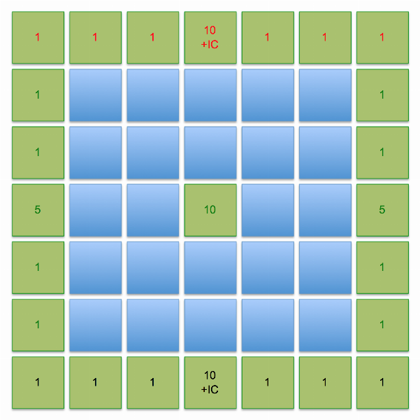
Yes the Negotiations Chart and Research chart are both included in the 7.0 production chart here about halfway down the page:
http://www.axisandallies.org/forums/index.php?topic=34496.30
Hey thats pretty nifty. Can you begin uploading the files on BBG?
Looks good Tekkyy :mrgreen:, but that Italian flag should be placed right off Bucharest instead of Berlin I think :wink:
The hit allocation chart is with the battleboard ZIP files on BGG.
This isn’t on BGG yet.
Oh yeah, not Berlin.
Peer review is important. :wink:
http://www.yourfilehost.com/media.php?cat=image&file=105820070425_victory_city_aid.png
I’ve been printing these on matte (not gloss) photo paper.
Looks great I think.
Tekkyy i could just kiss you ! :-P
It just struck me how much of a professional job we did and what great promise our varient will provide to thousands of AA players. Please finish the path we both traveled on for so many months and upload all of the files. All the others who worked countless hours and days on this project have my unending support and best wishes. You are all held in high esteem and have accomplished something greater than the sum of our individual contributions. Now others have a chance to really play something terrific and we have given them value for their game and deserve any and all accolades that may ensue.
If you make a nice print of the map and other items please post the picture in Board Game Geek.
@Imperious:
Please finish the path we both traveled on for so many months and upload all of the files.
Well the 4 zip files at BGG has everything (including hit allocation chart) but not victory city chart and original illustrator files.
yeah those yourfilehost links has expired
we can either point to BBG, or re-upload to mediafire or something
Axis and Allies Historical Edition rules version 3.0
http://www.boardgamegeek.com/fileinfo.php?fileid=23892
Battleboards, hit allocation, technology, neutrals
http://www.boardgamegeek.com/fileinfo.php?fileid=23891
AARHE 3.0 “4 maps”, standard/italy, plain/setup, A0 128dpi
http://www.boardgamegeek.com/fileinfo.php?fileid=23890
AARHE 3.0 Country Player Aids
http://www.boardgamegeek.com/fileinfo.php?fileid=23889
Adobe Illustrator files for editing or high quality printing
http://www.axisandallies.org/forums/index.php?action=pm;sa=send;u=3122
Sorry but as the map for this breaks ALL of my golden rules, retaining ALL of the unhistorical borders of AAR, I simply cannot entertain the idea of playing on it. Shame, as there might be some good stuff in the rules. First impressions, and all that.
We made it sole for that purpose.
You would not like the older version… it had 5,000 ports and 1,000 different unnecessary pictures i got from the internet and i used a $30 buck program to draw all the thick pixilated shoddy rough lines that had no aesthetic value to an accurate map whatsoever. It even had lots of ^^^^ for mountains and ***** denoting snow territories. To top it off it had 500 different flags for nearly every nation on earth just in case someone would forget what the flag for Slovakia actually looked like.
Yeah AARHE isn’t a map. In fact, we avoided map changes for the project.
As for the rules, theres little reason why the bulk of it can’t be used for other strategic level maps.
What old version are you talking about Imperious? Another project you did?
no that post was true sarcasm on flashmans maps. Take a look at them. :-D
Such ingratitiude after all the trouble I went to drawing a simlified map that even IL could understand:
http://elbowmaster.com/web1/flashman/1942/Complete1942junSimplified.jpg
The outline of the land masses are horrible. redo.
The Soviets need to be earth brown
China needs to be red
Neutrals need to be white or cream colored
The lakes need to the same blue as the oceans and that blue is too pale
The IPC need to be in roundels and not squares
The lines need to be thinner
the pictures need to be gone
too many clip arts from the internet
Japan looks too close to the Italians color
Italians need to be a grey green anyway
America is too bright
British color is okay but also too strong
I can see how ( actually where) you got your ideas for sea zones and how they are staggered and get larger near the poles.
Lybia is not drawn correctly
your missing rio de oro which is the most important territory on the map
Japan is white - can’t you tell white from Grey? Even your chum’s map has Italy in grey, and as I’ve said there are far too many yellow/tan/orange/red/brown colours on most maps. Me colour blind - me no like. Earth brown is too close to the UK colour which is too close to tan which is too close to the sand colour…
Why should China be Red? I though it WAS red, at least “Red” (Soviet controlled) China.
Don’t see what’s wrong with “Lybia”. At least I can SPELL it correctly.
On this scale R de O is irrelevant - a worthless strip of desert best absorbed into Mauretania.
That green does look bright, this must happen in the process of converting into a net file, so thank Elbowmaster for this, plus the rather fuzzy jpeg effect.
The lakes in dark blue was a mistake - I thought you might confuse them for sea zones since the SZs are not now named; but yes it looks terrible.
The idea of the large strip at the top was because I elongated the map to widen the oceans, and it seemed reasonable to cram this with keys etc. rather than have a thin strip of a board. This isn’t necessarilly how a productuion map would appear.
I hope you’ve told Jeff to remove those B/W photos of Yankee artillery from the middle of the Atlantic on his map. Thought not.
Still, to indulge you, I’ll try the IPCs in circles; though maybe keep the IC numbers in squares for clarity.
I also did a map with neutrals in white and Japan in vomit yellow for your benefit, surely you’ve seen it?
http://elbowmaster.com/web1/flashman/1942/Complete1942junYellow.jpg
OK the map is marginally better… except you have some major thing with bright colors… That vomit yellow would not be bad if you picked a less bright yellow.
ON your old map you had Japan and Italy way too close in colors
Lybia does not look like any Lybia i have seen
china should be red so you can use AAP Japanese pieces form it and now they will match…plus soon its red china anyway so why not help it along?
The Soviets need to be the same color as Milton Bradley Soviet pieces… because thats the bast color for them. That revised burgundy is crap.
British Kaiki is hardly as strong a color or similar to Milton Bradley Soviets.
You should dump the squares with that anchor and put the ports inside on the territory. make the anchor white and the box the same color as the territory so we dont have to see those lame boxes and slit our throats
So um, do you wanna update the first post to include the links at
since all the yourfilehost.com links are dead?
Lets use your BBG links in their place. If you can get them ill change my sticky to correspond to the links.
I already posted the links earlier.
Click on “Quote from: tekkyy…” and it’ll take you to my post.
I am about to print out the map again.
The Spanish translation of your map prompted me to do some tweaks to the icons.
I also added in icons for neutral army so you don’t have to look up the table.
http://www.mediafire.com/?4y2l4bywmi4
A0 100dpi
@Imperious:
You should dump the squares with that anchor and put the ports inside on the territory. make the anchor white and the box the same color as the territory so we dont have to see those lame boxes and slit our throats
surprised you didn’t make buryatia a port. :lol: :lol: there are way to many of them. i aso think there are too many victory cities too.