@Panther yes I forgot was the money accumulated by France when taking its capital, thanks
Turn History the Old Way (was: You should read this)
-
Greetings all,
just for those who haven’t played with the themes yet and who are annoyed about the way a turn history is displayed in a window that requires scrolling to see everything:
you can mitigate this by choosing a different theme:Your profile (top left) / settings / select a skin
Choose e.g. slate and hit save changes on the bottom.Then the history appears the “old” way

I hope this helps.
Best,
Tobias -
That’s weird. I think that’s actually a bug.
Also, again, Turn History is a feature of TripleA. Please request this change from the TripleA team.
-
@JapanDOWRound1Fan Are you sure that works? I don’t think the skin will impact whether or not scroll bars appear on the turn post summary. I just tried it and don’t see any change.
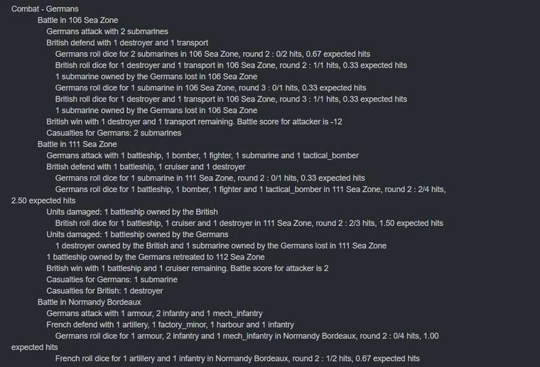
The reason for the scroll bars is that the forum formats the posts as “code blocks” as it uses markdown language. So because TripleA posts the turn with indentations for the various levels of information, the forum displays it as a code block. Information on markdown implementation and code block example can be seen here: https://daringfireball.net/projects/markdown/syntax#precode
@djensen This isn’t a bug as I don’t believe it changed at all from the TripleA side. I’m not sure if there is a way to disable the code block highlighting/scroll bars in NodeBB. We could consider changing the TripleA post to trick NodeBB into not formatting it that way.
-
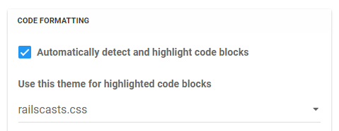
@djensen I took a quick look and I think the Markdown plugin settings can be changed for code blocks. If you turn off or change the CSS then I think it’ll display differently. Here is a screenshot of the settings:

-
@redrum I’d rather not turn off code blocks though. Though I guess this wouldn’t affect using ```
Why not use Markdown for the summary. It’s a more compact and just as easy to read as using tabs:
For instance:
### Round: 1

#### Purchase Units - Chinese
- Trigger Chinese Artillery Supplies: Chinese has their production frontier changed to: productionChinese_Burma_Road_Open
- Chinese buy 3 artilleries; Remaining resources: 0 PUs;

#### Combat Move - Chinese

#### Non Combat Move - Chinese

- 4 infantry moved from Yunnan to Szechwan
- 2 infantry moved from Hunan to Yunnan
- 1 infantry moved from Shensi to Szechwan
- 2 infantry moved from Suiyuyan to Shensi
- 1 fighter moved from Szechwan to Burma

#### Place Units - Chinese
- 3 artilleries placed in Szechwan

#### Turn Complete - Chinese
- Chinese collect 10 PUs; end with 10 PUs
- Objective Chinese 1 Burma Road: Chinese met a national objective for an additional 6 PUs; end with 16 PUs
renders in to this, which is super nice
Round: 1
Purchase Units - Chinese
- Trigger Chinese Artillery Supplies: Chinese has their production frontier changed to: productionChinese_Burma_Road_Open
- Chinese buy 3 artilleries; Remaining resources: 0 PUs;
Combat Move - Chinese
Non Combat Move - Chinese
- 4 infantry moved from Yunnan to Szechwan
- 2 infantry moved from Hunan to Yunnan
- 1 infantry moved from Shensi to Szechwan
- 2 infantry moved from Suiyuyan to Shensi
- 1 fighter moved from Szechwan to Burma
Place Units - Chinese
- 3 artilleries placed in Szechwan
Turn Complete - Chinese
- Chinese collect 10 PUs; end with 10 PUs
- Objective Chinese 1 Burma Road: Chinese met a national objective for an additional 6 PUs; end with 16 PUs
-
@djensen Yeah, that’s the alternative is changing the TripleA post to use markdown formatting rather than spaces. Discussing on the TripleA forum as well since whatever the solution is will probably be used for both: https://forums.triplea-game.org/topic/1105/changing-how-pbf-posts-are-displayed/3
-
I tried turning off the code highlighting all it did was turn off highlighting. It’s still a codeblock.
I think Markdown is the way to go here. Vertical scrollbars are a UI anti-pattern. Developers are willing to tolerate it for coding purposes but we’re weird that way. Everybody else hates it.
-
@djensen Oh, I guess it only turns off the highlighting which is like the only good part of it :) The scrollbars are the really annoying part especially the horizontal ones.
I’ll look to make a TripleA code update to move the posts to markdown syntax especially since now both forums use it.


