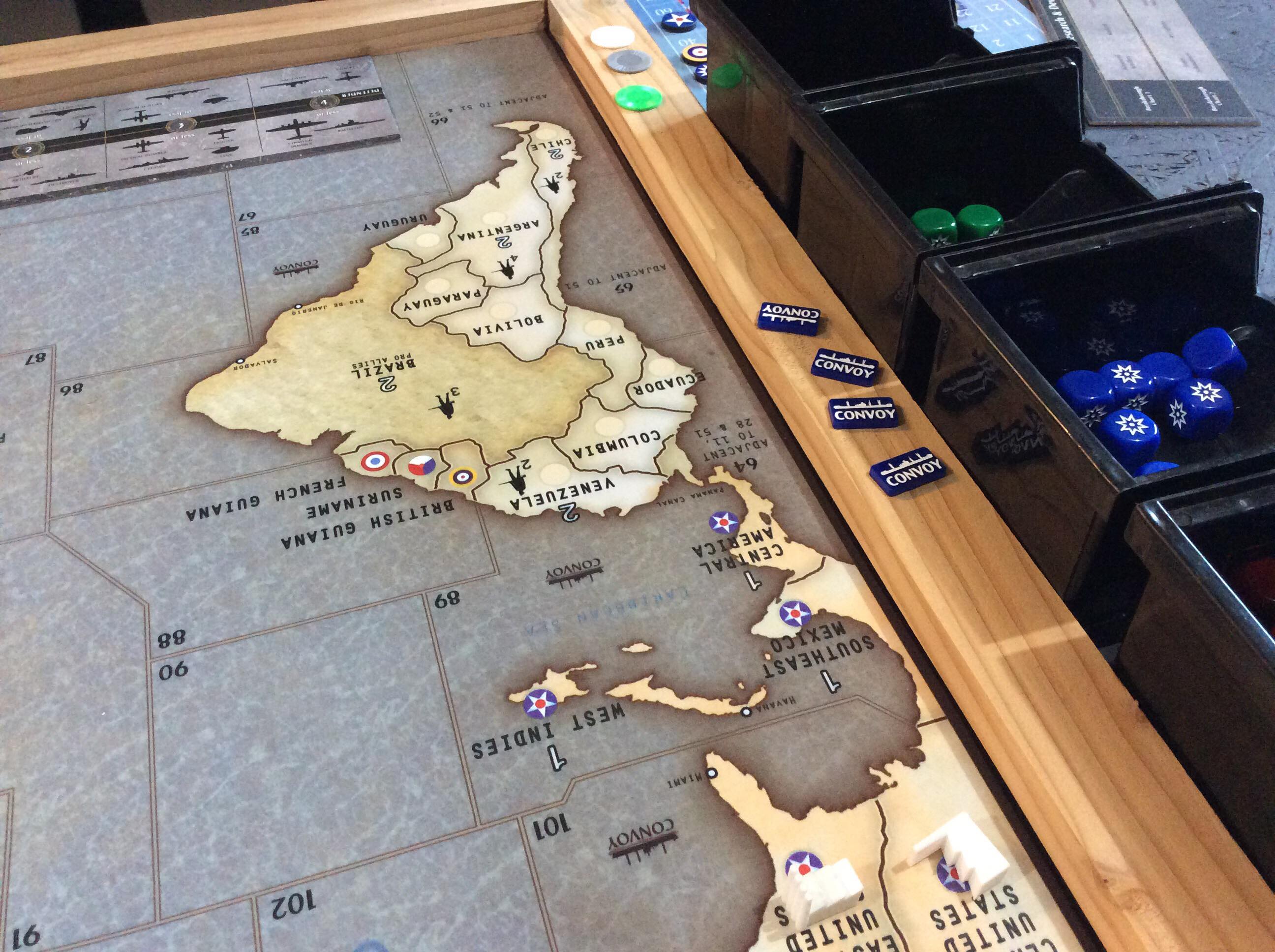
I remember that this isn’t a fie that can be shared. He basically took an actual map and added decals and created the areas with markers. So its a “one off” map.
Sired's Map project - Updated- 4/16 - files available see first post
-
A great piece of work, Siredblood. We finally printed and trimmed our map last week and played on it over the weekend. Thanks so much for the time and effort you put into it.
Edit: sorry for the potato image. I’ll try to get a better photo after work today.
Sweet! I couldn’t make out what the blue roundels were on the right on the frame… what are they?
-
Convoy markers from HBG.

-
My mat came in last week and it looks amazing! Unfortunately I can’t seem to get images uploaded. I found a place overseas that I went with since it is one large playmat, not two like it would have been if I went with Inked Playmats. Simply amazing the detail and how it looks. Thanks sired, you did a great job on this!! Currently have a game planned with a buddy in two weeks. :)
I went to the website you mentioned but didn’t find a custom mousepad size (or a rectangle size that would work).
Can you provide a specific link or more info?
I found this link and was curious if anyone has used? shop.x-raypad.com/custom-axis-allies-g40-play-mat/
Thx
jonpfl -
Our mostly finished table using your map. Pretty happy with it so far.
https://imgur.com/gallery/eeon10G -
I must say that map and table is styling and profiling…
-
Navy, that’s super sick, thanks for the pics buddy!
-
Hey Siredblood,
Congrats on the ‘Bloodbath’ Tourney, it looks like it was a great time from your video on Youtube.
Just a couple questions on your map files that are available to purchase and download for $20. Is the OOB map file completely true to the original?
- OOB Anzac Roundel
- All IPC values returned to normal
- Removal of cavalry from Mongolian territories
- OOB Italy Roundel
- OOB Far East Command Roundel
- OOB German Red and Black Roundels
Thank you for your time, and your hard work on this project,
Rand.
Ipc values are OOB, standing army is OOB, roundels remain changed
-
Thanks for the answer, will be in touch.
-
Version 2.0 is under way
-
-
Spinal Tap suddenly comes to mind along with the number 11. :-D
I figure since his bloodbath, he has seen areas to tweak/enlarge/clarify on the map.
I know from experience, coming back to a project after a break, you see things that were missed before.
OR
he just likes to tinker with something which he enjoys… 8-)
-
Both… tinker and tweak!
I always wanted to add 100 more cities or so for a map touch! But also there are still OOB stuff not correct or at least misleading. Not in a gameplay aspect, but historical… and yup, some border tweets… china territories will have the Chinese symbols under name, japan will be 2 SZ as it currently contradicts the rule book… there is more, but it’s a surprise!.. it’s gonna be love trust me ;)
-
@siredblood Any status update for the custom maps?
-
Hi @siredblood - the map and all your other customizations look amazing. I’m particularly liking the color scheme on the map.
Not knowing how much difference there is between the maps: Would it be possible to make a version of the map suitable for play with the Anniversary version of the game?
Keep up the great work, man!
-
Greetings Generaloberst sired,
What version number is your OOB variant at?
What changes since 1.6 OOB? (I searched but could not find any thing as to ongoing changes specifically for 1.6 OOB). -
@siredblood is it possible to download vector versions of these maps? Also is it $20 for all of them? If so, where do I pay? :)
We play 1942 Global, is the map correct to that?
-
@siredblood Sorry one more question. What is OOB? I’m thinking “original … something … board?”
-
Out Of Box or Original Out of Box … OOB
-
@jasonondesign Out Of Box


