


Or, just build infantry in Moscow and pull everything back except the first line.
This is a strategy that will make Moscow nearly impenetrable. As Germany treks across the Russian territory that has only one infantry each spot except the front line, Britain will be pouring their entire strength into invading from the opposite side.
E40 and G40 ABattlemap modules preview
-
light but even lighter and even color distribution.
-
Allright, clearly forgot to check this thread regularly :roll:
My votes:
- KISS: if not all can be auto, then all should be manual. No confusion for newbies ;)
- KISS: All together plz. In A50 the first map made by Atilla had them spread out the map, so I kept it that way. But together, with a little text info on the exact objective, would be the most intuitive and simplest way. Also, no unnecessary decision making of where to put the boxes, and everyone finds them back easily.
- keep the darkness of ocean and land about equal, then make the whole map lighter. Or something similar so it’s no problem reading the amount of units in a country.
About a first -incompatible, barely playable- version: if you have one, plz publish it, it’s better to play and get incompatible games, then no games at all 8-)
-
I would like all the bonuses to be in one area. I did not like hunting all over the map to check to see if all the bonuses were correct.
-
You have to take France’s blue into account. You want very bright blue oceans and very dark blue french or viceversa, because you don’t want confuse France and the sea
Same could go for true neutrals and impassable … last could be white and first … maybe like cream?
-
I like the natural look of the maps… whatever is easy on the eyes. I like the point of unit color and map color working well together to quickly and easy to make out what the units are and how many etc.
I can tell its going to be an awesome module!
-
You have to take France’s blue into account. You want very bright blue oceans and very dark blue french or viceversa, because you don’t want confuse France and the sea
Same could go for true neutrals and impassable … last could be white and first … maybe like cream?
Perhaps all white, with positive slanted lines for Axis neutrals, negative for allie neutrals, vertical for strict, and horizontal for impassable? or criss-cross/double-slanted lines for impassable?
-
I’m against the lines … they mix with the number of units that one has and things get confusing. My suggestion:
- White for impassable
- Cream for true neutrals
- Some type of grey (not the same as Germany) for pro-axis
- Some type of green (not the same as USA or China) for pro-allies
- Purple for Dutch
Alternative: make ALL the neutrals (true and both pro) white, but make a counter for pro-axis and another for pro-allies. It can be handy in case of true neutrals being attacked. Also, make impassable cream and Dutch purple
-
I’ll add my votes for the following
- Neutral token as per Funcioneta’s suggestion
- All NOs in a singular location for each nation near there capital.
- No auto for any NOs. If half are not auto then it will just mess people up in my opinion
-
-
I’ll add my votes for the following
- All NOs in a singular location for each nation near there capital.
- No auto for any NOs. If half are not auto then it will just mess people up in my opinion
I chance my vote from NO’s in one location to #2 above. Good idea bugoo (or whoever gets the credit).
I also agreed with #3 above.
-
I’m ok with all the NO’s being in one spot… if not thats ok too.
No automatic stuff… thats ok too.
-
I’ll add my votes for the following
- Neutral token as per Funcioneta’s suggestion
**2) All NOs in a singular location for each nation near there capital.**3) No auto for any NOs. If half are not auto then it will just mess people up in my opinion
The seems strange to me. Are you saying you would prefer this to having them all on a toolbar? If so, for what purpose? I can keep all the NOs of each nation together, even if they are all together on a toolbar. Putting all the markers on the map itself seems to me to just take up a lot of room on the map where you may already be limited on space for putting pieces with some of these territories. It may or may not be difficult to not obscure the view of territory borders. I personally think they would look better on a toolbar, anyway, but if you have good reasons that I am missing and others agree, I’m willing to consider your suggestion.
Thanks for all the input, guys. Please keep it coming!
- Neutral token as per Funcioneta’s suggestion
-
You make a good point, toolbar is good too.
-
OK, toolbar please.
Just not spread all over the place.
-
I’m against the lines … they mix with the number of units that one has and things get confusing. My suggestion:
- White for impassable
- Cream for true neutrals
- Some type of grey (not the same as Germany) for pro-axis
- Some type of green (not the same as USA or China) for pro-allies
- Purple for Dutch
Alternative: make ALL the neutrals (true and both pro) white, but make a counter for pro-axis and another for pro-allies. It can be handy in case of true neutrals being attacked. Also, make impassable cream and Dutch purple
If I were to make the markers, what would they look like?
-
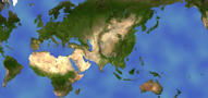
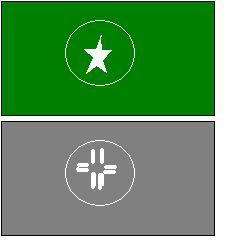
Not sure … but let’s see, HOI2 uses for allies a white star surrounded by a circle, all surrounded by green, for allies tag. Axis uses the same, I think, but with with grey. That could work
-
A possible example (you can get the idea)
Suggested Topics