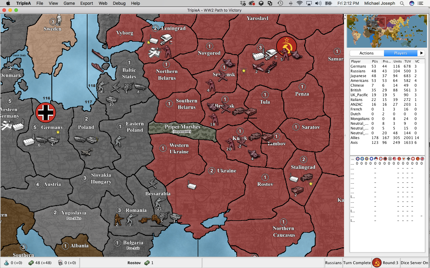
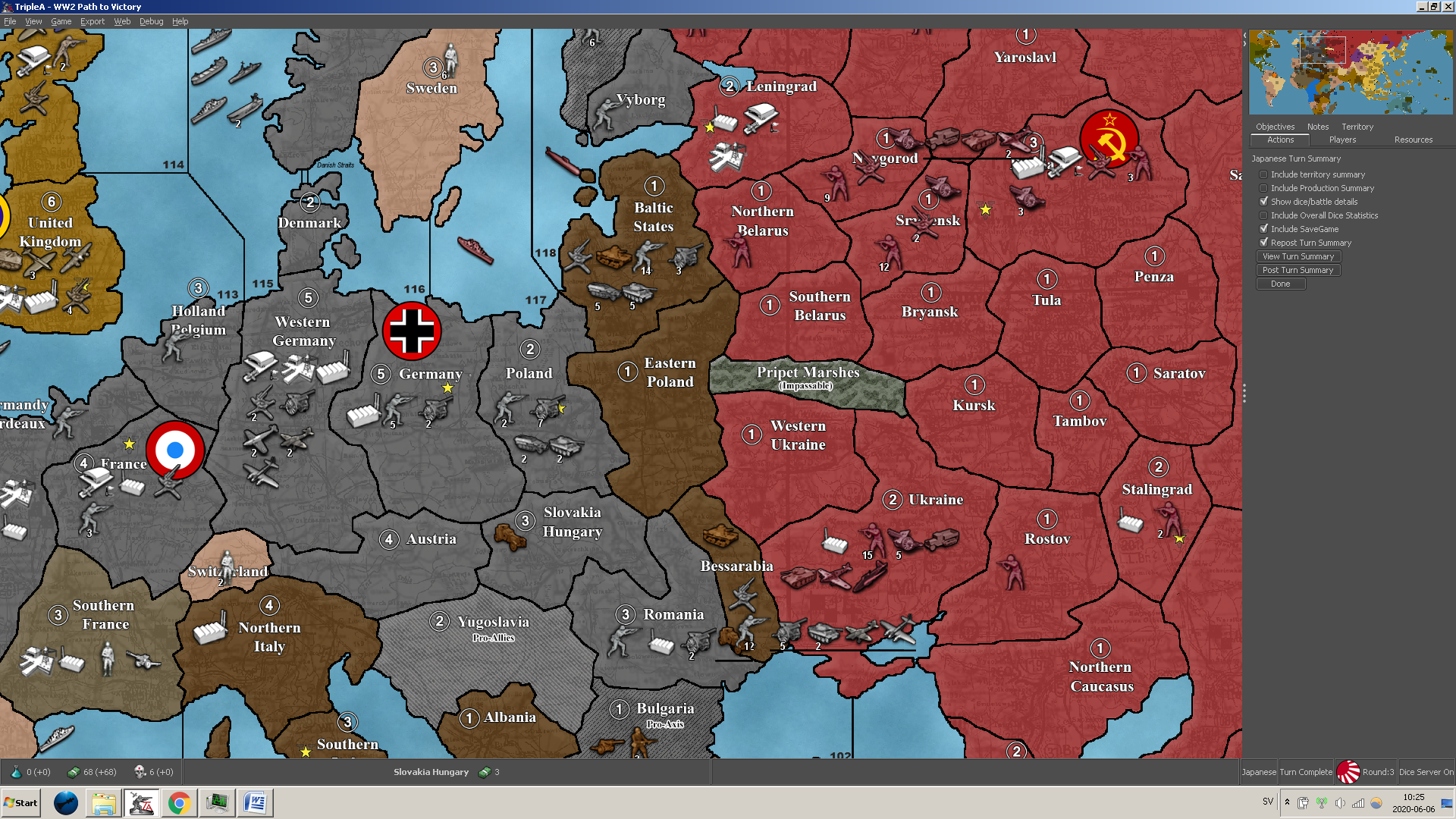
Hi Craig, you are correct that there is another game that the Balanced Mod uses for its baseline objectives, that would be Global 1940 so you were starting in a good spot on your search. And I’m not sure there is a handy comprehensive list of the National Objectives listed on the rules since they used Balanced mod to build off of.
However I quickly summarized them here, let us know if you have more questions!
Germans
5 IPCs if not yet at war with Russia. 5 IPCs for each German controlled territory: Leningrad or Stalingrad or Russia. 5 IPCs if Axis controls Southern Caucasus. 5 IPCs if there is at least one German land unit in either Egypt or United Kingdom. 5 IPCs if Germany controls both Denmark and Norway and Sweden is not allied-controlled or pro-allied. 3 IPCs if Normandy and Holland Belgium are both Axis controlled at the beginning of Germany’s turn and each garrisoned with at least one German land unit at the end of Germany’s turn. 2 IPCs for each German controlled territory: Iraq, Southern Persia, or Northwest Persia. 3 IPCs if Romania, Yugoslavia, Albania, Bulgaria, Greece, and Crete are Axis or Pro-Axis controlled.Russians
2 IPCs if Russia is at war with European Axis beyond Round 2, Archangel is Russian-controlled, and sz128 has no enemy warships (“Northern Route”). 2 IPCs if Russia is at war with European Axis beyond Round 2, Southern Persia is Allied-controlled, and sz82 has no enemy warships (“Persian Corridor”). 2 IPCs if Russia is at war with European Axis beyond Round 2, Amur is Russian-controlled, and sz5 has no enemy warships (“Pacific Route”). 3 IPCs if Russia is at war with European Axis and there are no allied units in any originally Russian territories. 3 IPCs for each originally German, Italian, or Pro-Axis neutral territory in mainland Europe that Russia controls.Japanese
10 IPCs if not yet at war with USA, has not yet attacked or taken control of French Indo-China, and has not declared war on UK or ANZAC. 5 IPCs if Axis controls Dutch New Guinea, New Guinea, New Britain, and Solomon Islands. 5 IPCs for each Japanese controlled territory: Hawaii, Eastern India, New South Wales, and Western United States. 5 IPCs if Axis controls all of Sumatra, Java, Borneo, and Celebes. 5 IPCs if Midway, Wake Island, and Guam are Axis-controlled. 3 IPCs if Japan controls Kyushu, Hokkaido, Okinawa, and Iwo Jima. 5 IPCs if Marshall Islands, Caroline Islands, Palau Island, Marianas, and Gilbert Islands are Axis-controlled.Americans
10 IPCs if USA is at war and EUS, WUS, and CUS are American-controlled. 5 IPCs if USA is at war and Alaska, Aleutian Islands, Hawaiian Islands, and Johnston Island, and Line Islands are American-controlled. 5 IPCs if USA is at war and Mexico, South Eastern Mexico, Central America, and West Indies are American-controlled. 5 IPCs if USA is at war and Manilla and Davao are American-controlled. 5 IPCs each turn the USA has one land unit in France. 5 IPCs if Allies control at least 2 of: Normandy Bordeaux, Holland Belgium, Southern France, and USA has at least one land unit in any of these territories. 5 IPCs if Morocco, Algeria, and Tunisia are Allied-Control and the USA has at least one land unit in any of these territories. 5 IPCs if Midway, Wake Island, and Guam are Allied-controlled. 5 IPCs if Marshall Islands, Caroline Islands, Palau Island, Marianas, and Gilbert Islands are Allied-controlled. 5 IPCs if Americans have a land unit in at least one Axis capital.Chinese
3 IPCs and may build artillery if the Allies control Eastern India, Burma, Yunnan, and Szechwan.British
3 IPCs for UK Europe if UK Europe controls all of its original territories. 3 IPCs for UK Europe if Allies control two of: Sicily, Sardinia, Greece, Southern Italy, and Allies have at least one land unit in any of these territories. 3 IPCs for UK Europe if there are no enemy submarines in any Atlantic Ocean Sea Zones, excluding sz115 and sz128,…,sz130. 3 IPCs for UK Europe if Malta, Crete, and Cyprus are Allied or pro-Allied controlled.UK_Pacific
3 IPCs for UK Pacific if UK Pacific controls both Kwangtung and Malaya, and is at war with Japan. 3 IPCs for UK Pacific if UK Pacific controls Western India, and either Egypt or Union of South Africa is Allied-controlled, and there are no enemy submarines in the western half of the Indian Ocean: sz73,…,83.Italians
5 IPCs if no Allied ships are in the Med: sz94,…,sz101. 5 IPCs if Axis control at least 3 of: Gibraltar, Egypt, Southern France, and Greece. 5 IPCs if Axis controls all of: Morocco, Algeria, Tunisia, Libya, Tobruk, and Alexandria. 2 IPCs for each Italian controlled territory: Iraq, Southern Persia, or Northwest Persia. 3 IPCs if Malta, Crete, and Cyprus are Axis controlled.ANZAC
3 IPCs if the Allies control Malaya, and ANZAC controls all of their original territories, and is at war with Japan. 3 IPCs if the Allies (not including Dutch) control all of Dutch New Guinea, New Guinea, New Britain, and the Solomon Islands, and ANZAC is at war with Japan. 3 IPCs if the Allies control all of Gilbert Islands, Fiji, and Samoa, Solomon Islands, and ANZAC is at war with Japan.


