Modules for ABattlemap
-
Already done, Master Holkann!
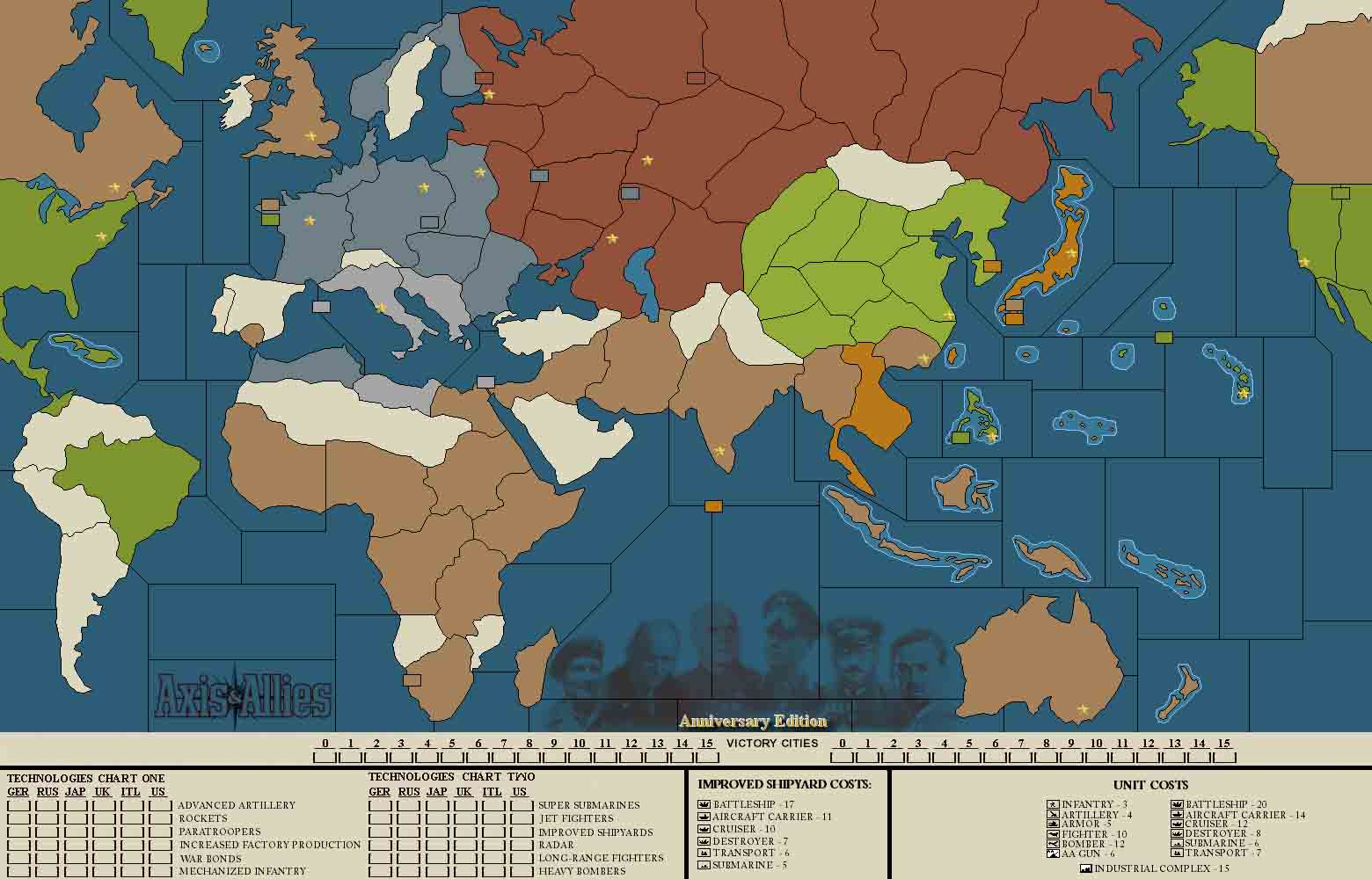
I’ll link it here, it’s in JPG so you’ll have to save it as a BMP. (My old Paint Shop Pro from JASC does this, so I’m sure whatever you are using can too, considering my JASC software was released in 1994!)
I also emailed you the bmp, but the jpg is there too (in case anyone wants to look at critique it before it’s finalized.)

-
BTW, the idea is to use flag icons in the little boxes to mark technologies and stuff. I’m sure you knew that, but I wanted to clarify.
Anyway, it’s about as fancy as I think it needs to be to function the way we want, it just needs to be made into usable space so the flags don’t stack on each other and the entire program does not crash when you try to use the new area under the map. :)
-
Nice Map, hopefully we can get it working.
-
I think adding turn and IPC counters would be unnecessary clutter added. As it is right now the system of adding a flag in the Sahara after each countries turn and using Saudi as a the bank is a simple and elegant solution.
-
I think adding turn and IPC counters would be unnecessary clutter added. As it is right now the system of adding a flag in the Sahara after each countries turn and using Saudi as a the bank is a simple and elegant solution.
Agreed. Everyone’s pretty much used to Saudi Arabia being the “Bank” and Sahara being the turn counter. Though, to be honest, why do we need a turn counter? Everyone names their maps with the country and turn anyway!
-
If you did use an expanded map with the counters like that, you’d probably want to use an additional counter for active research teams as well. Funcioneta and I have been putting flags in spain, but if you’re going to put that much in to track techs, you should also track the researchers as well.
I like the concept (and have played around with various ways to alter the map to accommodate something similar). However that particular layout seems to waste an incredible amount of space and makes the image - which doesn’t fit on my screen as it is - even bigger and more cumbersome.
I was also thinking we could add a row to the toolpieces and make custom icons for the various techs (a paratrooper, a rocket, a radar array, etc), and just line up the research tokens and acquired techs next to each country’s flag in spain, mongolia, or argentina or something like that - similar to how flags are used in saudi, etc. But for that to work, everyone would have to use a version of toolpieces with the 8th row for techs, or they dissappear when you open the map.
-
The spain thing works fine. The problem with the map as it currently is, is that there is no functionable way to tell who has what technology.
For instance, Radar and Rockets could both be realistically represented by AA Guns. Likewise, Paratroopers and Mechanized Infantry could realistically be represented by an Infantry unit. Researchers and War Bonds by flags. How do you represent Jet Fighters and Long Range Aircraft?
Just about anything you would think to use as a token to remind you of what technology you have could be mistaken later for a different technology (with some obvious exceptions, like Super Submarines or Improved Factories, but even those could be Improved Shipyards (either of them))
-
It’s not a good idea to post a non-final version with this much changes, because some people would have the changes, others wouldn’t, and both would have to upgrade to the final version sooner or later, making pbm a bit more cumbersome. So for now I’m posting a “work in progress” version here:
http://www.mediafire.com/?sharekey=e0d3928ee746fd2b91b20cc0d07ba4d2fc8df7fa75a88935(obsolete, for latest version: see first post of this thread).
If you guys got any suggestions/comments, go ahead, I’ll try to explain why I did stuff this or that way, but maybe some other way would be better, so go ahead.As for the map being to big: I’m aiming at a resolution fitting 16801050 under a windows machine (so without a scrollbar at the side or bottom). Currently, the .bmp file is 1560960, but I don’t know if that’s too big for 1680*1050 to fit…
'bout the turn counter: they don’t hurt anyone, if you don’t like them, simply don’t use them ;)
'bout everyone being used to Saudi as a bank: I’m used to a bike, but I wouldn’t mind having a car. And if I really wish, I can still use my bike whilst having a car ;)
Ow, I also adjusted some other stuff, like the flag markers (sry Tim :evil: ) and the little isles.
'nyhow, give it a try, and plz tell what you think of it :)
-
the icons were not going to the correct areas on the bottom of the map. After placing any icon on the bottom of the map Abattlemap crashed.
-
From the flames of Europe site.
One can use also in-scanned maps between 1000x500 and 2000x1000
(the ratio does not have to be 2:1) -
That actually works marvelously.
Love the new Russian flag too, btw.
-
@Cmdr:
That actually works marvelously.
Love the new Russian flag too, btw.
Excellent Map, Thanks HolKann for putting it together.
Just an aside, I disagree with Jen, Russian flag should be the sickle and hammer, they were commies, and nothing says commie like the sickle and hammer. :-D :-D
-
:cry: Keep the Hammer & sickle!!! :lol:
-
You can copy the old toolpieces and put them back in the folder, Jeff
-
Well so far looks like I am the only one this is not working for. As soon as I minimize battlemap the program crashes.
-
I have not tried to minimize it. I know it crashes when you play around in the new area too long, so save often when using that area.
-
Well so far looks like I am the only one this is not working for. As soon as I minimize battlemap the program crashes.
@Cmdr:
I have not tried to minimize it. I know it crashes when you play around in the new area too long, so save often when using that area.
There was a little bug, sry :oops:
Should be fixed now (the .MAP file wasn’t neatly sync’d with the .bmp).:cry: Keep the Hammer & sickle!!! :lol:
They are there, you just have to have a really good look ;)
Ow, and thanks for all the help you guys gave: toolpieces, bigpieces, tech drawings, VC counters… Some thing missing though is a nice photoshopped .bmp, kinda like IL’s, but I’m lacking the time and skills for now.
However, if you like any new counters/things added/things changed to the map, now is the perfect time to ask :)As soon as I get your blessings, I’m gonna make a 42 module and put them in the first post.
-
we need to redownload to get the fixed maps then I take it?
-
Some thing missing though is a nice photoshopped .bmp, kinda like IL’s, but I’m lacking the time and skills for now.
I will be loading my graphics programs onto this computer sometime this weekend. I can probably take care of such for us. The crash bug seems to be gone now. One thing does need to be changed however. The squares on the tech chart are only large enough to accommodate 4 flags. they need to be increased in size to handle 6 flags on the off chance all the countries acquire the same tech.
-
Shouldn’t the starting map Show Japan’s cash as 17 not 18?


