Thanks, Guys! I will try these Ideas out.
Paint markers to better define borders?
-
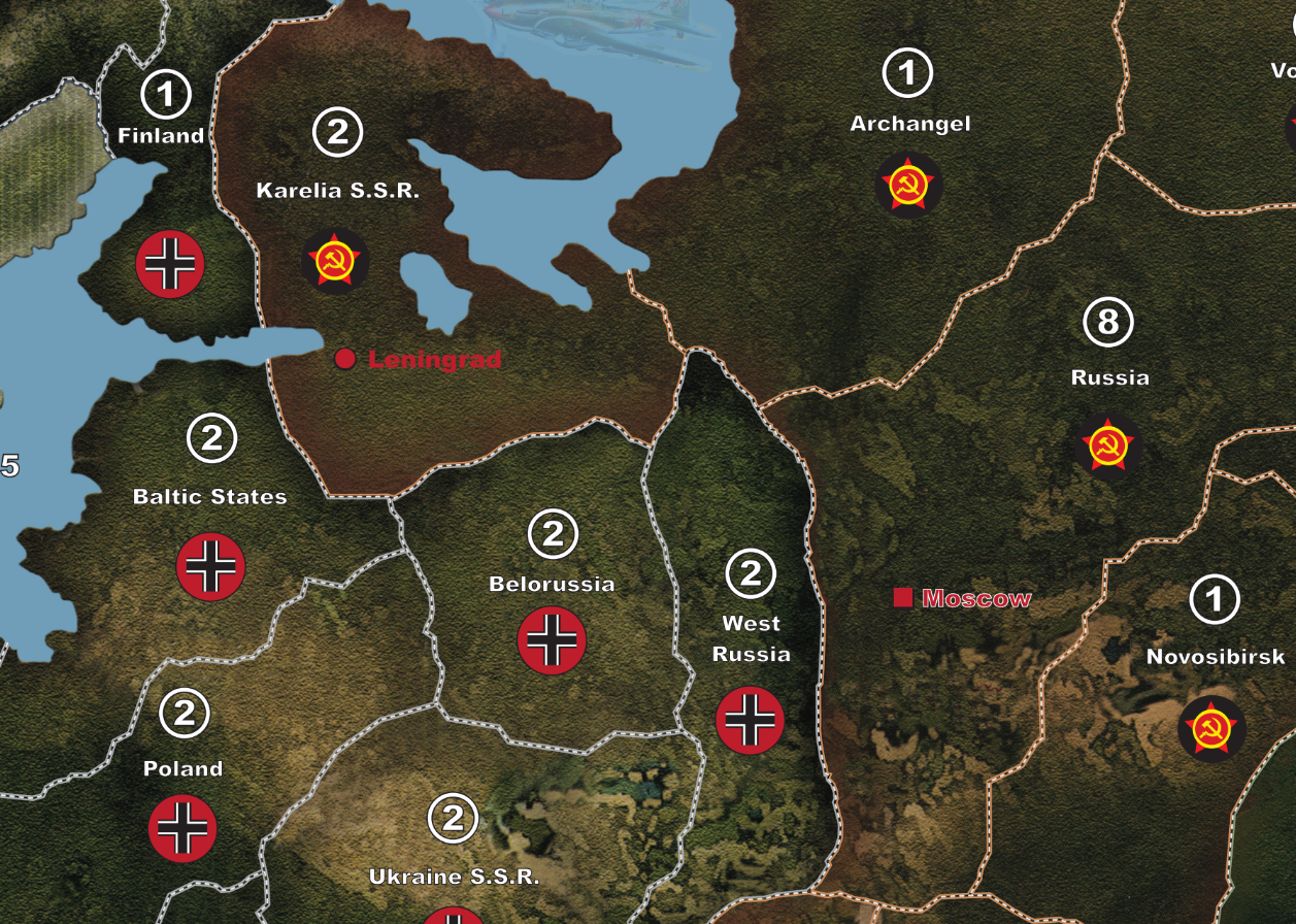
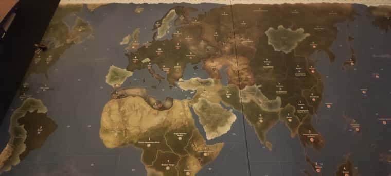
I like the general look of the 1942 se map but I’m kinda baffled as to why the designers made the borders so difficult to see.
I was wondering if anyone has tried improving the definition of the border lines on the map using something like acrylic paint markers??
Might be necessary to hit it after with some matt varnish to protect it but I can imagine bright white border lines or some other colour would be a big improvement. Even a light gray would probably be clearer to see.
-
@8d88 totally agree! I say go for it - what’s a new board going to cost you anyway, if you mess it up? $50, tops? And if it works, you’ve entered the world of homemade A&A goodness.
Alternatively, here’s one of the “triple-thick-borders” versions of @dedo’s awesome map (check out page 2 of his original thread) you might be interested in: https://www.mediafire.com/file/8z2ncptrkbn3xtl
Example:

-
@vodot- Thanks - - I think if I print a map it’ll be one of the Anniversary Edition or global 40/BBR maps, to me the 1942 map seems an appriopriate size, so I don’t think it’s as worth the printing cost.
-
Before …

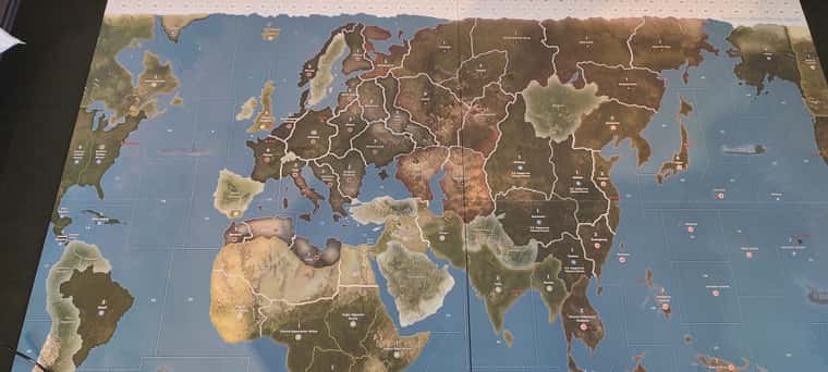
After …

-
@8d88 nice!!
-
Here’s another pic in dimmer light, which is a better comparison to the before picture above.
The silver pops nicely. Before, in the same lighting situation, I couldn’t see most of the border lines at all.
I used the Edding 5300 silver acrylic paint marker with a 1-2 mm tip
The silver seems to really catch what little light there is in the room.As the paint the marker ran low of paint it was harder and harder to control, so I reccomend just stopping and using a fresh paint marker if this happens. A few of the last lines I did are fatter than I would like because of this.
But the overal result is a huge improvement.


