@Valladares Thanks for understanding.
Tjoek's 1940 Global Map file and setup charts (Updated May 30th 2018)
-
When do you expect this map to be done? Also, would you be okay with me taking it to use for my custom map? I mainly will be changing territories and values (as you can see in the progress I had made). I am asking since I will be changing programs and will likely have to restart. So I figure I might as well restart with a well done map. However, if this will take a few more months I will likely continue to use IE’s map
I expect to finish this map second half of April. Shouldn’t take to long anymore.
And I will post a few versions of my map on the forums so feel free to reuse it for you purpose. I would love to see the fruit of my time and effort be used by other enthusiasts within this community.
-
Your work is very nice ! it’s the little details that make the difference !
Thanks! The downside of attention for details is that it takes time and time and even more time, but I like it!
-
I’ve been working on my Anniversary map file the last 2 weeks, but will continue the work on the Global 1940 file as of right now.
I’ve finished the color corrections on the oceans and I’m currently re-centering country names of mainly neutral territories of which I’ve removed the standing army icons. Stay tuned for some pictures in the coming days.
-
Just a quick update to show you guys what I’m currently doing with re-centering the country names:
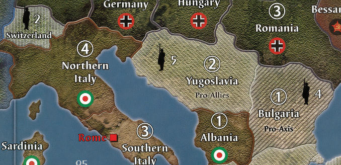
Looking at the image I actually think Italy has been moved a bit to far to the left.
-
I like the moved Northern Italy. The number 4 could be nudged right a bit as it doesn’t quite look centred on the text.
The roundel I would leave in its original position. I don’t believe in keeping everything centred at the cost of the overall look. -
Looks great! Yeah, moving the northern Italy a tad more back to the right would be perfect. The ‘4’ looks fine to me
-
Thanks for the feedback!
I’ve moved the text for Northern Italy a bit more to the top right (giving the italian roundel some more distance from the beaches :-)) and double checked the positioning of the 4. This was only 1 pixel off so I fixed that to, but this small difference is not be visible on the previous image so it most likely is some optical illusion close to the Swiss border.
To me this looks way better now:
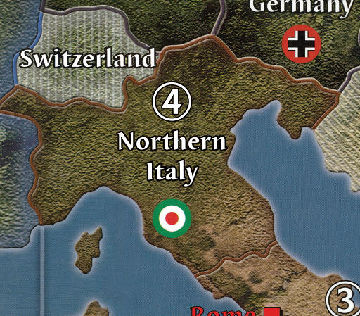
-
That looks great. My eyes aren’t sensitive enough to pick up a 1 pixel difference… haha :-D
-
could be an optical rather than a physical imbalance with the 4.
The tension points between the end of northern and the top of the 4 could be doing it.
I’ve often altered/uncentred designs because of this effect. For some, its like fingers on a chalk board. :-Dafter importing it into Illustrator, I found the 4 is off. It is too far right within the circle. This is what is throwing me off.
-
A pixel off within the circle? And I thought I was picky for just wanting historically accurate Fasces instead of the default Iranian roundels for Italy.
-
more than a pixel, more like 1/16" off.
If you are involved in graphics, it is glaring. If you are just a hobby only person, not so much.
When something is off in your line of work, I’m sure it jumps out at you too.
Best to read and try to understand rather than resorting to ridicule, you might go farther in life. :roll: -
Best to read and try to understand rather than resorting to ridicule, you might go farther in life. :roll:
Best to read and comprehend I was joking about my own OCD rather than immediately assuming you were being ridiculed and lashing out wildly at people who meant no offense…you might go farther in life.
:roll: -
after importing it into Illustrator, I found the 4 is off. It is too far right within the circle. This is what is throwing me off.
I didn’t see it before, but you’re right. The optical weight of the 4 is to far to the right in the circle. In noticed this is the case for all 6 territories with IPC value four. I will correct this as my OCD cannot unsee it now I know it’s there :-D
-
I’ve moved the 4 just 2 pixels to the left in the original file and now it looks more centered. Anyone with a sharp eye that thinks it’s not? :-D

-
Glad it worked out.
Balancing things visually is hard to do as item weight often defies centring logic.
After all the time spent creating this, it’s good to have it perfect before you print.
nowhere man, nothing in your post even remotely hinted at it being a joke.
Next time try adding a smiley face. :-D -
Some good progress on the map today. I’ve finished most of the country name centering and started with the adjacent to indicators on the sea zones on the edge of the map and I’m dying to hear what you guys thinks of my adjacent to attempt.
Mongolia cleaned and centered
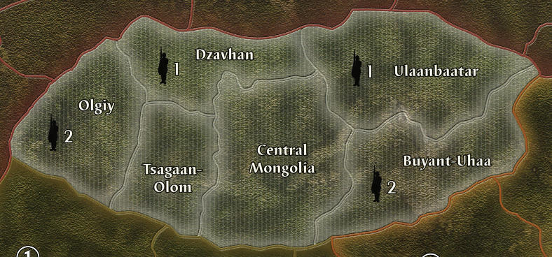
Sea zones adjacent to test
Original map from Ambilzi and YG
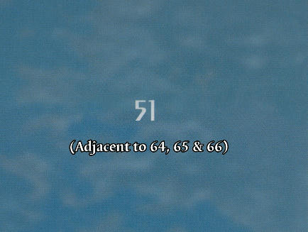
My personal attempt at a more clean and easy on the eye solution
-
I like it, much cleaner and still gets the point across.
-
Very nice changes… i really like the change to the “adjacent sea zones”.
Oh, and Tjoek… maybe you can help a fellow Dutchman in the 1914 forum… he’s trying to get a map printed for 1914, but got it printed in posterboard because his print shop didn’t have vinyl. Maybe you can offer him advice on where to get a vinyl map printed in Holland… i’d help, but I’m afraid I know nothing of Dutch print shops! lol
(He’s Mukremin in this thread: https://www.axisandallies.org/forums/index.php?topic=38666.0 )
-
I like it better, nice and clean, great idea… too bad I added the adjacent crap to mine
-
I like it, much cleaner and still gets the point across.
@Nowhere:
Very nice changes… i really like the cha
I like it better, nice and clean, great idea… too bad I added the adjacent crap to mine
Thanks guys! I won’t be changing these adjacency markings.
In fact I’ve been busy working on some final adjustments like realigning the Convoy and Kamikaze tokens with the SZ numbers (it turns out the enhanced icons are worse aligned then the OOB positioning on the original map). I’ve managed to fix the last issues I had with the map and have two final things to do:
-
Roundels: replace those with more vibrant artwork and change the OOB Italian onces with the Faces
-
Color balance: change the color balance two get more vibrant colors on the map as a whole
So stay tuned as I expect to release a few versions of the map next week. Finally after 14 months of working on this map it is really nearing completion.
-


