@Minor:
Thanks for your comments Special Forces,
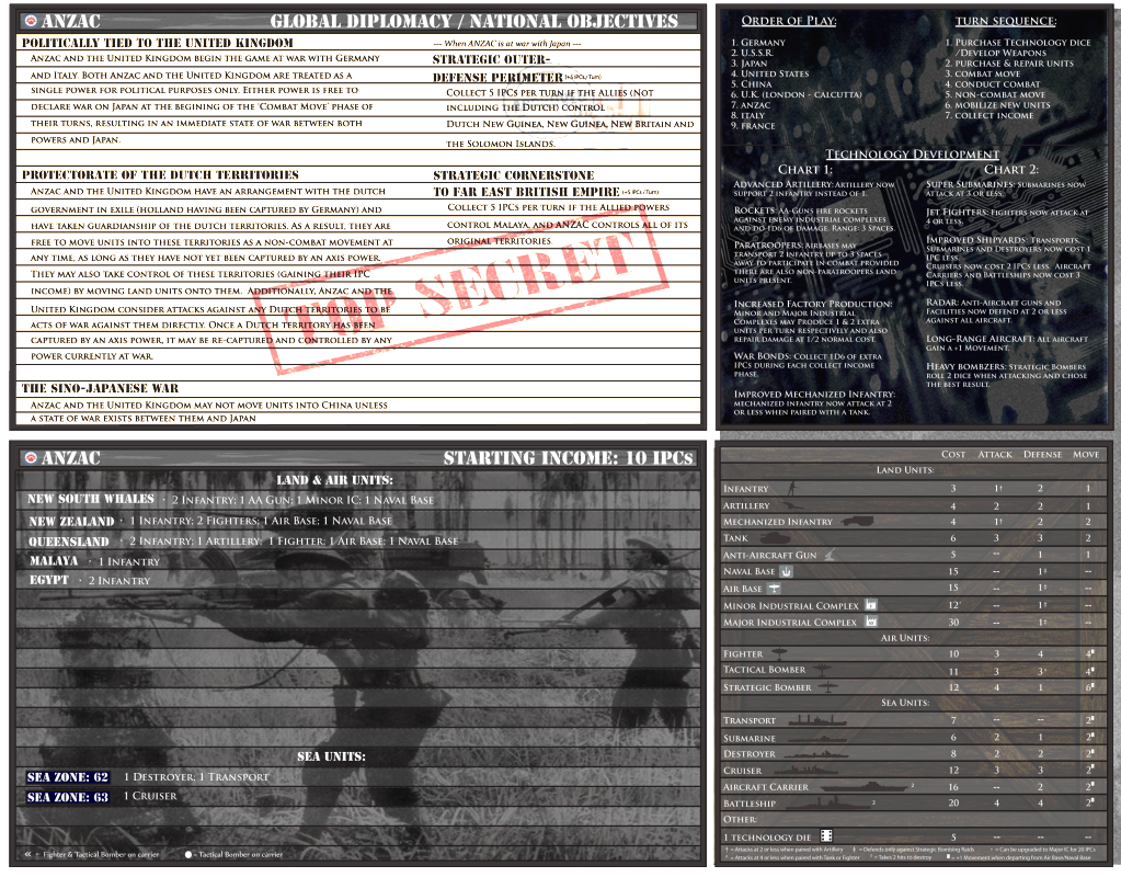
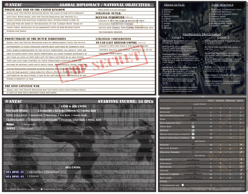
1. I have made some adjustments to the font representing the territories, which do you think would look best? The lines on the chart is something i won’t change, it requires a lot more work based on the format that i’m using. I could darken the manilla folder texture just a little, but too much and the letters would get too mixed in. The Nation-specific stamps would be a pretty cool feature and i thought about it, but require searching the web for hours… its just something i’m tired of :cry: though i wouldn’t mind some help :-D then maybe i could add them.
2. The mobo background pic was all i could find that fit the profile, i tried looking for WWII era labs etc… but couldn’t find appropriate ones. Though if you know of any feel free to post =)
3. I might try that, but i likes the messyness :-P but compare the two and let me know which one you like.
1. For a second i thought you were gonna use different fonts per territory :lol:
Personally i like the Malaya font the most. It is clear, simple, and sorta condensed, this way longer territory names easily fit on the card. Queensland font is nice too but the same as the other text, right? But still good.
Fair enough about the lines. Would you consider lower case text there?
2. Came across a few pictures a while ago but i didn’t save them. Did have this one, though.

Maybe not ideal for adding text all over it
Perhaps some members could chip in in visual material?
3. i like the centered images, because i can find what i am looking for in an instant (you forgot to center the technology die?)
But the centering of the titles (land units, etc) is a bit more to the right than the centering of the pieces, which gives it a sloppy look, i think.
But ok, you didn’t mind messiness? ;)


