@Panther Following your advice I logged out from Google and reset my Eqqman (on that forum) password and was then able to log in with posting privileges. Thanks!
TripleA 1914 download here
-
you’re welcome ;)
https://www.mediafire.com/file/6l8ni5rzkruakro/world_war_i_1914.zip/file
-
 P Panther moved this topic from Axis & Allies 1914 on
-
I saw this one and threw together a very simple relief for it, just in case you wanted something to riff on. It has no underlayer, just the borderlines.
Basically what I do is take the baseline image, select the black border and copy/paste onto a new transparency layer. Then I expand that selection by 1 px, fill with black. Expand the selection again by another 1 px and apply gaussian blur to the selection area. This creates a gradient or a fade for the border area (basically to soften it, so things look a bit better especially at 200% in triplea 2.6.) Once the fade is in place, I go back in an select/delete the original 1px blaxk from baseline so that part is empty in that relief layer. This allows the baseline to show through the relief, and to change from black to white when a tile is selected in-game to show the highlight effect. Looks like so…

You can then create a pattern or topographical underlayer for the relief by choosing whatever pattern fill and then making that portion/layer of the image semi-transparent in the final relief. Like for whatever visual effects, drawn on graphics, labels and the like.
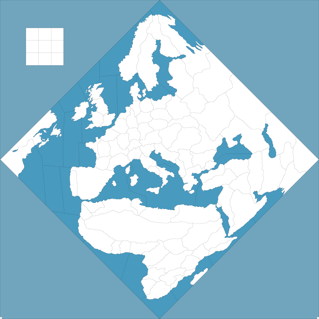
Main challenge with the 1914 board is it’s diamond presentation. This is tricky when the map is scaling height to width, since it prioritizes the one dimension (I guess cause most maps are typically wider than they are tall, with 1914 being the exception to the general rule). What happens is that rather than zooming out all the way it will crop at about 45% zoom-out, basically cause the image is a square. Basically means you can’t see the full diamond when zoomed out, but just the spot shown here in the mini-map window.

To get the outer diamond to display as something other than white I just filled those areas with a lighter shade of blue. To get that to carry over onto the mini-map the way to do it would be to assign the polygons as sea zone tiles, but just to leave them unconnected (no connections assigned in the xml for those tiles). Then it’ll draw over into the mini map too.
Only way I can think of to pull off a full zoom out would be to warp the board (stretch width), or tilt it on it’s side and stretch, or something along those lines. But that requires adjustments to the baseline and the polys, and you’d lose that sort of diamond vibe coming over from OOB.
Anyhow, here’s the quickie relief…

I tried to keep it pretty simple just in case you wanted to play around. Just needs to go in a folder called “reliefTiles” when run through the map creator tool “run tilebreaker.” It’s only about 800k cause the image is mostly a transparency, but still a little too large to attach a preview here on the boards, just cause it’s 3200x3200px. I put it on dropbox in case you want to grab.
Here’s the base I used to select out the diamond sections and make em a shade of blue.

Anyhow, I was doing it for a couple maps, figured one for 1914 might be cool.
Nice work dude! Catch ya next round
Elk
-
Azimuth had a great idea to get the zoom to work, try this…
I doubled the width of your base from 3200px to 6400px expanding the canvas only to the right. This allows the image to zoom quite a bit further in both directions in/out.
This is the display in-game…
At max zoom out you can see the entire diamond

At max zoom in (200%) you can get pretty close. Like right on top of it, so some hot fuzz there, but not too shabby.

When you run the base and relief through the tile breaker, just remember to also do the new width in the map.properties and to the minimap. For the minimap you can paint that image blue or do a little rescale. Just depends how wide you want the stats bar really.
On the map view itself, you could place any graphic in the empty section, which only becomes visible at max zoom out anyway, but could be used for stuff like units charts or whatever to fill the space.
Here’s the baseline and relief I used in case you want to experiment around
preview of widened base

Relief wide (simple borders)
https://www.dropbox.com/scl/fi/mu9yslcuzyut3bc9c54bs/relief_simple_world_war_1_1914_widezoom.png?rlkey=9ocsrt9ht9rpct48gxtrds6ku&dl=0Hope that helps
ps. fooling around with it again, I think if you just go 4:3 or 16:9 aspect when you extend the canvas of the baseline map image (just to the right or you’d have to redo the place and centers and such) you should be fine. Those images above are both at 2:1, but checking that out will also show you the dimensions of the little marquee on the mini. So you can adjust the aspect of the overall map that way, even if the main area of interest is off to the lefthand side. Just to get the zoom to work right. Pretty much everything else you can handle with the relief for whatever visual. When I think of WW1 I tend to picture a more period propaganda vibe or whatever with all the gilded embellishments, but 1914 in the design is sorta more like a fauvist riff on that I think, pretty modernist in it’s take, like to be all tilted on the side hehe. Even the color choice struck me that way, sorta different than I expected, but also made sense once I acquiesced to that. Like the world on it’s sidewise, seems apt. Anyhow, best I could figure for making a zoom work there. Seemed to do the trick
-
@Black_Elk Great, that’s exactly what I had in mind ;)
I think it is possible to find what is the exact minimal ratio to minimize the empty space on the right. And I already have some ideas on what to put there. It’s great how sometimes technical constrains give you the opportunity to develop nice stuff!


