@Stucifer 2176a44d-8289-4f50-a902-39614650fba4-9ba1m8.jpg
WW2 Path to Victory - Feedback Thread
-
@trulpen Just select the territories tab and mouse over areas of interest.
-
Won’t work completely when there is a shit-ton of different units but that’s when the battle calculator is your friend.
-
@Misterblue said in WW2 Path to Victory - Feedback Thread:
@trulpen Just select the territories tab and mouse over areas of interest.
I do at times, but I prefer to be able to see it directly, if possible, excluding piles of different units where all is crawling over each other fighting for breath.
-
@trulpen yes it is possible. Click “View” then “Edit Map Font and Color” and enter a higher number into the font field. I set mine to 18, and it makes the unit numbers very easy to read.
-
@regularkid said in WW2 Path to Victory - Feedback Thread:
@trulpen yes it is possible. Click “View” then “Edit Map Font and Color” and enter a higher number into the font field. I set mine to 18, and it makes the unit numbers very easy to read.
Ahh… the sweetness!
-
Now the troops just look somewhat retarded, but that’s ok. :grin:
-
@trulpen not retarded, just ‘differently abled.’
-
@regularkid said in WW2 Path to Victory - Feedback Thread:
@trulpen not retarded, just ‘differently abled.’
Lol, 16 seems to be perfect for me. Looks very good. Not bracky. Just clean and informative.
-
@trulpen said in WW2 Path to Victory - Feedback Thread:
Now the troops just look somewhat retarded, but that’s ok. :grin:
13 is ideal, after that all the numbers are too big and bolded
-
@trulpen post pic of how it looks on ur screen
-

Also, the colors appear a bit softer on Mac than they do on PC (which i like).
-
@Amon-Sul said in WW2 Path to Victory - Feedback Thread:
@trulpen said in WW2 Path to Victory - Feedback Thread:
Now the troops just look somewhat retarded, but that’s ok. :grin:
13 is ideal, after that all the numbers are too big and bolded
i am speaking of BM
-
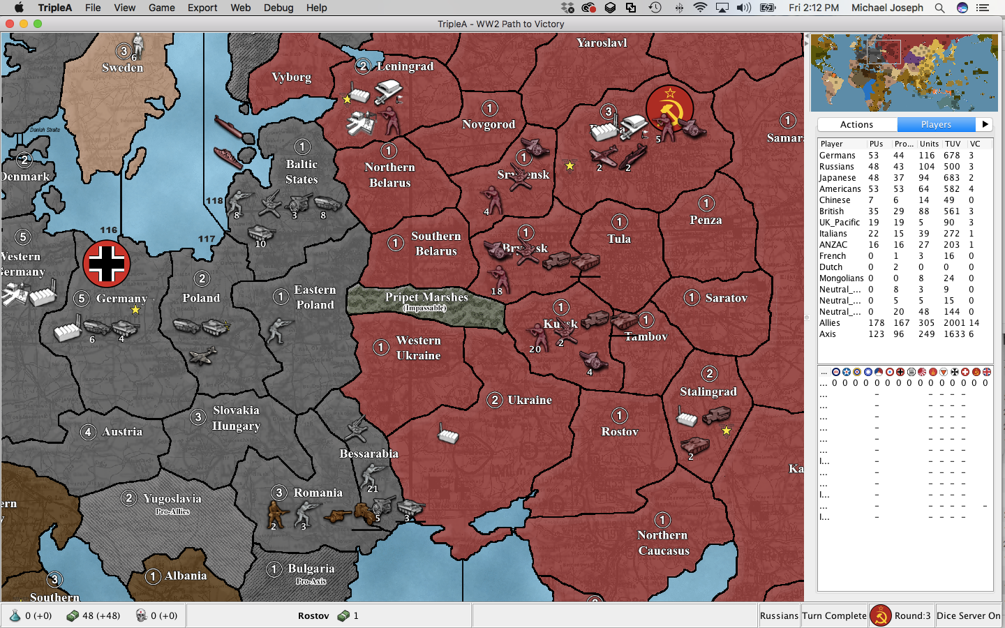
This is BM3, size 16.

-
the numbers are white bolded. its ugly. 13 is the biggest size without bolding
-
Forgot to zoom out a bit, now that I have the opportunity. Was the point as before mentioned. Think it looks very good now!

-
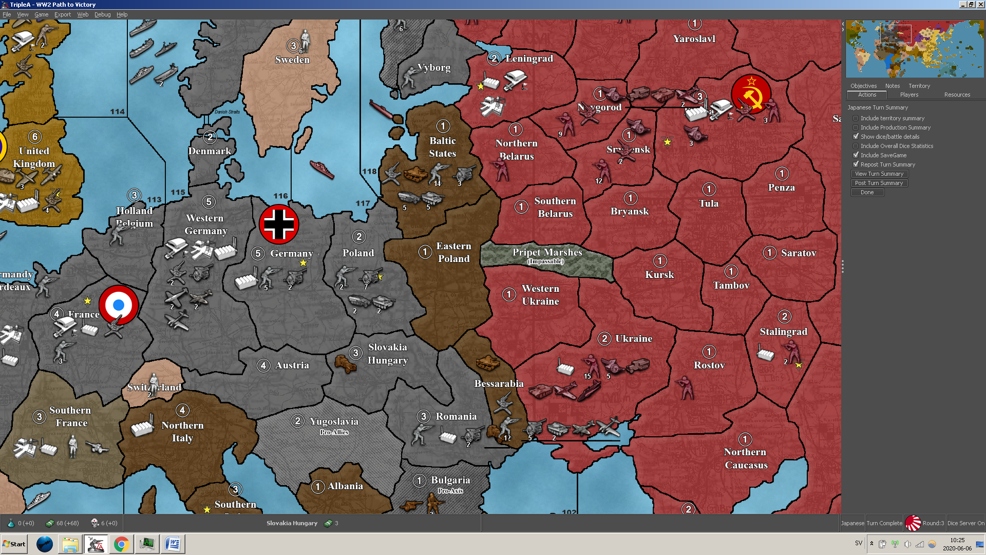
Hey guys. Here’s a game-in-progress Adam and I are playing which showcases some of the interesting scenarios and strategies that have already emerged in PTV. Among other things, note the eastern front shenanigans (airbase in Stalingrad), dynamic pacific, and heroic defense of the western front by the Germans. I feel like the game is leaning towards the Axis, but its still close.
joe_TV_nice_game.tsvg -
@trulpen said in WW2 Path to Victory - Feedback Thread:
This is BM3, size 16.

i dont like the bolded big numbers near units. i dislike it severely.
-
@Amon-Sul said in WW2 Path to Victory - Feedback Thread:
i dont like the bolded big numbers near units. i dislike it severely.
We’re different.
I like to see.
-
I really like a detail with this new map, which is that Leningrad and Stalingrad is called just that.
I understand it’s called Russia because it’s the nation, but I’d actually prefer Moscow there as well, as London, Paris, Berlin, Rome etc. That’s what I call those territories anyway when I write about them here.
I think Egypt could be divided to Egypt and Cairo, with 1 IPC for both, or 2 + 1 like in the Philippines.
Eastern India could be Calcutta, or similarly divided.
A s o.
-
The UK-Pac objective, is it supposed to say z73… 81 or as it is now with z71?
I’m asking since z71 and z72 are part of the Atlantic, not the Indian Ocean.


