http://www.axisandallies.org/forums/index.php?topic=38414.0
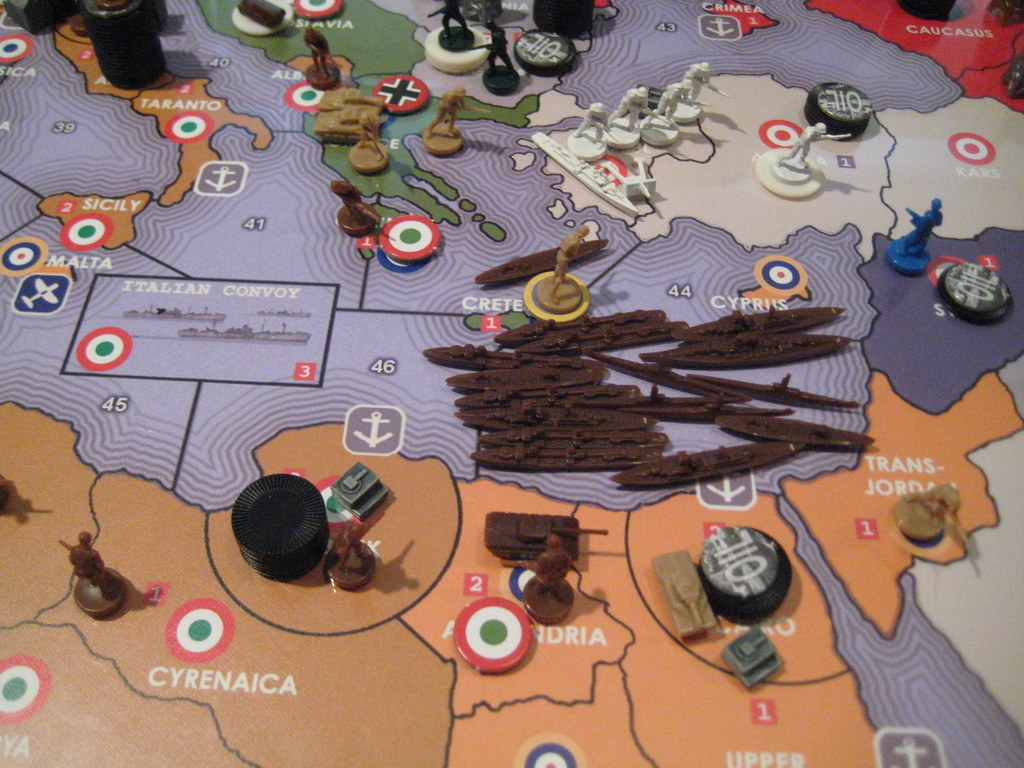
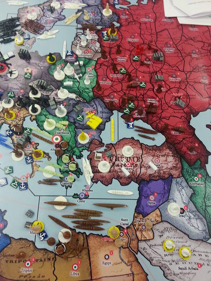
Has a few ideas I used for this exact issue. I’ve changed a few things since with the chips colours. It was a bit overwhelming at first.
Though over time I’ve started to buy or make some pieces to replace these chips from hbg. Occasionally they are out of stock on some stuff. Some we used often and others we didn’t bother with. Torpedo boat destroyers for example were not worth it for us we just switched to destroyers for these at setup. For now….
HBG says you can play with global40 oob pieces. But a few items are nice to have extra.
Found it way cheaper to buy some units from hbg. The pieces from Pacific or Europe 40. Some are sold in a complete bag for a nation uk and usa most likely in stock. And spray paint any extra colours you want. Dutch orange, yellow comunist china and spain to augment the special units in the same colours i bought.
If money isn’t an issue I’d say call or email the folks at HBG and get everything you need there. They know their stuff and can assist you with the pieces and options required. Have had lots of communication with them. They are very good at getting back to you and assisting with your orders!


.jpg)
.jpg)


