@Imperious:
Note: these are from the producer, make your own list and or provide links or images of colors you feel strongly about
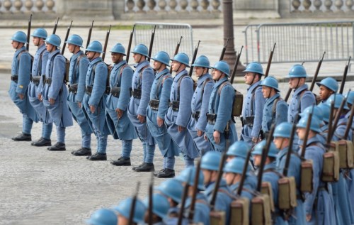
Most of these colours sound good to me, and for the others I have an open mind (since it depends partly on how these colours get rendered, in terms of the exact shade used), so I’ll just make a few general recommendations. To me, an important consideration would be to make sure that all the colour choices are clearly defined and well differentiated from each other. In other words: by looking at a sculpt on its own it should be possible to tell exactly what the colour is intended to be, and by looking at it alongside the sculpts of other nations there should be no possibility of confusion. An example of a bad colour choice was the original brownish-green one used in the Milton Bradley game for the US. I found it unattractive, which I admit is a matter of taste, but more fundamentally it had the problem of being in a murky, hard-to-describe colour, and of not being sufficiently different visually (especially in some lighting conditions) from the dark brown Russian units.
A few other thoughts. First, be careful with any units that are green. Shades of green are apparently hard to produce consistenly in manufacturing processes; as evidence, I can point to the A&A US infantry sculpts in my collection, of which I have about a dozen different shades. Moreover, green is a notoriously fickle colour which can look quite different in bluish daylight, reddish incandescent light and greenish fluorescent light. Second, make sure that the infantry sculpts are the same shade as the equipment sculpts. The A&A infantry sculpts in the Milton Bradley games had appreciable shade differences when compared to the equipment sculpts, for reasons I’ve never understood (perhaps they were made of a different type of plastic, or manufactured in a different production run). The same problem has cropped up in a few later games, though to a much lesser extent; for instance, there are more German infantry shades in my collection than equipment shades. Consistency across printings is nice too: the American and German units in Global 1940 2nd edition (of which I own several copies) were produced in at least two different shades each, and as far as the American pieces go the difference is so pronounced (one version has decidedly yellowish overtones) that I keep the two types of US pieces separate from each other in my storage boxes.


